


注意:要给块设置高度,如果只让元素撑起,可能会导致下一个块与其有间距。 一个单独的块(也可能是嵌套)只设置高度,不设置宽度,默认跟随上一个块元素的宽度 #banner{height: 500px;}
一些标签
a:
<a href="#" style="text-decoration: none;color: black;margin: 0 15px; ">电影</a>
text-decoration: none; 设置超链接样式 margin:元素的间距
内部样式表是在head里面添加<style type="text/css"><style>标签
鼠标样式:
cursor:crosshair;
表格:
表格布局: table-layout:automatic|fixed
automatic; 单元格的大小由td的内容宽度决定
fixed; 单元格的大小由td上设置的宽度决定
只对连续的英文字母起作用
表格边框: border-collapse
值:  separate:边框分隔    collapse:边框合并
容器及选择器
div ,span都是容器标签。标签内可以用style为内部元素添加样式
text-align:让容器内部元素水平居中 css中,align用text-align代替。要设置一块文字居中应该给他的父元素设置text-align:center
空div容器,默认宽度100%,高度0 。往里面填充内容,会被撑起
{margin: auto}的设置是让该块在父容器里居中显示
<div style="color: #555">
     <p style="text-align: center;">
          <span style="background-color: darkgray; color: white; font-size: 24px;">fan_lee</span>
     </p>
<div>
<div id="navigation" style="text-align: center; height: 70px; line-height: 70px; background-color: white;">
*height: 70px;设置块高度为70px   line-height:设置行高70px,可以使里面内容上下居中*

<a href="#" class="nav" >类别选择器</a> 设置样式 .nav{}  <div id="nav">ID选择器 </div>设置样式 #nav{}
p{width:100px} 标签选择器,对所有p标签都生效
 *{}所有标签都生效
CSS优先级: 行内>ID>类>标签>通用
选择器选择的范围越小越精准,优先级越高
选择器也可以叠加:#bb p .cv>#bb .cv
#sort .ym.fast 多个类时,不加空格 clss ="ym fast"
文本及字体属性
文本属性:
CSS文本属性:
   .p1{color: red;} /*文本颜色*/                        .p2{font-family: "arial narrow";}/*字体类型*/
   .p3{font-size: 26px;}                                      .p4{font-weight: bold;}/*字体加粗*/
   .p5{font-style: initial;}/*字体倾斜*/                .p6{text-indent: 50px;}/*首行缩进*/
   .p7{line-height: 100px;}/*行高*/                    .p8{text-align: center;}/*字体居中*/
   .p9{height: 100px;background-color: #FF0000; line-height: 100px;}
   .p10{text-decoration: underline}/*字体修饰*/
'字体属性:'
font-size	尺寸
font-style	风格
font-weight	粗细	normal 标准粗细    bold 粗一点
font-family	字库
font	声明在一起
风格有:
font-style:   normal 标准字体      italic 斜体
字库:
默认字库 font family:default

设置字库 font-family: Times New Roman
设置字库 font-family: Arial
设置字库 font-family: 宋体, 这种字体是IE默认字体
设置字库 font-family: 黑体
设置字库 font-family: 楷体
设置字库 font-family: 微软雅黑, 这个字体是火狐默认字体
边框

所以当body是空标签时候,如果想让页面显示,可以给html标签设置大小

背景
背景图属性:
 background-image: url(001.gif   );      background-size: 500px(宽 高);
 background-repeat: no-repeat;        background-position: left bottom;
#插入图片占据空间结构,背景图属于网页的样式,背景图上可以显示文字等
容器尺寸 =图片尺寸 ,背景图正好显示在容器内,大于,背景图平铺,直至铺满。小于,只显示部分背景图、
插入图片大于容器尺寸,会溢出#
浮动
边框:
 		border-color: #000000;
	    border-style: solid;
        border-width: 1px;

浮动 用float,元素脱离固定位置,浮动
浮动元素不能撑起父元素,因此在浮动元素的内容会覆盖下面的内容,若想摆脱影响,有三种解决办法:
1. 给父元素设置高度
2. 给父元素设置 overflow:auto;
3. 想要摆脱浮动影响的内容设置clear:left/right/both

浮动元素在排列时,只参考前一个元素的位置


居中
ul{margin: 0 auto; } 整体在父标签里居中显示,想让那个块居中,就给块设置 margin: auto
*{margin:0 padding:0 } 首先清除所有标签的边距
直接给图片添加外边距,会使图片超出父标签内
line-height 适合单独一行垂直居中:
<style>
#d {
line-height: 100px;
}
div{
  border:solid 1px lightskyblue;
}
</style>

<div id="d">line-height 适合单独一行垂直居中</div>
内边距方式:
借助设置相同的上下内边距,实现垂直居中效果,可以用在多行文本上
<style>
#d {
    padding: 30 0;
}
div{
    border:solid 1px lightskyblue;
}
</style>
<div id="d">多行内容 多行内容 多行内容 多行内容 多行内容 多行内容 多行内容 多行内容 多行内容 多行内容 多行内容 多行内容 多行内容 多行内容 多行内容 多行内容 多行内容 多行内容 多行内容 多行内容 多行内容 多行内容 多行内容 多行内容 多行内容 多行内容 多行内容 多行内容 多行内容 多行内容 多行内容 多行内容 多行内容 多行内容 多行内容 多行内容 多行内容 多行内容 多行内容 多行内容  </div>
table方式:
首先通过display: table-cell;把div用单元格的形式显示,然后借用单元格的垂直居中vertical-align: middle; 来达到效果。
这样对图片也可以居中,上一步 line-height就不能对图片居
中。
<style>
#d {
display: table-cell;
vertical-align: middle;
height:200px;
}

div{
  border:solid 1px lightskyblue;
}
</style>

<div id="d">
<img src="https://how2j.cn/example.gif">
</div>
左右固定:
<style>
 .left{
   width:200px;
   float:left;
   background-color:pink
  }
  .right{
   width:200px;
   float:right;
   background-color:pink
  }
  .center {margin:0 200px;   background-color:lightblue}
</style>

<div class="left">左边固定宽度</div>
<div class="right">左边固定宽度</div>
 <div class="center">中间自适应</div>

</head>

<body>

</html>
填充


样式层叠:
<!DOCTYPE html>
<html>
	<head>
		<meta charset="utf-8">
		<title></title>
		<style>
			#navigation{
				text-align: center;
			}
			#navigation .last{
				border: none;
			}
			.nav{
				text-decoration: none;
				color: #000000;
				border-right: solid 1px #808080;
				padding: 0 15px;//margin:0 15px;
			}
		</style>
	</head>
	<body>
		<div id="navigation">
			<a href="#" class="nav" >首页</a>
			<a href="#" class="nav">电影</a>
			<a href="#" class="nav">电视剧</a>
			<a href="#" class="nav">动漫</a>
			<a href="#" class="nav">科幻</a>
			<a href="#" class="nav">冒险</a>
			<a href="#" class="nav last" >动作</a>
		</div>
	</body>
</html>
其中当代码为padding: 0 15px;时,效果:

当代码为margin: 0 15px;时,效果:

padding:会改变元素的大小,扩大了元素
margin:是加在元素外遍
填充实例:
<!DOCTYPE html>
<html>
	<head>
		<meta charset="utf-8">
		<title></title>
		<style>
			*{margin: 0;}
			.item{
				float: left;
				margin: 20px;
				border: #000000 4px solid;
				padding: 20px;
				text-align: center;
			}
			.bb{
				width: 635px;
				border-color: darkgoldenrod;
				border: 3px;
				border-style: dashed;
				overflow: auto;
				margin: auto;
			}
			.item img{ height: 150px; width: 120px;}
		</style>
	</head>
	<body>
		<div class="bb">
			<div class="item">
				<img src="./1.jpg" alt="Image Lost" ><br>
				我是标题1
			</div>
			<div class="item" >
				<img src="./3.jpg" alt="Image Lost"><br>
				我是标题2
			</div>
			<div class="item">
				<img src="./1.jpg" alt="Image Lost"><br>
				我是标题3
			</div>
		</div>
	</body>
</html>
效果:

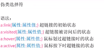
a可以简化写:a:{color:}a:hover{}三个相同,只有划过时不同
ul : list-style-type 设置序号样式 (不同浏览器显示会有不同)
list-style-image :url();也可以用图片代替
list-style-position: inside/outside
给每一行增加前面的序号, position是左边 上下50% padding-left是使文字不覆盖图片


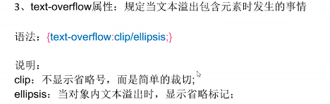
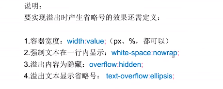
如:.ab{white-space: nowrap; overflow: hidden; text-overflow: ellipsis; height: 30px;list-style-position: inside; }
           <ol class="shiju" type="A">
               <li class="ab">有一种诗词,</li>
               <li class="ab">唯美动人,让人回味无穷sssssssssssssssssss。</li>
               <li class="ab">下面五十句唯美诗句,</li>
           /ol>
;list-style-position: inside这样才能显示序号
img 和表单input th等默认是inline-block
display:none 元素不会被显示,并脱离文档流
display: list-item 将元素转换为列表 li的默认类型 不设置宽度时撑满一行 独占一行 支持宽高 列表默认是list-item
使用display:none; 隐藏一个元素,这个元素将不再占有原空间 “坑” 让出来了
使用 visibility:hidden;隐藏一个元素,这个元素继续占有原空间,只是“看不见”


可以设置层叠顺序,数值越大越靠上

动手敲一个网页的时候,应该先设计网页的整天版块,计算各个块的占比,间距之类的,设计好Div,再往div里面添加内容。
<!DOCTYPE html>
<html>
    <head>
        <meta charset="utf-8" />
        <meta name="viewport" content="width=device-width, initial-scale=1">
        <title>design</title>
		<style type="text/css">
			*{margin: 0;padding: 0;}
			#header{
				width: 100%;
				height: 3.125rem;
				background-color: #008000;
			}
			#header .head{
				margin: auto;
				height: 50px;
				width: 1005px;
				text-align: center;
				line-height: 50px;
				background-color: #2E8B57;
			}
			#header .head a{color: white;}
			#header .head a:hover{color: black;}
			#header .head .item{
				padding: 0 20px;
				text-decoration: none;
				border-right: white 1px solid;
				color: white;
			}
			#header .head .item.last{border: none;}
			#banner{height: 500px;}
			#banner img{width: 100%; height: 500px; background-repeat: none; }
			#cate{
				width: 1005px;
				height: 200px;
				margin: auto;
				background-color: #FF4500;}
			#cate .item{
				width: 125px; height: 165px;
				padding: 25px 25px 10px 25px;
				border-right-color: blue;
				border-right-width: 1px;
				border-right-style: dotted;
				float: left;
			}
			#cate .item.fast{padding-right: 0;}
			#cate .item.last{padding-right: 0; border: none;}
			#case{
				height: 490px;
				background-color: seagreen;
				}
			#case .text{
				width: 1005px;
				color: white;
				text-align: center;
				margin: auto;
				padding: 20px 0 10px 0;
				font-size: 45px;
				font-family: "lucida sans unicode";
			}
			#case .wapper{
				width: 1000px;
				overflow: auto;
				margin: auto;
			}
			#case .wapper .item{
				width: 320px; height: 20.625rem;
				background-color: #A52A2A;
				float: left;
			}
			#case .wapper .item.mg{margin: 0 20px;}
			#case p{
				width: 950px;
				margin: 10px auto;
				height: 40px;
				line-height: 40px;
				text-align: center;
				color: white;
				font: 20px "calisto mt"  ;
			}
		</style>
    </head>
	<body>
		<div id="header">
			<div class="head">
				<a href="#" class="item">首页</a>
				<a href="#" class="item">跑步</S>
				<a href="#" class="item">乒乓球</a>
				<a href="#" class="item">篮球</a>
				<a href="#" class="item last" >足球</a>
			</div>
		</div>
		<div id="banner">
			<img src="ad3.jpg">
		</div>
		<div id="cate">
			<div class="item fast">样品1</div>
			<div class="item">样品1</div>
			<div class="item">样品1</div>
			<div class="item">样品1</div>
			<div class="item">样品1</div>
			<div class="item last">样品1</div>
		</div>
		<div id="case">
			<div class="text">
				Fan.lee
			</div>
			<div class="wapper">
				<div class="item"></div>
				<div class="item mg"></div>
				<div class="item"></div>
			</div>
			<p>查看更多</p>
		</div>
	</body>
效果图:

<! 看的视频是千峰,截取了一些图片>


 466
466


 被折叠的 条评论
为什么被折叠?
被折叠的 条评论
为什么被折叠?
 到【灌水乐园】发言


