


一、实验目的
(1)掌握支持向量机模型 SVM 的原理和使用方法。
二、实验内容
保持公司的员工满意的问题是一个长期存在且历史悠久的挑战。如果公司投入了大量时间和金钱的员工离开,那么这意味着公司将不得不花费更多的时间和金钱来雇佣其他人。以 IBM 公司的员工流失数据集(HR-Employee-Attrition.csv)作为处理对象,使用第三方模块sklearn 中的相关类来建立支持向量机模型,进行 IBM员工流失预测。要求:
1)对数据集做适当的预处理操作;
2)划分 25%的数据集作为测试数据;
3)输出支持向量;
4)输出混淆矩阵,计算查准率、查全率和 F1度量,并绘制 P-R 曲线和 ROC 曲线。
说明:数据集的第 2 列(Attrition)为员工流失的类别。
三、实验代码和过程
1、导包
import numpy as np
import pandas as pd
import matplotlib.pyplot as plt
from sklearn.ensemble import RandomForestClassifier, GradientBoostingClassifier
from sklearn.linear_model import LogisticRegression
from sklearn.metrics import accuracy_score, log_loss
from sklearn.preprocessing import OneHotEncoder, MinMaxScaler ,LabelEncoder
import warnings
warnings.filterwarnings('ignore')
2、预处理
def preProcessData(data):
    data['Attrition'] = data['Attrition'].map(lambda x:1 if x=='Yes' else 0)

    data = data.drop(['EmployeeNumber', 'StandardHours'], axis=1)

    attr = ['Age', 'BusinessTravel', 'Department', 'Education', 'EducationField', 'Gender', 'JobRole', 'MaritalStatus',
            'Over18', 'OverTime']
    for feature in attr:
        lbe = LabelEncoder()
        data[feature] = lbe.fit_transform(data[feature])

    return data
3、数据划分
 train = pd.read_csv('HR-Employee-Attrition_1.csv')
 train = preProcessData(train)
    # print(train['Attrition'].value_counts())
 X_train, X_valid, y_train, y_valid = train_test_split(train.drop('Attrition', axis=1), train['Attrition'],test_size=0.25  )
4、训练并预测,输出支持向量
from sklearn.svm import SVC
from sklearn.metrics import confusion_matrix
model = SVC(kernel='poly',
class_weight={1:6},
gamma="auto",
max_iter=1000000,
degree=3,
coef0=1e-3,
C=0.5
)
model.fit(X_train, y_train)
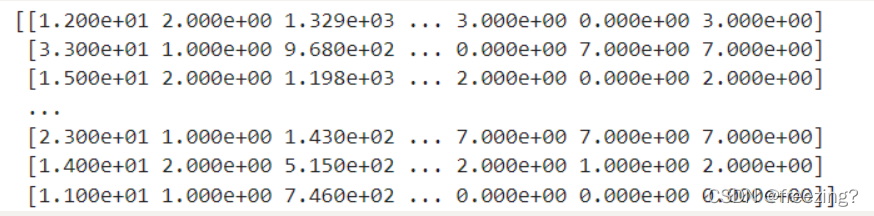
print(model.support_vectors_)
predict = model.predict(X_test)
result = model.score(X_test,y_test)
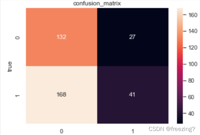
5、输出混淆矩阵
	sn.set()
    f, ax = plt.subplots()
    C2 = confusion_matrix(predict,y_valid, labels=[0, 1])
    sn.heatmap(C2, fmt="d",annot=True, ax=ax)
    ax.set_title('confusion_matrix')
    ax.set_xlabel('predict')
    ax.set_ylabel('true')
    plt.show()
6、计算数据、绘制曲线
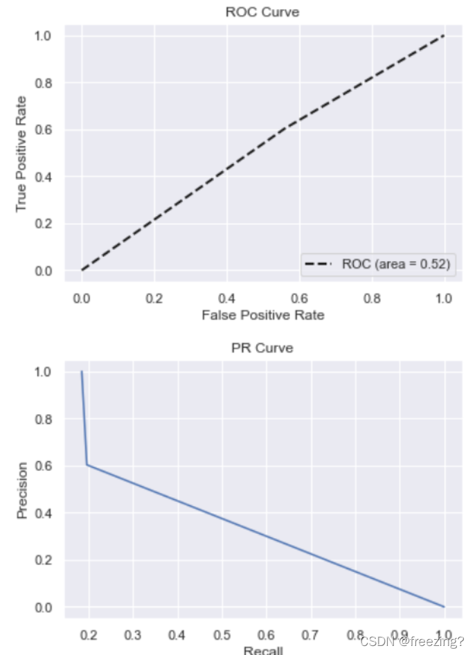
def PR_Curve(y,pre):
precision, recall, thresholds = precision_recall_curve(y, pre)
# plt.figure(1)
plt.xlabel('Recall')
plt.ylabel('Precision') # 可以使用中文,但需要导入一些库即字体
plt.title('PR Curve')
plt.plot(precision, recall)
plt.show()
def ROC_Curve(y,pre):
fpr, tpr, thersholds = roc_curve(y, pre, pos_label=1)
for i, value in enumerate(thersholds):
print("%f %f %f" % (fpr[i], tpr[i], value))
roc_auc = auc(fpr, tpr)
plt.plot(fpr, tpr, 'k--', label='ROC (area = {0:.2f})'.format(roc_auc), lw=2)
plt.xlim([-0.05, 1.05])
plt.ylim([-0.05, 1.05])
plt.xlabel('False Positive Rate')
plt.ylabel('True Positive Rate')
plt.title('ROC Curve')
plt.legend(loc="lower right")
plt.show()
...........
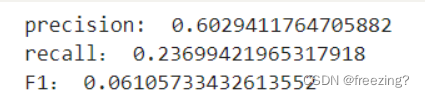
TP = C2[0][0]
TN = C2[1][1]
FN = C2[0][1]
FP = C2[1][0]
precision = TP / (TP + FP)
recall = TP / (TP + FN)
F1 = (2 * TP)/(1470 + TP -TN) #1470为样本总数
print('precision: ', precision)
print('recall:', recall)
print("F1:",F1)
ROC_Curve(y_valid,predict)
PR_Curve(y_valid, predict)
四、实验结果截图及结果分析
1、支持向量
2、混淆矩阵
3、计算查全率、查准率和F1度量
 ·
·
4、绘制PR、ROC曲线


 4378
4378


 被折叠的 条评论
为什么被折叠?
被折叠的 条评论
为什么被折叠?
 到【灌水乐园】发言


