


gitee地址: heimamm: 黑马面面移动端项目的首页,使用了swiper插件、flexible.js等进行简化时间,使用了muke、photshop等进行图片协作处理。
该案例需要用到的插件:swiper-5.4.5,lib-flexible-2.0
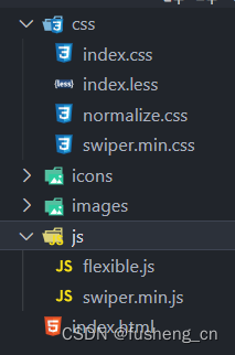
项目的具体文件如下 :
index.html代码:
<!DOCTYPE html>
<html lang="en">
  <head>
    <meta charset="UTF-8" />
    <meta name="viewport" content="width=device-width, initial-scale=1.0" />
    <title>黑马面面</title>
    <link rel="stylesheet" href="./css/normalize.css" />
    <!-- 先引入css文件 放到自己css文件的上面 -->
    <link rel="stylesheet" href="./css/swiper.min.css" />
    <link rel="stylesheet" href="./css/index.css" />
  </head>

  <body>
    <section class="warp">
      <!-- 头部区域 -->
      <header class="header">黑马面面</header>
      <!-- 导航栏部分 -->
      <nav class="nav">
        <a href="#" class="item">
          <img src="./icons/icon1.png" alt="" />
          <span>HR面试</span>
        </a>
        <a href="#" class="item">
          <img src="./icons/icon2.png" alt="" />
          <span>笔试</span>
        </a>
        <a href="#" class="item">
          <img src="./icons/icon3.png" alt="" />
          <span>技术面试</span>
        </a>
        <a href="#" class="item">
          <img src="./icons/icon4.png" alt="" />
          <span>模拟面试</span>
        </a>
        <a href="#" class="item">
          <img src="./icons/icon5.png" alt="" />
          <span>面试技巧</span>
        </a>
        <a href="#" class="item">
          <img src="./icons/icon6.png" alt="" />
          <span>薪资查询</span>
        </a>
      </nav>
      <!-- go模块 -->
      <section class="go">
        <img src="./images/go.png" alt="" />
      </section>
    </section>
    <!-- 就业指导模块 -->
    <section class="content">
      <!-- 头部 -->
      <div class="con-hd">
        <h4>
          <span class="icon"><img src="./icons/i2.png" alt="" /></span>
          就业指导
        </h4>
        <a href="#" class="more">更多>></a>
      </div>
      <!-- 旋转木马轮播图模块 -->
      <div class="get_job_focus">
        <!-- Swiper -->
        <div class="swiper-container get_job_fo">
          <div class="swiper-wrapper">
            <div class="swiper-slide">
              <a href="#"><img src="./images/pic.png" alt="" /></a>
              <p>老师教你应对面试技巧</p>
            </div>
            <div class="swiper-slide">
              <a href="#"><img src="./images/ldh.jpg" alt="" /></a>
              <p>老师教你应对面试技巧</p>
            </div>
            <div class="swiper-slide">
              <a href="#"><img src="./images/3.jpg" alt="" /></a>
              <p>老师教你应对面试技巧</p>
            </div>
          </div>
        </div>
        <!-- Add Arrows 根据需求这个代码放到 container外面 添加左右箭头-->
        <div class="swiper-button-next"></div>
        <div class="swiper-button-prev"></div>
      </div>
    </section>
    <!-- 充电学习模块 -->
    <section class="content study_con">
      <!-- 头部 -->
      <div class="con-hd">
        <h4>
          <span class="icon"><img src="./icons/i2.png" alt="" /></span>
          充电学习
        </h4>
        <a href="#" class="more">更多>></a>
      </div>
      <!-- 学习模块轮播图模块 -->
      <div class="study">
        <!-- Swiper -->
        <div class="swiper-container study_fo">
          <div class="swiper-wrapper">
            <div class="swiper-slide">
              <img src="./images/pic1.png" alt="" />
              <h5>说低调英语,告别中式英语</h5>
              <p>156人学习</p>
            </div>
            <div class="swiper-slide">
              <img src="./images/pic2.png" alt="" />
              <h5>说低调英语,告别中式英语</h5>
              <p>156人学习</p>
            </div>
            <div class="swiper-slide">
              <img src="./images/pic1.png" alt="" />
              <h5>说低调英语,告别中式英语</h5>
              <p>156人学习</p>
            </div>
            <div class="swiper-slide">
              <img src="./images/pic1.png" alt="" />
              <h5>说低调英语,告别中式英语</h5>
              <p>156人学习</p>
            </div>
          </div>
          <!-- Add Pagination -->
          <div class="swiper-pagination"></div>
        </div>
      </div>
    </section>
    <footer class="footer">
      <a href="#" class="item">
        <img src="./icons/home.png" alt="" />
        <p>首页</p>
      </a>
      <a href="#" class="item">
        <img src="./icons/ms.png" alt="" />
        <p>模拟面试</p>
      </a>
      <a href="#" class="item">
        <img src="./icons/net.png" alt="" />
        <p>技术面试</p>
      </a>
      <a href="#" class="item">
        <img src="./icons/user.png" alt="" />
        <p>我的首页</p>
      </a>
    </footer>
    <script src="./js/flexible.js"></script>
    <!-- 比如引入js文件 -->
    <script src="./js/swiper.min.js"></script>
    <script>
      // 第一个函数里面是 就业指导轮播图
      (function () {
        var swiper = new Swiper(".get_job_fo", {
          // 能够显示的 slider的个数
          slidesPerView: 2,
          // 每一个slide之间的距离
          spaceBetween: 30,
          centeredSlides: true,
          loop: true,
          // 添加左右箭头
          navigation: {
            nextEl: ".swiper-button-next",
            prevEl: ".swiper-button-prev",
          },
        });
      })();
      // 第二个函数的轮播图
      (function () {
        //  如果有多个轮播图最好修改下 swiper-container
        var swiper = new Swiper(".study_fo", {
          // 我们可以可以看看到的是 2个半
          slidesPerView: 2.2,
          spaceBetween: 20,
        });
      })();
    </script>
  </body>
</html>
index.less代码
vscode插件:Easy LESS (可以将less转换为css)
body {
  min-width: 320px;
  max-width: 750px;
  margin: 0 auto;
  background-color: #f2f4f7;
}

a {
  text-decoration: none;
  color: #707070;
}

// 约束当屏幕大于 750px 的时候,html字体大小就不不变化了
@media screen and (min-width: 750px) {
  html {
    font-size: 37.5px !important;
  }
}

.warp {
  background-color: #fff;
  padding-bottom: 1.146667rem;
}

.header {
  height: 2.133333rem;
  border-bottom: 1px solid #eaeaea;
  text-align: center;
  line-height: 2.133333rem;
  font-size: 0.933333rem;
  color: #1c1c1c;
}

.nav {
  display: flex;
  // 显示不开就换行
  flex-wrap: wrap;
  padding: 1.2rem 0 1.6rem 0;
  .item {
    display: flex;
    width: 33.33%;
    // 纵向显示
    flex-direction: column;
    // 水平居中
    align-items: center;
    img {
      width: 3.706667rem;
      height: 3.706667rem;
    }
    span {
      font-size: 0.666667rem;
      color: #707070;
    }
    // 选择前面三个 -n + 3 选择前3个
    &:nth-child(-n + 3) {
      margin-bottom: 1.653333rem;
    }
  }
}

.go {
  margin: 0 0.266667rem 0 0.48rem;
}

.content {
  padding: 1.066667rem 0.64rem;
  background-color: #fff;
  margin-top: 0.266667rem;

  .con-hd {
    display: flex;
    justify-content: space-between;
    height: 1.013333rem;
    line-height: 1.013333rem;
    margin-bottom: 0.906667rem;
    h4 {
      margin: 0;
      font-size: 0.746667rem;
      color: #333333;
      .icon {
        display: inline-block;
        width: 1.013333rem;
        height: 1.013333rem;
        // 添加这个代码,可以让后面的文字垂直居中
        vertical-align: middle;
      }
    }
    .more {
      font-size: 0.586667rem;
      color: #999999;
    }
  }
}

.get_job_focus {
  position: relative;
  .swiper-container {
    // width: 100%;
    height: 100%;
    // 根据需求把宽度定位 540px
    width: 14.4rem;
  }

  .swiper-slide {
    text-align: center;
    font-size: 18px;
    background: #fff;

    /* Center slide text vertically */
    display: -webkit-box;
    display: -ms-flexbox;
    display: -webkit-flex;
    display: flex;
    // 竖向显示
    flex-direction: column;
    /* Center slide text vertically */
    display: -webkit-box;
    display: -ms-flexbox;
    display: -webkit-flex;
    display: flex;
    -webkit-box-pack: center;
    -ms-flex-pack: center;
    -webkit-justify-content: center;
    justify-content: center;
    -webkit-box-align: center;
    -ms-flex-align: center;
    -webkit-align-items: center;
    align-items: center;
    transition: 300ms;
    // 其余的兄弟是 0.8
    transform: scale(0.8);
    opacity: 0.4;
    a {
      width: 9.013333rem;
      height: 10.026667rem;
      img {
        width: 100%;
        height: 100%;
      }
    }
    p {
      width: 9.013333rem;
      font-size: 0.666667rem;
      margin-top: 0.64rem;
      color: #333;
    }
  }

  // 当前选中的 slide   中间那个
  .swiper-slide-active,
  .swiper-slide-duplicate-active {
    transform: scale(1);
    z-index: 999;
    opacity: 1;
  }

  .swiper-button-next,
  .swiper-button-prev {
    outline: none;
    &:after {
      font-size: 1.066667rem;
      color: #333;
    }
  }
}

.study_con {
  padding-bottom: 3.733333rem;
}

// 学习模块的轮播图
.study {
  .study_fo {
    padding: 0.266667rem;
  }

  .swiper-slide {
    font-size: 18px;
    background: #fff;
    width: 7.733333rem;
    height: 9.066667rem;
    background-color: #fff;
    border-radius: 0.266667rem;
    box-shadow: 0 0px 10px rgba(0, 0, 0, 0.1);
    h5 {
      font-size: 0.693333rem;
      margin: 0.533333rem 0;
      font-weight: 400;
      padding: 0 0.266667rem;
    }
    p {
      font-size: 0.693333rem;
      color: #ff4400;
      padding: 0 0.266667rem;
    }
  }
}

.footer {
  position: fixed;
  left: 0;
  bottom: 0;
  height: 2.933333rem;
  width: 100%;
  z-index: 99999;
  display: flex;
  padding: 0.533333rem;
  background-color: #fff;
  border-top: 1px solid #ccc;
  .item {
    flex: 1;
    display: flex;
    flex-direction: column;
    align-items: center;
    img {
      width: 1.04rem;
      height: 1.093333rem;
    }
    p {
      font-size: 0.586667rem;
      color: #666666;
      margin-top: 0.266667rem;
    }
  }
}
图片,图标等详见gitee


 3125
3125


 被折叠的 条评论
为什么被折叠?
被折叠的 条评论
为什么被折叠?
 到【灌水乐园】发言


