


Canvas Panel
Introduction介绍
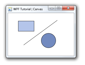
The Canvas is the most basic layout panel in WPF. It's child elements are positioned by explicit coordinates. The coordinates can be specified relative to any side of the panel usind the Canvas.Left, Canvas.Top, Canvas.Bottom and Canvas.Right attached properties.
The panel is typically used to group 2D graphic elements together and not to layout user interface elements. This is important because specifing absolute coordinates brings you in trouble when you begin to resize, scale or localize your application. People coming from WinForms are familiar with this kind of layout - but it's not a good practice in WPF.
Canvas控件在WPF上是最基础的布局面板。它的子元素都是绝对位置定位的。子元素可通过附加属性Canvas.Left、Canvas.Top、Canvas.Bottom和Canvas.Right来设置位于面板的任意位置。
Canvas控件对定义于组合一组二维图形元素,也不是用户界面元素的而已。Canvas控件避免对于应用程序的大小调整、本地化设置会导致绝对坐标变化带来的麻烦。
<Canvas>
    <Rectangle Canvas.Left="40" Canvas.Top="31" Width="63" Height="41" Fill="Blue"  />
    <Ellipse Canvas.Left="130" Canvas.Top="79" Width="58" Height="58" Fill="Blue"  />
    <Path Canvas.Left="61" Canvas.Top="28" Width="133" Height="98" Fill="Blue"
          Stretch="Fill" Data="M61,125 L193,28"/>
</Canvas>
Override the Z-Order of Elements(重写Z-Order元素)
Normally the Z-Order of elements inside a canvas is specified by the order in XAML. But you can override the natural Z-Order by explicity defining a Canvas.ZIndex on the element.
通常Canvas控件在XAML文档顺序中包含了一个Z-order元素,但你可以重写这个Z-order属性来定位Canvas控件的层次顺序。
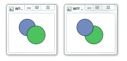
<Canvas>
<Ellipse Fill="Green" Width="60" Height="60" Canvas.Left="30" Canvas.Top="20"
Canvas.ZIndex="1"/>
<Ellipse Fill="Blue" Width="60" Height="60" Canvas.Left="60" Canvas.Top="40"/>
</Canvas>
2011-04-16
译者:gavinlove_


 扫一扫
扫一扫


 5万+
5万+

 被折叠的 条评论
为什么被折叠?
被折叠的 条评论
为什么被折叠?
 到【灌水乐园】发言


