


团队开发项目时,需要用到一个switch开关,原先用的是mui-switch;可是mui-switch在IE下的表现很不好;
于是,自己就动手写一个兼容IE的switch开关;
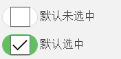
样式和mui-switch差不多,是长这样的(IE下的表现)

先附上源码:
.iSwitch{
  position: relative;
  display: inline-block;
  width: 60px;
  height: 30px;
  border-radius: 15px;
  background: #dcdcdc;
  border:1px solid #dcdcdc;
  box-shadow: 0 0 5px #dcdcdc;
  overflow: hidden;
  vertical-align: middle;

}
.iSwitch input{
  visibility: hidden;
}
.iSwitch i{
  position: absolute;
  top: 0;
  left: 0;
  display: inline-block;
  width: 50%;
  height: 100%;
  border-radius: 100%;
  background: #fff;
}
.iSwitch i::before{
  content: " ";
  display: none;
  width: 200%;
  height: 100%;
  border-radius: 25%;
  background: #61cafd;
}
.iSwitch i::after{
  content: " ";
  position: absolute;
  left: 0;
  top: 0;
  z-index: 2;
  display: inline-block;
  width: 100%;
  height: 100%;
  border-radius: 100%;
  background: #fff;
}
.iSwitch input:checked + i{
  transform:translateX(100%);
  -webkit-transform:translateX(100%);
}
.iSwitch input:checked + i:before{
  display: inline-block;
  transform:translateX(-50%);
  -webkit-transform:translateX(-50%);
}原理就是使用:checked选择器实现开关的动态效果(开关打开时应用:checked的样式,关闭时应用正常的样式),而按钮的动画就是使用了css3的transform来实现的;
使用方式:
<label class="iSwitch">
    <input type="checkbox">
    <i></i>
</label> - 如果要控制开关大小
    .iSwitch{
    width: 你的宽度;
    height: 宽度的一半;
    border-radius: 你的圆角大小;
}- 如果要控制开关背景色
  .iSwitch i::before{
    background-color:你喜欢的颜色;
}为什么要多使用一个空标签<i>呢?
因为IE并不支持<input>的伪元素,所以使用去<input>的伪元素模拟按钮,并没有什么用,所以就用一个<i>去模拟。
为什么使用:before&:after
我把<input>隐藏起来,使用<i>:after来模拟按钮,<i>:before来改变开关的背景色。为啥要使用<i>:after来模拟按钮?因为<i>:before在渲染的时候回覆盖<i>(并不能通过z-index改变覆盖顺序),所以只好使用<i>:after来模拟按钮(如果你能解决,请告诉我解决方法)。
兼容性
chrome
IE8+
360 6.5+
FireFox


 扫一扫
扫一扫
 449
449

 被折叠的 条评论
为什么被折叠?
被折叠的 条评论
为什么被折叠?
 到【灌水乐园】发言


