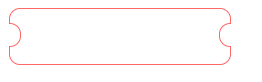
效果如图:
CSS代码:
<!DOCTYPE html>
<html>
    <head>
    <meta charset="UTF-8">
    <title>test</title>
    <style>
      .btn {
        width: 200px;
        text-align: center;
        height: 50px;
        line-height: 50px;
        background: #fff;
        color: #fff;
        position: relative;
		border-radius:10px;
		border:1px solid #f66;

      }
      .btn:after {
        position: absolute;
        content: '';
        width: 10px;
        height: 20px;
        background: #fff;
        top: 13px;
        right: -1px;
        border-radius: 10px 0 0 10px;
		border:1px solid #f66;
		border-right:none;


      }
	  .btn:before {
        position: absolute;
        content: '';
        width: 10px;
        height: 20px;
        background: #fff;
        top: 13px;
        left: -1px;
		border-radius: 0 10px 10px 0 ;
		border:1px solid #f66;
		border-left:none;

      }
    </style>
</head>
<body>
 <div class="btn">
   button
 </div>
    </body>
</html>


 1872
1872


 被折叠的 条评论
为什么被折叠?
被折叠的 条评论
为什么被折叠?
 到【灌水乐园】发言


