


目录
1. 椭圆
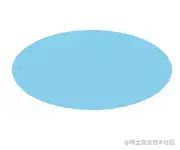
椭圆.png
.oval {
    width: 200px;
    height: 100px;
    background-color: skyblue;
    border-radius: 100px / 50px;
}
复制代码
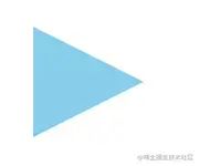
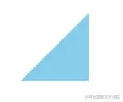
2. 上三角
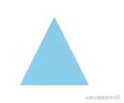
上三角.png
.triangle-up {
    width: 0;
    height: 0;
    border-right: 50px solid transparent;
    border-bottom: 100px solid skyblue;
    border-left: 50px solid transparent;
}
复制代码
3. 下三角
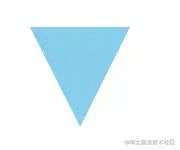
下三角.png
.triangle-down {
    width: 0;
    height: 0;
    border-top: 100px solid skyblue;
    border-right: 50px solid transparent;
    border-left: 50px solid transparent;
}
复制代码
4. 左三角
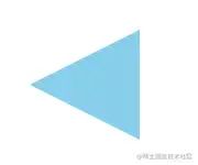
左三角.png
.triangle-left {
    width: 0;
    height: 0;
    border-top: 50px solid transparent;
    border-right: 100px solid skyblue;
    border-bottom: 50px solid transparent;
}
复制代码
5. 右三角
右三角.png
.triangle-right {
    width: 0;
    height: 0;
    border-top: 50px solid transparent;
    border-bottom: 50px solid transparent;
    border-left: 100px solid skyblue;
}
复制代码
6. 左上角
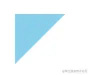
左上角.png
.triangle-topleft {
    width: 0;
    height: 0;
    border-top: 100px solid skyblue;
    border-right: 100px solid transparent;
}
复制代码
7. 右上角
右上角.png
.triangle-topright {
    width: 0;
    height: 0;
    border-top: 100px solid skyblue;
    border-left: 100px solid transparent;
}
复制代码
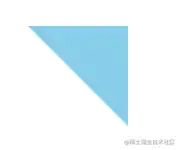
8. 左下角
左下角.png
.triangle-bottomleft {
    width: 0;
    height: 0;
    border-right: 100px solid transparent;
    border-bottom: 100px solid skyblue;
}
复制代码
9. 右下角
右下角.png
.triangle-bottomright {
    width: 0;
    height: 0;
    border-bottom: 100px solid skyblue;
    border-left: 100px solid transparent;
}
复制代码
10. 箭头

箭头.png
.curvedarrow {
    position: relative;
    width: 0;
    height: 0;
    border-top: 9px solid transparent;
    border-right: 9px solid skyblue;
    transform: rotate(10deg);
}

.curvedarrow:after {
    position: absolute;
    top: -12px;
    left: -9px;
    width: 12px;
    height: 12px;
    content: '';
    border: 0 solid transparent;
    border-top: 3px solid skyblue;
    border-radius: 20px 0 0 0;
    transform: rotate(45deg);
}
复制代码
11. 平行四边形
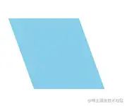
平行四边形.png
.parallelogram {
    width: 100px;
    height: 100px;
    background-color: skyblue;
    transform: skew(20deg);
}
复制代码
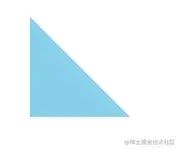
12. 梯形
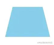
梯形.png
.trapezoid {
    width: 100px;
    height: 0;
    border-right: 25px solid transparent;
    border-bottom: 100px solid skyblue;
    border-left: 25px solid transparent;
}
复制代码
13. 五边形
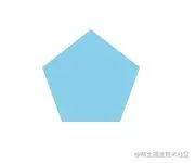
五边形.png
.pentagon {
    position: relative;
    width: 54px;
    border-width: 50px 18px 0;
    border-style: solid;
    border-color: skyblue transparent;
    box-sizing: content-box;
}

.pentagon:before {
    position: absolute;
    top: -85px;
    left: -18px;
    height: 0;
    width: 0;
    content: '';
    border-width: 0 45px 35px;
    border-style: solid;
    border-color: transparent transparent skyblue;
}
复制代码
14. 六边形
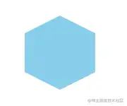
六边形.png
.hexagon {
    position: relative;
    width: 100px;
    height: 55px;
    background-color: skyblue;
}

.hexagon:before {
    position: absolute;
    top: -25px;
    left: 0;
    width: 0;
    height: 0;
    content: '';
    border-right: 50px solid transparent;
    border-bottom: 25px solid skyblue;
    border-left: 50px solid transparent;
}

.hexagon:after {
    position: absolute;
    bottom: -25px;
    left: 0;
    width: 0;
    height: 0;
    content: '';
    border-top: 25px solid skyblue;
    border-right: 50px solid transparent;
    border-left: 50px solid transparent;
}
复制代码
15. 爱心 ❤️
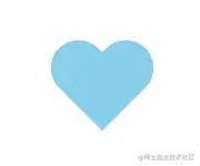
爱心.png
.heart {
    position: relative;
    width: 100px;
    height: 90px;
}

.heart:before,
.heart:after {
    position: absolute;
    left: 50px;
    top: 0;
    width: 50px;
    height: 80px;
    content: '';
    background-color: skyblue;
    border-radius: 50px 50px 0 0;
    transform: rotate(-45deg);
    transform-origin: 0 100%;
}

.heart:after {
    left: 0;
    transform: rotate(45deg);
    transform-origin: 100% 100%;
}
复制代码
16. 无穷大
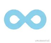
无穷大.png
.infinity {
    position: relative;
    width: 150px;
    height: 100px;
    box-sizing: content-box;
}

.infinity:before,
.infinity:after {
    position: absolute;
    top: 0;
    left: 0;
    width: 30px;
    height: 30px;
    content: '';
    border: 20px solid skyblue;
    border-radius: 50px 50px 0 50px;
    box-sizing: content-box;
    transform: rotate(-45deg);
}

.infinity:after {
    left: auto;
    right: 0;
    border-radius: 50px 50px 50px 0;
    transform: rotate(45deg);
}
复制代码
17. 钻石 💎
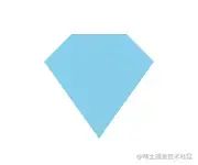
钻石.png
.diamond {
    position: relative;
    width: 50px;
    height: 0;
    border-width: 0 25px 25px 25px;
    border-style: solid;
    border-color: transparent transparent skyblue transparent;
    box-sizing: content-box;
}

.diamond:after {
    position: absolute;
    top: 25px;
    left: -25px;
    width: 0;
    height: 0;
    content: '';
    border-width: 70px 50px 0 50px;
    border-style: solid;
    border-color: skyblue transparent transparent transparent;
}
复制代码
18. 锁 🔒

锁.png
.lock {
    position: relative;
    width: 90px;
    height: 65px;
    border: 18px solid skyblue;
    border-right-width: 37px;
    border-left-width: 37px;
    border-radius: 10px;
    box-sizing: border-box;
}

.lock:before {
    position: absolute;
    top: -60px;
    left: 50%;
    width: 70px;
    height: 60px;
    content: '';
    border: 12px solid skyblue;
    border-top-left-radius: 35px;
    border-top-right-radius: 35px;
    box-sizing: border-box;
    transform: translateX(-50%);
}

.lock:after {
    position: absolute;
    top: -5px;
    left: 50%;
    width: 25px;
    height: 40px;
    content: '';
    border: 5px solid skyblue;
    border-radius: 12px;
    box-sizing: border-box;
    transform: translateX(-50%);
}
复制代码
19. 吃豆人

吃豆人.png
.pacman {
    width: 0px;
    height: 0px;
    border: 60px solid skyblue;
    border-right: 60px solid transparent;
    border-radius: 60px;
}
复制代码
20. 对话泡泡
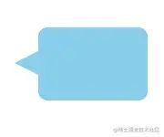
对话泡泡.png
.talkbubble {
    position: relative;
    width: 120px;
    height: 80px;
    background-color: skyblue;
    border-radius: 10px;
}

.talkbubble:before {
    position: absolute;
    top: 26px;
    right: 100%;
    width: 0;
    height: 0;
    content: '';
    border-top: 13px solid transparent;
    border-right: 26px solid skyblue;
    border-bottom: 13px solid transparent;
}
复制代码
21. 太极
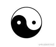
太极.png
.supremepole {
    position: relative;
    width: 96px;
    height: 48px;
    background-color: #fff;
    border-width: 2px 2px 50px 2px;
    border-style: solid;
    border-color: #000;
    border-radius: 50%;
    box-sizing: content-box;
}

.supremepole:before {
    position: absolute;
    top: 50%;
    left: 0;
    width: 12px;
    height: 12px;
    content: '';
    background-color: #fff;
    border: 18px solid #000;
    border-radius: 50%;
    box-sizing: content-box;
}

.supremepole:after {
    position: absolute;
    top: 50%;
    left: 50%;
    width: 12px;
    height: 12px;
    content: '';
    background-color: #000;
    border: 18px solid #fff;
    border-radius: 50%;
    box-sizing: content-box;
}
复制代码
22. 丝带徽章

丝带徽章.png
.badge-ribbon {
    position: relative;
    height: 100px;
    width: 100px;
    background-color: skyblue;
    border-radius: 50%;
}

.badge-ribbon:before,
.badge-ribbon:after {
    position: absolute;
    top: 70px;
    left: -10px;
    content: '';
    border-right: 40px solid transparent;
    border-bottom: 70px solid skyblue;
    border-left: 40px solid transparent;
    transform: rotate(-140deg);
}

.badge-ribbon:after {
    right: -10px;
    left: auto;
    transform: rotate(140deg);
}
复制代码
23. 雪佛兰车标
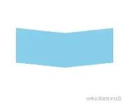
雪佛兰车标.png
.chevrolet {
    position: relative;
    width: 140px;
    height: 50px;
}

.chevrolet:before {
    position: absolute;
    top: 0;
    left: 0;
    width: 50%;
    height: 100%;
    content: '';
    background-color: skyblue;
    transform: skew(0deg, 6deg);
}

.chevrolet:after {
    position: absolute;
    top: 0;
    right: 0;
    width: 50%;
    height: 100%;
    content: '';
    background-color: skyblue;
    transform: skew(0deg, -6deg);
}
复制代码
24. 放大镜 🔍

放大镜.png
.magnifying-glass {
    position: relative;
    width: 0.4em;
    height: 0.4em;
    font-size: 10em;
    border: 0.1em solid skyblue;
    border-radius: 0.35em;
    box-sizing: content-box;
}

.magnifying-glass:before {
    position: absolute;
    right: -0.25em;
    bottom: -0.1em;
    width: 0.35em;
    height: 0.08em;
    content: '';
    background-color: skyblue;
    transform: rotate(45deg);
}
复制代码
25. Facebook 图标

Facebook 图标.png
.facebook-icon {
    position: relative;
    width: 100px;
    height: 110px;
    background-color: skyblue;
    border: 15px solid skyblue;
    border-bottom: 0;
    border-radius: 5px;
    box-sizing: content-box;
    overflow: hidden;
}

.facebook-icon:before {
    position: absolute;
    right: -37px;
    bottom: -30px;
    width: 40px;
    height: 90px;
    content: '';
    background-color: skyblue;
    border: 20px solid #fff;
    border-radius: 25px;
    box-sizing: content-box;
}

.facebook-icon:after {
    position: absolute;
    top: 50px;
    right: 5px;
    width: 55px;
    height: 20px;
    content: '';
    background-color: #fff;
    box-sizing: content-box;
}
复制代码
26. 月亮 🌙
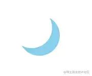
月亮.png
.moon {
    width: 80px;
    height: 80px;
    border-radius: 50%;
    box-shadow: 15px 15px 0 0 skyblue;
}
复制代码
27. 圆锥
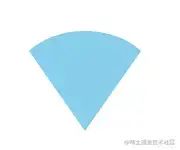
圆锥.png
.cone {
    width: 0;
    height: 0;
    border-top: 100px solid skyblue;
    border-right: 70px solid transparent;
    border-left: 70px solid transparent;
    border-radius: 50%;
}
复制代码
28. 十字架
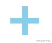
十字架.png
.cross {
    position: relative;
    width: 20px;
    height: 100px;
    background-color: skyblue;
}

.cross:before {
    position: absolute;
    top: 40px;
    left: -40px;
    width: 100px;
    height: 20px;
    content: "";
    background-color: skyblue;
}
复制代码
29. 谷堆
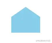
谷堆.png
.base {
    position: relative;
    width: 100px;
    height: 55px;
    background-color: skyblue;
}

.base:before {
    position: absolute;
    top: -35px;
    left: 0;
    width: 0;
    height: 0;
    content: '';
    border-right: 50px solid transparent;
    border-bottom: 35px solid skyblue;
    border-left: 50px solid transparent;
}
复制代码
30. 指示器
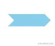
指示器.png
.pointer {
    position: relative;
    width: 120px;
    height: 40px;
    background-color: skyblue;
}

.pointer:before {
    position: absolute;
    bottom: 0;
    left: 0;
    width: 0;
    height: 0;
    content: '';
    border-top: 20px solid transparent;
    border-bottom: 20px solid transparent;
    border-left: 20px solid #fff;
}

.pointer:after {
    position: absolute;
    right: -20px;
    bottom: 0;
    width: 0;
    height: 0;
    content: '';
    border-top: 20px solid transparent;
    border-bottom: 20px solid transparent;
    border-left: 20px solid skyblue;
}
复制代码


 423
423


 被折叠的 条评论
为什么被折叠?
被折叠的 条评论
为什么被折叠?
 到【灌水乐园】发言


