


介绍
在很多应用中,向上滑动"我的"页面,页面顶部会有如下变化效果:一部分信息逐渐隐藏,另一部分信息逐渐显示,同时一些组件会进行缩放或者位置移动。向下滑动时则相反。
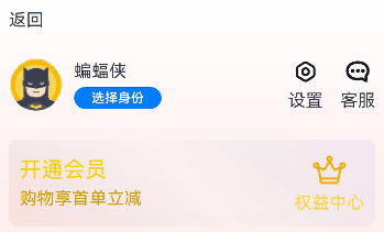
效果图预览
使用说明
- 向上滑动页面,出现如下变化:用户名/选择身份/设置图标/客服图标逐渐隐藏,用户头像尺寸逐渐缩小并向右上平移,顶部"返回"文本后方用户名逐渐显示。
- 滑动到顶部后,向下滑动页面,出现如下变化:用户头像尺寸逐渐变大并向左下平移,顶部"返回"文本后方的用户名逐渐隐藏,原来的用户名/选择身份/设置图标/客服图标逐渐显示。
实现思路
本例涉及的关键特性和实现方案如下:
- 将屏幕从上向下分为三部分,第一部分Row组件包含"返回"和初始状态下隐藏的用户名,第二部分Row包含用户头像/用户名/选择身份/设置/客服,下方其余部分位第三部分。本例场景的变化体现在第一和第二部分。
Column() {
  Row() {...}
  .padding($r('app.integer.slidetohideanddisplace_padding_small'))
  .width($r('app.string.slidetohideanddisplace_size_full'))
  .alignItems(VerticalAlign.Center)
  Row() {...}
  .height($r('app.integer.slidetohideanddisplace_height_one_hundred'))
  .width($r('app.string.slidetohideanddisplace_size_full'))
  Scroll() {...}
}
- 在第一和第二部分中,使用 @State装饰器 装饰相关的组件属性,使之与自定义组件的渲染绑定起来,状态变量改变时,UI会发生对应的渲染改变。用户头像的缩放通过改变其width和height属性值的大小来刷新,用户头像的位移通过改变其margin属性中的top和left的大小来刷新。其他一些组件的显隐变化通过改变其 opacity 属性值的大小来刷新。
  @State userRowOpacity: number = 1;
  @State userImageHeight: number = 50;
  ...

  build() {
    Column() {
      Row() {
        ...
        Text($r('app.string.slidetohideanddisplace_phone_number'))
          .opacity(this.userNameOpacity) // userNameOpacity控制顶部用户名的透明度
        Blank()
        Text("设置")
          .opacity(this.userNameOpacity) // 设置的文字透明度与顶部用户名相同
        Text("客服")
          .opacity(this.userNameOpacity) // 客服的文字透明度与顶部用户名相同
      }

      Row() {
        Image($r('app.media.slidetohideanddisplace_batman'))
          .width(this.userImageHeight)
          .height(this.userImageHeight) // userImageHeight控制头像尺寸
          // userImageMarginTop和userImageMarginLeft控制头像在父容器内的位置
          .margin({ top: this.userImageMarginTop, left: this.userImageMarginLeft })

        Column() {...}
        .alignItems(HorizontalAlign.Start)
        .opacity(this.userRowOpacity) // 控制Row组件的透明度
      }
      ...
    }
  }
- 第三部分页面滚动通过 Scroll 组件实现,其中第二栏和第三栏相似,使用 @Builder装饰器 封装了两个自定义构建函数IconAndDescription和CustomRow,增加代码复用。
  // 自定义构建函数,将重复使用的UI元素抽象成一个方法。此处样式为:上方图标下方文字
  @Builder
  IconAndDescription(icon: Resource, description: string | Resource, iconSize?: Size, radius?: number) {
    Column() {
      Image(icon)
        .size(iconSize === undefined ? { height: $r('app.integer.slidetohideanddisplace_icon_default_height'),
          width: $r('app.integer.slidetohideanddisplace_icon_default_height') } : iconSize)
        .borderRadius(radius)
      Text(description)
        .margin({ top: $r('app.integer.slidetohideanddisplace_margin_between_icon_and_description') })
    }
  }

  // 自定义构建函数。此处样式为:在Row组件中横向排列IconAndDescription
  @Builder
  CustomRow(iconsAndDescriptions: IconAndDescription[]) {
    Row() {
      ForEach(iconsAndDescriptions, (item: IconAndDescription) => {
        this.IconAndDescription(item.icon, item.description)
      })
    }
    .width($r('app.string.slidetohideanddisplace_size_full'))
    .justifyContent(FlexAlign.SpaceAround)
    .padding($r('app.integer.slidetohideanddisplace_padding_small'))
    .margin({ top: $r('app.integer.slidetohideanddisplace_margin_small') })
    .backgroundColor($r('app.color.slidetohideanddisplace_color_transparent_aa'))
    .borderRadius($r('app.integer.slidetohideanddisplace_border_radius'))
  }
高性能知识点
本例中Scroll组件绑定onScroll滚动事件回调,onScroll属于频繁回调,在回调中需要尽量减少耗时和冗余操作,例如减少不必要的日志打印。
工程结构&模块类型
   slidetohideanddisplace                                      // har包
   |---model
   |   |---Util.ets                         				   // 提供测试数据类
   |---SlideToHideAndDisplace.ets                              // 滑动变化效果实现页面
模块依赖
不涉及。
写在最后
如果你觉得这篇内容对你还蛮有帮助,我想邀请你帮我三个小忙:
- 点赞,转发,有你们的 『点赞和评论』,才是我创造的动力。
- 关注小编,同时可以期待后续文章ing🚀,不定期分享原创知识。
- 想要获取更多完整鸿蒙最新学习知识点,请看下方小图


 1001
1001

 被折叠的 条评论
为什么被折叠?
被折叠的 条评论
为什么被折叠?
 到【灌水乐园】发言


