


效果截图: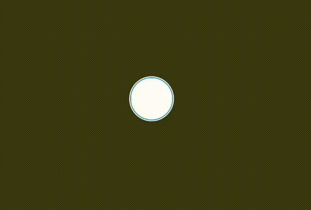
html部分,只有一句:
<div class="main"></div>css部分:
* {
    margin: 0;
    padding: 0;
}

body,
html {
    width: 100%;
    height: 100vh;
}

body {
    display: flex;
    justify-content: center;
    align-items: center;
    background: #333;
}

.main {
    width: 100px;
    height: 100px;
    border: 3px solid transparent;
    box-shadow: 0 0 0 2px white,
    inset 0 0 10px white;
    background: #3498db;
    border-radius: 50%;
    position: relative;
    overflow: hidden;
}

.main::before,
.main::after {
    position: absolute;
    content: '';
    width: 300%;
    height: 300%;
    left: 50%;
    bottom: -150%;
    transform: translate(-50%, -50%);
}

.main::before {
    border-radius: 40%;
    background: rgba(255, 255, 255, 1);
    animation: roll 3s linear infinite,
    fill 40s linear;
    animation-fill-mode: forwards;
}

.main::after {
    border-radius: 47%;
    background: rgba(255, 255, 255, .5);
    animation: roll 5s linear infinite,
    fill 40s linear;
    animation-fill-mode: forwards;
}

@keyframes roll {
    100% {
        transform: translate(-50%, -50%) rotate(360deg);
    }
}

@keyframes fill {
    100% {
        bottom: 0;
    }
}


 3万+
3万+


 被折叠的 条评论
为什么被折叠?
被折叠的 条评论
为什么被折叠?
 到【灌水乐园】发言


