


 本文详细介绍了AndroidJetpackCompose中的组件渲染过程,包括组合、布局和绘制阶段,重点讲解了LayoutModifier用于调整布局节点尺寸和位置的方法,以及DrawModifier的drawWithContent和drawBehind示例。同时讨论了如何使用GraphicsLayer进行图形层操作以实现复杂的视觉效果。
Android Jetpack Compose基础之组件的帧渲染
Android View 系统,它有 3 个主要阶段:测量、布局和绘制,而Compose和它很相似,它的渲染流程分为组合、布局、绘制这三个阶段。
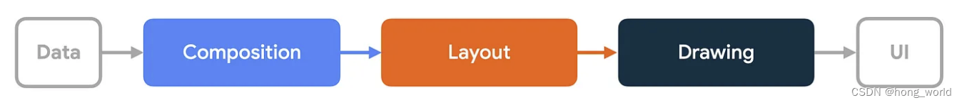
组合:执行Composable函数体,生成LayoutNode视图树
布局:该阶段包含两个步骤:测量和放置。对于布局树中的每个节点LayoutNode,布局元素都会根据 2D 坐标来测量宽高尺寸并放置自己及其所有子元素。
绘制:将所有的LayoutNode实际绘制到屏幕上
组合
组合阶段主要是生成并维护LayoutNode视图树,当我门在Activity中使用setContent时,会开始首次组合,此时会执行代码块中设计的所有Composable函数体,生成与之对应的LayoutNode视图树(具体过程可见《Android Jetpack Compose基础之Compose视图结构》)
在Compose中如果某个Compsable依赖了某个可变状态,该状态发生更新时,会触发当前Composable重新进行组合阶段,即重组,具体重组内容详见《Android Jetpack Compose基础之生命周期-重组》
布局
在Compose中,每个LayoutNode都会根据来自父LayoutNode的布局约束来进行自我测量(类似传统View中的MeasureSpec)。布局约束中包含了父LayoutNode允许子LayoutNode的最大宽高和最小宽高,当父LayoutNode希望子LayoutNode测量的宽高为具体值时,约束中宽高的最大值和最小值是一致的
注意:LayoutNode不允许被多次测量。
步骤:
测量子节点:节点会测量其子节点(如果存在)
确定自己的大小:节点根据这些测量结果来决定自己的大小。
放置子节点:每个子节点根据节点自身的位置进行放置。
LayoutModifier
作用是用来修饰LayoutNode的宽高与原有内容在新宽高下摆放的位置,其具体调用调用方法如下
fun Modifier.layout(
    measure: MeasureScope.(Measurable, Constraints) -> MeasureResult
) = this then LayoutElement(measure)

private data class LayoutElement(
    val measure: MeasureScope.(Measurable, Constraints) -> MeasureResult
) : ModifierNodeElement<LayoutModifierImpl>() {
    override fun create() = LayoutModifierImpl(measure)

    override fun update(node: LayoutModifierImpl) {
        node.measureBlock = measure
    }

    override fun InspectorInfo.inspectableProperties() {
        name = "layout"
        properties["measure"] = measure
    }

interface Measurable : IntrinsicMeasurable {
    /**
     * Measures the layout with [constraints], returning a [Placeable] layout that has its new
     * size. A [Measurable] can only be measured once inside a layout pass.
     */
    fun measure(constraints: Constraints): Placeable
}
Measurable:表示被修饰的LayoutNode的测量句柄,通过内部的measure方法完成LayoutNode的测量。
constraints:表示来自父LayoutNode的布局约束
示例
使用LayoutModifier实现Text顶部到文本基线的高度

 Column(modifier = Modifier
                   .fillMaxSize()
                   .verticalScroll(scrollState)
            ) {
                Text(
                    text = "Text Sample",
                    modifier = Modifier
                        .background(Color.Cyan)
                        .firstBaselineToTop(40.dp)
                )
       		}

fun Modifier.firstBaselineToTop(top: Dp) = Modifier.layout { measurable, constraints ->
    //将父LayoutNode的布局约束,直接传入Measure中,直接提供给被修饰的LayoutNode进行测量,测量的结果包装在Placeable示例中进行返回
    val placeable = measurable.measure(constraints)
    //确认组件时存在内容基线的
    check(placeable[FirstBaseline] != AlignmentLine.Unspecified)
    //获取基线高度
    val firstBaseline = placeable[FirstBaseline]
    //应摆放的顶部高度=所设置的顶部到基线的高度-实际组件内容顶部到基线的高度
    val placeableY = top.roundToPx() - firstBaseline
    //该组件占有的高度=应摆放的顶部高度+实际内容的高度
    val height = placeable.height + placeableY
    layout(placeable.width, height) {
        //指定原有应该绘制的内容在新的高宽下摆放的相对位置
        placeable.placeRelative(0, placeableY)
    }
}
LayoutCompsable
LayoutModifier可以类比于定制具体View,如果需要定制ViewGoup,就需要使用LayoutCompsable了,它的源码如下
@UiComposable
@Composable
inline fun Layout(
    content: @Composable @UiComposable () -> Unit,//我们声明的子组件信息
    modifier: Modifier = Modifier,//外部传入的修饰符
    measurePolicy: MeasurePolicy//表示测量策略,
) {
    val compositeKeyHash = currentCompositeKeyHash
    val localMap = currentComposer.currentCompositionLocalMap
    ReusableComposeNode<ComposeUiNode, Applier<Any>>(
        factory = ComposeUiNode.Constructor,
        update = {
            set(measurePolicy, SetMeasurePolicy)
            set(localMap, SetResolvedCompositionLocals)
            @OptIn(ExperimentalComposeUiApi::class)
            set(compositeKeyHash, SetCompositeKeyHash)
        },
        skippableUpdate = materializerOf(modifier),
        content = content
    )
}
示例
粗略仿照column,它本身的源码如下
@Composable
inline fun Column(
    modifier: Modifier = Modifier,
    verticalArrangement: Arrangement.Vertical = Arrangement.Top,
    horizontalAlignment: Alignment.Horizontal = Alignment.Start,
    content: @Composable ColumnScope.() -> Unit
) {
    val measurePolicy = columnMeasurePolicy(verticalArrangement, horizontalAlignment)
    Layout(
        content = { ColumnScopeInstance.content() },
        measurePolicy = measurePolicy,
        modifier = modifier
    )
}
自定义CustomColumnLayout主要是为了直观看出测量高宽的过程,运行效果自行脑补,编码过程如下。
 CustomColumnLayout {
                    Text(text = "CustomColumnLayout", modifier = Modifier.background(Color.Cyan))
                    Text(text = "CustomColumnLayout2", modifier = Modifier.background(Color.Cyan))
                }
@Composable
fun CustomColumnLayout(
    modifier: Modifier = Modifier,
    // 此处可添加自定义的参数
    content: @Composable () -> Unit
) {
    Layout(
        modifier = modifier,
        content = content
    ) { measurable, constraints ->
        val placeables = measurable.map { measurable ->
            //测量每个子组件
            measurable.measure(constraints)
        }
        var yPosition = 0
        layout(constraints.maxWidth, 2000) {
            placeables.forEach { placeable ->
                placeable.placeRelative(x = 0, y = yPosition)
                yPosition += placeable.height
            }
        }
    }
}
绘制
绘制就是将所有的LayoutNode实际绘制到屏幕之上咯
Canvas
@Composable
fun Canvas(modifier: Modifier, onDraw: DrawScope.() -> Unit) =
    Spacer(modifier.drawBehind(onDraw))

@Composable
@NonRestartableComposable
fun Spacer(modifier: Modifier) {
    Layout(measurePolicy = SpacerMeasurePolicy, modifier = modifier)
}
DrawScope 作用域中,compose提供了基础的绘制API

drawLine:绘制线
drawRect:绘制矩形
drawImage:绘制图片
drawRoundRect:绘制圆觉矩形
drawCircle:绘制圆
drawOval:绘制椭圆
drawArc:绘制弧线
drawPath:绘制路径
drawPoints:绘制点
DrawModifier
DrawModifier-drawWithContent
可以允许在绘制时自定义绘制层级Z轴的层级
,方法需要传入ContentDrawScope作用域lambda,而它ContentDrawScope是继承自DrawScope,最终通过drawContent()方法绘制组件本身的内容
fun Modifier.drawWithContent(
    onDraw: ContentDrawScope.() -> Unit
): Modifier = this then DrawWithContentElement(onDraw)

interface ContentDrawScope : DrawScope {
    /**
     * Causes child drawing operations to run during the `onPaint` lambda.
     */
    fun drawContent()
}

private data class DrawWithContentElement(
    val onDraw: ContentDrawScope.() -> Unit
) : ModifierNodeElement<DrawWithContentModifier>() {
    override fun create() = DrawWithContentModifier(onDraw)

    override fun update(node: DrawWithContentModifier) {
        node.onDraw = onDraw
    }

    override fun InspectorInfo.inspectableProperties() {
        name = "drawWithContent"
        properties["onDraw"] = onDraw
    }
}
示例
绘制如下效果

@Composable
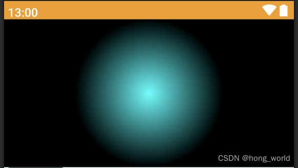
fun BaseDrawWithContent() {
var pointerOffset by remember {
mutableStateOf(Offset(0f, 0f))
}
Column(modifier = Modifier
.fillMaxWidth()
.height(200.dp)
.pointerInput(key1 = "dragging") {
detectDragGestures { change, dragAmount ->
pointerOffset += dragAmount
}
}
.onSizeChanged {
pointerOffset = Offset(it.width / 2f, it.height / 2f)
}
.drawWithContent {
drawContent()
drawRect(
Brush.radialGradient(listOf(Color.Transparent, Color.Black), center = pointerOffset, radius = 100.dp.toPx())
)
}
) {
Text(
text = "drawWithContent", modifier = Modifier
.fillMaxSize()
.background(color = Color.Cyan)
)
}
}
DrawModifier-drawBehind
在绘制组件拓展的内容,在绘制组件本身,用作自定义组件背景
源码
定制的绘制逻辑onDraw最终被传入DrawBackgroundModifier的主构造函数中,在draw()方法中先绘制自定义的内容onDraw,然后在绘制组件内容drawContent
fun Modifier.drawBehind(
    onDraw: DrawScope.() -> Unit
) = this then DrawBehindElement(onDraw)

private data class DrawBehindElement(
    val onDraw: DrawScope.() -> Unit
) : ModifierNodeElement<DrawBackgroundModifier>() {
    override fun create() = DrawBackgroundModifier(onDraw)

    override fun update(node: DrawBackgroundModifier) {
        node.onDraw = onDraw
    }

    override fun InspectorInfo.inspectableProperties() {
        name = "drawBehind"
        properties["onDraw"] = onDraw
    }
}

internal class DrawBackgroundModifier(
    var onDraw: DrawScope.() -> Unit
) : Modifier.Node(), DrawModifierNode {

    override fun ContentDrawScope.draw() {
        onDraw()
        drawContent()
    }
}
示例
给文本绘制一个bg
@Composable
fun BaseDrawBehind() {
    Text(text = "DrawBehind", modifier = Modifier.drawBehind {
        drawRoundRect(Color.DarkGray, cornerRadius = CornerRadius(10.dp.toPx()))
    })
}
DrawModifier-drawWithCache
背景:在drawScop中绘制时,绘制一些有关对象时,如ImageBitmap,Paint、Path时,当组件发生重绘时,由于drawScop会反复执行,会使其中声明的对象发生频繁创建,
作用:drawWithCache会缓存在其中创建的对象。只要绘制区域的大小不变,或者读取的任何状态对象都未发生变化,对象就会被缓存。此修饰符有助于改进绘制调用的性能,因为它不必对绘制时创建的对象(例如:Brush, Shader, Path 等)进行重新分配。
注意:请仅在创建必须缓存的对象时才使用 Modifier.drawWithCache。如果在无需缓存对象时使用此修饰符,可能会导致不必要的 lambda 分配。
源码
方法需要传入CacheDrawScope作用域的lambda并返回DrawResult
fun Modifier.drawWithCache(
    onBuildDrawCache: CacheDrawScope.() -> DrawResult
) = this then DrawWithCacheElement(onBuildDrawCache)

private data class DrawWithCacheElement(
    val onBuildDrawCache: CacheDrawScope.() -> DrawResult
) : ModifierNodeElement<CacheDrawModifierNodeImpl>() {
    override fun create(): CacheDrawModifierNodeImpl {
        return CacheDrawModifierNodeImpl(CacheDrawScope(), onBuildDrawCache)
    }

    override fun update(node: CacheDrawModifierNodeImpl) {
        node.block = onBuildDrawCache
    }

    override fun InspectorInfo.inspectableProperties() {
        name = "drawWithCache"
        properties["onBuildDrawCache"] = onBuildDrawCache
    }
}

fun CacheDrawModifierNode(
    onBuildDrawCache: CacheDrawScope.() -> DrawResult
): CacheDrawModifierNode {
    return CacheDrawModifierNodeImpl(CacheDrawScope(), onBuildDrawCache)
}
示例
@Composable
fun BaseDrawWithCache() {
    Text(text = "drawWithCache", modifier = Modifier.drawWithCache {
        val brush = Brush.linearGradient(listOf(Color.Red, Color.Green))
        onDrawBehind {
            drawRoundRect(brush, cornerRadius = CornerRadius(10.dp.toPx()))
        }
    })
}
拓展Modifier.graphicsLayer
可实现对图层的缩放、平移、旋转、裁剪、透明度等功能
使用方式
@Composable
fun BaseGraphicsLayer() {
    var progressX by remember {
        mutableStateOf(0.1f)
    }
    Slider(value = progressX, onValueChange = { progressX = it }, valueRange = 0f..2f)
    var progressY by remember {
        mutableStateOf(0.1f)
    }
    Slider(value = progressY, onValueChange = { progressY = it }, valueRange = 0f..2f)
    Image(
        painter = painterResource(id = R.mipmap.btn_shara), contentDescription = "",
        modifier = Modifier.graphicsLayer(
            scaleX = progressX,
            scaleY = progressY
        )
    )
}
————note end————


 1178
1178

 被折叠的 条评论
为什么被折叠?
被折叠的 条评论
为什么被折叠?
 到【灌水乐园】发言


