


今天,又学了两招Spotfire Tree Map及KPI Chart。
使用自己的CSDN文章浏览数据,制作了一个Spotfire Page,感觉还是挺酷炫的(虽然当时写下这一篇篇文章不知耗费了多少时间)。
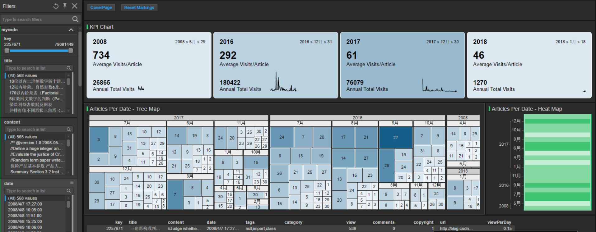
顺便科普一下基本概念:
1. What is a Treemap?
Treemaps are ideal for displaying large amounts of hierarchically structured (tree-structured) data. The space in the visualization is split up into rectangles that are sized and ordered by a quantitative variable.
The levels in the hierarchy of the treemap are visualized as rectangles containing other rectangles. Each set of rectangles on the same level in the hierarchy represents a column or an expression in a data table. Each individual rectangle on a level in the hierarchy represents a category in a column. For example, a rectangle representing a continent may contain several rectangles representing countries in that continent. Each rectangle representing a country may in turn contain rectangles representing cities in these countries. You can create a treemap hierarchy directly in the visualization, or use an already defined hierarchy. To learn more, see the section To Create a Treemap Hierarchy.
A number of different algorithms can be used to determine how the rectangles in a treemap should be sized and ordered. The treemap in Spotfire uses a squarified algorithm.
The rectangles in the treemap range in size from the top left corner of the visualization to the bottom right corner, with the largest rectangle positioned in the top left corner and the smallest rectangle in the bottom right corner. For hierarchies, that is, when the rectangles are nested, the same ordering of the rectangles is repeated for each rectangle in the treemap. This means that the size, and thereby also position, of a rectangle that contains other rectangles is decided by the sum of the areas of the contained rectangles.
----------------------------------------------------------------------------------------------------------------------------------------------------------------------------------------------
2. What is a KPI Chart?
The KPI chart is used to, at a quick glance, give information about the current performance of a company or organization. Factors, which are crucial for monitoring how the company performs, are measured and then presented in form of KPIs, Key Performance Indicators. The type of information that is shown varies. Examples of KPIs are information about net revenue, sales growth, and customer satisfaction.
The KPI chart consists of a grid of tiles, where each tile displays various KPI values for a certain category. Moreover, a simple line graph, sparkline, can be included to display the performance over time. Also the color of a tile background is a means to indicate performance. The data, on which the values are based, can differ from one tile to another. Also within a tile, data from different data tables can be used to calculate the displayed values.
3. What is a Heat Map?
The easiest way to understand a heat map is to think of a cross table or spreadsheet which contains colors instead of numbers. The default color gradient sets the lowest value in the heat map to dark blue, the highest value to a bright red, and mid-range values to light gray, with a corresponding transition (or gradient) between these extremes. Heat maps are well-suited for visualizing large amounts of multi-dimensional data and can be used to identify clusters of rows with similar values, as these are displayed as areas of similar color.


 2757
2757

 被折叠的 条评论
为什么被折叠?
被折叠的 条评论
为什么被折叠?
 到【灌水乐园】发言


