


 本文详细介绍了CSS3中线性渐变在不同浏览器前缀下的使用规范,包括角度表示法的差异,以及渐变边框、背景和过渡效果的应用实例,帮助开发者理解和处理跨浏览器兼容问题。
源于某次工作写项目时发现线性渐变的角度,有前缀的和没前缀的角度方向不一样,所以想记录一下方便工作
一、CSS3浏览器前缀
1、-ms- : -ms-linear-gradient IE浏览器专属的CSS属性需添加-ms-前缀;
2、-moz- : -moz-linear-gradient 所有基于Gecko引擎的浏览器(如Firefox)专属的CSS属性需添加-moz-前缀;
3、-o- : -o–linear-gradient Opera浏览器专属的CSS属性需添加-o-前缀;
4、-webkit-: -webkit–linear-gradient 所有基于Webkit引擎的浏览器(如Chrome、Safari)专属的CSS需添加-webkit-前缀。
二、线性渐变角度的问题
这是加了-webkit-前缀后,角度发生了变化。1、有前缀时,第一个参数不能用to bottom、to right、to left、to top等,可以写bottom、right、left、top,不能含to
background-image: -webkit-linear-gradient(-53deg, #84f5de 0%, #56e8f2 50%, #4cc5f8 100%);

这是正常想要的渐变角度
background-image: linear-gradient(-53deg, #84f5de 0%, #56e8f2 50%, #4cc5f8 100%);

2、使用角度时不一样。
标准的语法放最后,注意有前缀的和没有前缀的角度不一样。
从左到右渐变
background: -webkit-linear-gradient(left, red, blue);
/* Safari 5.1 - 6.0 */
background: -o-linear-gradient(left, red, blue);
/* Opera 11.1 - 12.0 */
background: -moz-linear-gradient(left, red, blue);
/* Firefox 3.6 - 15 */
background: linear-gradient(to right, red, blue);
/* 标准的语法放最后,注意有前缀的和没有前缀的角度不一样 */
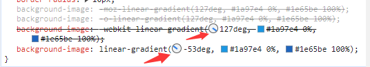
-53°的渐变,有前缀的是127°【180-53=127】
    background-image: -moz-linear-gradient(127deg, #1a97e4 0%, #1e65be 100%);
    background-image: -o-linear-gradient(127deg, #1a97e4 0%, #1e65be 100%);
    background-image: -webkit-linear-gradient(127deg, #1a97e4 0%, #1e65be 100%);
    background-image: linear-gradient(-53deg, #1a97e4 0%, #1e65be 100%);
角度要相反
如果省去第一个参数方向,则都是从上到下渐变。两者都一样了。
.page1 .box1 .list ul li:hover .center {
    background-image: -moz-linear-gradient(rgba(132, 245, 222) 0%, rgba(86, 232, 242) 50%, rgba(76, 197, 248) 100%);
    background-image: -o-linear-gradient(rgba(132, 245, 222) 0%, rgba(86, 232, 242) 50%, rgba(76, 197, 248) 100%);
    background-image: -webkit-linear-gradient(rgba(132, 245, 222) 0%, rgba(86, 232, 242) 50%, rgba(76, 197, 248) 100%);
    background-image: linear-gradient(rgba(132, 245, 222) 0%, rgba(86, 232, 242) 50%, rgba(76, 197, 248) 100%);
}
三、渐变边框、渐变背景
.index1 .right .des a {
    font-size: 14px;
    color: #a4a4a4;
    width: 126px;
    height: 40px;
    display: flex;
    justify-content: center;
    align-items: center;
    /*必不可少*/
    border: 1px solid transparent;
    border-radius: 20px;
    background-clip: padding-box, border-box;
    background-origin: padding-box, border-box;
    background-image: linear-gradient(to right, #fff, #fff), linear-gradient(to top, rgb(132, 245, 222), rgb(76, 197, 248));
    box-sizing: border-box;
}
鼠标悬停时,渐变边框变为渐变背景色。
.index1 .right .des a:hover{
    border: none;
    background-image: -webkit-linear-gradient(bottom, rgb(132, 245, 222), rgb(76, 197, 248));
    background-image: -moz-linear-gradient(bottom, rgb(132, 245, 222), rgb(76, 197, 248));
    background-image: -o-linear-gradient(bottom, rgb(132, 245, 222), rgb(76, 197, 248));
    background-image: linear-gradient(to top, rgb(132, 245, 222), rgb(76, 197, 248));
    color: #fff;
    -webkit-transition: all .3s ease-in-out 0s;
    -moz-transition: all .3s ease-in-out 0s;
    -ms-transition: all .3s ease-in-out 0s;
    -o-transition: all .3s ease-in-out 0s;
    transition: all .3s ease-in-out 0s;
}
四、过渡
时间0.3s
-webkit-transition: all .3s ease-in-out 0s;
-moz-transition: all .3s ease-in-out 0s;
-ms-transition: all .3s ease-in-out 0s;
-o-transition: all .3s ease-in-out 0s;
transition: all .3s ease-in-out 0s;
时间0.6s
-webkit-transition: all 0.6s ease;
-moz-transition: all 0.6s ease;
-ms-transition: all 0.6s ease;
-o-transition: all 0.6s ease;
transition: all 0.6s ease;
过渡效果的值
linear:规定以相同速度开始至结束的过渡效果(等于 cubic-bezier(0,0,1,1))。(匀速)
ease:规定慢速开始,然后变快,然后慢速结束的过渡效果(cubibezier(0.25,0.1,0.25,1))(相对于匀速,中间快,两头慢)。
ease-in:规定以慢速开始的过渡效果(等于 cubic-bezier(0.42,0,1,1))(相对于匀速,开始的时候慢,之后快)。
ease-out:规定以慢速结束的过渡效果(等于 cubic-bezier(0,0,0.58,1))(相对于匀速,开始时快,结束时候间慢)。
ease-in-out:规定以慢速开始和结束的过渡效果(等于 cubic-bezier(0.42,0,0.58,1))(相对于匀速,(开始和结束都慢)两头慢)。
例子:鼠标悬停在图片上,图片放大1.05倍【这个效果常用且好看,大家可以试着做一下~】
/*放图片的盒子*/
.page1 .box3 .content .mySwiper_advantage .pic {
    border-radius: 5px;
    height: 240px;
    background-color: #fff;
    box-shadow: 0px 0px 0px rgba(0, 0, 0, .03);
    overflow: hidden;
}
/*图片宽高填充满图片盒子,并给他过渡效果*/
.page1 .box3 .content .mySwiper_advantage .swiper-slide .pic img {
    width: 100%;
    height: 100%;
    -webkit-transition: all 0.6s ease;
    -moz-transition: all 0.6s ease;
    -ms-transition: all 0.6s ease;
    -o-transition: all 0.6s ease;
    transition: all 0.6s ease;
}
/*鼠标悬停时放大1.05倍*/
.page1 .box3 .content .mySwiper_advantage .swiper-slide:hover .pic img{
    transform: scale(1.05);
}
借鉴于: https://blog.csdn.net/weixin_43776126/article/details/119219991


 3万+
3万+


 被折叠的 条评论
为什么被折叠?
被折叠的 条评论
为什么被折叠?
 到【灌水乐园】发言


