


2d转换
2d旋转
2d旋转 transform
- rotate(30deg)
- 正值 顺时针旋转
- 负值 逆时针旋转
- 正值 顺时针旋转
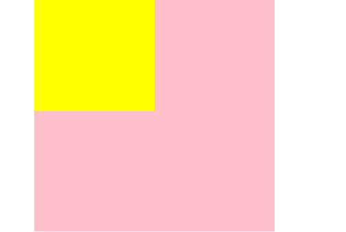
<style>
        .baba {
            width: 200px;
            height: 200px;
            background-color: pink;
            margin: auto;
        }


        .son {
            width: 100px;
            height: 100px;
            background-color: yellow;
            transition: 2s;
        }


        .baba:hover .son {
            transform: rotate(60deg);
        }
    </style>
💡执行结果截图
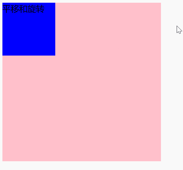
平移和旋转
<style>
        .father {
            width: 300px;
            height: 300px;
            background-color: pink;
            margin: 100px auto;
        }

        .son {
            width: 100px;
            height: 100px;
            background-color: blue;
            transition: 2s;
        }
        .father:hover .son{
            transform:translate(200px) rotate(50deg);
            /* transform: rotate(50deg) translate(200px); */
        }
    </style>
💡执行结果截图

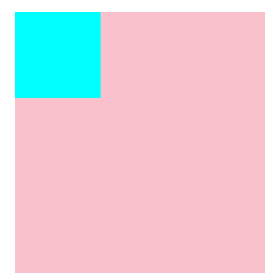
变换原点
语法:transform-origin: 水平垂直
- 数值
- 百分比
- 百分比是参考元素的宽高
- 方位词
- 水平方向方位词:left right center
- 垂直方向方位词:top bottom center
<style>
    .father {
      width: 400px;
      height: 400px;
      background-color: pink;
      margin: 100px auto;
    }

    .son {
      width: 100px;
      height: 100px;
      background-color: cyan;
      transition: 1s;
      /* 变换原点 */
      /* 默认 中心点 */
      /* 数值 */
      /* 左上 */
      transform-origin: 0 0;
      transform-origin: 10px 10px;

      /* 百分比 参考元素的宽高*/
      transform-origin: 100% 100%;

      /* 方位词 */
      /* 如果只有方位词,顺序可以换 */
      transform-origin: left bottom;
      transform-origin: bottom left;
      /* 如果混搭,顺序不可以换 */
      transform-origin: top 100%;
      /* 如果只写一个方位词,默认另外一个为center */
      transform-origin: bottom;
    }

    .father:hover .son {
      transform: rotate(60deg);
    }
  </style>
  <div class="father">
    <div class="son"></div>
  </div>
💡执行结果截图
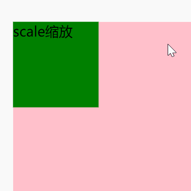
2d缩放
语法: transform: scale()
三种写法
- scaleX()
- scaleY()
- scale(x,y)
小结
- x,y代表水平方向和垂直方向的缩放倍数
- x,y是数值,不用写单位
-
1 放大
- =1 不变
- <1 缩小
- =0 消失
- <0 先翻转再缩小或者放大如
- 果scale(x,y)只写一个值,另外一个值默认是相同的数值
<style>
    .baba {
      width: 500px;
      height: 500px;
      background-color: pink;
      margin: 160px auto;
    }
    .son {
      width: 100px;
      height: 100px;
      background-color: green;
      transition: 5s;
    }
    .baba:hover .son {
      /* 默认原点是中心点 */
      /* 元素沿着x轴放大了2倍 */
      /* 大于1 放大 */
      transform: scaleX(2);
      /* 小于1 缩小 */
      transform: scaleX(0.5);
      /* 等于1 不变 */
      transform: scaleX(1);
      /* 等于0 消失 */
      transform: scaleX(0);

      /* 小于0 先翻转再缩效或者放大*/
      /* 先翻转再放大 */
      transform: scaleY(-2);
      /* 先翻转再缩小 */
      transform: scaleY(-0.5);

      /* x放大 y放大 */
      transform: scale(2, 3);
      /* x放大 y缩小 */
      transform: scale(2, 0.5);
      /* 只写一个值,意味着x,y同时缩放同样的倍数 */
      transform: scale(2);
    }
  </style>
  <div class="baba">
    <div class="son">scale缩放</div>
  </div>
💡执行结果截图
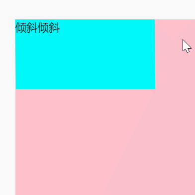
2d倾斜
语法:transform:三种写法
- transform:skew(x,y)
- transform:skewX()
- transform:skewY()
如果skew(x,y)只写一个值,代表的是skewX()
<style>
    .father {
      width: 500px;
      height: 500px;
      background-color: pink;
      margin: 50px auto;
    }

    .son {
      width: 200px;
      height: 100px;
      background-color: cyan;
      transition: 1s;
    }

    .father:hover .son {
      /* 倾斜的原点在元素中心点 沿着左右方向拉了一下盒子 */
      /* 盒子不管怎么倾斜,高度是不变的,文本会倾斜*/
      /* 元素和y轴夹角30度 */
      transform: skewX(30deg);

      /* 倾斜的原点在元素中心点 沿着上下方向拉了一下盒子 */
      /* 元素和x轴夹角30 */
      transform: skewY(30deg);

      /* 沿着x轴倾斜30度,再沿着y轴倾斜30度 */
      transform: skew(30deg, 30deg);

      /* 如果skew(x,y)只写一个值,表示skewX() */
      transform: skew(30deg);
    }
  </style>
  <div class="father">
    <div class="son">倾斜倾斜</div>
  </div>
💡执行结果截图


 1526
1526


 被折叠的 条评论
为什么被折叠?
被折叠的 条评论
为什么被折叠?
 到【灌水乐园】发言


