


2d转换(平面上对元素的旋转、缩放、移动、拉伸)-transform
transform:rotate(旋转的角度 单位deg 可以是正数顺时针 负数逆时针) 函数进行旋转
transform:scale(x水平方向缩放的倍数,y垂直方向的缩放比例)函数进行缩放 0-1 缩小 >1放大
<!DOCTYPE html>
<html lang="en">
	<head>
		<meta charset="UTF-8">
		<meta name="viewport" content="width=device-width, initial-scale=1.0">
		<title>首页</title>
		<style type="text/css">
			#original{
				width: 100px;
				height: 50px;
				background-color: yellow;
				border: 1px solid black;
			}
			#rorate{
				width: 100px;
				height: 50px;
				background-color: yellow;
				border: 1px solid black;
				transform: rotate(30deg);
			}
		</style>

	</head>

	<body>
		<div id="container">
			<div id="original">web前端学习</div>
			<div id="rorate">哈哈哈哈</div>
		</div>
	</body>

</html>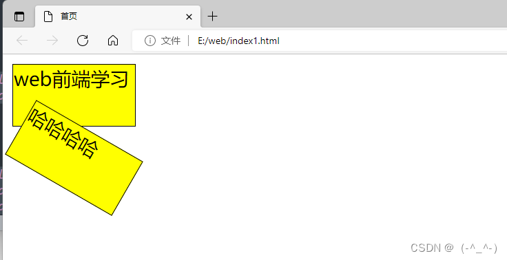
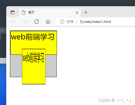
transform: scale(x水平方向缩放的倍数,y垂直方向的缩放比例)函数进行缩放 0-1 缩小 >1放大
<!DOCTYPE html>
<html lang="en">
	<head>
		<meta charset="UTF-8">
		<meta name="viewport" content="width=device-width, initial-scale=1.0">
		<title>首页</title>
		<style type="text/css">
			#container{
				width: 100px;
				height: 100px;
				background-color: #ccc;
				border: 1px solid black;
			}
			#original{
				width: 100px;
				height: 50px;
				background-color: yellow;
				border: 1px solid black;
			}
			#rorate{
				width: 100px;
				height: 50px;
				background-color: yellow;
				border: 1px solid black;
				transform: rotate(30deg);
			}
			#rorate:hover{
				transform: scale(0.5,1.5); 水平缩小小于1 垂直放大 大于1
			}
		</style>

	</head>

	<body>
		<div id="container">
			<div id="original">web前端学习</div>
			<div id="rorate">web前端学习</div>
		</div>
	</body>

</html> 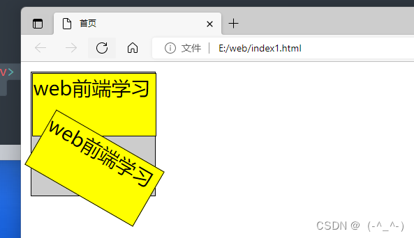


 712
712


 被折叠的 条评论
为什么被折叠?
被折叠的 条评论
为什么被折叠?
 到【灌水乐园】发言


