


Bootstrap可以说是前端第一框架,丰富的插件、跨移动和PC平台等优势使得Bootstrap很受前端开发者的青睐。笔者也是刚接触Bootstrap不久,对Bootstrap简单的代码实现强大的功能很是喜爱。但自己在写Bootstrap代码的过程中发现Bootstrap的组件插件很多都是需要重写的,否则在页面布局显示方面是达不到自己想要的效果的。其中Bootstrap的组件插件的样式经常要重写的莫过于pading、margin等了,这篇文章以重写Jumbotron的padding(其他的类似都是用覆盖的方法改变样式)为例,说说如何用覆盖的方法重写Bootstrap的一些组件的属性值。
先看一段代码:
<!DOCTYPE html>
<html>
<head>
   <title>Bootstrap超大屏幕(Jumbotron)</title>
   <link href="/bootstrap/css/bootstrap.min.css" rel="stylesheet">
   <script src="/scripts/jquery.min.js"></script>
   <script src="/bootstrap/js/bootstrap.min.js"></script>
</head>
<body>

<div class="container">
   <div class="jumbotron">
      <h1>Show</h1>
      <p>This is a Jumbotron</p>
      <p><a class="btn btn-primary btn-lg" role="button">
         learn more</a>
      </p>
   </div>
</div>

</body>
</html>
运行后结果是这样的:
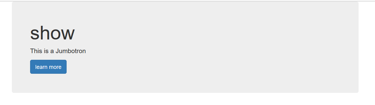
可以看到,文字的四周存在很多的“空白处”,有时这样的效果是我们不想要的。如何减少或去除这些所谓的“空白处”,其实很简单,我们只要修改一下Jumbotron的padding(填充)就行。问题是在哪修改和如何修改padding?
Just follow me……
我们在jumbotron的<div>的class里jumbotron的前面(因为这样级别能高于“jumbotron“)随便加上一个类名,如这里写个h,这样就能实现第一步了。然后我们再在<style></style>里写上自己想要的padding值,即可完成覆盖操作。代码如下:
<!DOCTYPE html>
<html>
<head>
<title>bootstrap</title>
<link href="bootstrap/css/bootstrap.min.css" rel="stylesheet">
<script src="bootstrap/jq/jquery-2.1.4.min.js"></script>
<script src="bootstrap/js/bootstrap.min.js"></script>
<style type="text/css">
.h.jumbotron{
padding: 4px;
}
</style>
</head>
<body>
<div class="container">
<div class="h jumbotron">
<h1>show</h1>
<p>This is a Jumbotron</p>
<p><a class="btn btn-primary btn-lg" role="button">
learn more</a>
</p>
</div>
</div>
</body>
</html>
运行,Bingo!
我们效果出来了
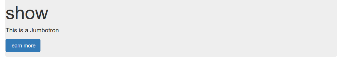
“空白处”减少了,你可以根据自己的需要修改属性值(margin等同样用类似方法可实现修改)。


 257
257


 被折叠的 条评论
为什么被折叠?
被折叠的 条评论
为什么被折叠?
 到【灌水乐园】发言


