


前言:这里我们使用UserControl、TextBox、PasswordBox等控件自定义一个具有明文、密文、清除密码等功能的密码框控件;需要用到附加属性、依赖属性、数据绑定、style、template等;
1、因为WPF中PasswordBox控件的Password属性不是依赖属性,不能直接进行数据绑定,如果要实现绑定,需要增加一个附加属性,网上有很多实现该功能的例子,这里就不写了,下边附一个链接:https://www.cnblogs.com/h82258652/p/4088433.html;
(另外,也可用TextBox来实现PasswordBox功能,需要使用IValueConverter来进行暗文转换,同时直接用TextBox的Text属性进行Binding就可以了,这里就不一一赘述了。)
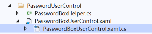
2、建立一个用户控件:PasswordBoxUserControl
我们需要在PasswordBoxUserControl.xaml.cs中定义我们需要用到的依赖属性:
(注意:依赖属性快捷键:propdp;附加属性快捷键:propa;双按Tab键即可)
    /// <summary>
    /// PasswordBoxUserControl.xaml 的交互逻辑
    /// </summary>
    public partial class PasswordBoxUserControl : UserControl
    {
        public PasswordBoxUserControl()
        {
            InitializeComponent();
        }

        /// <summary>
        /// 控制TextBox显示或者隐藏----TextBox来显示明文
        /// </summary>
        public Visibility TbVisibility
        {
            get { return (Visibility)GetValue(TbVisibilityProperty); }
            set { SetValue(TbVisibilityProperty, value); }
        }

        // Using a DependencyProperty as the backing store for TbVisibility.  This enables animation, styling, binding, etc...
        public static readonly DependencyProperty TbVisibilityProperty =
            DependencyProperty.Register("TbVisibility", typeof(Visibility), typeof(PasswordBoxUserControl));

        /// <summary>
        /// 控制PassworBox显示或者隐藏----PasswordBox控件来显密文
        /// </summary>
        public Visibility PwVisibility
        {
            get { return (Visibility)GetValue(PwVisibilityProperty); }
            set { SetValue(PwVisibilityProperty, value); }
        }

        // Using a DependencyProperty as the backing store for PwVisibility.  This enables animation, styling, binding, etc...
        public static readonly DependencyProperty PwVisibilityProperty =
            DependencyProperty.Register("PwVisibility", typeof(Visibility), typeof(PasswordBoxUserControl));

        /// <summary>
        /// 和“眼睛”进行绑定
        /// </summary>
        public bool IsChecked
        {
            get { return (bool)GetValue(IsCheckedProperty); }
            set { SetValue(IsCheckedProperty, value); }
        }

        // Using a DependencyProperty as the backing store for Check.  This enables animation, styling, binding, etc...
        public static readonly DependencyProperty IsCheckedProperty =
            DependencyProperty.Register("IsChecked", typeof(bool), typeof(PasswordBoxUserControl), new PropertyMetadata((s, e) =>
            {
                var dp = s as PasswordBoxUserControl;
                if ((bool)e.NewValue)
                {
                    dp.TbVisibility = Visibility.Visible;
                    dp.PwVisibility = Visibility.Collapsed;
                }
                else
                {
                    dp.TbVisibility = Visibility.Collapsed;
                    dp.PwVisibility = Visibility.Visible;
                }
            }));

        /// <summary>
        /// 点击图标“x”,使密码框清空
        /// </summary>
        public bool IsCleared
        {
            get { return (bool)GetValue(IsClearedProperty); }
            set { SetValue(IsClearedProperty, value); }
        }
        public static readonly DependencyProperty IsClearedProperty =
            DependencyProperty.Register("IsCleared", typeof(bool), typeof(PasswordBoxUserControl), new PropertyMetadata((s, e) =>
            {
                var c = s as PasswordBoxUserControl;
                c.Password = "";
            }));

        /// <summary>
        /// 控制显示符号“x”
        /// </summary>
        public Visibility ClearVisibility
        {
            get { return (Visibility)GetValue(ClearVisibilityProperty); }
            set { SetValue(ClearVisibilityProperty, value); }
        }
        public static readonly DependencyProperty ClearVisibilityProperty =
            DependencyProperty.Register("ClearVisibility", typeof(Visibility), typeof(PasswordBoxUserControl), new PropertyMetadata(Visibility.Collapsed));

        /// <summary>
        /// 密码
        /// </summary>
        public string Password
        {
            get { return (string)GetValue(PasswordProperty); }
            set { SetValue(PasswordProperty, value); }
        }

        // Using a DependencyProperty as the backing store for Password.  This enables animation, styling, binding, etc...
        public static readonly DependencyProperty PasswordProperty =
            DependencyProperty.Register("Password", typeof(string), typeof(PasswordBoxUserControl), new PropertyMetadata((s, e) =>
            {
                var pw = s as PasswordBoxUserControl;
                if (!string.IsNullOrEmpty(pw.Password))  //根据密码框是否有内容来显示符号“x”
                {
                    pw.ClearVisibility = Visibility.Visible;
                }
                else
                {
                    pw.ClearVisibility = Visibility.Collapsed;
                }
            }));
    }
PasswordUserControl.xaml前台代码:
<UserControl x:Class="WpfApp.View.PasswordUserControl.PasswordBoxUserControl"
xmlns="http://schemas.microsoft.com/winfx/2006/xaml/presentation"
xmlns:x="http://schemas.microsoft.com/winfx/2006/xaml"
xmlns:mc="http://schemas.openxmlformats.org/markup-compatibility/2006"
xmlns:d="http://schemas.microsoft.com/expression/blend/2008"
xmlns:local="clr-namespace:WpfApp.View.PasswordUserControl"
mc:Ignorable="d" >
<UserControl.Resources>
<Style TargetType="CheckBox" x:Key="CheckBoxStyle">
<Setter Property="FontFamily" Value="../../Assets/Fonts/#iconfont"></Setter>
<Setter Property="HorizontalAlignment" Value="Right"></Setter>
<Setter Property="VerticalAlignment" Value="Center"></Setter>
<Setter Property="Margin" Value="0 0 5 0"></Setter>
<Setter Property="Template">
<Setter.Value>
<ControlTemplate TargetType="CheckBox">
<TextBlock Text="{Binding RelativeSource={RelativeSource Mode=TemplatedParent},Path=Content}"
Margin="{Binding RelativeSource={RelativeSource Mode=TemplatedParent },Path=Margin}"></TextBlock>
</ControlTemplate>
</Setter.Value>
</Setter>
</Style>
<Style TargetType="TextBox" x:Key="PasswordVisibleStyle">
<Setter Property="FontWeight" Value="Regular"></Setter>
<Setter Property="FocusVisualStyle" Value="{x:Null}" />
<Setter Property="FontSize" Value="14" />
<Setter Property="Height" Value="32" />
<Setter Property="Foreground" Value="#303133"></Setter>
<Setter Property="Template">
<Setter.Value>
<ControlTemplate TargetType="TextBox">
<Border BorderBrush="#dcdfe6" CornerRadius="4" BorderThickness="1"
Background="{Binding RelativeSource={RelativeSource Mode=TemplatedParent}, Path= Background}">
<Grid>
<Grid.ColumnDefinitions>
<ColumnDefinition></ColumnDefinition>
<ColumnDefinition Width="Auto"></ColumnDefinition>
<ColumnDefinition Width="Auto"></ColumnDefinition>
</Grid.ColumnDefinitions>
<ScrollViewer x:Name="PART_ContentHost" BorderThickness="0" VerticalAlignment="Center"
FontSize="{Binding RelativeSource={RelativeSource Mode=TemplatedParent}, Path= FontSize}" IsTabStop="False" Margin="2"
Background="{Binding RelativeSource={RelativeSource Mode=TemplatedParent}, Path= Background}" />
<CheckBox Grid.Column="1" Style="{StaticResource CheckBoxStyle}" Content="" Foreground="#e6e6e6"
IsChecked="{Binding (local:PasswordBoxUserControl.IsCleared),RelativeSource={RelativeSource Mode=FindAncestor,AncestorType={x:Type UserControl}},Mode=TwoWay}"
Visibility ="{Binding (local:PasswordBoxUserControl.ClearVisibility),RelativeSource={RelativeSource Mode=FindAncestor,AncestorType={x:Type UserControl}},Mode=TwoWay}"/>
<CheckBox Grid.Column="2" Style="{StaticResource CheckBoxStyle}" Content="" Foreground="#bfbfbf"
IsChecked="{Binding (local:PasswordBoxUserControl.IsChecked),RelativeSource={RelativeSource Mode=FindAncestor,AncestorType={x:Type UserControl}},Mode=TwoWay}"/>
</Grid>
</Border>
<ControlTemplate.Triggers>
<Trigger Property="IsEnabled" Value="false">
<Setter Property="Background" Value="#ebeef5"></Setter>
</Trigger>
</ControlTemplate.Triggers>
</ControlTemplate>
</Setter.Value>
</Setter>
</Style>
<Style TargetType="PasswordBox" x:Key="PasswordBoxCollapsedStyle">
<Setter Property="FontWeight" Value="Regular"></Setter>
<Setter Property="FocusVisualStyle" Value="{x:Null}" />
<Setter Property="FontSize" Value="14" />
<Setter Property="Height" Value="32" />
<Setter Property="Foreground" Value="#303133"></Setter>
<Setter Property="Template">
<Setter.Value>
<ControlTemplate TargetType="PasswordBox">
<Border BorderBrush="#dcdfe6" CornerRadius="4" BorderThickness="1"
Background="{Binding RelativeSource={RelativeSource Mode=TemplatedParent}, Path= Background}">
<Grid>
<Grid.ColumnDefinitions>
<ColumnDefinition></ColumnDefinition>
<ColumnDefinition Width="Auto"></ColumnDefinition>
<ColumnDefinition Width="Auto"></ColumnDefinition>
</Grid.ColumnDefinitions>
<ScrollViewer x:Name="PART_ContentHost" BorderThickness="0" VerticalAlignment="Center"
FontSize="{Binding RelativeSource={RelativeSource Mode=TemplatedParent}, Path= FontSize}" IsTabStop="False" Margin="2"
Background="{Binding RelativeSource={RelativeSource Mode=TemplatedParent}, Path= Background}" />
<CheckBox Grid.Column="1" Style="{StaticResource CheckBoxStyle}" Content="" Foreground="#e6e6e6"
IsChecked="{Binding (local:PasswordBoxUserControl.IsCleared),RelativeSource={RelativeSource Mode=FindAncestor,AncestorType={x:Type UserControl}},Mode=TwoWay}"
Visibility ="{Binding (local:PasswordBoxUserControl.ClearVisibility),RelativeSource={RelativeSource Mode=FindAncestor,AncestorType={x:Type UserControl}},Mode=TwoWay}"/>
<CheckBox Grid.Column="2" Style="{StaticResource CheckBoxStyle}" Content="" Foreground="#bfbfbf"
IsChecked="{Binding (local:PasswordBoxUserControl.IsChecked),RelativeSource={RelativeSource Mode=FindAncestor,AncestorType={x:Type UserControl}},Mode=TwoWay}"/>
</Grid>
</Border>
<ControlTemplate.Triggers>
<Trigger Property="IsEnabled" Value="false">
<Setter Property="Background" Value="#ebeef5"></Setter>
</Trigger>
</ControlTemplate.Triggers>
</ControlTemplate>
</Setter.Value>
</Setter>
</Style>
</UserControl.Resources>
<Grid>
<TextBox Style="{StaticResource PasswordVisibleStyle}"
Visibility="{Binding (local:PasswordBoxUserControl.TbVisibility),RelativeSource={RelativeSource Mode=FindAncestor,AncestorType={x:Type UserControl}},Mode=TwoWay}"
Text="{Binding (local:PasswordBoxUserControl.Password),RelativeSource={RelativeSource Mode=FindAncestor,AncestorType={x:Type UserControl}},Mode=TwoWay,UpdateSourceTrigger=PropertyChanged}"></TextBox>
<PasswordBox Style="{StaticResource PasswordBoxCollapsedStyle}"
Visibility="{Binding (local:PasswordBoxUserControl.PwVisibility),RelativeSource={RelativeSource Mode=FindAncestor,AncestorType={x:Type UserControl}},Mode=TwoWay}"
local:PasswordBoxHelper.Attach="True" local:PasswordBoxHelper.Password="{Binding (local:PasswordBoxUserControl.Password),RelativeSource={RelativeSource Mode=FindAncestor, AncestorType={x:Type UserControl}},Mode=TwoWay,UpdateSourceTrigger=PropertyChanged}"></PasswordBox>
</Grid>
</UserControl>
注意:绑定依赖属性这里需要加括号(local:PasswordBoxUserControl.TbVisibility)
3、现在我们就可以直接使用自定义的密码框控件了
PasswordBoxWindow前台代码:
<Window x:Class="WpfApp.View.PasswordBoxWindow"
        xmlns="http://schemas.microsoft.com/winfx/2006/xaml/presentation"
        xmlns:x="http://schemas.microsoft.com/winfx/2006/xaml"
        xmlns:d="http://schemas.microsoft.com/expression/blend/2008"
        xmlns:mc="http://schemas.openxmlformats.org/markup-compatibility/2006"
        xmlns:local="clr-namespace:WpfApp.View" xmlns:usercontrols="clr-namespace:WpfApp.View.PasswordUserControl" xmlns:viewmodel="clr-namespace:WpfApp.ViewModel"
        mc:Ignorable="d"
        Title="PasswordBoxWindow" Height="200" Width="350"
        WindowStyle="None" WindowStartupLocation="CenterScreen"
        AllowsTransparency="True" Background="Transparent">
    <Window.DataContext>
        <viewmodel:PasswordBoxViewModel></viewmodel:PasswordBoxViewModel>
    </Window.DataContext>
    <Border BorderBrush="#20333333" BorderThickness="1" CornerRadius="8" Background="White" Margin="0">
        <Border.Effect>
            <DropShadowEffect BlurRadius="8" Color="#20333333" ShadowDepth="0"></DropShadowEffect>
        </Border.Effect>
            <StackPanel Orientation="Horizontal" HorizontalAlignment="Center">
                <TextBlock Text="自定义密码框:" FontSize="18" FontFamily="Microsoft Yahei" VerticalAlignment="Center"></TextBlock>
                <usercontrols:PasswordBoxUserControl Password="{Binding Password,Mode=TwoWay,UpdateSourceTrigger=PropertyChanged}" Width="200"></usercontrols:PasswordBoxUserControl>
            </StackPanel>
    </Border>
</Window>
4、ViewModel
using System;
using System.Collections.Generic;
using System.ComponentModel;
using System.Linq;
using System.Runtime.CompilerServices;
using System.Text;
using System.Threading.Tasks;

namespace WpfApp.ViewModel
{
    public class PasswordBoxViewModel : INotifyPropertyChanged
    {
        public event PropertyChangedEventHandler PropertyChanged;
        public void RaisePropertyChanged([CallerMemberName] string propertyName = null)
        {
            PropertyChangedEventHandler handler = PropertyChanged;
            if (handler != null)
            {
                handler(this, new PropertyChangedEventArgs(propertyName));
            }
        }

        private string _password;

        public string Password
        {
            get { return _password; }
            set
            {
                _password = value;
                RaisePropertyChanged();
            }
        }
    }
}
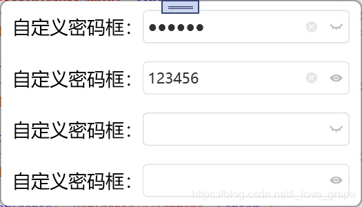
5、最终效果-----可点击“眼睛”,“x”等进行操作。
(另:这里密码框中的“x”,“眼睛”等图标是使用的阿里矢量图;如果有美工,可以使用设计的图片等;当然,也可以使用Path自己画一个)
另:写的可能有点繁琐,不到之处请大家指正,谢谢。


 扫一扫
扫一扫


 681
681

 被折叠的 条评论
为什么被折叠?
被折叠的 条评论
为什么被折叠?
 到【灌水乐园】发言


