


未经允许,不得转载!!
水平有限考虑不全不周之处,欢迎指正交流!
一、块级元素水平margin居中;
demo:
<!DOCTYPE html>
<html lang="en">
    <head>
        <meta charset="utf-8">
        <title>http://blog.csdn.net/ime33 居中元素demo</title>
        <style type="text/css">
            *{padding: 0;margin: 0}
            a{text-decoration: none;}
            ul,li{list-style: none;}
            .box{width: 600px;height: 300px;background: #21d1c0;color: #fff;font-size: 24px;margin: 0 auto}
        </style>
    </head>
    <body>
        <div class="box">
            我是居中元素
        </div>
    </body>
</html>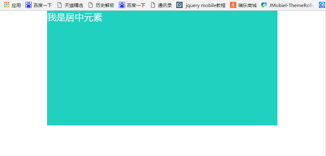
二、文字,图片水平居中text-align,.box{添加即可}
三、table表格垂直水平居中:
demo:
<!DOCTYPE html>
<html lang="en">
    <head>
        <meta charset="utf-8">
        <title>http://blog.csdn.net/ime33 table垂直居中元素demo</title>
        <style type="text/css">
            *{padding: 0;margin: 0}
            a{text-decoration: none;}
            ul,li{list-style: none;}
            table{width:800px;margin:0 auto;border-collapse: collapse}
            table tr td{height: 45px;text-align: center;}
        </style>
    </head>
    <body>

        <table border="1">
            <tr>
                <td>块级元素</td>
                <td>块级元素</td>
                <td>块级元素</td>
                <td>块级元素</td>
            </tr>
        </table>
    </body>
</html>
四、水平居中,浮动(记得清浮动)
demo:
<!DOCTYPE html>
<html lang="en">
    <head>
        <meta charset="utf-8">
        <title>http://blog.csdn.net/ime33 居中元素demo</title>
        <style type="text/css">
            *{padding: 0;margin: 0}
            a{text-decoration: none;}
            ul,li{list-style: none;}
            .box{font-size: 24px;float:left;position:relative;left:50%}
            .item{position:relative;left:-50%;color: #fff;background: #21D1C0}
        </style>
    </head>
    <body>
        <div class="box">
            <div class="item">这里是元素</div>
        </div>

    </body>
</html>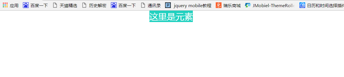
五、垂直居中,line-height定义行高
demo:
<!DOCTYPE html>
<html lang="en">
    <head>
        <meta charset="utf-8">
        <title>http://blog.csdn.net/ime33 居中元素demo</title>
        <style type="text/css">
            *{padding: 0;margin: 0}
            a{text-decoration: none;}
            ul,li{list-style: none;}
            .box{font-size: 24px;color: #fff;background: #21D1C0;width: 600px;height: 300px;line-height: 300px;text-align: center;}
        </style>
    </head>
    <body>
        <div class="box">
            <div class="item">这里是元素</div>
        </div>

    </body>
</html>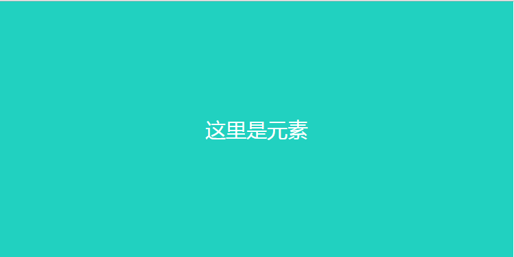
六、在居中元素给相等的补丁值padding即可。
七:vertical-align:middle垂直居中,这在td、tr中起作用,其他元素默认不支持此属性,那么在火狐和IE8下可以设置元素的display属性值为table-cell即可,低版本的IE7以下不支持table-cell咋办,那可以用table表格布局。
八、浮动垂直水平居中:
demo:
<!DOCTYPE html>
<html lang="en">
    <head>
        <meta charset="utf-8">
        <title>http://blog.csdn.net/ime33 居中元素demo</title>
        <style type="text/css">
            *{padding: 0;margin: 0}
            a{text-decoration: none;}
            ul,li{list-style: none;}

            html, body {
                margin: 0;
                padding: 0;
                height: 100%;
            }

            body {
                background: 50% 50% no-repeat #21D1C0;
                font-family: Georgia, Times, serifs;
            }

            #floater {
                position: relative;
                float: left;
                height: 50%;
                margin-bottom: -200px;
                width: 1px;
            }

            #centered {
                position: relative;
                clear: left;
                height: 400px;
                width: 80%;
                max-width: 800px;
                min-width: 400px;
                margin: 0 auto;
                background: #fff;
                border: 4px solid #666;
                -webkit-border-radius: 8px;
                -moz-border-radius: 8px;
                border-radius: 8px;
            }
            </style>
            </head>
        </style>
    </head>
    <body>
        <body>
            <div id="floater"></div>
            <div id="centered">这个是垂直居中内容</div>
        </body>

    </body>
</html>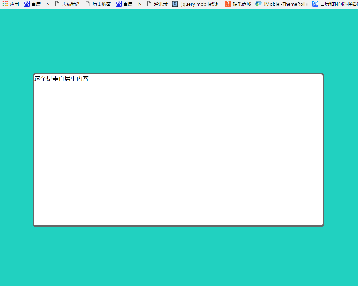
九、图片内容垂直水平居中,淘宝经常使用的技巧;
demo:
<!DOCTYPE html>
<html lang="en">
    <head>
        <meta charset="utf-8">
        <title>http://blog.csdn.net/ime33 居中元素demo</title>
        <style type="text/css">
            *{padding: 0;margin: 0}
            a{text-decoration: none;}
            ul,li{list-style: none;}
            .box {

                display: table-cell;
                vertical-align:middle;
                text-align:center;
                *display: block;
                *font-size: 175px;
                *font-family:Arial;
                width:200px;
                height:200px;
                border: 2px solid #21D1C0;
            }
            .box img {
                vertical-align:middle;
            }
        </style>
        <div class="box">
            <img src="https://img.alicdn.com/bao/uploaded/i2/708767074/TB2UnQFcXXXXXbFXXXXXXXXXXXX_!!708767074.jpg_80x80.jpg" />
        </div>

        <!-- 背景法 -->
        <style type="text/css">
            .qq {
                width:500px;
                display:table-cell;
                height:400px;
                text-align:center;
                vertical-align:middle;
                border: 2px solid #21D1C0
            }
            i {
                display:inline-block;
                height:100%;
                vertical-align:middle
            }
            .qq img {
                vertical-align:middle;
            }
        </style>
        <div class="qq"><i></i><img src="http://www.baidu.com/img/baidu_logo.gif" /></div>
</body>
</html>
<style>
.imgbig{
                position: fixed;
                overflow: auto;
                width: 100%;
                height: 100%;
                top: 0;
                bottom: 0;
                right: 0;
                background-color: rgba(0,0,0,.3);
                display: none;
            }
            .imgbig .imgboxbig{
                width: 90%;
                border-radius: 2px;
                height: auto;
                overflow: visible;
                top: 50%;
                -webkit-transform: translateY(-50%);
                -ms-transform: translateY(-50%);
                transform: translateY(-50%);
                position: relative;
                margin: 0 auto;
                overflow: auto;
                -webkit-overflow-scrolling: touch;
                overflow-scrolling: touch;
            }
            .imgbig .imgboxbig img{
                width: 100%;
                display: block;
                border-radius: 6px;
            }
</style>
<div class="imgbig">
            <div class="imgboxbig">
                <img src="http://www.ruilife.net/data/catlogo/1466360899933185387.png">
            </div>
        </div>
十、CSS3 transform垂直水平居中元素,特别适合在移动端玩诺;
demo:
<!DOCTYPE html>
<html lang="en">
    <head>
        <meta charset="utf-8">
        <style type="text/css">
            *{padding: 0;margin: 0;font-family: 微软雅黑}
            html {
                font-size: 40px;
                -webkit-text-size-adjust: none;
            }
            .popup-from-top, .popup-from-bottom, .popup-from-left, .popup-from-right {
                display: block;
                position: fixed;
                z-index: 10001;
                width: 100%;
                height: 100%;
                left: 0;
                top: 0;
                background: rgba(0,0,0,.5);
                pointer-events: none;
                opacity: 0;
                -webkit-transition: opacity .3s;
                transition: opacity .3s;
            }
            .popup-visible {
                opacity: 1;
                -webkit-transform: none;
                transform: none;
            }
            .userTypeDialog {
                position: absolute;
                width: 11.09333rem;
                background-color: #fff;
            }
            .popup-from-top>*, .popup-from-bottom>*, .popup-from-left>*, .popup-from-right>* {
                position: relative;
                left: 50%;
                top: 50%;
                -webkit-transition: -webkit-transform .3s;
                transition: transform .3s;
            }
            .popup-from-top>* {
                -webkit-transform: translate(-50%,-700px);
                transform: translate(-50%,-700px);
            }
            .popup-visible>* {
                -webkit-transform: translate(-50%,-50%);
                transform: translate(-50%,-50%);
            }
            .userTypeDialog .role-title {
                display: block;
                width: 100%;
                height: 1.36533rem;
                line-height: 1.36533rem;
                text-align: center;
                font-size: .68267rem;
                color: #fff;
                background-color: #E43C53;
            }
            .userTypeDialog i {
                display: inline-block;
                position: absolute;
                top: 1.28rem;
                left: 50%;
                width: 0;
                height: 0;
                margin-left: -.42667rem;
                border: .42667rem solid transparent;
                border-top: .42667rem solid #e63b53;
                font-size: 0;
            }
            .userTypeDialog .user-role-selec {
                text-align: center;
                padding-top: .85333rem;
                position: relative;
                border: 0;
            }
            .userTypeDialog .user-role-selec>span {
                font-size: .512rem;
                color: #818181;
                vertical-align: top;
            }
            .userTypeDialog .user-role-selec .select-area {
                display: inline-block;
                width: 100%;
                padding-top: .42667rem;
            }
            .userTypeDialog .user-role-selec .select-area .select-item {
                display: inline-block;
            }
            .userTypeDialog .user-role-selec .select-area .select-item div {
                width: 2.56rem;
                height: 3.2rem;
                margin-top: .42667rem;
            }
            .userTypeDialog .user-role-selec .select-area .select-item div {
                background: url(./images/5.png) no-repeat 0 0/contain;
            }
            .userTypeDialog .user-role-selec .btn-area {
                display: inline-block;
                width: 100%;
                margin: .64rem 0;
                font-size: 0;
            }
            .userTypeDialog .user-role-selec .btn-area .btn-cancel {
                display: inline-block;
                width: 4.26667rem;
                height: 1.28rem;
                border-radius: .21333rem;
                line-height: 1.28rem;
                color: #818181;
                font-size: .59733rem;
                text-align: center;
                background-color: #e8e8e8;
            }
            .userTypeDialog .user-role-selec .btn-area .btn-sure {
                display: inline-block;
                width: 4.26667rem;
                height: 1.28rem;
                margin-left: .85333rem;
                border-radius: .21333rem;
                line-height: 1.28rem;
                color: #fff;
                font-size: .59733rem;
                text-align: center;
                background-color: #e43c53;
            }
        </style>
    </head>
    <body>
        <div class="popup-from-top popup-visible popup-enabled">

            <div class="userTypeDialog">
                <span class="role-title">身份选择</span>
                <i></i>

                <div class="user-role-selec">
                    <span>选择身份,只为给你私人定制更合适的商品</span>
                    <div class="select-area">
                        <div class="select-item boy" user_role="1">
                            <div></div>
                        </div>
                        <div class="select-item girl" user_role="4">
                            <div></div>
                        </div>
                        <div class="select-item mother" user_role="6">
                            <div></div>
                        </div>
                        <div class="student">
                            <div class="on"></div>
                        </div>
                    </div>
                    <div class="btn-area">
                        <span class="btn-cancel">取 消</span>
                        <span class="btn-sure">确 认</span>
                    </div>
                </div>
            </div>
        </div>
    </body>
</html>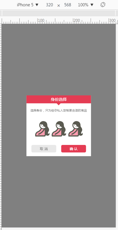
十一、box-align+align-items垂直水平居中;
demo:
<!DOCTYPE html>
<html lang="en">
   	<head>
      	<meta charset="utf-8">
      	<meta name="viewport" content="width=device-width, initial-scale=1, maximum-scale=1, minimum-scale=1, user-scalable=no">
      	<meta name="Generator" content="ECTouch 1.0">
      	<title>弹框</title>
	</head>
	<body>
      <style type="text/css">
         * {
             margin: 0;
             padding: 0;
             -webkit-tap-highlight-color: rgba(0,0,0,0);
             -webkit-text-size-adjust: none;
             -webkit-user-select: none;
             -ms-user-select: none;
             user-select: none;
         }
         .toolbox {
             position: fixed;
             left: 0;
             top: 0;
             z-index: 806;
             width: 100%;
             height: 100%;
             display: -webkit-box;
             display: -webkit-flex;
             display: -ms-flexbox;
             display: flex;
             -ms-flex-pack: center;
             -webkit-box-pack: center;
             box-pack: center;
             -webkit-justify-content: center;
             justify-content: center;
             -ms-flex-align: center;
             -webkit-box-align: center;
             box-align: center;
             -webkit-align-items: center;
             align-items: center;
             background-color: rgba(0,0,0,.4);
         }
         .content_box {
             width: 80%;
             border: 1px solid #e5e5e5;
             border-radius: 3px;
             background-color: #fff;
             font-size: 12px;
             color: #666;
         }
         .toolbox .title {
             position: relative;
             height: 30px;
             line-height: 30px;
             text-align: center;
             border-bottom: 1px solid #e5e5e5;
         }
         .toolbox .close {
             position: absolute;
             left: 10px;
             top: 6px;
             width: 16px;
             height: 16px;
             border: 1px solid #ddd;
             border-radius: 50%;
         }
         .toolbox .close:before {
             -webkit-transform: rotate(45deg);
             transform: rotate(45deg);
         }
         .toolbox .close:before, .toolbox .close:after {
             content: '';
             position: absolute;
             left: 8px;
             top: 1px;
             width: 1px;
             height: 14px;
             background-color: #ddd;
         }
         .toolbox .close:after {
             -webkit-transform: rotate(-45deg);
             transform: rotate(-45deg);
         }
         .toolbox .text {
             display: -webkit-box;
             display: -webkit-flex;
             display: -ms-flexbox;
             display: flex;
             -ms-flex-pack: center;
             -webkit-box-pack: center;
             box-pack: center;
             -webkit-justify-content: center;
             justify-content: center;
             -ms-flex-align: center;
             -webkit-box-align: center;
             box-align: center;
             -webkit-align-items: center;
             align-items: center;
             height: 68px;
             line-height: 20px;
         }
         .toolbox .btn_box {
             display: -webkit-box;
             display: -webkit-flex;
             display: -ms-flexbox;
             display: flex;
             border-top: 1px solid #e5e5e5;
             padding: 10px;
         }
         .toolbox .btns {
             -webkit-box-flex: 1;
             -webkit-flex: 1;
             -ms-flex: 1;
             flex: 1;
             display: block;
             width: 100%;
             height: 30px;
             line-height: 30px;
             border-radius: 4px;
             text-align: center;
             color: #fff;
             font-size: 12px;
             text-decoration: none;
         }
         .toolbox .btn_general {
             background-color: #666;
         }
         .toolbox .btns:last-of-type:not(:first-of-type) {
             margin-left: 10px;
         }
         .toolbox .btn_highlight {
             background-color: #ff7171;
         }
      </style>
      <div class="toolbox"  >
         <div class="content_box">
            <div class="title">温馨提示<b class="close"></b></div>
            <div class="text"><p>XXXX统升级中,暂未开放下单~谢谢</p></div>
            <div class="btn_box">
               <a href="javascript:window.close()" class="btns btn_general">好的</a>
               <a href="javascript:void(0)" class="btns btn_highlight">继续浏览</a>
            </div>
         </div>
      </div>
	</body>
</html>
十二、以上都是CSS控制居中的方法,当然了JS也是可以实现的,不过个人还是喜欢CSS实现,效果妥妥的!
好了,本篇就是以上的内容,水平有限,若有不周之处,欢迎指正、交流,感谢阅读!!


 1508
1508


 被折叠的 条评论
为什么被折叠?
被折叠的 条评论
为什么被折叠?
 到【灌水乐园】发言


