


五. 添加图例
(源代码legends.m)
在图像包含较多图形时,适当的图例对快速、正确的理解图像反映的信息是必不可少的。以下一个实例可以说明精心设计图例的重要性。
我们在一幅图像中,同时绘出10个不同均值和方差的正态分布曲线。数据可以由如下代码生成,或直接加载10NormalDistributions.mat
% stdVect and meanVect
stdVect = [.49,.26,.93,.47,.25,.43,.7,.4,.18,.86];
meanVect = [-.8,-.62,-.44,-.27,-.09,.09,.27,.44,.62,.8];

% 正态分布数据,每行一个
t = -1:.02:1;
dataVect = ones(10,length(t));
for i=1:10
    dataVect(i,:) = (1/sqrt(2*pi)/stdVect(i))*...
        exp(-(t-meanVect(i)).^2/(2*stdVect(i)^2));
end

% 图例说明
legendMatrix = cell(1,10);
for i = 1:10
    legendMatrix{i} = [sprintf( 'mean = %.2f, std = %.2f',...
        meanVect(i),stdVect(i) )];
end
legend(legendMatrix);

save('10NormalDistribution.mat', 'stdVect','meanVect',...
    'dataVect','legendMatrix');

clear;% 加载数据 meanVect stdVect legendMatrix
load 10NormalDistributions;
% 绘图
plot(dataVect');
xlim([0,100]);
% 添加标注
title({'10种不同的正态分布','图例不缺乏清晰度','颜色区分也不明显!'},'Color',[1 0 0]);
xlabel('x');
ylabel('x的概率密度函数');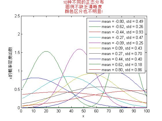
图1
2、我们通过改变曲线的颜色(color)、线型(line style)和标志(marker)的方式增加可读性,并将图例放置在图像外边。(图2)
% 为不同曲线生成不同的设置
LineStyles = {'-','--',':'};
MarkerSpecs = {'+','o'};
ColorSpecs = {'r','g','b','k'};
cnt = 1;
for i = 1:length(LineStyles)
    for j = 1:length(MarkerSpecs)
        for k = 1:length(ColorSpecs)
            LineSpecs{cnt} = [LineStyles{i} MarkerSpecs{j} ...
                ColorSpecs{k}];
            cnt = cnt+1;
        end
    end
end

figure; hold on;
for i = 1:10
    plot(dataVect(i,:), LineSpecs{i});
end
xlim([0 100]);

title({'10种不同的正态分布','使用不同的颜色和线型','可读性大大提高'});
xlabel('x'); ylabel('x的概率密度函数');
legend(legendMatrix,'Location','NorthEastOutside',...
    'Fontsize',8);
box on;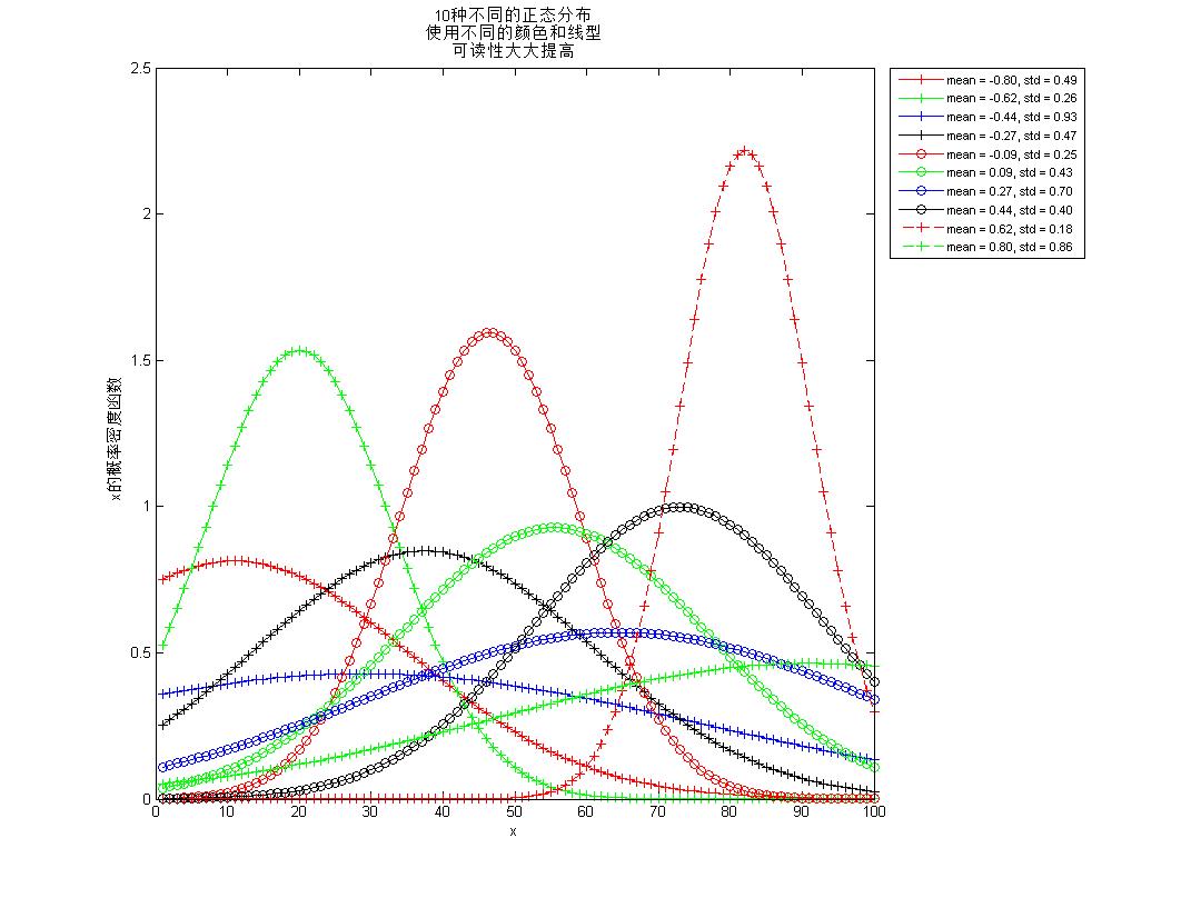
图2
3、 有时候,我们可能会将图形分组。由于每执行一次绘图任务,legend的计数就会增加1,因此,在这种情况下,我们可以通过如下方式来减少图例数量。(图3)
% 合并图例
figure; hold;
h1 = plot(dataVect(1:6,:)','rd-','Color',[1 0 0]);
h2 = plot(dataVect(7:10,:)','k*--','Color',[0 0 0]);
xlim([0 100]);

h = legend([h1(1),h2(1)],['Color 1' char(10) 'first 6 curves'],...
    ['Color 2' char(10) 'remaining 4 curves'],...
    'Location','Best');

% 提高可读性,将图例字体颜色调整为与图形颜色一致
% 注意:每两个为一组,分别代表直线、标号和文字的颜色的属性,且顺序与所表示的图形顺序相反,即第一个绘制的图形的图例出现在数组的最后3个
c = get(h,'Children');
set(c(1:3),'Color',[0,0,0]);
set(c(4:6),'Color',[1,0,0]);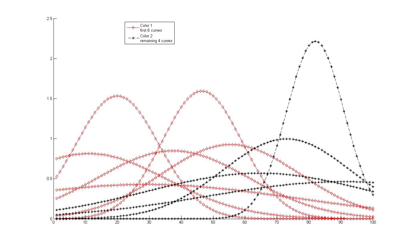
图3
4、利用legendlex优化图例。(图4)
legendfex为我们提供了更加灵活的调整图例格式的功能。得用legendflex, 我们不但可以调整说明的布局(指定分几行或几列显示),还可以单独调整图标和文字的大小,设定图例相对于任何对象的位置(原始legend限于坐标轴)。利用 legendflex ,我们还可以为图例添加小标题。legendflex可从之里下载。
figure('units','normalized','position',...
    [ 0.4172 0.1769 0.3 0.5]);
hold on;
for i = 1:10
    h(i) = plot(dataVect(i,:), LineSpecs{i});
end
xlim([0 100]);
legendflex(h,... %handle to plot lines
    legendMatrix,... %corresponding legend entries
    'ref', gcf, ... %which figure
    'anchor', {'nw','nw'}, ... %location of legend box
    'buffer',[30 -5], ... %an offset wrt the location
    'nrow',4, ... %number of rows
    'fontsize',8,... %font size
    'xscale',.5); %a scale factor for actual symbols

title({'应用legendflex优化图像显示','可以调整相对位置、布局,字体及图标大小'});
xlabel('x'); ylabel('x的概率密度函数');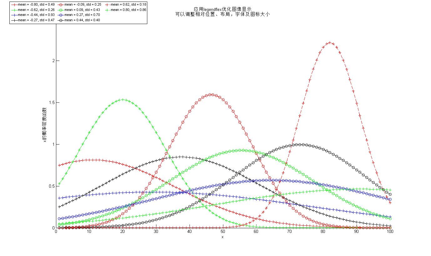
图4
六. 通过数据变换突出细节特征
(源代码trans.m)
有些数据通过一定的变换后,更便于可视化,也更容易发现隐藏的信息。
1、绘制一幅双Y轴图(图5)
%% 生成数据
x = 1:50;
r = 5e5;
E = [ones(1,30) linspace(1,0,15) zeros(1,5)];
y1 = r * (1+E).^x;

%% 绘制又Y轴图形
y2 = log(y1);
axes('position',[0.1300    0.1100    0.7750    0.7805]);

[AX,H1,H2] = plotyy(x,y1,x,y2,'plot');
title({'利用对数变换增强数据','增长、稳定、衰减的可视化效果'});
set(get(AX(1),'Ylabel'),'String','data');
set(get(AX(2),'Ylabel'),'String','log(data)');
xlabel('x'); set(H1,'LineStyle','--'); set(H2,'LineStyle',':');

%% 添加标注
annotation('textarrow',[.26 .28],[.67,.37],'String',['指数增长' char(10) '(1到30周期)']);
annotation('textarrow',[.7 .7],[.8,.64],'String',['非指数衰减' char(10) '(30到45周期)']);
annotation('textarrow',[.809 .859],[.669,.192],'String',['稳定' char(10) '(45到50周期)']);
legend({'原始数据','对数变换后的数据'},'Location','Best');
set(gcf,'Paperpositionmode','auto','Color',[1 1 1]);
图5
2、在数字较大时,matlab会默认采用科学计数法,有时这可能不是我们想要的,我们可以通过如下方式处理。(图6)
%% 关闭科学记数法格式
% 改变图像大小
set(gcf,'units','normalized','position',[0.0411    0.5157    0.7510    0.3889]);
% AX(1) 存储的是原始数据的句柄
title({'利用对数变换增强数据','增长、稳定、衰减的可视化效果','关闭科学计数法格式'});
n=get(AX(1),'Ytick');
set(AX(1),'yticklabel',sprintf('%d |',n'));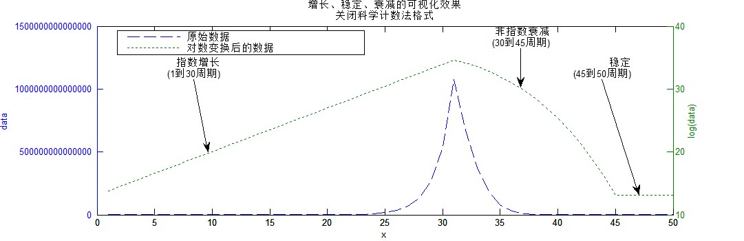
图6
3、通过缩放坐标轴达到变换的目的
上边实例中,我们通过对原始数据进行取对数操作达到变换的效果。由于对数操作的常用性,Matlab允许我们直接对X和Y轴进行对数缩放。semilogx、semilogy、loglog可以分别对X轴、Y轴和XY轴进行对数缩放。这也可以通过设置坐标轴的xscale和yscale属性实现。
%% 直接利用 semilogx, semilogy, loglog
figure;
subplot(2,1,1);
semilogy(x,y1);
xlabel('x');
ylabel('取对数后数据');
title({'MATLAB的semilogy函数',...
               '直接将Y轴对数缩放后显示'});
subplot(2,1,2);
plot(x,y1);
set(gca,'yscale','log');
xlabel('x');
ylabel('取对数后的数据');
title({'使用常规的plot进行绘图','然后通过理性属性达到相同目的'});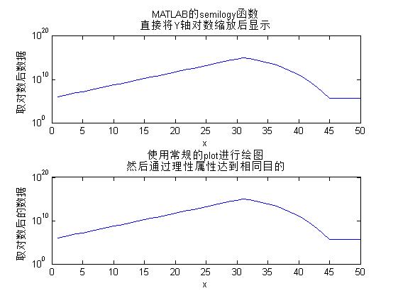
图7
七. 多图的绘制
(源代码subfig.m)
1、常规子图的绘制
我们利用苹果公司2011年度每日股票交易数据为例,绘制包括开盘价、最高价、最低价、收盘价、成交量和临近收盘价在内的6个趋势图。
首先加载数据
%% 加载数据并按时间先后顺序排列
[AAPL dateAAPL] = xlsread('AAPL_090784_012412.csv');
dateAAPL = datenum({dateAAPL{2:end,1}});
dateAAPL = dateAAPL(end:-1:1);
AAPL = AAPL(end:-1:1,:);
% 选择时间窗口(2011年全年)
rangeMIN = datenum('1/1/2011');
rangeMAX = datenum('12/31/2011');
idx = find(dateAAPL >= rangeMIN & dateAAPL <= rangeMAX);
然后,通过subplot命令绘图(图8)
%% 使用subplot绘图命令绘制常规子图网格
% 注意设置各个子图的标题内容的title命令的位置

figure('units','normalized','position',[ 0.0609    0.0593    0.5844    0.8463]);
matNames = {'开盘价','最高价','最低价','收盘价','成交量','临近收盘价'};
for i = 1:6
    subplot(3,2,i);
    plot(idx,AAPL(idx,i));
    if i~=5
        title([matNames{i} ' $, subplot(3,2,' num2str(i) ')'],'Fontsize',12,'Color',[1 0 0 ]);
        ylabel('美元');
    else
        title([matNames{i} ' vol, subplot(3,2,' num2str(i) ')'],'Fontsize',12,'Color',[1 0 0 ]);
        ylabel('成交量');
    end
    set(gca,'xtick',linspace(idx(1),idx(end),12),'xticklabel',...
        datestr(linspace(dateAAPL(idx(1)),dateAAPL(idx(end)),12),...
                                                'mm'),'Fontsize',10,'fontweight','bold');
    rotateXLabels(gca,40);
    box on; axis tight
end
% 添加总标题
annotation('textbox',[ 0.37   0.96   0.48   0.03],'String','2011年度苹果公司股价趋势','Fontsize',14,'Linestyle','none');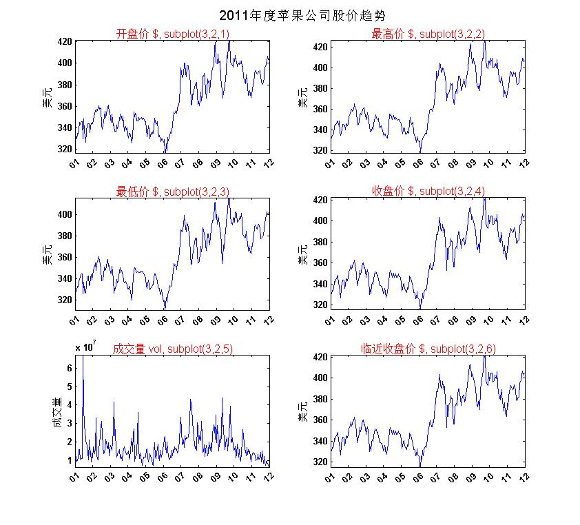
图8
2、进阶篇
我们可以自定义子图的布局,并且子图可以是任何一种图形。下面我们绘制包括3个垂直排列的子图(由上而下编号1、2、3)的图像(如图9)。子图1展示选定时间窗口内的股价走势,子图2展示相同时期内的成交量,子图3则显示全部时间内股价的变化情况。
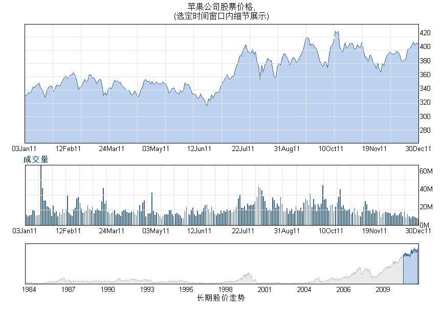
图9
子图1是一个面积图,可通过area命令绘制。
%% 自定义子图布局
figure('units','normalized','Position',[ 0.0427    0.2102    0.6026    0.6944]);

%% 子图1显示收盘价随时间的变化趋势
% 设置坐标轴位置
Panel1 = axes('Position',[ 0.0570    0.5520    0.8850    0.3730]);hold;
% 绘制面积图
area(AAPL(idx,4),'FaceColor',[188 210 238]/255,'edgecolor',[54 100 139 ]/255);
% 设置坐标轴相关参数
xlim([1 length(idx)]);
yminv = min(AAPL(idx,4))-.5*range(AAPL(idx,4));
ymaxv = max(AAPL(idx,4))+.1*range(AAPL(idx,4));
ylim([yminv ymaxv]);
box on;
% 绘制网格线
set(gca,'Ticklength',[0 0],'YAxisLocation','right');
line([linspace(1,length(idx),15);linspace(1,length(idx),15)],[yminv*ones(1,15); ymaxv*ones(1,15)],'Color',[.9 .9 .9]);
line([ones(1,10); length(idx)*ones(1,10)],[linspace(yminv, ymaxv,10); linspace(yminv, ymaxv,10);],'Color',[.9 .9 .9]);
% 设置注解
set(gca,'xtick',linspace(1,length(idx),10),'xticklabel',datestr(linspace(dateAAPL(idx(1)),dateAAPL(idx(end)),10),'ddmmmyy'));
title({'苹果公司股票价格,','(选定时间窗口内细节展示)'},'Fontsize',12);%% 子图2展示相同时间段内成交量的变化情况
% 设置坐标轴位置
Panel2 = axes('Position',[ 0.0570 0.2947 0.8850 0.1880]);
% 用条形图绘图
bar(1:length(idx), AAPL(idx,5),.25,...
'FaceColor',[54 100 139 ]/255);
hold; xlim([1 length(idx)]);hold on;
% 添加网格线
yminv = 0;
ymaxv = round(max(AAPL(idx,5)));
line([linspace(1,length(idx),30);...
linspace(1,length(idx),30)],...
[yminv*ones(1,30); ymaxv*ones(1,30)],...
'Color',[.9 .9 .9]);
line([ones(1,5); length(idx)*ones(1,5)],...
[linspace(yminv, ymaxv,5); ...
linspace(yminv, ymaxv,5);],'Color',[.9 .9 .9]);
ylim([yminv ymaxv]);
% 设置特殊的时间刻度
set(gca, 'Ticklength',[0 0],...
'xtick',linspace(1,length(idx),10),'xticklabel',...
datestr(linspace(dateAAPL(idx(1)),dateAAPL(idx(end)),10),...
'ddmmmyy'));
tickpos = get(Panel2,'ytick')/1000000;
for i = 1:numel(tickpos)
C{i} = [num2str(tickpos(i)) 'M'];
end
set(Panel2,'yticklabel',C,'YAxisLocation','right');
text(0,1.15*ymaxv,'成交量','VerticalAlignment','top',...
'Color',[54 100 139 ]/255,'Fontweight','bold');子图3是也一个面积图,其中选定时间段被高亮,这是通过在大图上叠加绘制一个与子图1相同颜色的小得到。
%% 子图3展示全部时间段内股价变化情况,其中被选中的时间窗口高亮显示
Panel3 = axes('Position',[0.0570    0.1100    0.8850    0.1273]);
area(dateAAPL, AAPL(:,4),'FaceColor',[234 234 234 ]/255,'edgecolor',[.8 .8 .8]); hold;
line([min(idx) min(idx)],get(gca,'ylim'),'Color','k');
line([max(idx) max(idx)],get(gca,'ylim'),'Color','k');
set(gca,'Ticklength',[0 0]);
% 相同颜色重新绘制时间窗口内的趋势
area(dateAAPL(idx),AAPL(idx,4),'FaceColor',[188 210 238]/255,'edgecolor',[54 100 139 ]/255);
ylim([min(AAPL(:,4)) 1.1*max(AAPL(:,4))]);
xlabel('长期股价走势');
line([min(get(gca,'xlim')) min(get(gca,'xlim'))],get(gca,'ylim'),'Color',[1 1 1]);
line([max(get(gca,'xlim')) max(get(gca,'xlim'))],get(gca,'ylim'),'Color',[1 1 1]);
line(get(gca,'xlim'),[max(get(gca,'ylim')) max(get(gca,'ylim'))],'Color',[1 1 1]);
line(get(gca,'xlim'),[min(get(gca,'ylim')) min(get(gca,'ylim'))],'Color',[1 1 1]);
set(gca,'xticklabel',datestr(get(gca,'xtick'),'yyyy'),'yticklabel',[]);
八. 可视化直观地比较实验结果
(源代码comparison.m)
这涉及多种方法的对比实验中,选择适当的方式进行可视化分析,有助于我们快速、直观地对各种方法的优劣进行评判。我们以五种聚类算法在5个测试集上的实验结果为数据,通过绘图对其进行比较。
我们已经知道,matlab自带有多种配色方案(colormap)可供选择,我们还可以自定义配色方案。为了保证配色的友好性和易区分性,我们可以通过在线工具color brewer(http://colorbrewer2.org/),对配色进行测试,辅助我们找到比较好的方案。
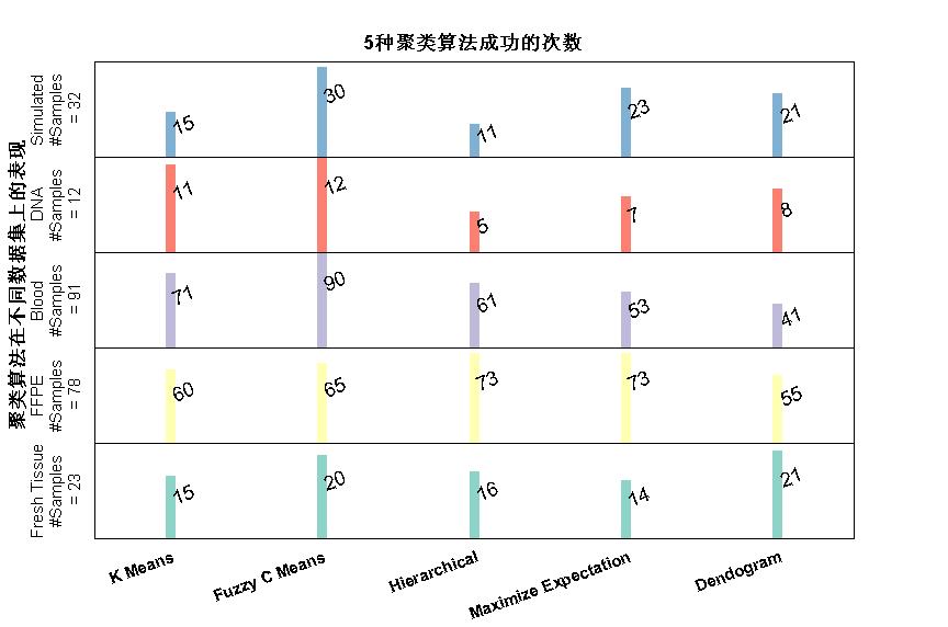
图10
%% 定义可视化方案
% 设定图像大小和位置
figure('units','normalized','Position',[ 0.0880    0.1028    0.6000    0.6352]);

% 绘制一个隐藏的坐标轴,其X轴刻度标签列出进行比较的五种算法的名称
hh = axes('Position',[.1,.135,.8,.1]);
set(gca,'Visible','Off','TickLength',[0.0 0.0],'TickDir','out','YTickLabel','','xlim',[0 nosOfMethods],'FontSize',11,'FontWeight','bold');
set(gca,'XTick',.5:nosOfMethods-.5,'XTickLabel',{'K Means','Fuzzy C Means','Hierarchical','Maximize Expectation','Dendogram'});
catgeoryLabels = {'Fresh Tissue','FFPE','Blood','DNA','Simulated'};
rotateXLabels(gca,20);
% 将Y轴长等分为五份,分别分配给5个测试集结果
y = linspace(.142,.75,nosOfCategories);

% Place an axes for creating each row dedicated to a sample
% category. The height of the axes corresponds to the total
% number of samples in that category.
%
for i = 1 :nosOfCategories

    if CategoryTotals(i); ylimup = CategoryTotals(i); else ylimup = 1; end
    dat = [MethodPerformanceNumbers(i,:)];
    h(i) = axes('Position',[.1,y(i),.8,y(2)-y(1)]);
    set(gca,'XTickLabel','','TickLength',[0.0 0.0],'TickDir','out','YTickLabel','','xlim',[.5 nosOfMethods+.5],'ylim',[0 ylimup]);

    % Use the line command to create bars representing the number of successes
    % in each category using colour scheme defined at the beginning of this recipe
    line([1:nosOfMethods; 1:nosOfMethods],[zeros(1,nosOfMethods); dat],'Color',Colors(i,:),'Linewidth',7);box on;

    % Place the actual number as a text next to the bar
    for j= 1:nosOfMethods
        if dat(j); text(j+.01,dat(j)-.3*dat(j),num2str(dat(j)),'Rotation',20,'FontSize',13); end
    end

    % Add the category label
    ylabel([catgeoryLabels{i} char(10) '#Samples' char(10) ' = ' num2str(ylimup) ],'Fontsize',11);
end
% Add annotations
title('5种聚类算法成功的次数','Fontsize',14,'Fontweight','bold');
axes(h(3));
text(-0.02,-80,'聚类算法在不同数据集上的表现','rotation',90,'Fontsize',14,'Fontweight','bold');


 656
656


 被折叠的 条评论
为什么被折叠?
被折叠的 条评论
为什么被折叠?
 到【灌水乐园】发言


