


1. 基本介绍
Chip、ActionChip、ChoiceChip、FilterChip 是一个常见的标签控件,会内敛布局,并且有一些常用的点击功能。
2. 示例代码
代码下载地址。如果对你有帮助的话记得给个关注,代码会根据我的 Flutter 专题不断更新。
3. 属性介绍
| Chip 属性 | 介绍 |
|---|---|
| avatar | 左侧图标组件 |
| label | @required 文本 Widget |
| labelStyle | 文本样式,TextStyle |
| labelPadding | 文本外边距 Padding |
| deleteIcon | 右侧删除按钮 Widget |
| onDeleted | 删除按钮点击事件 |
| deleteIconColor | 删除按钮颜色 |
| deleteButtonTooltipMessage | 长按删除按钮的提示语 |
| shape | 形状,ShapeBorder |
| clipBehavior | 裁剪方式,默认为 Clip.none |
| focusNode | 焦点控制,Flutter 组件之 FocusNode 详解 |
| autofocus | 自动聚焦,默认为 false |
| backgroundColor | 背景色 |
| padding | 内边距 Padding |
| visualDensity | 紧凑程度,VisualDensity |
| materialTapTargetSize | 内边距,默认最小点击区域为 48 * 48,MaterialTapTargetSize.shrinkWrap 为组件实际大小 |
| elevation | 阴影高度,默认为 0 |
| shadowColor | 阴影颜色 |
| CircleAvatar 属性 | 介绍 |
|---|---|
| child | 子控件 Widget |
| backgroundColor | 背景色 |
| backgroundImage | 背景图 |
| onBackgroundImageError | 背景图加载失败回调 |
| foregroundColor | text 颜色 |
| radius | 半径 (和 maxRadius 以及 minRadius 不能同时存在) |
| minRadius | 最小半径 (和 radius 不能同时存在) |
| maxRadius | 最大半径 (和 radius 不能同时存在) |
4. Chip 详解
import 'package:flutter/material.dart';
class FMChipVC extends StatefulWidget {
@override
FMChipState createState() => FMChipState();
}
class FMChipState extends State <FMChipVC>{
@override
Widget build(BuildContext context) {
// TODO: implement build
return Scaffold(
appBar: AppBar(title: Text("Chip"),),
body: _listView(),
);
}
ListView _listView(){
return ListView(
children: [
_chipForSimpleText(),
_chipForSimple(),
_chipForNormal(),
_chip(),
],
);
}
CircleAvatar _circleAvatar(){
return CircleAvatar(
child: Container(
height: 30,
color: Colors.red,
alignment: Alignment.center,
child: Text("Avatar child text"),
), // avatar 子控件
backgroundColor: Colors.red, // avatar 背景色
foregroundColor: Colors.white, // avatar 中 text 颜色
// avatra 背景图
backgroundImage: NetworkImage("http://tiebapic.baidu.com/forum/w%3D580/sign=a96ca741eafaaf5184e381b7bc5594ed/7ea6a61ea8d3fd1f2643ad5d274e251f95ca5f38.jpg"),
// 背景图加载失败回调
onBackgroundImageError: (error, trace){
print("onBackgroundImageError");
},
// radius: 200, // avatar 半径 (和 maxRadius 以及 minRadius 不能同时存在)
maxRadius: 100, // avatar 最小半径 (和 radius 不能同时存在)
minRadius: 80, // avatar 最大半径 (和 radius 不能同时存在)
);
}
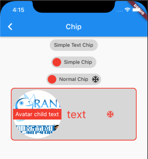
Chip _chipForSimpleText(){
return Chip(
label: Text("Simple Text Chip")
);
}
Chip _chipForSimple(){
return Chip(
label: Text("Simple Chip"),
avatar: CircleAvatar(backgroundColor: Colors.red,),
);
}
Chip _chipForNormal(){
return Chip(
label: Text("Normal Chip"),
avatar: CircleAvatar(backgroundColor: Colors.red,),
deleteIcon: Icon(Icons.ac_unit),
onDeleted: (){},
);
}
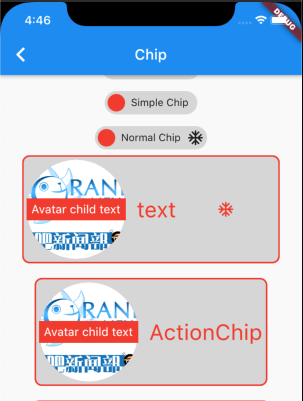
Chip _chip(){
return Chip(
avatar: _circleAvatar(), // 左侧图标组件
label: Text("text"), // 文本 Widget
labelStyle: TextStyle(color: Colors.red, fontSize: 30), // 文本样式,TextStyle
labelPadding: EdgeInsets.fromLTRB(15, 50, 0, 50), // 文本外边距 Padding
deleteIcon: Icon(Icons.ac_unit), // 右侧删除按钮 Widget
deleteButtonTooltipMessage: "deleteButtonTooltipMessage", // 长按删除按钮的提示语
deleteIconColor: Colors.red, // 删除按钮颜色
// 删除按钮点击事件
onDeleted: (){
print("onDeleted");
},
// Chip 形状
shape: RoundedRectangleBorder(
borderRadius: BorderRadius.circular(10),
side: BorderSide(
width: 2,
color: Colors.red,
),
),
// padding: EdgeInsets.zero,
);
}
}
5. ActionChip 详解
相比 Chip,ActionChip 增加了 onPressed 的点击事件,同时 ActionChip 移除了 deleteIcon 等相关属性。
  ListView _listView(){
    return ListView(
      children: [
        _chipForSimpleText(),
        _chipForSimple(),
        _chipForNormal(),
        _chip(),
        Padding(padding: EdgeInsets.all(10)),
        _actionChip(),
      ],
    );
  }

  ActionChip _actionChip(){
    return ActionChip(
      avatar: _circleAvatar(),
      onPressed: (){
        print("ActionChip onPressed");
      },
      label: Text("ActionChip"), // 文本 Widget
      labelStyle: TextStyle(color: Colors.red, fontSize: 30), // 文本样式,TextStyle
      labelPadding: EdgeInsets.fromLTRB(15, 50, 0, 50), // 文本外边距 Padding

      // Chip 形状
      shape: RoundedRectangleBorder(
        borderRadius: BorderRadius.circular(10),
        side: BorderSide(
          width: 2,
          color: Colors.red,
        ),
      ),
    );
  }
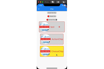
6. ChoiceChip 详解
  ListView _listView(){
    return ListView(
      children: [
        _chipForSimpleText(),
        _chipForSimple(),
        _chipForNormal(),
        _chip(),
        Padding(padding: EdgeInsets.all(10)),
        _actionChip(),
        Padding(padding: EdgeInsets.all(10)),
        _choiceChip(),
      ],
    );
  }

  bool _choiceChipSelected = false;

  ChoiceChip _choiceChip(){
    return ChoiceChip(
      avatar: _circleAvatar(), // 左侧图标组件
      label: Text("ChoiceChip"), // 文本 Widget
      labelStyle: TextStyle(color: Colors.red, fontSize: 30), // 文本样式,TextStyle
      labelPadding: EdgeInsets.fromLTRB(15, 50, 0, 50), // 文本外边距 Padding

      selected: _choiceChipSelected, // 是否选中
      selectedColor: Colors.yellow, // 选中背景色
      // 选中点击事件
      onSelected: (value){
        print("ChoiceChip onSelected");
        _choiceChipSelected = value;
        setState(() {

        });
      },

      // Chip 形状
      shape: RoundedRectangleBorder(
        borderRadius: BorderRadius.circular(10),
        side: BorderSide(
          width: 2,
          color: Colors.red,
        ),
      ),
    );
  }
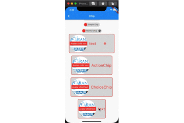
7. FilterChip 详解
  ListView _listView(){
    return ListView(
      children: [
        _chipForSimpleText(),
        _chipForSimple(),
        _chipForNormal(),
        _chip(),
        Padding(padding: EdgeInsets.all(10)),
        _actionChip(),
        Padding(padding: EdgeInsets.all(10)),
        _choiceChip(),
        Padding(padding: EdgeInsets.all(10)),
        _filterChip(),
      ],
    );
  }

  bool _filterChipSeleted = false;

  FilterChip _filterChip(){
    return FilterChip(
      avatar: _circleAvatar(), // 左侧图标组件
      label: Text("text"), // 文本 Widget
      labelStyle: TextStyle(color: Colors.red, fontSize: 30), // 文本样式,TextStyle
      labelPadding: EdgeInsets.fromLTRB(15, 50, 0, 50), // 文本外边距 Padding

      selected: _filterChipSeleted, // 是否选中
      selectedColor: Colors.white, // 选中背景色
      // 点击回调
      onSelected: (value){
        _filterChipSeleted = value;
        setState(() {

        });
      },

      showCheckmark: true, // 是否显示勾选框
      checkmarkColor: Colors.yellow, // 勾选框颜色

      // Chip 形状
      shape: RoundedRectangleBorder(
        borderRadius: BorderRadius.circular(10),
        side: BorderSide(
          width: 2,
          color: Colors.red,
        ),
      ),
    );
  }
8. 技术小结
Chip 其实并不难,就是属性较多,多加练习理解各个属性对应样式即可。
扩展效果
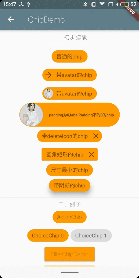
一、效果
二、构造函数解析:
const Chip({
    Key key,
    this.avatar,//左侧的图标
    @required this.label,//这个是必填的参数,控件上显示的文本
    this.labelStyle,
    this.labelPadding,
    this.deleteIcon,//右侧的删除图标
    this.onDeleted,//删除图标的点击事件,如果不写该方法的话,deleteIcon显示不出来
    this.deleteIconColor,
    this.deleteButtonTooltipMessage,//点击删除图标后弹出的文本,类似于tooltip的效果
    this.shape,
    this.clipBehavior = Clip.none,//这个不晓得是啥
    this.backgroundColor,
    this.padding,
    this.materialTapTargetSize,//这个具体也不晓得怎么描述,它的两个值,一个为padded,一个为shrinkWrap,前者自带margin,后者好像没有margin,紧贴附近的控件
    this.elevation,//阴影深度
    this.shadowColor,//阴影颜色
  })
三、例子
import 'package:flutter/material.dart';
import 'package:the_first_one/utils/PageUtil.dart';
import 'InputChipDemo.dart';
import 'FilterChipDemo.dart';
import 'package:fluttertoast/fluttertoast.dart';

class ChipPage extends StatefulWidget {
  @override
  _ChipPageState createState() => _ChipPageState();
}

class _ChipPageState extends State<ChipPage> {
  int _valueChoice = 0;

  Widget _buildChoiceItem(int index) {
    return ChoiceChip(
      label: Text("ChoiceChip $index"),
      selectedColor: Colors.orange, //选中的颜色
      disabledColor: Colors.orange[100], //没选中的颜色
      onSelected: (bool selected) {
        setState(() {
          _valueChoice = selected ? index : null;
        });
      },
      selected: _valueChoice == index,
      labelStyle: TextStyle(color: Colors.black54),
    );
  }

  @override
  Widget build(BuildContext context) {
    return Scaffold(
      appBar: AppBar(
        title: Text("ChipDemo"),
      ),
      body: Center(
        child: SingleChildScrollView(
          child: Column(
            children: <Widget>[
              SizedBox(height: 10.0),
              Text("一、初步认识"),
              Divider(),
              Chip(
                label: Text("普通的chip"),
                labelStyle: TextStyle(color: Colors.black54),
                backgroundColor: Colors.orange,
              ),
              Chip(
                avatar: Icon(
                  Icons.arrow_forward,
                  color: Colors.black54,
                ),
                label: Text("带avatar的chip"),
                labelStyle: TextStyle(color: Colors.black54),
                backgroundColor: Colors.orange,
              ),
              Chip(
                avatar: CircleAvatar(
                  backgroundImage:
                      AssetImage('assets/images/illustration_1.jpg'),
                  radius: 18.0,
                ),
                label: Text("带avatar的chip"),
                labelStyle: TextStyle(color: Colors.black54),
                backgroundColor: Colors.orange,
              ),
              Chip(
                avatar: CircleAvatar(
                  backgroundImage:
                      AssetImage('assets/images/illustration_1.jpg'),
                  radius: 30.0,
                ),
                padding: EdgeInsets.all(0.0),
                label: Text("padding为0,labelPadding不为0的chip"),
                labelPadding: EdgeInsets.all(15.0),
                labelStyle: TextStyle(
                  color: Colors.black54,
                  fontSize: 10.0,
                  fontWeight: FontWeight.bold,
                ),
                backgroundColor: Colors.orange,
              ),
              Chip(
                label: Text("带deleteIcon的chip"),
                deleteIcon: Icon(Icons.close),
                deleteIconColor: Colors.black54,
                onDeleted: () {
                  print("点击了删除噢");
                },
                deleteButtonTooltipMessage: "弹出提示",
                labelStyle: TextStyle(color: Colors.black54),
                backgroundColor: Colors.orange,
              ),
              Chip(
                label: Text("圆角矩形的chip"),
                deleteIcon: Icon(Icons.close),
                deleteIconColor: Colors.black54,
                onDeleted: () {
                  print("点击了删除噢");
                },
                deleteButtonTooltipMessage: "弹出提示",
                shape: RoundedRectangleBorder(
                  borderRadius: BorderRadius.circular(2.0),
                ),
                labelStyle: TextStyle(color: Colors.black54),
                backgroundColor: Colors.orange,
              ),
              Chip(
                label: Text("尺寸最小的chip"),
                materialTapTargetSize: MaterialTapTargetSize.shrinkWrap,
                labelStyle: TextStyle(color: Colors.black54),
                backgroundColor: Colors.orange,
              ),
              Chip(
                label: Text("带阴影的chip"),
                shadowColor: Colors.grey,
                elevation: 10.0,
                labelStyle: TextStyle(color: Colors.black54),
                backgroundColor: Colors.orange,
              ),
              Divider(),
              Text("二、例子"),
              ActionChip(
                //自带一个onPress事件,有点击效果
                label: Text("ActionChip"),
                backgroundColor: Colors.orange,
                onPressed: () {
                  Fluttertoast.showToast(msg: "ActionChip");
                },
              ),
              Wrap(
                spacing: 5.0, //主轴间距
                runSpacing: 8.0, //副轴间距
                children: List<Widget>.generate(2, (int index) {
                  return _buildChoiceItem(index);
                }),
              ),
              RaisedButton(
                  child: Text(
                    "FilterChipDemo",
                    style: TextStyle(color: Colors.black54),
                  ),
                  color: Colors.orange,
                  onPressed: () {
                    PageUtil().pushTo(context, FilterChipDemo());
                  }),
              RaisedButton(
                  child: Text(
                    "InputChipDemo",
                    style: TextStyle(color: Colors.black54),
                  ),
                  color: Colors.orange,
                  onPressed: () {
                    PageUtil().pushTo(context, InputChipDemo());
                  }),
              SizedBox(height: 10.0),
            ],
          ),
        ),
      ),
    );
  }
}
四、其他
关于chip也可以看看以下扩展类,以下排列顺序按照功能的升序排列
- ActionChip //比普通的chip多一个onPressed事件
- ChoiceChip //允许从一组选项中进行单一选择
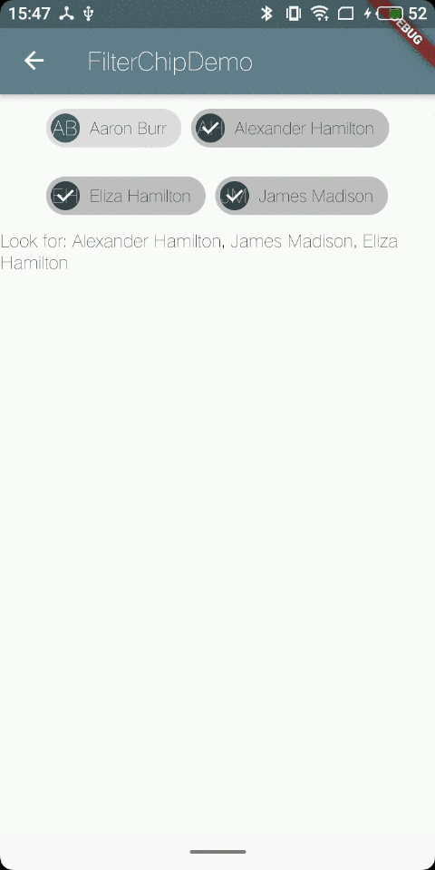
- FilterChip //自带的比ChoiceChip多一个选中的勾勾的效果
import 'package:flutter/material.dart';

class FilterChipDemo extends StatefulWidget {
  @override
  _FilterChipDemoState createState() => _FilterChipDemoState();
}

class ActorFilterEntry {
  const ActorFilterEntry(this.name, this.initials);

  final String name;
  final String initials;
}

class _FilterChipDemoState extends State<FilterChipDemo> {
  final List<ActorFilterEntry> _cast = <ActorFilterEntry>[
    const ActorFilterEntry('Aaron Burr', 'AB'),
    const ActorFilterEntry('Alexander Hamilton', 'AH'),
    const ActorFilterEntry('Eliza Hamilton', 'EH'),
    const ActorFilterEntry('James Madison', 'JM'),
  ];
  List<String> _filters = <String>[];

  Iterable<Widget> get actorWidgets sync* {
    for (ActorFilterEntry actor in _cast) {
      yield Padding(
        padding: const EdgeInsets.all(4.0),
        child: FilterChip(
          avatar: CircleAvatar(child: Text(actor.initials)),
          label: Text(actor.name),
          selected: _filters.contains(actor.name),
          onSelected: (bool value) {
            setState(() {
              if (value) {
                _filters.add(actor.name);
              } else {
                _filters.removeWhere((String name) {
                  return name == actor.name;
                });
              }
            });
          },
        ),
      );
    }
  }

  @override
  Widget build(BuildContext context) {
    return Scaffold(
      appBar: AppBar(
        title: Text("FilterChipDemo"),
      ),
      body: Column(
        children: <Widget>[
          Wrap(
            children: actorWidgets.toList(),
          ),
          Text('Look for: ${_filters.join(', ')}'),
        ],
      ),
    );
  }
}
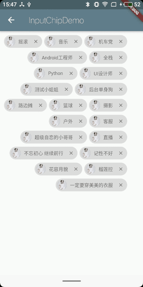
- InputChip //比FilterChip多一个onPressed和onDeleted
import 'package:flutter/material.dart';

class InputChipDemo extends StatefulWidget {
  @override
  _InputChipDemoState createState() => _InputChipDemoState();
}

class _InputChipDemoState extends State<InputChipDemo> {
  List<String> list = [
    "摇滚",
    "音乐",
    "机车党",
    "Android工程师",
    "全栈",
    "Python",
    "UI设计师",
    "测试小姐姐",
    "后台单身狗",
    "产品老大",
    "路边摊",
    "火锅 串串 麻辣烫",
    "篮球",
    "摄影",
    "户外",
    "客服",
    "超级自恋的小哥哥",
    "直播",
    "不忘初心 继续前行",
    "记性不好",
    "花容月貌",
    "榴莲控",
    "一定要穿美美的衣服"
  ];

  List<String> _filters = <String>[];

  Widget _buildItem(int index) {
    String content = list[index];
    return InputChip(
      avatar: CircleAvatar(
        backgroundImage: AssetImage('assets/images/illustration_1.jpg'),
        radius: 12.0,
      ),
      label: Text(
        content,
        style: TextStyle(fontSize: 12.0),
      ),
      shadowColor: Colors.grey,
      deleteIcon: Icon(
        Icons.close,
        color: Colors.black54,
        size: 14.0,
      ),
      onDeleted: () {
        setState(() {
          list.removeAt(index);
        });
      },
      onSelected: (bool selected) {
        setState(() {
          if (selected) {
            _filters.add(list[index]);
          } else {
            _filters.removeWhere((String name) {
              return name == list[index];
            });
          }
        });
      },
      selectedColor: Colors.orange,
      disabledColor: Colors.grey,
      selected: _filters.contains(list[index]),
      materialTapTargetSize: MaterialTapTargetSize.shrinkWrap,
      labelStyle: TextStyle(color: Colors.black54),
    );
  }

  @override
  Widget build(BuildContext context) {
    return Scaffold(
      appBar: AppBar(
        title: Text("InputChipDemo"),
      ),
      body: Container(
        padding: EdgeInsets.all(10.0),
        child: Wrap(
          spacing: 5.0,
          //主轴间距
          runSpacing: 8.0,
          //副轴间距
          alignment: WrapAlignment.end,
          //主轴上的对齐方式
          crossAxisAlignment: WrapCrossAlignment.center,
          //副轴上的对齐方式
          children: List<Widget>.generate(
            list.length,
            (int index) {
              return _buildItem(index);
            },
          ).toList(),
        ),
      ),
    );
  }
}
- RawChip //原始chip,通常仅在您想要创建自己的定制芯片类型时使用
五、补充
更多的应用场景,请点击我


 扫一扫
扫一扫


 6908
6908

 被折叠的 条评论
为什么被折叠?
被折叠的 条评论
为什么被折叠?
 到【灌水乐园】发言


