


效果图
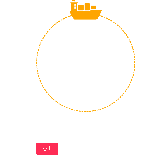
第一种写法虚线太丑了,所以用了canvas画,结果有些圆弧失真了,暂时还没有解决办法;第三种就是UI切图(捂脸.jpg)
<!-- 虚线圆2 -->
        <div class="left-canvas">
          <canvas id="cvs" class="canvas"></canvas>
          <i ref="rotate" :style="{ transform: `rotate(${rotate}deg)` }"
            ><img class="ship-img" src="../../assets/image/ship.png" alt=""
          /></i>
          <el-button type="primary" @click="btn">点击</el-button>
        </div>
        <!-- 虚线圆3 -->
        <!-- <div class="left-img-circle">
          <img class="circle-imgq" src="../../assets/image/dashed.png" />
          <i ref="rotate" :style="{ transform: `rotate(${rotate}deg)` }"
            ><img class="ship-img" src="../../assets/image/ship.png" alt=""
          /></i>
          <el-button type="primary" @click="btn">点击</el-button>
        </div> -->
        <!-- 虚线圆1 -->
        <!-- <div class="left">
          <div class="module_box">
            <div class="box">
              <i ref="rotate" :style="{ transform: `rotate(${rotate}deg)` }"
                ><img class="ship-img" src="../../assets/image/ship.png" alt=""
              /></i>
            </div>
          </div>
          <el-button type="primary" @click="btn">点击</el-button>
        </div> -->
// 第2种
.left-canvas {
position: relative;
// width: 300px;
// height: 300px;
// border-radius: 50%;
i {
width: 300px;
height: 300px;
position: absolute;
top: 0;
left: 0;
transform: rotate(180deg);
transition: all 0.5s linear;
}
.ship-img {
position: absolute;
top: -68px;
left: 100px;
width: 100px;
// height: 60px;
border-radius: 50%;
// background: #ff6200;
transform: rotate(0deg);
}
}
// 第3种
.left-img-circle {
position: relative;
width: 300px;
height: 300px;
border-radius: 50%;
.circle-imgq {
width: 300px;
height: 300px;
border-radius: 50%;
}
i {
width: 300px;
height: 300px;
position: absolute;
top: 0;
left: 0;
transform: rotate(0deg);
transition: all 0.5s linear;
}
.ship-img {
position: absolute;
top: -68px;
left: 100px;
width: 100px;
// height: 60px;
border-radius: 50%;
// background: #ff6200;
}
}
// 第1种
.module_box {
height: 400px;
display: flex;
margin-top: 10px;
}
.box {
position: relative;
width: 300px;
height: 300px;
border: 3px dashed #ffab00;
border-radius: 50%;
}
.box i {
width: 300px;
height: 300px;
position: absolute;
/*旋转动画*/
// animation: circleRoate 5s infinite linear;
transform: rotate(0deg);
transition: all 0.5s linear;
}
.box i .ship-img {
position: absolute;
top: -68px;
left: 100px;
width: 100px;
// height: 60px;
border-radius: 50%;
// background: #ff6200;
}


 1535
1535


 被折叠的 条评论
为什么被折叠?
被折叠的 条评论
为什么被折叠?
 到【灌水乐园】发言


