


转载声明:Ryan的博客文章欢迎您的转载,但在转载的同时,请注明文章的来源出处,不胜感激! :-)
http://my.oschina.net/ryanhoo/blog/86874
译者:Ryan Hoo
来源:http://blog.stylingandroid.com/archives/378#
译者按:在外企工作的半年多中花了不少时间在国外的网站上搜寻资料,其中有一些相当有含金量的文章,我会陆陆续续翻译成中文,与大家共享之。初次翻译,“信达雅”三境界恐怕只到信的层次,望大家见谅!
-------------------------------------------------------------------------------------
译文:
通常一些像Photoshop这样的工具可以用来创建各种各样的文字效果,并且我们经常用到的一种效果就是阴影。Android是支持字体阴影的,在这片文章中,我们将会探讨各种创建阴影的方式。在TextView中实现字体阴影效果比在位图元素中的效率更高,并且使得设计可适配多种屏幕尺寸。相同条件下,Android的LayoutManager缩放TextView控件可比在ImageView中缩放位图要简单多了。
字体阴影需要四个相关参数:
1. android:shadowColor:阴影的颜色
2. android:shadowDx:水平方向上的偏移量
3. android:shadowDy:垂直方向上的偏移量
4. android:shadowRadius:阴影的范围
字体阴影是一种误称,因为实际上我们可以实现一些与阴影看起来毫不相关的效果,这个我们将在后面看到。无论如何,让我们从一个简单的类似阴影的效果开始:
|
1
2
3
4
5
6
7
8
9
10
11
12
13
14
15
16
|
<
LinearLayout
xmlns:android
=
"http://schemas.android.com/apk/res/android"
android:orientation
=
"vertical"
android:background
=
"@color/White"
android:layout_width
=
"fill_parent"
android:layout_height
=
"fill_parent"
>
<
TextView
android:textColor
=
"@color/Black"
android:layout_width
=
"wrap_content"
android:text
=
"Simple Shadow"
android:layout_height
=
"wrap_content"
android:padding
=
"2dp"
android:shadowColor
=
"@color/TransparentGrey"
android:shadowDx
=
"3"
android:shadowDy
=
"3"
android:shadowRadius
=
"0.01"
/>
</
LinearLayout
>
|
这里有一些定义了颜色的支持文件,我们将在本文中用到它们。它们是 res/values/colours.xml:
以及res/drawables/gradient.xml:
如果运行程序,我们将会看到一个简单的投影效果。
这里只有一个方向的阴影并且有可能引起一些问题:阴影的范围必须始终存在,并且不能设置为'0',否则阴影是不会被绘制出来的。在这个例子中,我想要硬边缘的阴影效果,所以我将shadowRadius设置为一个较小的数字以达到此效果。
好了,这个例子实现了一个灰色的阴影,水平垂直方向上偏移3个像素(似乎应该是dp?但是不是3dp。),并且用一个非常非常小的阴影半径实现了硬边缘的阴影。
我们可以通过增加阴影半径来软化阴影:
|
1
2
3
4
5
6
7
8
9
10
11
12
13
14
15
16
|
<
LinearLayout
xmlns:android
=
"http://schemas.android.com/apk/res/android"
android:orientation
=
"vertical"
android:background
=
"@color/White"
android:layout_width
=
"fill_parent"
android:layout_height
=
"fill_parent"
>
<
TextView
android:textColor
=
"@color/Black"
android:layout_width
=
"wrap_content"
android:text
=
"Soft Shadow"
android:layout_height
=
"wrap_content"
android:padding
=
"2dp"
android:shadowColor
=
"@color/TransparentGrey"
android:shadowDx
=
"3"
android:shadowDy
=
"3"
android:shadowRadius
=
"1.5"
/>
</
LinearLayout
>
|
这个效果如下:

还有一件事情是,我们可以通过改变偏移量来有效的改变光源的方向:
|
1
2
3
4
5
6
7
8
9
10
11
12
13
14
15
16
|
<
LinearLayout
xmlns:android
=
"http://schemas.android.com/apk/res/android"
android:orientation
=
"vertical"
android:background
=
"@color/White"
android:layout_width
=
"fill_parent"
android:layout_height
=
"fill_parent"
>
<
TextView
android:textColor
=
"@color/Black"
android:layout_width
=
"wrap_content"
android:text
=
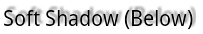
"Soft Shadow (Below)"
android:layout_height
=
"wrap_content"
android:padding
=
"2dp"
android:shadowColor
=
"@color/TransparentGrey"
android:shadowDx
=
"3"
android:shadowDy
=
"-3"
android:shadowRadius
=
"1.5"
/>
</
LinearLayout
>
|
效果如下:
它看起来是这样子的:
效果如图:


通过简单的改变阴影的颜色,我们也可以改变发光的效果。

下面有一个例子:

左边的文本很容易阅读,但是越靠近右边,背景颜色就与文本颜色相趋近了,到最后文本会与背景变得一致而难以阅读。让我们创建一个发光效果使得文本显出明显的差异。

最后有一点很重要的是,我们学了新的技术就值得去好好运用,但是这不意味着你要到处使用。对内容字体应用这种效果会导致它们变得更加难以阅读。 将这些花哨的效果限制在标题和独立的文本块中使用。
-------------------------------------------------------------------------------------
附录:+Kirill Grouchnikov 这篇文章中的方法有一个优点是:Android中为添加文本阴影并不会使文本边框增大。
文章中所有的例子都是android:padding="2dp",设置其他的阴影或许会出现阴影被裁减的现象(译者注:阴影偏移量过多,超出文本框范围的现象。因此偏移量要适中。:-))。一个具有大范围的阴影,或者较大的偏移量需要更多的padding以防止这种现象。(译者注:意为增加TextView的padding)
这篇文章的所有源码都可以在这里找到。
©Mark Allison. All rights reserved.这篇文章最早出现在 Styling Android。
此页的某些部分是基于Google的创造和共享内容,并使用知识共享许可协议3.0版(CreativeCommons 3.0 Attribution License)。


 1254
1254

 被折叠的 条评论
为什么被折叠?
被折叠的 条评论
为什么被折叠?
 到【灌水乐园】发言


