


selector
- selector的作用可以理解为将不同的显示效果应用到一个控件背景。而什么情况下应显示什么效果将根据控件当前状态变化来控制。可用状态有以下这几种,当然不是每个控件都有这么多状态,而是要根据我们控件具有的状态来,选择对应Item。(说这句话暴露了我的初级,没错我确实是菜鸟。。。)
有动作变化的控件一般有:按钮Button、复选框Checkbox、单选框RadioButton,输入框EditText、ListView的Item等。
<?xml version="1.0" encoding="utf-8"?>
<selector xmlns:android="http://schemas.android.com/apk/res/android">
    <item android:drawable="@drawable/shape_file_use_demo_4"/>
    <item android:drawable="@drawable/shape_file_use_demo_5" android:state_pressed="true"/>
    <!--
     android:state_focused=""  获得焦点时
     android:state_window_focused=""
    控件所在窗口是否获得焦点即在顶层显示,当窗口弹出窗口,或通知样被拉来来时,窗口失去焦点。
     android:state_enabled=""
     控件是否可用,控件是否可用通过enabled属性设置
     android:state_checkable=""
     android:state_checked=""
     是否选中:RadioButton、CheckBox
     android:state_selected=""
     用于ListView选中时效果和下拉框通过上下键上下移动选择时显示效果
     android:state_pressed=""
     按钮按下时显示效果,可以应用到很多控件上,Button/EditText/checkbox/radioButton等
     android:state_activated=""
     android:state_active=""
     android:state_single=""
     android:state_first=""
     android:state_middle=""
     android:state_last=""
     android:state_accelerated=""
     android:state_hovered=""
     android:state_drag_can_accept=""
     android:state_drag_hovered=""
     android:state_accessibility_focused=""
    -->
</selector>
在编写selector文件时,不小心的操作IDE提示以下信息,从以下信息可以看出,在解析应用该文件内容时,是从上至下依次匹配控件状态,若匹配以一个可用Item,则使用该Item,而不会寻找最优。所以一般默认显示效果一般都配制在最后面。
This item is unreachable because a previous item (item #1) is a more general match than this one
下面文章详细讲解了几种状态,说得很细,推介下:
http://blog.csdn.net/whyrjj3/article/details/7852761
示例
- 第一种方式:这种方式还是比较常用,单独定义各种状态下的显示图形,selector的作用不是把各种情况组合在一起,合法比较简单。
<?xml version="1.0" encoding="utf-8"?>
<selector xmlns:android="http://schemas.android.com/apk/res/android">
    <!--当按钮按下时显示背景,这是用shape标签自定义的图形,在上一节中可以找到shape_file_use_demo_5的内容,是一个渐变背景-->
    <item android:drawable="@drawable/shape_file_use_demo_5" android:state_pressed="true"/>
    <!--默认按钮显示背景-->
    <item android:drawable="@drawable/shape_file_use_demo_4"/>
</selector>- 第二种方式:把应该多个文件里的内容揉合一个文件中,这种方式会使得这个文件看起来较复杂一些。但也有它的好处:一是减少了应用资源文件数量,使应用在结构上比较简洁,二是资源文件上了,应用大小也应该所减小(自己猜想,并未实测)。
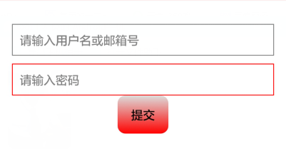
- 示例:自定义EditText边框,有焦点时显示红色,失去焦点时显示灰色边框。
<?xml version="1.0" encoding="utf-8"?>
<selector xmlns:android="http://schemas.android.com/apk/res/android">
    <item android:state_focused="true">
        <shape>
            <stroke android:width="1dp" android:color="@color/red"></stroke>
        </shape>
    </item>
    <item>
        <shape>
            <stroke android:width="1dp" android:color="@color/grey"></stroke>
        </shape>
       </item>
</selector>
显示效果


 3951
3951

 被折叠的 条评论
为什么被折叠?
被折叠的 条评论
为什么被折叠?
 到【灌水乐园】发言


