


使用flex进行页面布局非常方便,下面对flex的使用方法进行详细说明。
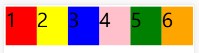
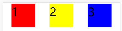
假如页面上有3个色块,我们通过flex操作这3个色块的布局。
<!DOCTYPE html>
<html lang="en">
<head>
    <meta charset="UTF-8">
    <title>flex</title>


    <style>
        html {
            font-size: 100px;
        }

        .container {
            display: flex;
            flex-direction: row;
        }

        .item_1 {
            width: 200px;
            height: 200px;
            background-color: red;
        }

        .item_2 {
            width: 200px;
            height: 200px;
            background-color: yellow;
        }

        .item_3 {
            width: 200px;
            height: 200px;
            background-color: blue;
        }

    </style>
</head>
<body>
<div class="container">
    <div class="item_1">1</div>
    <div class="item_2">2</div>
    <div class="item_3">3</div>
</div>
</body>
</html>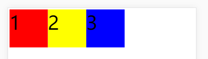
一、首先是父元素的6个属性
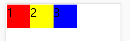
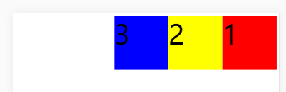
1、flex-direction 属性决定主轴的方向,它有4个值。
row:默认值,主轴为水平方向,起点在左端。row-reverse:主轴为水平方向,起点在右端。column:主轴为垂直方向,起点在上端。column-reverse:主轴为垂直方向,起点在下端。
.container {
    display: flex;
    flex-direction: row; /*默认*/
}
.container {
    display: flex;
    flex-direction: row-reverse;
}
.container {
    display: flex;
    flex-direction: column;
}
.container {
    display: flex;
    flex-direction: column-reverse;
}
2、flex-wrap 属性决定子元素在一行排不下的情况下是否换行,它有三种值。
nowrap:默认值,不换行。wrap:换行,第一行在主轴开始方向,依次往主轴结束方向布置。wrap-reverse:换行,第一行在主轴结束方向,依次往主轴结束方向布置
.container {
    display: flex;
    flex-wrap: nowrap;
}
.container {
    display: flex;
    flex-wrap: wrap;
}
.container {
    display: flex;
    flex-wrap: wrap-reverse;
}
3、flex-flow 属性是flex-direction属性和flex-wrap属性的简写形式,默认值为row nowrap。
.container {
    display: flex;
    flex-flow: row nowrap;
}
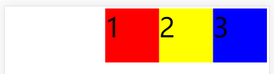
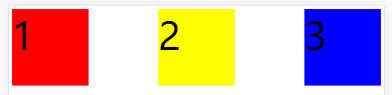
4、justify-content 属性定义了子元素在主轴上的对齐方式,它有五个值。
flex-start:默认值,主轴开始方向对齐。flex-end:主轴结束方向对齐。center:主轴居中对齐。space-between:两端对齐,子元素之间间隔都相等。space-around:每个子元素两侧的间隔相等,所以子元素之间间隔是子元素与边框间隔的两倍。
.container {
    display: flex;
    justify-content: flex-start;
}
.container {
    display: flex;
    justify-content: flex-end;
}
.container {
    display: flex;
    justify-content: center;
}
.container {
    display: flex;
    justify-content: space-between;
}
.container {
    display: flex;
    justify-content: space-around;
}
5、align-items 属性定义了每行子元素在交叉轴方向上的对齐方式,它有五个值。
flex-start:交叉轴开始方向对齐。- flex-end:交叉轴结束方向对齐。
- center:交叉轴居中对齐。
- baseline:子元素第一行文字的基线对齐 。
- stretch:默认值,如果子元素未设置高度或高度设为auto,将占满整个容器。
.container {
    height: 500px;
    background-color: #ccc;
    display: flex;
    align-items: flex-start;
}
.container {
    height: 500px;
    background-color: #ccc;
    display: flex;
    align-items: flex-end;
}
.container {
    height: 500px;
    background-color: #ccc;
    display: flex;
    align-items: center;
}
.container {
    height: 500px;
    background-color: #ccc;
    display: flex;
    align-items: baseline;
}
.container {
    height: 500px;
    background-color: #ccc;
    display: flex;
    align-items: stretch;
}
6、align-content 属性定义了容器在交叉轴方向上有额外空间时,如何排布每一行,当容器只有一行时,它不起作用,它有六个值。
flex-start:交叉轴开始方向对齐。flex-end:交叉轴结束方向对齐。center:交叉轴中心中对齐。space-between:与交叉轴两端对齐,每行轴线间隔平均。space-around:每根轴线两侧间隔相等。stretch:默认值,占满整个整个交叉轴。
.container {
    height: 500px;
    background-color: #ccc;
    display: flex;
    flex-wrap: wrap;
    align-content: flex-start;
}
.container {
    height: 500px;
    background-color: #ccc;
    display: flex;
    flex-wrap: wrap;
    align-content: flex-end;
}
.container {
    height: 500px;
    background-color: #ccc;
    display: flex;
    flex-wrap: wrap;
    align-content: center;
}
.container {
    height: 500px;
    background-color: #ccc;
    display: flex;
    flex-wrap: wrap;
    align-content: space-between;
}
.container {
    height: 500px;
    background-color: #ccc;
    display: flex;
    flex-wrap: wrap;
    align-content: space-around;
}
.container {
    height: 500px;
    background-color: #ccc;
    display: flex;
    flex-wrap: wrap;
    align-content: stretch;
}
二、其次是子元素的6个属性
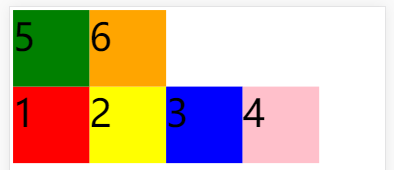
1、order 属性定义子元素的排列顺序,数值越小排列越靠前,默认为0,可能的值为任意整数。
        .container {
            height: 500px;
            background-color: #ccc;
            display: flex;
        }

        .item_1 {
            width: 200px;
            height: 200px;
            background-color: red;
            order: 3;
        }

        .item_2 {
            width: 200px;
            height: 200px;
            background-color: yellow;
            order: 2;
        }
2、flex-grow 属性定义子元素的放大比例,默认为0,即如果存在剩余空间也不放大。如果所有子元素的flex-grow属性都为1,则它们将等分剩余空间(如果有的话)。如果一个子元素的flex-grow属性为2,其他子元素都为1,则前者占据的剩余空间将比其他子元素多一倍。
        .item_1 {
            width: 200px;
            height: 200px;
            background-color: red;
            flex-grow: 1;
        }
        .item_1 {
            width: 200px;
            height: 200px;
            background-color: red;
            flex-grow: 2;
        }

        .item_2 {
            width: 200px;
            height: 200px;
            background-color: yellow;
            flex-grow: 1;
        }

        .item_3 {
            width: 200px;
            height: 200px;
            background-color: blue;
            flex-grow: 1;
        }
3、flex-shrink 属性定义了子元素的缩小比例,默认为1,即如果空间不足该子元素将缩小。负值对该属性无效,即该属性可能的值为0或正整数。如果所有子元素的flex-shrink属性都为1,当空间不足时,都将等比例缩小。如果一个子元素的flex-shrink属性为0,其他项目都为1,则空间不足时,前者不缩小。
        .item_1 {
            width: 200px;
            height: 200px;
            background-color: red;
            flex-shrink: 0;
        }
4、flex-basis 属性定义了在分配多余空间之前,子元素占据的主轴空间(main-size)。浏览器根据整个属性,计算主轴是否有多余空间。它的默认值为auto,即子元素的本来大小。它可以设为跟width或height属性一样的值(比如400px),则子元素将占据固定空间。(flex-basis优先级高于width属性,如果没有设置flex-basis,子元素的值其实就是width的值,但是flex-basis受max-width和min-width限制。)
        .item_1 {
            width: 200px;
            height: 200px;
            background-color: red;
            flex-basis: 400px;
        }
5、flex 属性是flex-grow, flex-shrink 和 flex-basis的简写,默认值为0 1 auto。后两个属性可选。该属性有两个快捷值:auto (1 1 auto)(既可以放大占满空间,也可缩小) 和 none (0 0 auto)(不可放大,也不可缩小)。建议优先使用这个属性,而不是单独写三个分离的属性,因为浏览器会推算相关值。
        .item_1 {
            width: 200px;
            height: 200px;
            background-color: red;
            flex: auto;
        }
6、align-self属性允许单个子元素有与其他子元素不一样的侧轴对齐方式,可覆盖align-items属性。默认值为auto,表示继承父元素的align-items属性,如果没有父元素,则等同于stretch。其值除auto外,其他与align-items完全一致。
        .container {
            height: 500px;
            background-color: #ccc;
            display: flex;
            align-items: flex-start;
        }

        .item_1 {
            width: 200px;
            height: 200px;
            background-color: red;
            align-self: flex-end;
        }
OK,差不多就这么多了。


 476
476


 被折叠的 条评论
为什么被折叠?
被折叠的 条评论
为什么被折叠?
 到【灌水乐园】发言


