


1. 容器内 居中
<!DOCTYPE html>
<html>
<head>
<meta charset="utf-8">
<meta http-equiv="X-UA-Compatible" content="IE=edge,chrome=1">
<title>center</title>
<meta name="description" content="">
<meta name="keywords" content="">
<link href="" rel="stylesheet">
<!-- 移动设备兼容 -->
<meta content="width=device-width, initial-scale=1.0, maximum-scale=1.0, user-scalable=0" name="viewport" />
<meta content="yes" name="apple-mobile-web-app-capable" />
<meta content="black" name="apple-mobile-web-app-status-bar-style" />
<meta content="telephone=no" name="format-detection" />
</head>
<style>
.center-wp{
position:relative; /*父级relative定位*/
height:200px;/*父级高度元素需设置,因子元素为absolute定位,无法撑开父级高度*/
background:#999;
margin-top:200px;
}
.center-content{
position:absolute;
top:0;
left:0;
right:0;
bottom:0;
height:60%; /*必须设置高度,百分比或绝对值*/
overflow: auto;/*超出内容滚动显示*/
margin:auto 3%;/*恰当的边距*/
background:#fff;
}
</style>
<body>
<div class="center-wp">
<div class="center-content">
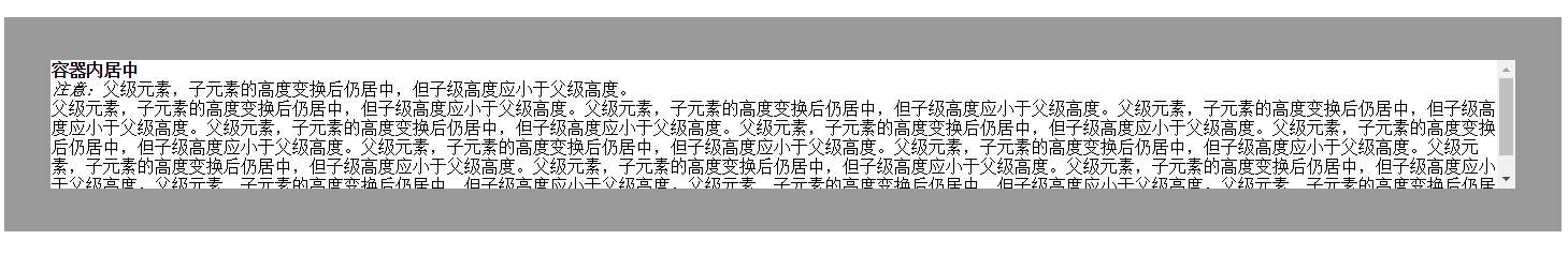
<b>容器内居中</b><br>
<em>注意:</em>父级元素,子元素的高度变换后仍居中,但子级高度应小于父级高度。<br>
父级元素,子元素的高度变换后仍居中,但子级高度应小于父级高度。父级元素,子元素的高度变换后仍居中,但子级高度应小于父级高度。父级元素,子元素的高度变换后仍居中,但子级高度应小于父级高度。父级元素,子元素的高度变换后仍居中,但子级高度应小于父级高度。父级元素,子元素的高度变换后仍居中,但子级高度应小于父级高度。父级元素,子元素的高度变换后仍居中,但子级高度应小于父级高度。父级元素,子元素的高度变换后仍居中,但子级高度应小于父级高度。父级元素,子元素的高度变换后仍居中,但子级高度应小于父级高度。父级元素,子元素的高度变换后仍居中,但子级高度应小于父级高度。父级元素,子元素的高度变换后仍居中,但子级高度应小于父级高度。父级元素,子元素的高度变换后仍居中,但子级高度应小于父级高度。父级元素,子元素的高度变换后仍居中,但子级高度应小于父级高度。父级元素,子元素的高度变换后仍居中,但子级高度应小于父级高度。父级元素,子元素的高度变换后仍居中,但子级高度应小于父级高度。父级元素,子元素的高度变换后仍居中,但子级高度应小于父级高度。
</div>
</div>
</body>
</html>效果:
2. 可视范围内 居中
<!DOCTYPE html>
<html>
<head>
<meta charset="utf-8">
<meta http-equiv="X-UA-Compatible" content="IE=edge,chrome=1">
<title>center</title>
<meta name="description" content="">
<meta name="keywords" content="">
<link href="" rel="stylesheet">
<!-- 移动设备兼容 -->
<meta content="width=device-width, initial-scale=1.0, maximum-scale=1.0, user-scalable=0" name="viewport" />
<meta content="yes" name="apple-mobile-web-app-capable" />
<meta content="black" name="apple-mobile-web-app-status-bar-style" />
<meta content="telephone=no" name="format-detection" />
</head>
<style>
.center-wp{
position:fixed; /*父级全屏fixed定位*/
height:100%;
width:100%;
top:0;
left:0;
background:#999;
}
.center-content{
position:absolute;
top:0;
left:0;
right:0;
bottom:0;
height:100px; /*必须设置高度,百分比或绝对值*/
width:50%;
overflow: auto;/*超出内容滚动显示*/
margin:auto 25%;/*恰当的边距*/
background:#fff;
}
</style>
<body>
<div class="center-wp">
<div class="center-content">
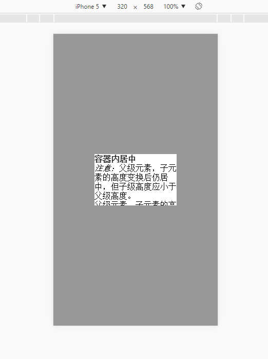
<b>容器内居中</b><br>
<em>注意:</em>父级元素,子元素的高度变换后仍居中,但子级高度应小于父级高度。<br>
父级元素,子元素的高度变换后仍居中,但子级高度应小于父级高度。父级元素,子元素的高度变换后仍居中,但子级高度应小于父级高度。父级元素,子元素的高度变换后仍居中,但子级高度应小于父级高度。父级元素,子元素的高度变换后仍居中,但子级高度应小于父级高度。父级元素,子元素的高度变换后仍居中,但子级高度应小于父级高度。父级元素,子元素的高度变换后仍居中,但子级高度应小于父级高度。父级元素,子元素的高度变换后仍居中,但子级高度应小于父级高度。父级元素,子元素的高度变换后仍居中,但子级高度应小于父级高度。父级元素,子元素的高度变换后仍居中,但子级高度应小于父级高度。父级元素,子元素的高度变换后仍居中,但子级高度应小于父级高度。父级元素,子元素的高度变换后仍居中,但子级高度应小于父级高度。父级元素,子元素的高度变换后仍居中,但子级高度应小于父级高度。父级元素,子元素的高度变换后仍居中,但子级高度应小于父级高度。父级元素,子元素的高度变换后仍居中,但子级高度应小于父级高度。父级元素,子元素的高度变换后仍居中,但子级高度应小于父级高度。
</div>
</div>
</body>
</html>效果:
3. display:table居中
兼容性:IE8及以上
(1).父元素有宽高限制,如下:
<style>
    .parent{
        background:#333;
        width:300px;
        height:300px;
        padding:10px; /*父元素、子元素中间的内边距(效果图中的黑色边框)*/
        display:table;
        text-align:center;
    }
    .parent .child{
        background:#999;
        **display:table-cell;
        vertical-align:middle;**
    }
</style>
</head>
<body>
    <div class="parent">
        <div class="child">
            <p>child</p>
            <img src="https://www.baidu.com/img/baidu_jgylogo3.gif" alt="">
        </div>
    </div>
</body>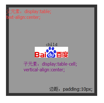
(2).父元素没宽高限制,如下:
<style>
    .parent{
        background:#333;
        display:table;
        text-align:center;
    }
    .parent .child{
        background:#999;
        display:table-cell;
        vertical-align:middle;
        padding:50px 30px; /*子元素内边距离撑开父元素宽高,上=下、左=右*/
    }
</style>
</head>
<body>
    <div class="parent">
        <div class="child">
            <p>child</p>
            <img src="https://www.baidu.com/img/baidu_jgylogo3.gif" alt="">
        </div>
    </div>
</body>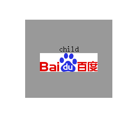
(2).父元素100%宽高,子元素始终垂直居中,如下:(常用于弹窗提示)
HTML/CSS:
<style>
    *{margin:0;padding:0;}
    .pop{position:fixed;width:100%;height:100%;top:0;left:0;background:rgba(255,255,0,.4);display:table;}
    .pop-content-box{display:table-cell;vertical-align:middle;text-align:center;padding:10px;}
    .pop-content{display:inline-block;padding:10px;background:rgba(0,0,0,.4);border-radius:5px;}
</style>
<input type="button" value="提示" onclick = showPop('用户名不能为空!')>
JS
<script>
    function showPop(msg){
        if($('.pop').length <= 0){
            $('body').append('<div class="pop" style="display:Done"><div class="pop-content-box"><span class="pop content">'+ msg +'</span></div></div>') ;
        }
        $('.pop').fadeIn();
        $('.pop-content').html(msg);

        // 定时器
        var t = setTimeout(function(){
            $('.pop').fadeOut();
        },2000)
    };
</script>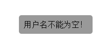
父元素100%宽高,子元素有具体宽高值(百分比或像素都行):
<!--HTML-->
<div class="parent">
    <div class="child">content here</div>
</div>

<!--CSS-->
.parent{position: fixed;top:0;bottom:0;left:0;right:0;z-index:2;width:100%;height:100%;background:rgba(0,0,0,.5);}
.child{position:absolute;top:0;bottom:0;left:0;right:0;z-index:3;margin:auto;width:50%;height:200px;background:#fff;}


 1092
1092

 被折叠的 条评论
为什么被折叠?
被折叠的 条评论
为什么被折叠?
 到【灌水乐园】发言


