


目录
一.常用属性介绍
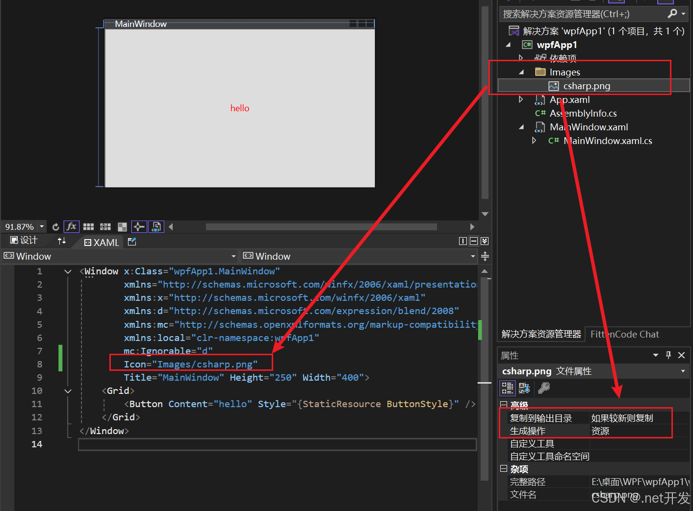
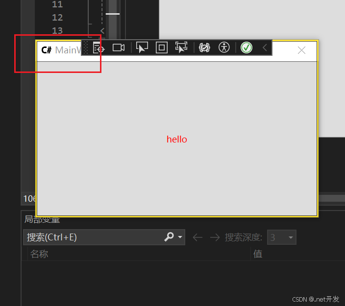
- Icon: 指定窗口的图标
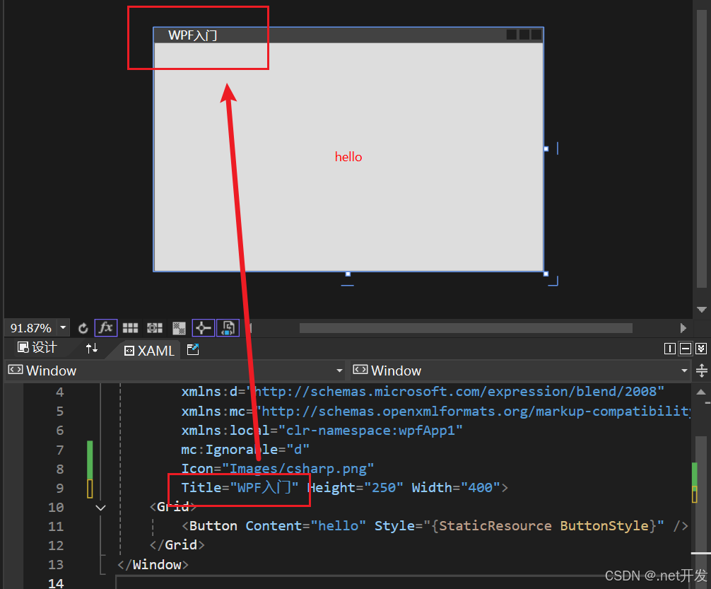
- Title: 窗口标题
- WindowStyle:控制界面边框样式
- None-无边框 (窗口无法拖动)
- SingleBorderWindow-单边框(默认)
- ThreeDBorderWindow-3D边框
- ToolWindow-工具箱窗口(只有标题和删除界面图标)
- ResizeMode:指定窗口大小调节样式
- NoResize:不能调节、并且没有窗口最大最小按钮
- CanMinimize:不能调节,有最小化按钮
- CanResize:可调节(默认)
- CanResizeWithGrip: 可根据网格调节
- Topmost: 调节窗口前后顺序,为true时窗口位于最前,都为true时根据顺序决定
- Height、Width、MaxHeight、MaxWidth:高度、宽度、最大高度、最大宽度
- SizeToContent:表示窗体大小决定方式
- Manual:手工决定(可以自由改变)
- Width:宽度决定
- Height:高度决定
- WidthAndHeight:内容决定
- Visibility:窗口可见性
- Visible:可见
- Hidden:隐藏
- Collapsed:折叠
- WindowState: 窗口状态
- Normal:正常
- Maximized:最大化
- Minimized:最小化
- WindowStartupLocation:窗口启动时位置
- CenterScreen:正中间
二、 程序退出方式
- close():关闭当前窗口
private void Button_Close(object sender, RoutedEventArgs e)
{
    this.Close();
}- Application.Current.Shutdown():关闭UI,但后台进程没有关闭,只到所有后台进程关闭才关闭
private void Button_Exit(object sender, RoutedEventArgs e)
{
    Application.Current.Shutdown();
}- Environment.Exit(0):强制退出(不会执行finally,但是会进行资源清理)
private void Button_Exit(object sender, RoutedEventArgs e)
{
   Environment.Exit(0);
}- Process.GetCurrentProcess().Kill():强制退出(不会进行资源清理)
private void Button_Exit(object sender, RoutedEventArgs e)
{
    Process.GetCurrentProcess().Kill();
}
三、布局样式
3.1 Panel的附加属性ZIndex
当我们在Grid中定义两个Button的时候,我们可以看到只会显示出按钮2,因为两个按钮重叠在了一起,那么如果我们要自由选择显示哪一个按钮改怎么实现呢?
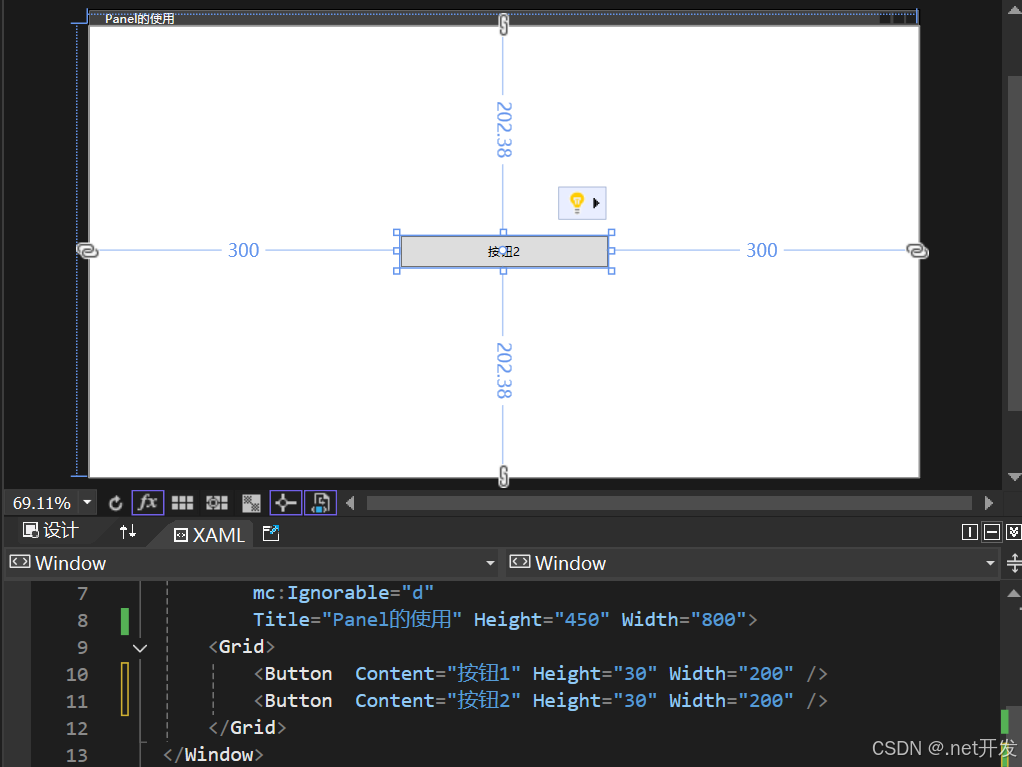
我们在Button中加上Panel的附加属性ZIndex后,就可以根据值的大小选择需要显示的内容,比如下面的代码展示的效果则是按钮1被显示
<Grid>
    <Button Panel.ZIndex="1" Content="按钮1" Height="30" Width="200" />
    <Button Panel.ZIndex="0" Content="按钮2" Height="30" Width="200" />
</Grid>
3.2 Grid(网格)布局
- 定义行和列
   <Grid ShowGridLines="True">
       <!--两行-->
       <Grid.RowDefinitions>
           <RowDefinition />
           <RowDefinition />
       </Grid.RowDefinitions>
       <!--两列-->
       <Grid.ColumnDefinitions>
           <ColumnDefinition />
           <ColumnDefinition />
       </Grid.ColumnDefinitions>

       <!--不写默认是第一行 or 第一列-->
       <TextBlock Text="文本1" />
       <!--Grid.Row: 哪一行 Grid.Column:那一列-->
       <TextBlock Grid.Row="1" Grid.Column="0" Text="文本2" />
       <TextBlock Grid.Row="0" Grid.Column="1" Text="文本3" />
       <TextBlock Grid.Row="1" Grid.Column="1" Text="文本4" />
   </Grid>
- 合并行和合并列
<Grid ShowGridLines="True">
    <!--两行-->
    <Grid.RowDefinitions>
        <RowDefinition />
        <RowDefinition />
    </Grid.RowDefinitions>
    <!--两列-->
    <Grid.ColumnDefinitions>
        <ColumnDefinition />
        <ColumnDefinition />
    </Grid.ColumnDefinitions>

    <!--Grid.ColumnSpan:合并列  Grid.RowSpan:合并行-->
    <TextBlock Grid.ColumnSpan="2" Text="合并列" VerticalAlignment="Center" HorizontalAlignment="Center" />
    <TextBlock Grid.RowSpan="2" Text="合并行" VerticalAlignment="Center" HorizontalAlignment="Center" />
</Grid>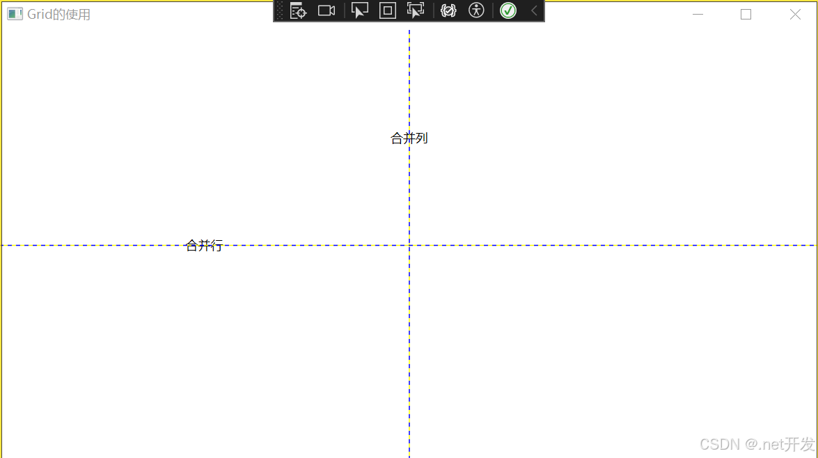
- 设置行和列高度的几种方式
1. 给具体的值
<Grid.RowDefinitions>
    <RowDefinition Height="120" />
    <RowDefinition />
</Grid.RowDefinitions>
2. 根据内容大小自动变换
<Grid.RowDefinitions>
    <RowDefinition Height="Auto" />
    <RowDefinition />
</Grid.RowDefinitions>
3. 设置比例
如下表示将整个网格设置为8等份,第一行占3份,第二行占五份
<Grid.RowDefinitions>
<RowDefinition Height="3*" />
<RowDefinition Height="5*" />
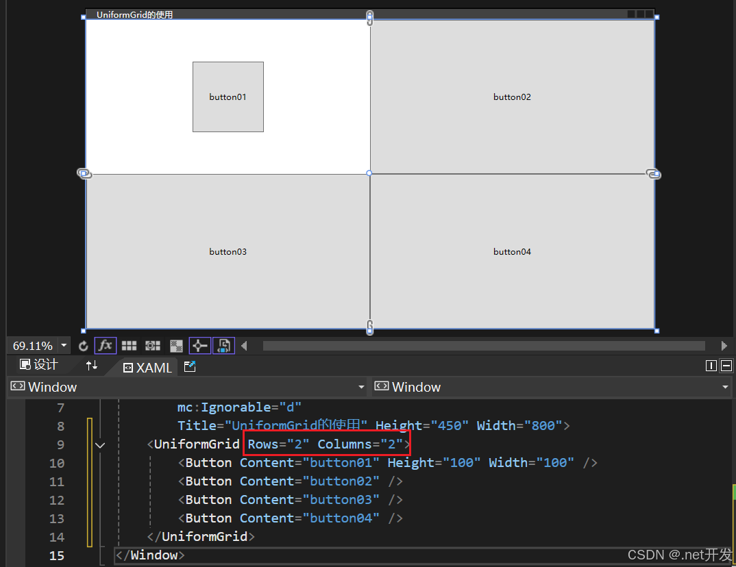
</Grid.RowDefinitions>3.3 UniformGrid(均分布局)
UniformGrid与Grid网格布局十分相似,只是UniformGrid的每个单元格面积都是相等的,单元格会平分整个UniformGrid。
- 定义一个两行两列的单元格
定义方式特别简单,只需要在UniformGrid中设置Rows和Columns即可
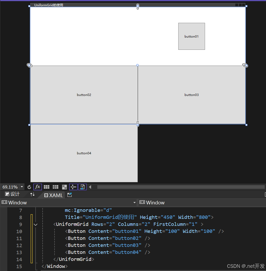
- FirstColumn属性的使用
FirstColumn代表第一行我要空多少格,被挤掉的格子会在布局外部显示,但是运行项目的时候是看不到的
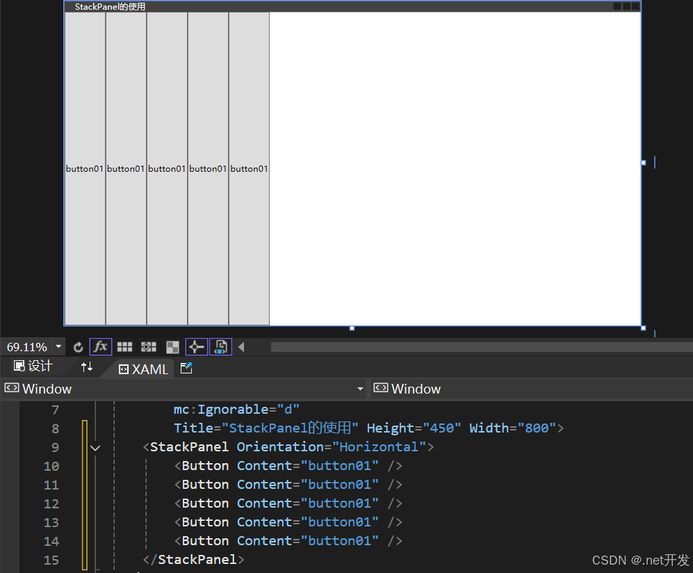
3.4 StackPanel(堆积面板)
StackPanel用于水平或者垂直堆叠子元素
<StackPanel>
    <Button Content="button01" />
    <Button Content="button01" />
    <Button Content="button01" />
    <Button Content="button01" />
    <Button Content="button01" />
</StackPanel>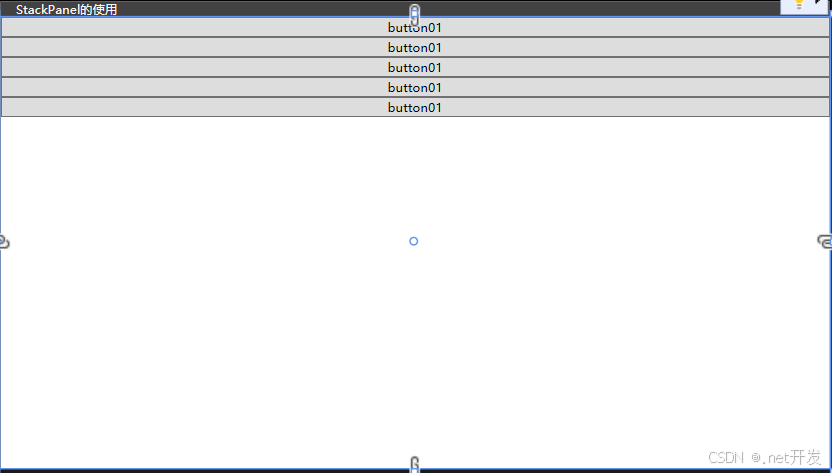
设置Orientation="Horizontal"后
3.5 WrapPanel(换行面板)
当一行或者一列内容放不下时,自动切换到另一行或另一列,提供了三个参数:Orientation-设置排列方式,ItemWidth-设置子项宽度,ItemHeight-设置子项高度
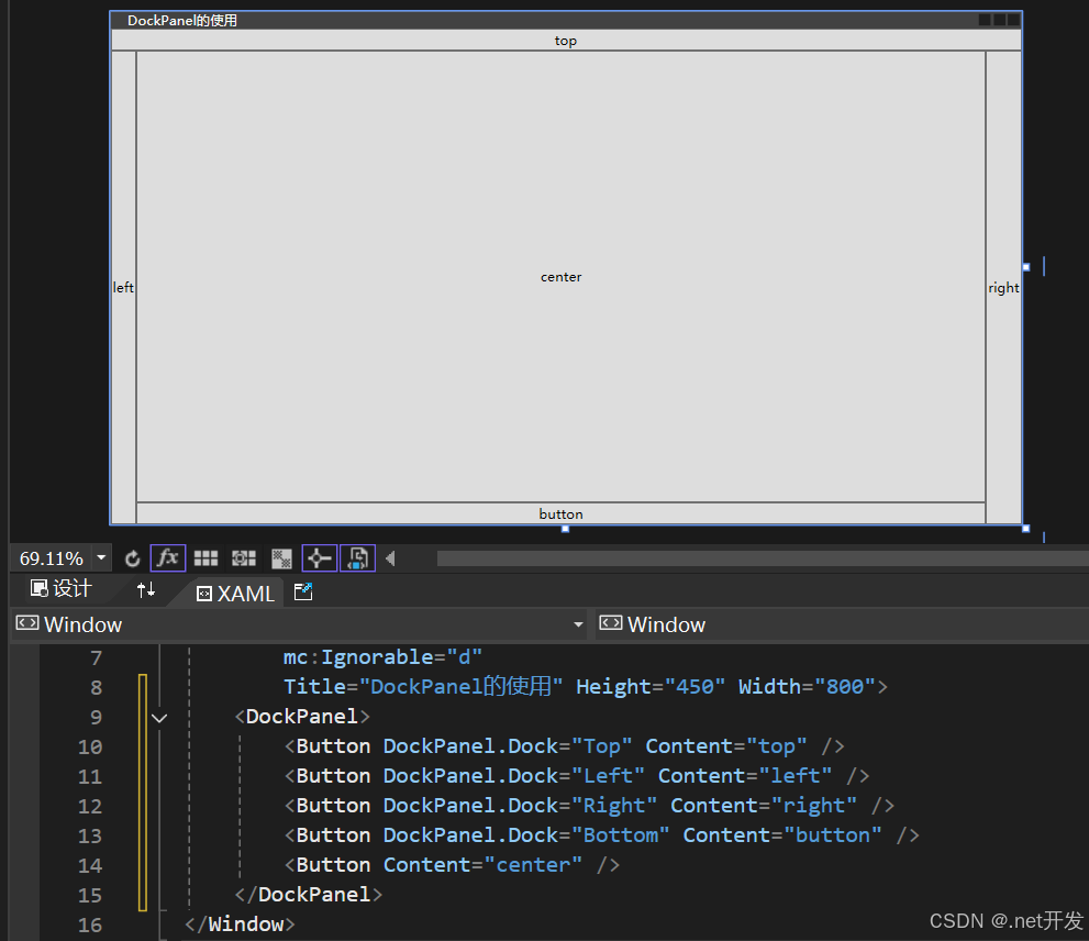
3.6 DockPanel(停靠面板)
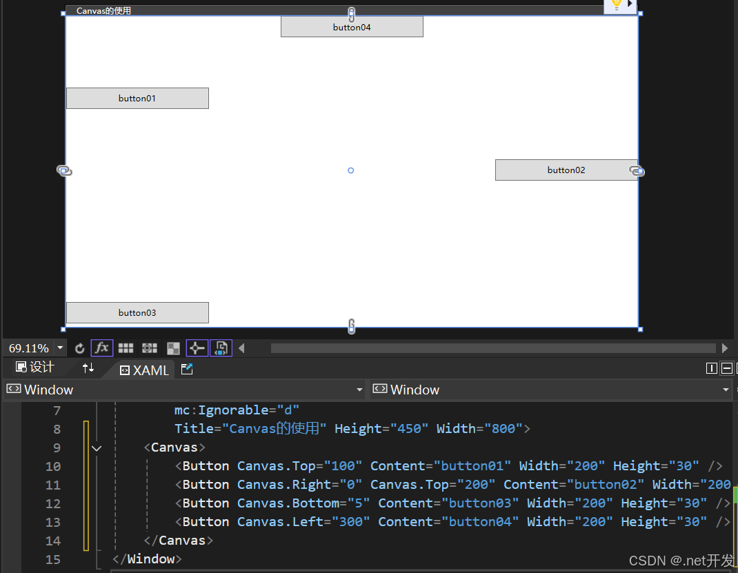
3.7 Canvas(画布布局)
3.8 个性化Border
<Canvas>
    <!--BorderThickness:边框厚度,可以设置为BorderThickness="左,上,右,下" BorderBrush:边框颜色 CornerRadius:边框圆角-->
    <Border Canvas.Left="20" Canvas.Top="20" BorderThickness="1" Width="100" Height="30" BorderBrush="red">
        <TextBlock Text="button" VerticalAlignment="Center" HorizontalAlignment="Center" />
    </Border>
    <Border Canvas.Left="20" Canvas.Top="80" BorderThickness="1" Width="100"
            Height="30" BorderBrush="Blue" CornerRadius="10" Background="Coral">
        <TextBlock Text="button" VerticalAlignment="Center" HorizontalAlignment="Center" />
    </Border>

    <!--需要注意,设置圆的时候长和宽需要一样,并且CornerRadius >= Width/2 or Height/2 -->
    <Border Canvas.Left="20" Canvas.Top="150" BorderThickness="1" Width="100" Height="100"
            BorderBrush="Green" Background="Yellow" CornerRadius="50">
        <TextBlock Text="button" VerticalAlignment="Center" HorizontalAlignment="Center" />
    </Border>
</Canvas>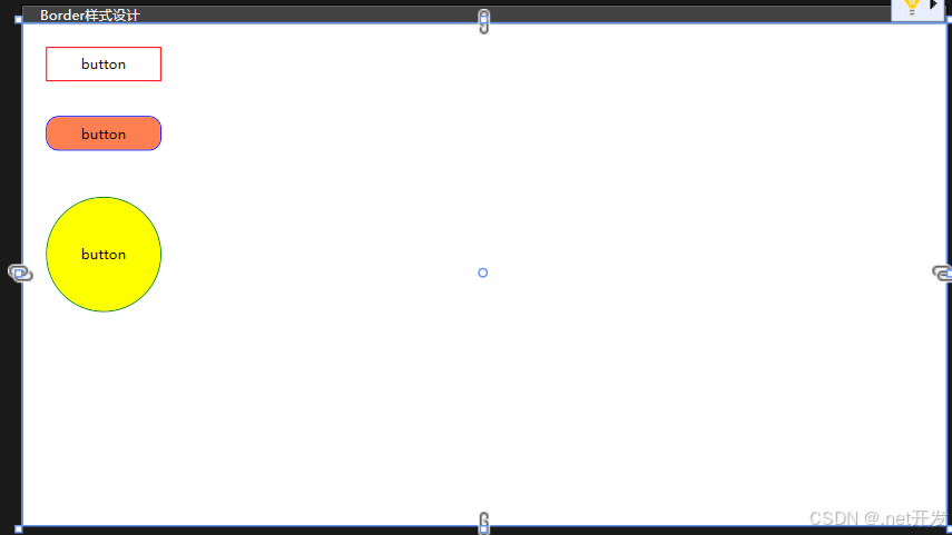
3.9 GridSplitter(分割窗口)
GridSplitter用于分割窗口的布局,可以通过鼠标实现左右或者上下的拖动
使用注意事项:
- 该属性必须在Grid布局中使用。
- 如果要实现左右拖动改变窗口的大小需要设置HorizontalAlignment="Center";
- 如果要实现上下拖动改变窗口的大小需要设置VerticalAlignment="Center";
- 默认是实时查看改变大小,当设置ShowsPreview="True"时,鼠标取消拖动后才会显示。
<Grid>
    <Grid.ColumnDefinitions>
        <ColumnDefinition />
        <ColumnDefinition Width="Auto" />
        <ColumnDefinition />
    </Grid.ColumnDefinitions>

    <Border Background="Aqua">
        <!--TextWrapping="Wrap": 自动换行-->
        <TextBlock TextWrapping="Wrap">
        1111111111111111111111111111111111111111111111
        </TextBlock>
    </Border>

    <GridSplitter Grid.Column="1" Width="5" HorizontalAlignment="Center" ShowsPreview="True" />

    <Border Grid.Column="2" Background="Yellow">
        <TextBlock TextWrapping="Wrap">
         2222222222222222222222222222222222222222222222222222222
        </TextBlock>
    </Border>
</Grid>
四、内容控件
4.1 Control类
Control类是很多控件的基类,而内容控件与布局控件的不同在于布局控件专注于界面设计,内容控件专注于数据。
Control在界面上不会有任何的显示,但是Control提供了一个控件模板Control.Template,几乎所有子类对Control.Template都进行了各自的实现,所以只有继承了Control的子类才会在界面上显示。
<Control>
    <Control.Template>
        <ControlTemplate TargetType="Control">
            <Border Width="200" Height="200" Background="Yellow" CornerRadius="100">
                <TextBlock Text="button" VerticalAlignment="Center" HorizontalAlignment="Center">

                </TextBlock>
            </Border>
        </ControlTemplate>
    </Control.Template>
</Control>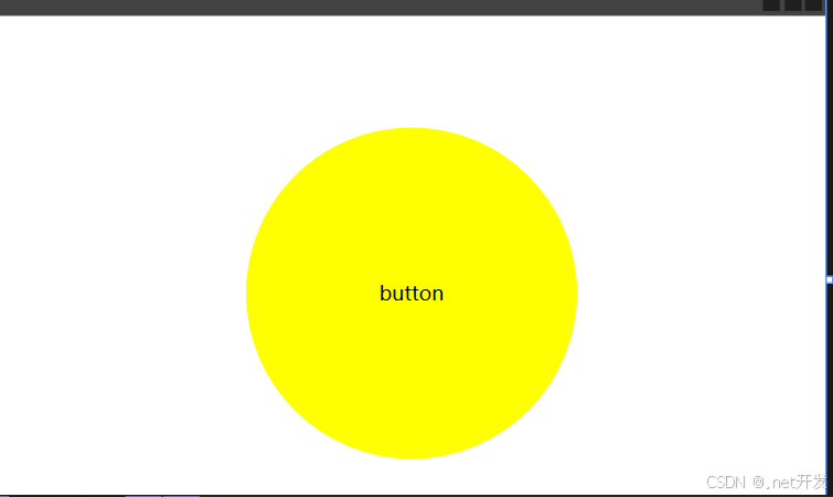
4.2 Button按钮
Button按钮自带的有三个属性:
- IsDefault:表示该Button是一个默认按钮,可以直接通过Enter键调用
- IsCancel:表示该Button是一个取消按钮,可以通过Esc键直接调用
- IsDefaulted:表示是否在用户按下Enter后才激活的按钮
Button自定义样式:
<Canvas>
    <Button Width="120" Height="30" Content="圆角按钮" Canvas.Left="50" Canvas.Top="50">
        <Button.Template>
            <ControlTemplate TargetType="Button">
                <!--TemplateBinding BorderBrush: 获取边框默认的颜色-->
                <Border CornerRadius="15" BorderBrush="{TemplateBinding BorderBrush}" BorderThickness="1" Background="Yellow">
                    <Grid>
                        <Grid.ColumnDefinitions>
                            <ColumnDefinition Width="Auto" />
                            <ColumnDefinition />
                        </Grid.ColumnDefinitions>

                        <Image Source="Images/csharp.png" Width="60" Height="20" />
                        <!--ContentPresenter:自动获取Button中content的值-->
                        <ContentPresenter Grid.Column="1" VerticalAlignment="Center" HorizontalAlignment="Center" />
                    </Grid>
                </Border>
            </ControlTemplate>
        </Button.Template>
    </Button>
</Canvas>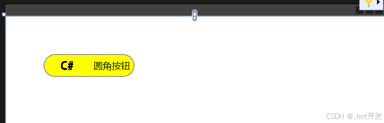
4.3 CheckBox复选框
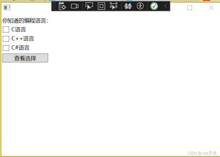
我们在StackPanel布局中定义三个复选框,为每个复选框绑定OnCheck检查事件,判断该复选框是被被选择,然后定义一个Button,绑定事件Show
<StackPanel x:Name="Select">
    <TextBlock Text="你知道的编程语言:" Margin="5,5,0,0" />
    <CheckBox Content="C语言" Checked="OnCheck" Margin="5,5,0,0" />
    <CheckBox Content="C++语言" Checked="OnCheck" Margin="5,5,0,0" />
    <CheckBox Content="C#语言" Checked="OnCheck" Margin="5,5,0,0" />

    <Button Content="查看选择" Width="100" HorizontalAlignment="Left" Margin="5,5,0,0" Click="Show" />
</StackPanel>
private void Show(object sender, RoutedEventArgs e)
{
StringBuilder show = new StringBuilder();
// 遍历Select下的所有子控件,Select是我在xaml中给Pannel布局定义的名字
foreach (var item in Select.Children)
{
if (item is CheckBox)
{
// 判断是否选中
if ((item as CheckBox).IsChecked == true)
{
show.Append((item as CheckBox).Content + " ");
}
}
}
if (show.Length > 0)
{
MessageBox.Show(show.ToString());
}
}
private void OnCheck(object sender, RoutedEventArgs e)
{
int total = 0;
foreach (var item in Select.Children)
{
if (item is CheckBox)
{
total += (item as CheckBox).IsChecked == true? 1 : 0;
}
}
// 最多选择两个
if (total > 2)
{
// sender: 是当前选中的CheckBox
var cbx = sender as CheckBox;
if (cbx.IsChecked == true) // 判断是否是选中状态
{
cbx.IsChecked = false;
MessageBox.Show("最多只能选两个");
}
}
}
4.4 RadioButton单选框
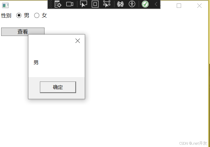
<StackPanel>
    <StackPanel Orientation="Horizontal" x:Name="Select">
        <TextBlock Text="性别" Margin="5,0,0,0" />
        <!--GroupName用于对单选框进行分组-->
        <RadioButton Content="男" GroupName="sex" Margin="10,0,0,0" />
        <RadioButton Content="女" GroupName="sex" Margin="10,0,0,0" />
    </StackPanel>

    <Button Content="查看" Width="100" HorizontalAlignment="Left" Margin="5,20,0,0" Click="Show" />
</StackPanel>
private void Show(object sender, RoutedEventArgs e)
{
foreach (var sex in Select.Children)
{
if (sex is RadioButton { IsChecked: true } str)
{
MessageBox.Show(str.Content.ToString());
}
}
}
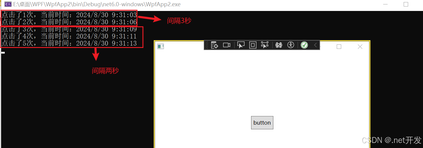
4.5 RepeatButton重复按钮
这个按钮事件是当我们按下鼠标后会一直重复执行,直到我们松开鼠标键,其中具有两个重要的属性:
- Delay:点击后隔多久开始重复执行
- Interval:重复执行函数的间隔时间
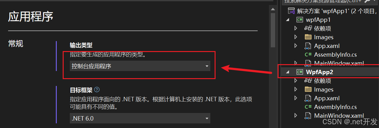
注意:想要打开控制台查看输出效果需要设置:鼠标右键点击你的解决方案,选择【属性】--> 输出类型修改为控制台应用程序
<Grid>
   <RepeatButton Width="50" Height="30" Content="button" Click="repeatButton" Delay="3000" Interval="2000" />
</Grid>
private int total = 0;
private void repeatButton(object sender, RoutedEventArgs e)
{
Console.WriteLine($"点击了{++total}次,当前时间:{DateTime.Now}");
}
4.6 Label控件
4.6.1 Label直接显示文本
当我们在Label中添加Content时,Label实际上会在内部创建一个TextBlock来显示我们的内容,但是Label会默认为其加上边距
<StackPanel>
    <Label Content="hello" />
</StackPanel>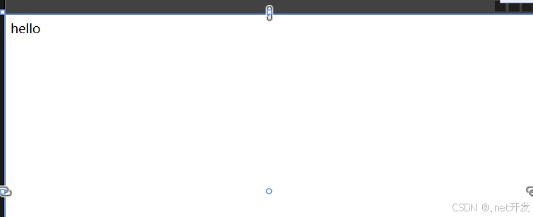
4.6.2 label和访问修饰符
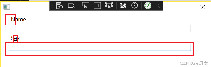
当我们设置了访问修饰符后,程序运行时我们按住【Alt】键,被我们修饰的子元符会高亮显示,通过【Alt】+"所设置的字符"可以将焦点切换到对应的Label中。
<StackPanel>
    <!--_后面的字符就是被我们修饰的字符,可以放在任何字符的前面-->
    <Label Margin="20,0,0,0" Content="_Name" Target="{Binding ElementName=txtName}" />
    <TextBox x:Name="txtName" Margin="20,0,50,0" />
    <Label Margin="20,0,0,0" Content="S_ex" Target="{Binding ElementName=txtSex}" />
    <TextBox x:Name="txtSex" Margin="20,0,50,0" />
</StackPanel>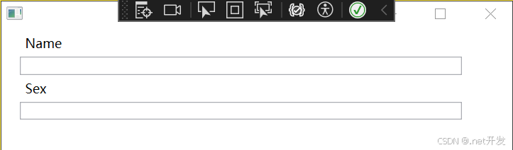
此时运行项目,点击【Alt】,会将我们修饰的字符通过下划线的方式进行显示,如果我们再按“e”,焦点会在Sex中。
4.6.3 使用控件作为Label的内容
<StackPanel>
    <!--Binding ElementName=txtName:绑定需要被聚焦的文本框-->
    <Label Target="{Binding ElementName=txtName}">
        <StackPanel Orientation="Horizontal" Margin="50,0">
            <Image Source="Images/csharp.png" Width="20" Height="20" />
            <!--AccessText才可以定义访问键-->
            <AccessText Text="_CSharp" VerticalAlignment="Center" />
        </StackPanel>
    </Label>
    <TextBox x:Name="txtName" Margin="50,0" />
</StackPanel>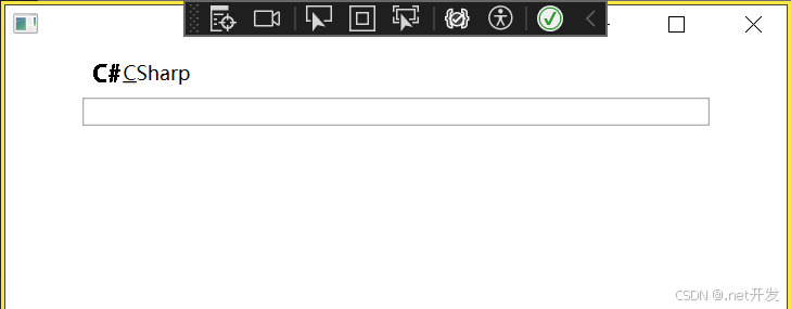
4.7 TextBox
在TextBox中具有许多的属性,下面我列举一些比较常用的
| MinLines | 最小可见行数 |
| MaxLines | 最大可见行数 |
| Text | 文本内容 |
| CharacterCasing | 是否转换成大小写 |
| VerticalScrollBarVisibility | 是否显示拉条 |
| MaxLength | 一行的最大字符长度 |
| TextAlignment | 设置文本水平方向位置 |
| VerticalContentAlignment | 设置文本垂直方向位置 |
| TextWrapping | 是否自动换行 |
4.8 PasswordBox密码框
- PasswordChar:改变密码框中内容默认显示符号
- PasswordChanged: 密码改变时执行事件
<StackPanel Margin="20">
<PasswordBox />
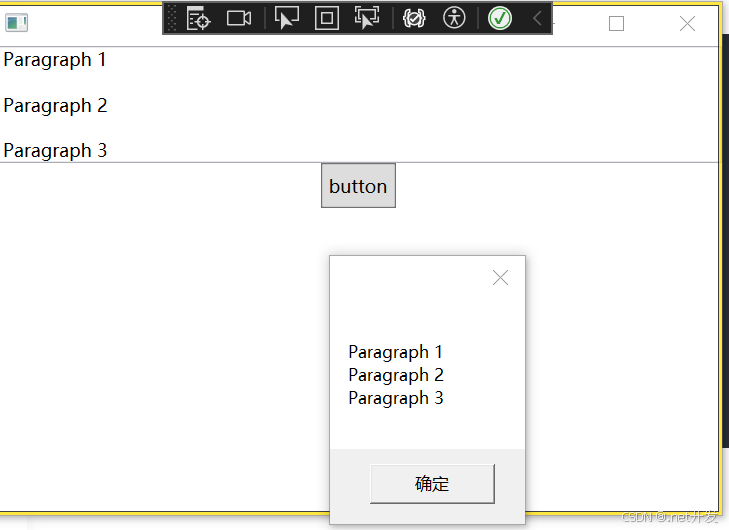
</StackPanel>4.9 RichTextBox富文本控件
RichTextBox可用于显示,输入和操作格式文本。可以实现TextBox的全部功能外,还提供了富文本的显示功能,同时我们可以对文本内容进行编辑。
需要注意:FlowDocumentFlowDocument RichTextBoxRichTextBox唯一支持的子元素是FlowDocument RichTextBox。
<StackPanel>
    <RichTextBox x:Name="content">
        <FlowDocument>
            <Paragraph>
                <Run>Paragraph 1</Run>
            </Paragraph>
            <Paragraph>
                <Run>Paragraph 2</Run>
            </Paragraph>
            <Paragraph>
                <Run>Paragraph 3</Run>
            </Paragraph>
        </FlowDocument>
    </RichTextBox>
</StackPanel>
4.9.1 获取富文本内容
给RichTextBox设置Name,通过button可以获取富文本的内容
private void getContent(object sender, RoutedEventArgs e)
{
    // 获取文本框内容,content是我们给RichTextBox设置的Name
    TextRange tr = new TextRange(content.Document.ContentStart, content.Document.ContentEnd);
    MessageBox.Show(tr.Text);
}
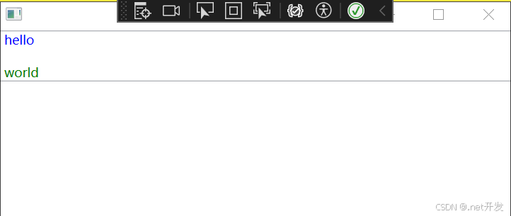
4.9.2 动态创建富文本内容
<StackPanel>
    <RichTextBox x:Name="content">

    </RichTextBox>
</StackPanel>
public partial class MainWindow : Window
{
public MainWindow()
{
InitializeComponent();
// 创建FlowDocument对象
FlowDocument flowDocument = new FlowDocument();
content.Document = flowDocument;
// 创建段落
Paragraph paragraph = new Paragraph();
paragraph.Foreground = Brushes.Blue;
paragraph.Inlines.Add("hello");
Paragraph paragraph2 = new Paragraph();
paragraph2.Foreground = Brushes.Green;
paragraph2.Inlines.Add("world");
// 将段落添加到文档中
flowDocument.Blocks.Add(paragraph);
flowDocument.Blocks.Add(paragraph2);
}
}
4.9.3 加载文件内容到富文本
可以设置一个Button,然后给Button绑定事件,可以实现将文件中的内容显示出来
private void Upload(object sender, RoutedEventArgs e)
{
    OpenFileDialog file = new OpenFileDialog();
    file.Filter = "Text files (*.txt)|*.txt|All files (*.*)|*.*";
    if (file.ShowDialog() == true)
    {
        TextRange txt = new TextRange(content.Document.ContentStart, content.Document.ContentEnd);
        using var stream = new FileStream(file.FileName, FileMode.Open, FileAccess.Read);
        txt.Load(stream, DataFormats.Text);
    }
}
4.10 ToolTip提示工具
ToolTip可以显示所有 任何类型,比如图像,字符, 其他控件等
当我们将鼠标放在Button上时,会显示出设定好的文字“hello”
<StackPanel>
    <Button Content="鼠标放过来" ToolTip="hello" />
</StackPanel>
4.10.1 自定义ToolTip内容
<StackPanel>
    <Button Width="100" Content="鼠标放过来">
        <Button.ToolTip>
            <StackPanel>
                <TextBlock>hello</TextBlock>
                <Border Width="100" Height="100">
                    <Image Source="Images/csharp.png" />
                </Border>
            </StackPanel>
        </Button.ToolTip>
    </Button>
</StackPanel>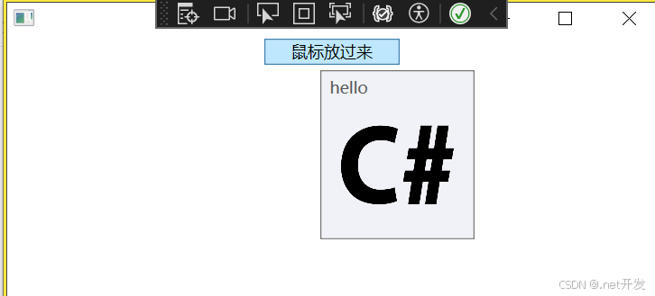
4.11 Popup弹出窗口
| AllowsTransparency | 控件是否包含透明内容 |
| PopupAnimation | 控件打开或关闭时的动画效果。None:没有效果;Fade:逐渐显示或淡出;Slide:向上向下划入;Scroll:滚动效果 |
| PlacementRectangle | 弹窗打开的位置 |
| PlacementTarget | 在那个控件身边打开 |
| StaysOpen | 默认为true,表示弹窗打开后,如果失去焦点是否继续显示 |
| IsOpen | 设置弹窗是否显示 |
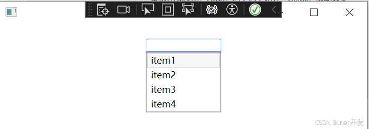
小案例如下:
<StackPanel>
    <TextBox x:Name="Menu" Width="100" Margin="0,20" GotFocus="got" LostFocus="lost" />
    <Popup x:Name="myPopup" PlacementTarget="{Binding ElementName=Menu}"
           Width="{Binding ElementName=Menu,Path=ActualWidth}" >
        <ListBox x:Name="list" SelectionChanged="ListBoxSelect">
            <ListBoxItem Content="item1" />
            <ListBoxItem Content="item2" />
            <ListBoxItem Content="item3" />
            <ListBoxItem Content="item4" />
        </ListBox>
    </Popup>
</StackPanel>
private void got(object sender, RoutedEventArgs e)
{
myPopup.IsOpen = true;
}
private void lost(object sender, RoutedEventArgs e)
{
myPopup.IsOpen = false;
}
private void ListBoxSelect(object sender, SelectionChangedEventArgs e)
{
Menu.Text = (list.SelectedItem as ListBoxItem).Content.ToString();
}
4.12 Image图片
| Source | 图片来源 |
| StretchDirection | 图片缩放条件。 UpOnly:仅在小于父级时缩放;DownOnly:仅在大于父级时缩放;Both:兼容前两者 |
| Stretch | 图片缩放模式。 None:保持原始大小;Fill:调整内容大小以填充目标尺寸;Uniform:保持纵横比基础上缩放;UniformToFill:保持纵横比基础上缩放,还具有裁剪功能; |
4.12.1 圆形图片
<StackPanel>
    <Ellipse Width="200" Height="200">
        <Ellipse.Fill>
            <ImageBrush ImageSource="Images/csharp.png" />
        </Ellipse.Fill>
    </Ellipse>
</StackPanel>
4.13 GroupBox分组容器
4.13.1 基本使用
<Grid Width="400" Margin="0,40">
    <!--定义行-->
    <Grid.RowDefinitions>
        <RowDefinition />
        <RowDefinition />
    </Grid.RowDefinitions>

    <GroupBox Header="基本信息">
        <!--定义第一行内部-->
        <Grid>
            <Grid.RowDefinitions>
                <RowDefinition />
                <RowDefinition />
            </Grid.RowDefinitions>
            <Grid.ColumnDefinitions>
                <ColumnDefinition Width="Auto" />
                <ColumnDefinition />
            </Grid.ColumnDefinitions>

            <TextBlock Text="姓名:" VerticalAlignment="Center" Margin="2,0" />
            <TextBox Grid.Column="1" Width="200" Height="20" HorizontalAlignment="Left" Margin="5,0" />
            <TextBlock Grid.Row="1" Text="性别:" VerticalAlignment="Center" Margin="2,0" />
            <WrapPanel Grid.Row="1" Grid.Column="1" Width="200" Height="30" HorizontalAlignment="Left">
                <RadioButton Content="男" GroupName="sex" Margin="7" />
                <RadioButton Content="女" GroupName="sex" Margin="7" />
            </WrapPanel>
        </Grid>
    </GroupBox>
</Grid>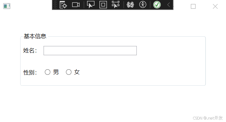
4.13.2 自定义header属性
<GroupBox.Header>
    <StackPanel Orientation="Horizontal">
        <Image Source="Images/csharp.png" Width="20" />
        <TextBlock Text="基本信息" VerticalAlignment="Center" Margin="5,0" />
    </StackPanel>
</GroupBox.Header>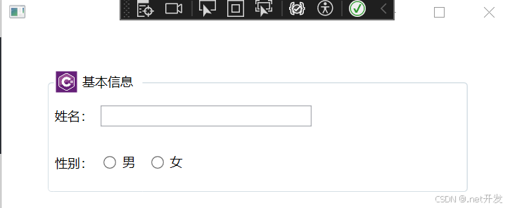
4.14 ScrollViewer 视图滚动控件
当在一个固定大小的布局格子中的内容查出格子范围时可以使用ScrollViewer;
<ScrollViewer>
    <!--定义第一行内部-->
    <Grid>
        <Grid.RowDefinitions>
            <RowDefinition Height="200" />
            <RowDefinition />
        </Grid.RowDefinitions>
        <Grid.ColumnDefinitions>
            <ColumnDefinition Width="Auto" />
            <ColumnDefinition />
        </Grid.ColumnDefinitions>

        <TextBlock Text="姓名:" VerticalAlignment="Center" Margin="2,0" />
        <TextBox Grid.Column="1" Width="200" Height="20" HorizontalAlignment="Left" Margin="5,0" />
        <TextBlock Grid.Row="1" Text="性别:" VerticalAlignment="Center" Margin="2,0" />
        <WrapPanel Grid.Row="1" Grid.Column="1" Width="200" Height="30" HorizontalAlignment="Left">
            <RadioButton Content="男" GroupName="sex" Margin="7" />
            <RadioButton Content="女" GroupName="sex" Margin="7" />
        </WrapPanel>
    </Grid>
</ScrollViewer>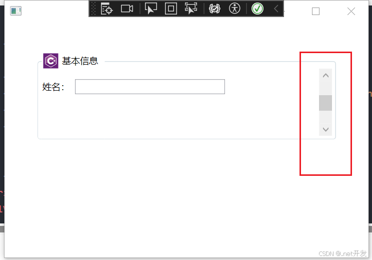
4.15 Slider 滑块
案例:通过Slider控制图片的透明度
<Grid Width="400" Margin="0,40">
    <Grid.RowDefinitions>
        <RowDefinition />
        <RowDefinition Height="Auto" />
    </Grid.RowDefinitions>

    <Image Source="Images/csharp.png" Width="200" Height="200" Opacity="{Binding ElementName=slider, Path=Value}"/>

    <!--Value:默认透明度 Maximum:最大值-->
    <Slider x:Name="slider" Value="0.3" Grid.Row="1" Maximum="1" />
</Grid>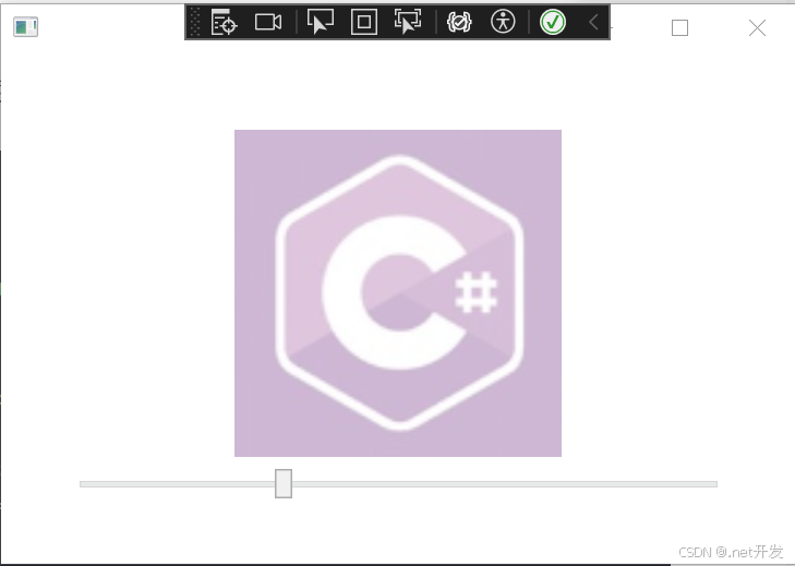
4.16 ProgressBar进度条
<StackPanel VerticalAlignment="Center">
    <ProgressBar x:Name="progress" Width="200" Height="10" Maximum="100" />
    <TextBlock x:Name="txt" VerticalAlignment="Center" HorizontalAlignment="Center">
        0%
    </TextBlock>
</StackPanel>


 1323
1323

 被折叠的 条评论
为什么被折叠?
被折叠的 条评论
为什么被折叠?
 到【灌水乐园】发言


