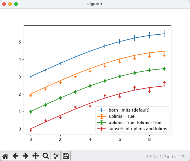
使用 matplotlib.pyplot
绘制了带有误差棒和上下限标记的曲线。
-
创建画布和生成数据:
fig = plt.figure() x = np.arange(10) y = 2.5 * np.sin(x / 20 * np.pi) yerr = np.linspace(0.05, 0.2, 10)
在这一步中,创建了一个画布,并生成了
x
和y
的数据,以及用于误差棒的yerr
。 -
绘制曲线,带有默认的误差棒:
plt.errorbar(x, y + 3, yerr=yerr, label='both limits (default)')
使用
errorbar
函数绘制曲线,带有默认的误差棒,误差棒由yerr
控制。 -
绘制曲线,只显示上限标记:
plt.errorbar(x, y + 2, yerr=yerr, uplims=True, label='uplims=True')
在这里,
uplims=True
表示只显示上限标记。 -
绘制曲线,同时显示上限和下限标记:
plt.errorbar(x, y + 1, yerr=yerr, uplims=True, lolims=True, label='uplims=True, lolims=True')
使用
uplims=True
和lolims=True
同时表示显示上限和下限标记。 -
指定部分数据点显示上限或下限标记:
upperlimits = [True, False] * 5 lowerlimits = [False, True] * 5 plt.errorbar(x, y, yerr=yerr, uplims=upperlimits, lolims=lowerlimits, label='subsets of uplims and lolims')
在这里,
uplims
和lolims
的值是列表,用于指定部分数据点是否显示上限或下限标记。 -
添加图例和显示图形:
plt.legend(loc='lower right') plt.show()
- 完整代码
import matplotlib.pyplot as plt
import numpy as np
# 创建一个画布
fig = plt.figure()
# 生成数据
x = np.arange(10)
y = 2.5 * np.sin(x / 20 * np.pi)
yerr = np.linspace(0.05, 0.2, 10)
# 绘制曲线,带有默认的误差棒
plt.errorbar(x, y + 3, yerr=yerr, label='both limits (default)')
# 绘制曲线,只显示上限标记
plt.errorbar(x, y + 2, yerr=yerr, uplims=True, label='uplims=True')
# 绘制曲线,同时显示上限和下限标记
plt.errorbar(x, y + 1, yerr=yerr, uplims=True, lolims=True,
label='uplims=True, lolims=True')
# 指定部分数据点显示上限或下限标记
upperlimits = [True, False] * 5
lowerlimits = [False, True] * 5
plt.errorbar(x, y, yerr=yerr, uplims=upperlimits, lolims=lowerlimits,
label='subsets of uplims and lolims')
# 添加图例
plt.legend(loc='lower right')
# 显示图形
plt.show()
类似地xuplims, 和xlolims可用于水平xerr 误差条。
-
创建画布和生成数据:
fig = plt.figure() x = np.arange(10) / 10 y = (x + 0.1)**2
在这一步中,创建了一个画布,并生成了
x
和y
的数据。 -
绘制曲线,带有x轴的下限标记:
plt.errorbar(x, y, xerr=0.1, xlolims=True, label='xlolims=True')
使用
errorbar
函数绘制曲线,带有 x 轴的下限标记,其中xerr=0.1
表示 x 轴的误差范围,xlolims=True
表示显示 x 轴的下限标记。 -
生成新的数据:
y = (x + 0.1)**3
生成新的
y
数据。 -
指定部分数据点显示x轴的上限和下限标记:
upperlimits = [True, False] * 5 lowerlimits = [False, True] * 5 plt.errorbar(x + 0.6, y, xerr=0.1, xuplims=upperlimits, xlolims=lowerlimits, label='subsets of xuplims and xlolims')
在这里,
xuplims
和xlolims
的值是列表,用于指定部分数据点是否显示 x 轴的上限或下限标记。 -
生成新的数据:
y = (x + 0.1)**4
生成新的
y
数据。 -
绘制曲线,带有x轴的上限标记:
plt.errorbar(x + 1.2, y, xerr=0.1, xuplims=True, label='xuplims=True')
使用
errorbar
函数绘制曲线,带有 x 轴的上限标记,其中xuplims=True
表示显示 x 轴的上限标记。 -
添加图例和显示图形:
plt.legend() plt.show()
- 完整代码
import matplotlib.pyplot as plt
import numpy as np
# 创建一个画布
fig = plt.figure()
# 生成数据
x = np.arange(10) / 10
y = (x + 0.1)**2
# 绘制曲线,带有x轴的下限标记
plt.errorbar(x, y, xerr=0.1, xlolims=True, label='xlolims=True')
# 生成新的数据
y = (x + 0.1)**3
# 指定部分数据点显示x轴的上限和下限标记
upperlimits = [True, False] * 5
lowerlimits = [False, True] * 5
plt.errorbar(x + 0.6, y, xerr=0.1, xuplims=upperlimits, xlolims=lowerlimits,
label='subsets of xuplims and xlolims')
# 生成新的数据
y = (x + 0.1)**4
# 绘制曲线,带有x轴的上限标记
plt.errorbar(x + 1.2, y, xerr=0.1, xuplims=True, label='xuplims=True')
# 添加图例
plt.legend()
# 显示图形
plt.show()