


小小的button也有很奇怪的地方,这几天我碰到一个问题,和大家分享一下,将问题简单化描述就是:
平时给button设置背景通常有两种方法,一种是通过xml的方式设置android:background,另一种是通过代码来设置BackgroundDrawable。但是发现通过这两种方式设置的按钮长得不一样(设置的背景都是同一张图片),通过xml设置的按钮文字居中,通过代码设置的按钮文字居中间偏上一点。really weird!!!!
给大家看下代码和效果:
<?xml version="1.0" encoding="utf-8"?>
<LinearLayout xmlns:android="http://schemas.android.com/apk/res/android"
    android:layout_width="match_parent"
    android:layout_height="match_parent"
    android:gravity="center_vertical"
    android:orientation="horizontal">

    <Button
        android:layout_width="80dp"
        android:layout_height="50dp"
        android:text="普通按钮"
        android:textSize="13dp" />

    <Button
        android:layout_width="100dp"
        android:layout_height="50dp"
        android:background="@drawable/background"
        android:text="xml按钮"
        android:textSize="13dp" />

    <Button
        android:id="@+id/btnCustom"
        android:layout_width="100dp"
        android:layout_height="50dp"
        android:text="代码按钮"
        android:textSize="13dp" />

</LinearLayout>
public class MainActivity extends Activity {

    @Override
    protected void onCreate(Bundle savedInstanceState) {
        super.onCreate(savedInstanceState);
        setContentView(R.layout.activity_main);
        Button btnCustom = (Button) findViewById(R.id.btnCustom);
        btnCustom.setBackgroundDrawable(getResources().getDrawable(R.drawable.background));
    }
}
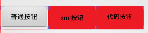
第一张是效果图,通过圈起来的方框可以看到xml按钮的文字要稍低于代码按钮的文字,不要以为这是巧合哦!
第二张图是布局边界图,重点来了。在布局文件中,三个按钮的高度宽度明明是一样的,为什么最左边的普通按钮在第一张图中要看起来小一点呢,但是在布局边界图中边框和另外两个一样大呢?
哈哈,这是有原因的,带你细看!
先看Button类的源码:
public class Button extends TextView {
    public Button(Context context) {
        this(context, null);
    }

    public Button(Context context, AttributeSet attrs) {
        this(context, attrs, com.android.internal.R.attr.buttonStyle);
    }

    public Button(Context context, AttributeSet attrs, int defStyleAttr) {
        this(context, attrs, defStyleAttr, 0);
    }

    public Button(Context context, AttributeSet attrs, int defStyleAttr, int defStyleRes) {
        super(context, attrs, defStyleAttr, defStyleRes);
    }

    @Override
    public CharSequence getAccessibilityClassName() {
        return Button.class.getName();
    }
}
代码很简单,只是继承TextView。button的类说明中有这样的一句话:
Every Button is styled using the system’s default button background, which is often different from one device to another and from one version of the platform to another.
细想一下,当我们随便写个button的时候,按钮是不是有默认的背景,但是button继承TextView只有简单的几行代码,为什么写textview的时候,它默认是没有背景的(透明)。在第二个构造函数中,button会使用默认的style,那我们来看下默认的style说不定可以解决我们的问题。
在themes.xml中有找到如下
<style name = "Theme">
    ....
    <!-- Button styles -->
    <item name="buttonStyle">@style/Widget.Button</item>
    <item name="buttonStyleSmall">@style/Widget.Button.Small</item>
    <item name="buttonStyleInset">@style/Widget.Button.Inset</item>
    <item name="buttonStyleToggle">@style/Widget.Button.Toggle</item>
继续查看第一个item的内容@style/Widget.Button。
内容如下:
<style name="Widget.Button">
    <item name="background">@drawable/btn_default</item>
    <item name="focusable">true</item>
    <item name="clickable">true</item>
    <item name="textAppearance">?attr/textAppearanceSmallInverse</item>
    <item name="textColor">@color/primary_text_light</item>
    <item name="gravity">center_vertical|center_horizontal</item>
    </style>
看到了吧,这里会默认为button设置一个背景,而且里面的文字内容默认是水平居中和垂直居中(这里要记住哦,很重要),那我们继续看看背景:
<selector xmlns:android="http://schemas.android.com/apk/res/android">
    <item android:state_window_focused="false" android:state_enabled="true"
        android:drawable="@drawable/btn_default_normal" />
    <item android:state_window_focused="false" android:state_enabled="false"
        android:drawable="@drawable/btn_default_normal_disable" />
    <item android:state_pressed="true"
        android:drawable="@drawable/btn_default_pressed" />
    <item android:state_focused="true" android:state_enabled="true"
        android:drawable="@drawable/btn_default_selected" />
    <item android:state_enabled="true"
        android:drawable="@drawable/btn_default_normal" />
    <item android:state_focused="true"
        android:drawable="@drawable/btn_default_normal_disable_focused" />
    <item
         android:drawable="@drawable/btn_default_normal_disable" />
</selector>
看,button的背景也是分各个state的:pressing、disabled、enabled等等。接着再看下每个item的drawable(发现继续点进去没用,这个时候就用到android studio强大的搜索功能了):
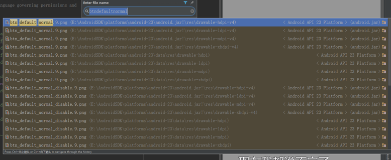
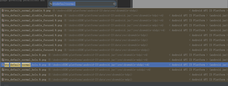
一搜发现,原来给的是.9图
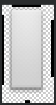
这里要解释下什么是.9图,当视觉人员给你的.9图,你会发现其实这个图没那么大,甚至很小,但是他的周围会标一些黑色的线,当你把这个图作为背景的时候,无论你的内容怎么扩展,他都会自动伸缩,很方便,试想一下,当无论怎么扩展button的大小,他的背景都是无限放大。旁边标的黑线就是告诉在哪个方向上可以无限伸长(具体我也不懂,视觉和我说的,但是知道大概功能)。
不过不是很清楚,为什么google给的按钮背景图,上面窄一点,下面留白要多点。。。目前根据给的.9图可以解释我们上面的一个问题,就是普通按钮看着比另外两个按钮要小,他并不是小,只是他个的背景中,有一部分是透明的,所以你看不到。
那问题又来了,为什么button里面的文字是居中的(运行起来时看到的样子,居于看得见的灰色部分的中间,而不是居于整个图片的中间(因为上面窄下面宽,所以居于中间灰的中间和居于整个图片中间的位置其实是不一样的)。
这是和.9图的特性有关系,他的居中是居于中间可见部分的中间,而不是整个图。
重新再回到这个图:
在这个图中,第一个按钮和第三个按钮的文字居于同水平线上,但是中间的按钮稍微下面一点。
第一个按钮的显示我们已经解释过,但是为什么第二个按钮的文字为什么会下面一点呢?
那是因为第二个按钮我们是直接通过xml来设置的,直接覆盖了系统默认给的背景,所以第二个按钮的整个背景是整个按钮,而不是像第一张,处于可见部分的中间,所以当然往下面一点啦,刚刚说到.9图下面留白的地方只比上面留白的地方大了一点,所以文字只是比正常情况往下了一点,所以差别不大,有些人可能肉眼是看不出来的,我也是放大了给大家看。
前面两个按钮解释完了,那为什么第三个是和第一个一样的呢?按理来说用代码来设置BackgroundDrawable,应该和xml设置是一样的,但是。。。。
这个目前我还没得出结论,不过第三个button的文字可能还是根据.9的背景来设置位置的,那么说明系统默认的背景并没有被抹去。而手动设置的Background只是像一张贴纸贴上去一样。这不禁让我想到一个问题就是我们在绘制图片的时候,有src_in,dst_in这种模式,可能与这种有关。具体可以看这篇文章
Android Xfermode 实战 实现圆形、圆角图片
到这里解释的差不多了。
那么如何解决代码设置BackgroundDrawable文字不居中的问题呢?
有三种办法:
- 你使用的button,在xml中给他设置android:background=”@null”,这样可以直接覆盖系统的默认背景。
- 另一种方法,不使用Button,使用textView,对于Button和TextView来说,只有显示的一些style不一样。当然,如果用TextView的话,发现按钮特别窄,不想按钮,上下会空一点,给文字留位置。这也很简单,你上下给他设置padding就好了。
- 哈哈,后面讲,请继续看。
现在要来谈谈theme的问题,button在不同的theme下不一样。这是因为刚刚在搜.9图的时候,看到:
看到btn_default_normal_holo.9.png,要知道holo是android系统主题的一种,点进去一看图:
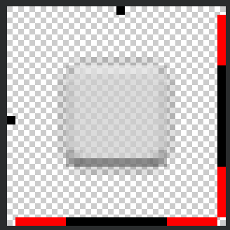
看到了么,这个图的灰色部分是居中的。哇,这就是刚刚说的第三种办法,刚好居中!!!
光看图片名字就猜这个图片是用在holo的主题下的,那我们去找找证据。
类似的,我在themes_holo.xml中找到
<style name="Theme.Holo">
    ......
    <!-- Button styles -->
    <item name="buttonStyle">@style/Widget.Holo.Button</item>
    ....
</style>
一直点进去看看,发现的确是居中的。
所以刚刚的第三种办法可以通过修改主题。
讲了这么多,好累


 扫一扫
扫一扫
 3704
3704

 被折叠的 条评论
为什么被折叠?
被折叠的 条评论
为什么被折叠?
 到【灌水乐园】发言


