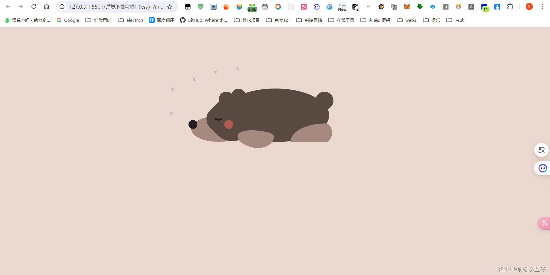
<!DOCTYPE html>
<html lang="en">
<head>
<meta charset="UTF-8">
<title>睡觉的熊动画</title>
<link rel="stylesheet" href="./style.css">
</head>
<body>
<div id="container">
<div class="head"></div>
<div class="muzzle"></div>
<div class="ears"></div>
<div class="body"></div>
<div class="paws-front"></div>
<div class="paws-back"></div>
<div class="details"></div>
<div class="tail"></div>
<div class="sleep">
<span class="s1">z</span>
<span class="s2">z</span>
<span class="s3">z</span>
<span class="s4">z</span>
<span class="s5">z</span>
</div>
</div>
</body>
</html>
body {
background-color: #EBD8D0;
text-align: center;
height: 100%;
margin: 0px;
}
#container {
margin: 120px auto;
position: relative;
height: 230px;
width: 754px;
}
#container div {
position: absolute;
}
#container div::before,
#container div::after {
content: '';
position: absolute;
display: block;
}
.head {
z-index: 10;
width: 152px;
height: 70px;
bottom: 32px;
left: 143px;
background: #A78A7F;
border-radius: 100%;
}
.head:before {
width: 122px;
height: 122px;
left: 54px;
bottom: 0px;
z-index: 199;
background: #594a41;
border-radius: 90% 50% 90% 90%;
transform: rotateZ(226deg);
}
.muzzle {
z-index: 5;
width: 152px;
height: 70px;
bottom: 30px;
left: 143px;
background: #A78A7F;
border-radius: 100%;
}
.ears {
width: 42px;
height: 42px;
background: #594a41;
border-radius: 100%;
left: 220px;
top: 60px;
box-shadow: 34px -8px 0 0 #594a41
}
.body {
width: 300px;
height: 150px;
background: #594a41;
left: 228px;
border-radius: 50%;
bottom: 29px;
}
.paws-front {
z-index: 15;
background: #A78A7F;
width: 100px;
height: 50px;
bottom: 14px;
left: 272px;
border-radius: 80% 22% 55% 50% / 55% 22% 80% 50%;
transform: rotateZ(12deg);
}
.paws-back {
width: 100px;
height: 52px;
border-top-left-radius: 100%;
background: #A78A7F;
left: 420px;
bottom: 29px;
}
.paws-back:after {
width: 36px;
height: 52px;
border-radius: 100%;
left: 80px;
background: #A78A7F;
}
.details {
width: 25px;
height: 25px;
background: #221E22;
border-radius: 100%;
z-index: 20;
box-shadow: 100px 0 0 #AD5D4E;
bottom: 66px;
left: 135px;
}
.details:after {
width: 22px;
height: 22px;
border-bottom: 5px solid #221E22;
border-top: 5px solid transparent;
border-left: 5px solid transparent;
border-right: 5px solid transparent;
border-radius: 50%;
left: 68px;
top: -30px;
}
.tail {
width: 50px;
height: 50px;
background: #594a41;
border-radius: 100%;
left: 490px;
top: 60px;
}
.sleep {
height: 90px;
width: 80px;
position: absolute;
left: 80px;
top: 30px;
font-size: 55px;
}
.sleep span {
width: 15px;
height: 15px;
display: block;
font-family: arial;
font-weight: bold;
text-align: center;
line-height: 20px;
background: #221E22;
animation: zz 3s linear infinite;
}
.sleep .s1 {
margin-left: 180px;
margin-top: -40px;
}
.sleep .s2 {
margin-left: 120px;
margin-top: -5px;
}
.sleep .s3 {
margin-left: 60px;
margin-top: 5px;
}
.sleep .s4 {
margin-left: 0px;
margin-top: 12px;
}
.sleep .s5 {
margin-left: -5px;
margin-top: 52px;
}
@keyframes zz {
0% {
opacity: 0;
transform: scale3d(.2, .2, .2) rotate(-20deg);
}
50% {
opacity: 1;
}
80% {
transform: translateY(-30px) translateX(20px) rotate(10deg);
opacity: 0;
}
100% {
opacity: 0;
}
}


 1487
1487


 被折叠的 条评论
为什么被折叠?
被折叠的 条评论
为什么被折叠?
 到【灌水乐园】发言


