


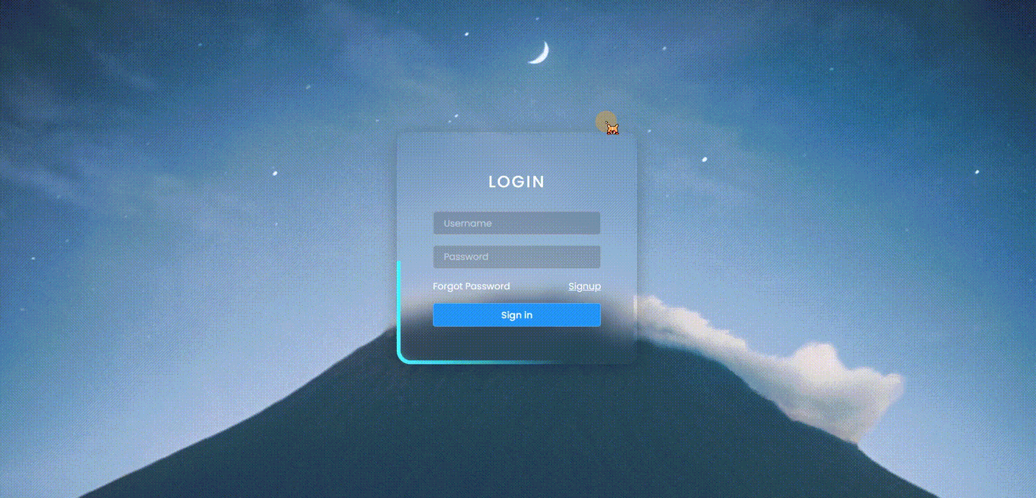
登录页面和注册页面点击时可以切换背景以及色调
一个HTML实现两个页面,是不是觉得美滋滋呢
边框还有非常酷炫的特效,是不是非常的哇塞呢
还在等什么,赶快白嫖起来吧:https://download.csdn.net/download/liyankang/88751593
代码我放在下面哦,快快白嫖起来吧。

HTML文件
<!DOCTYPE html>
<html lang="en">
<head>
	<meta charset="UTF-8">
	<meta name="viewport" content="width=device-width, initial-scale=1.0">
	<title>Animated Login & Registration Form</title>
	<link rel="stylesheet" type="text/css" href="style.css">
</head>
<body>
	<div class="container">
		<span></span>
		<span></span>
		<span></span>
		<form id="signinForm">
			<h2>Login</h2>
			<div class="inputBox">
				<input type="text" placeholder="Username">
			</div>
			<div class="inputBox">
				<input type="password" placeholder="Password">
			</div>
			<div class="inputBox group">
				<a href="#">Forgot Password</a>
				<a href="#" id="signup">Signup</a>
			</div>
			<div class="inputBox">
				<input type="submit" value="Sign in">
			</div>
		</form>

		<form id="signupForm">
			<h2>Registration</h2>
			<div class="inputBox">
				<input type="text" placeholder="Username">
			</div>
			<div class="inputBox">
				<input type="text" placeholder="Email Address">
			</div>
			<div class="inputBox">
				<input type="password" placeholder="Create Password">
			</div>
			<div class="inputBox">
				<input type="password" placeholder="Confirm Password">
			</div>
			<div class="inputBox">
				<input type="submit" value="Register Account">
			</div>
			<div class="inputBox group">
				<a href="#">Already Have an Account ? <b id="signin">Login</b></a>
			</div>
		</form>
	</div>
	<script>
		let signup = document.querySelector('#signup');
		let signin = document.querySelector('#signin');
		let body = document.querySelector('body');
		signup.onclick = function(){
			body.classList.add('signup');
		}
		signin.onclick = function(){
			body.classList.remove('signup');
		}
	</script>
</body>
</html>
css文件
@import url('https://fonts.googleapis.com/css?family=Poppins:200,300,400,500,600,700,800,900&display=swap');
*
{
	margin: 0;
	padding: 0;
	box-sizing: border-box;
	font-family: 'Poppins', sans-serif;
}
body
{
	display: flex;
	justify-content: center;
	align-items: center;
	min-height: 100vh;
}
body::before
{
	content: '';
	position: absolute;
	inset: 0;
	background: url(bg1.jpg);
	background-attachment: fixed;
	background-size: cover;
	background-position: center;
}
body::after
{
	content: '';
	position: absolute;
	inset: 0;
	background: url(bg2.jpg);
	background-attachment: fixed;
	background-size: cover;
	background-position: center;
	opacity: 0;
	transition: 0.5s;
}
body.signup::after
{
	opacity: 1;
}
.container
{
	position: relative;
	width: 350px;
	height: 340px;
	border-radius: 15px;
	box-shadow: 0 5px 25px rgba(0,0,0,0.25);
	display: flex;
	justify-content: center;
	align-items: center;
	z-index: 1000;
	transition: 0.5s;
	overflow: hidden;
}
body.signup .container
{
	height: 440px;
}
.container::before
{
	content: '';
	position: absolute;
	width: 100%;
	height: 100%;
	background: repeating-conic-gradient(from var(--a),#45f3ff 0%,#45f3ff 10%,transparent 10%,transparent 80%,#45f3ff 100%);
	border-radius: 20px;
	animation: animate 2.5s linear infinite;
}
body.signup .container::before
{
	filter: hue-rotate(140deg);
}
@property --a
{
	syntax: '<angle>';
	inherits: false;
	initial-value: 0deg;
}
@keyframes animate
{
	0%
	{
		--a: 0deg
	}
	100%
	{
		--a: 360deg
	}
}
.container span
{
	position: absolute;
	inset: 5px;
	overflow: hidden;
	border-radius: 15px;
}
.container span::before
{
	content: '';
	position: absolute;
	inset: 5px;
	background: url(bg1.jpg);background-attachment: fixed;
	background-size: cover;
	background-position: center;
	filter: blur(10px);
}
.container span::after
{
	content: '';
	position: absolute;
	inset: 5px;
	background: url(bg1.jpg);background-attachment: fixed;
	background-size: cover;
	background-position: center;
	filter: blur(15px);
}
body.signup .container span::before,
body.signup .container span::after
{
	background: url(bg2.jpg);background-attachment: fixed;
	background-size: cover;
	background-position: center;
	filter: blur(15px);
}
form
{
	position: absolute;
	left: 0;
	display: flex;
	justify-content: center;
	align-items: center;
	flex-direction: column;
	width: 100%;
	gap: 15px;
	transition: 0.5s;
}
form#signupForm
{
	left: 100%;
}
body.signup form#signinForm
{
	left: -100%;
}
body.signup form#signupForm
{
	left: 0;
}
form h2
{
	position: relative;
	color: #fff;
	font-size: 1.5em;
	letter-spacing: 0.1em;
	text-transform: uppercase;
	font-weight: 500;
	margin-bottom: 10px;
}
form .inputBox
{
	position: relative;
	width: 70%;
	display: flex;
	justify-content: space-between;
}
form .inputBox a
{
	color: #fff;
	text-decoration: none;
	font-size: 0.85em;
}
form .inputBox a:nth-child(2)
{
	text-decoration: underline;
}
form .inputBox input
{
	width: 100%;
	outline: none;
	border: 1px solid rgba(255,255,255,0.25);
	background: rgba(0,0,0,0.15);
	padding: 6px 15px;
	border-radius: 4px;
	font-size: 0.85em;
	color: #fff;
}
form .inputBox input::placeholder
{
	color: rgba(255,255,255,0.5);
}
form .inputBox input[type="submit"]
{
	background: #2196f3;
	font-weight: 500;
	cursor: pointer;
}

form#signupForm .inputBox input[type="submit"]
{
	background: #f4242f;
}
form#signupForm b
{
	font-weight: 500;
	color: #ffeb3b;
	text-decoration: underline;
}


 1711
1711


 被折叠的 条评论
为什么被折叠?
被折叠的 条评论
为什么被折叠?
 到【灌水乐园】发言


