


零、文章目录
移动WEB开发二、流式布局
1、流式布局
- 流式布局,就是
百分比布局,也称非固定像素布局,是移动web开发使用的比较常见的布局方式。 - 通过
盒子的宽度设置成百分比来根据屏幕的宽度来进行伸缩,不受固定像素的限制,内容向两侧填充。 - max-width 最大宽度 (max-height 最大高度)
- min-width 最小宽度 (min-height 最小高度)
案例如下:
<!DOCTYPE html>
<html lang="en">

<head>
    <meta charset="UTF-8">
    <meta name="viewport" content="width=device-width, initial-scale=1.0">
    <meta http-equiv="X-UA-Compatible" content="ie=edge">
    <title>流式布局</title>
    <style>
        * {
            margin: 0;
            padding: 0;
        }

        section {
            width: 100%;
            max-width: 980px;
            min-width: 320px;
            margin: 0 auto;
        }

        section div {
            float: left;
            width: 50%;
            height: 400px;
        }

        section div:nth-child(1) {
            background-color: pink;
        }

        section div:nth-child(2) {
            background-color: purple;
        }
    </style>
</head>

<body>
    <section>
        <div></div>
        <div></div>
    </section>
</body>

</html>

2、京东移动端首页制作
- 访问地址:m.jd.com
(1)技术选型
- 方案:我们采取单独制作移动页面方案
- 技术:布局采取流式布局
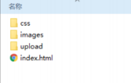
(2)搭建相关文件夹结构
(3)设置视口标签以及引入初始化样式
<meta name="viewport" content="width=device-width, user-scalable=no,
initial-scale=1.0, maximum-scale=1.0, minimum-scale=1.0">
<link rel="stylesheet" href="css/normalize.css">
<link rel="stylesheet" href="css/index.css">
(4)常用初始化样式
body {
margin: 0 auto;
min-width: 320px;
max-width: 640px;
background: #fff;
font-size: 14px;
font-family: -apple-system, Helvetica, sans-serif;
line-height: 1.5;
color: #666;
}
(5)二倍精灵图做法
- 有时候,精灵图大小是实际图大小的两倍,需要把精灵图等比例缩放为原来的一半,之后根据大小测量坐标。
- 注意代码里面background-size也要写: 整个精灵图设置为原来宽度的一半,高度会等比例缩放。
(6)图片格式
-
DPG图片压缩技术:京东自主研发推出DPG图片压缩技术,经测试该技术,可直接节省用户近50%的浏览流量,极大的提升了用户的网页打开速度。能够兼容jpeg,实现全平台、全部浏览器的兼容支持,经过内部和外部上万张图片的人眼浏览测试后发现,压缩后的图片和webp的清晰度对比没有差距。
-
webp 图片格式:谷歌开发的一种旨在加快图片加载速度的图片格式。图片压缩体积大约只有JPEG的2/3,并能节省大量的服务器宽带资源和数据空间。
(7)代码实现
index.html
<!DOCTYPE html>
<html lang="en">

<head>
    <meta charset="UTF-8">
    <meta name="viewport" content="width=device-width, initial-scale=1.0, user-scalable=no,maximum-scale=1.0,minimum-scale=1.0">
    <meta http-equiv="X-UA-Compatible" content="ie=edge">
    <!-- 引入我们的css初始化文件 -->
    <link rel="stylesheet" href="css/normalize.css">
    <!-- 引入我们首页的css -->
    <link rel="stylesheet" href="css/index.css">
    <title>京东移动首页</title>
</head>

<body>
    <!-- 顶部 -->
    <header class="app">
        <ul>
            <li>
                <img src="images/close.png" alt="">
            </li>
            <li>
                <img src="images/logo.png" alt="">
            </li>
            <li>打开京东App,购物更轻松</li>
            <li>立即打开</li>
        </ul>
    </header>
    <!-- 搜索 -->
    <div class="search-wrap">
        <div class="search-btn"></div>
        <div class="search">
            <div class="jd-icon"></div>
            <div class="sou"></div>
        </div>
        <div class="search-login">登陆</div>
    </div>
    <!-- 主体内容部分 -->
    <div class="main-content">
        <!-- 滑动图 -->
        <div class="slider">
            <img src="upload/banner.dpg" alt="">
        </div>

        <!-- 小家电品牌日 -->
        <div class="brand">
            <div>
                <a href="#">
                    <img src="upload/pic11.dpg" alt="">
                </a>
            </div>
            <div>
                <a href="#">
                    <img src="upload/pic22.dpg" alt="">
                </a>

            </div>
            <div>
                <a href="#">
                    <img src="upload/pic33.dpg" alt="">
                </a>

            </div>
        </div>
        <!-- nav部分 -->
        <nav class="clearfix">
            <a href="">
                <img src="upload/nav1.webp" alt="">
                <span>京东超市</span>
            </a>

            <a href="">
                <img src="upload/nav2.webp" alt="">
                <span>京东超市</span>
            </a>

            <a href="">
                <img src="upload/nav1.webp" alt="">
                <span>京东超市</span>
            </a>

            <a href="">
                <img src="upload/nav1.webp" alt="">
                <span>京东超市</span>
            </a>

            <a href="">
                <img src="upload/nav1.webp" alt="">
                <span>京东超市</span>
            </a>

            <a href="">
                <img src="upload/nav3.webp" alt="">
                <span>京东超市</span>
            </a>

            <a href="">
                <img src="upload/nav1.webp" alt="">
                <span>京东超市</span>
            </a>

            <a href="">
                <img src="upload/nav1.webp" alt="">
                <span>京东超市</span>
            </a>

            <a href="">
                <img src="upload/nav1.webp" alt="">
                <span>京东超市</span>
            </a>

            <a href="">
                <img src="upload/nav1.webp" alt="">
                <span>京东超市</span>
            </a>

        </nav>
        <!-- 新闻模块 -->
        <div class="news">
            <a href="#">
                <img src="upload/new1.dpg" alt="">
            </a>
            <a href="#">
                <img src="upload/new2.dpg" alt="">

            </a>
            <a href="#">
                <img src="upload/new3.dpg" alt="">

            </a>
        </div>
    </div>
</body>

</html>
index.css
body {
    width: 100%;
    min-width: 320px;
    max-width: 640px;
    margin: 0 auto;
    font-size: 14px;
    font-family: -apple-system, Helvetica, sans-serif;
    color: #666;
    line-height: 1.5;
}


/*点击高亮我们需要清除清除  设置为transparent 完成透明*/

* {
    -webkit-tap-highlight-color: transparent;
}


/*在移动端浏览器默认的外观在iOS上加上这个属性才能给按钮和输入框自定义样式*/

input {
    -webkit-appearance: none;
}


/*禁用长按页面时的弹出菜单*/

img,
a {
    -webkit-touch-callout: none;
}

a {
    color: #666;
    text-decoration: none;
}

ul {
    margin: 0;
    padding: 0;
    list-style: none;
}

img {
    vertical-align: middle;
}

div {
    /* css3 盒子模型 */
    box-sizing: border-box;
}

.clearfix:after {
    content: "";
    display: block;
    line-height: 0;
    visibility: hidden;
    height: 0;
    clear: both;
}

.app {
    height: 45px;
}

.app ul li {
    float: left;
    height: 45px;
    line-height: 45px;
    background-color: #333333;
    text-align: center;
    color: #fff;
}

.app ul li:nth-child(1) {
    width: 8%;
}

.app ul li:nth-child(1) img {
    width: 10px;
}

.app ul li:nth-child(2) {
    width: 10%;
}

.app ul li:nth-child(2) img {
    width: 30px;
    vertical-align: middle;
}

.app ul li:nth-child(3) {
    width: 57%;
}

.app ul li:nth-child(4) {
    width: 25%;
    background-color: #F63515;
}


/* 搜索 */

.search-wrap {
    position: fixed;
    overflow: hidden;
    width: 100%;
    height: 44px;
    min-width: 320px;
    max-width: 640px;
}

.search-btn {
    position: absolute;
    top: 0;
    left: 0;
    width: 40px;
    height: 44px;
}

.search-btn::before {
    content: "";
    display: block;
    width: 20px;
    height: 18px;
    background: url(../images/s-btn.png) no-repeat;
    background-size: 20px 18px;
    margin: 14px 0 0 15px;
}

.search-login {
    position: absolute;
    right: 0;
    top: 0;
    width: 40px;
    height: 44px;
    color: #fff;
    line-height: 44px;
}

.search {
    position: relative;
    height: 30px;
    background-color: #fff;
    margin: 0 50px;
    border-radius: 15px;
    margin-top: 7px;
}

.jd-icon {
    width: 20px;
    height: 15px;
    position: absolute;
    top: 8px;
    left: 13px;
    background: url(../images/jd.png) no-repeat;
    background-size: 20px 15px;
}

.jd-icon::after {
    content: "";
    position: absolute;
    right: -8px;
    top: 0;
    display: block;
    width: 1px;
    height: 15px;
    background-color: #ccc;
}

.sou {
    position: absolute;
    top: 8px;
    left: 50px;
    width: 18px;
    height: 15px;
    background: url(../images/jd-sprites.png) no-repeat -81px 0;
    background-size: 200px auto;
}

.slider img {
    width: 100%;
}


/* 品牌日 */

.brand {
    overflow: hidden;
    border-radius: 10px 10px 0 0;
}

.brand div {
    float: left;
    width: 33.33%;
}

.brand div img {
    width: 100%;
}


/* nav */

nav {
    padding-top: 5px;
}

nav a {
    float: left;
    width: 20%;
    text-align: center;
}

nav a img {
    width: 40px;
    margin: 10px 0;
}

nav a span {
    display: block;
}


/* news */

.news {
    margin-top: 20px;
}

.news img {
    width: 100%;
}

.news a {
    float: left;
    box-sizing: border-box;
}

.news a:nth-child(1) {
    width: 50%;
}


/* .news a:nth-child(2),
.news a:nth-child(3),
{
    width: 25%;
} */


/* n+2 就是从从2个往后面选 */

.news a:nth-child(n+2) {
    width: 25%;
    border-left: 1px solid #ccc;
}


/* .news a:nth-child(3) {
    width: 25%;
} */
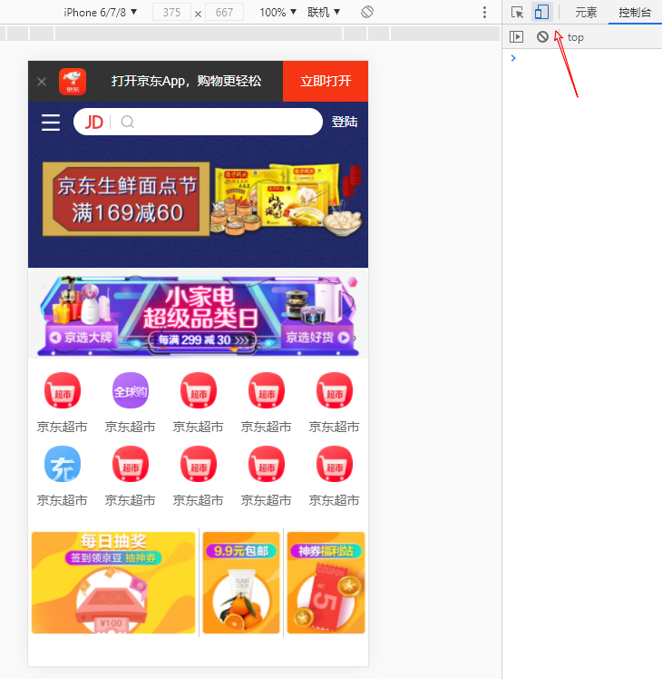
(8)运行效果


 271
271


 被折叠的 条评论
为什么被折叠?
被折叠的 条评论
为什么被折叠?
 到【灌水乐园】发言


