


一、基本画图
首先,给个简单的例子:
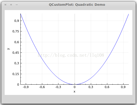
// 生成数据,画出的是抛物线
QVector<double> x(101), y(101); // initialize with entries 0..100
for (int i=0; i<101; ++i)
{
  x[i] = i/50.0 - 1; // x goes from -1 to 1
  y[i] = x[i]*x[i]; // let's plot a quadratic function
}
// 添加数据曲线(一个图像可以有多个数据曲线)
customPlot->addGraph();
// graph(0);可以获取某个数据曲线(按添加先后排序)
// setData();为数据曲线关联数据
customPlot->graph(0)->setData(x, y);
// 为坐标轴添加标签
customPlot->xAxis->setLabel("x");
customPlot->yAxis->setLabel("y");
// 设置坐标轴的范围,以看到所有数据
customPlot->xAxis->setRange(-1, 1);
customPlot->yAxis->setRange(0, 1);// 重画图像
customPlot->replot();上面代码生成的结果大致是这样的:
外观QCustomPlot的外观由很多方面特性组成,都可以改变:坐标轴:QCustomPlot有四个QCPAxis成员变量,分别代表四个坐标轴:xAxis(下)yAxis(左)xAxis2(上)yAxis2(右)QCPAxis有相应的函数可以设置坐标轴的刻度、间距、范围等:setTickStep(double step);//设置刻度间距
setTickVector(const QVector<double> &vec);//将坐标轴刻度设置为vec
setAutoTickStep(bool on);//设置是否自动分配刻度间距
setAutoTicks(bool on);//设置是否自动分配刻度
setAutoTickCount(int approximateCount);//设置是否自动分配刻度数量还有setBasePen、setTickPen、setTickLength、setSubTickLength、setSubTickPen、setTickLabelFont、setLabelFont、setTickLabelPadding、setLabelPadding、setRangeReversed等
等后面专门讲QCPAxis的时候再详细介绍曲线风格:
QCPGraph::setPen(const QPen &pen);曲线画笔:
QCPGraph::setLineStyle(LineStyle ls);曲线形状:
QCPGraph::setScatterStyle(QCPScatterStyle &style);曲线形状像*、+、x、o等等
填充曲线方式:
QCPGraph::setBrush(const QBrush &brush);QCPGraph::setChannelFillGraph(otherGraph);//设置与某之间曲线填充QCPGraph::setBrush(Qt::NoBrush);//移除填充
customPlot->yAxis->grid();setPen、setZeroLinePen、setSubGridVisible等等讲QCPGrid类再细讲二、高级画图
1、多曲线与多风格<pre name="code" class="cpp">customPlot->setLocale(QLocale(QLocale::English, QLocale::UnitedKingdom)); // period as decimal separator and comma as thousand separator
customPlot->legend->setVisible(true);
QFont legendFont = font(); // start out with MainWindow's font..
legendFont.setPointSize(9); // and make a bit smaller for legend
customPlot->legend->setFont(legendFont);
customPlot->legend->setBrush(QBrush(QColor(255,255,255,230)));
// by default, the legend is in the inset layout of the main axis rect. So this is how we access it to change legend placement:
customPlot->axisRect()->insetLayout()->setInsetAlignment(0, Qt::AlignBottom|Qt::AlignRight);
// setup for graph 0: key axis left, value axis bottom
// will contain left maxwell-like function
customPlot->addGraph(customPlot->yAxis, customPlot->xAxis);
customPlot->graph(0)->setPen(QPen(QColor(255, 100, 0)));
customPlot->graph(0)->setBrush(QBrush(QPixmap("./dali.png"))); // fill with texture of specified png-image
customPlot->graph(0)->setLineStyle(QCPGraph::lsLine);
customPlot->graph(0)->setScatterStyle(QCPScatterStyle(QCPScatterStyle::ssDisc, 5));
customPlot->graph(0)->setName("Left maxwell function");
// setup for graph 1: key axis bottom, value axis left (those are the default axes)
// will contain bottom maxwell-like function
customPlot->addGraph();
customPlot->graph(1)->setPen(QPen(Qt::red));
customPlot->graph(1)->setBrush(QBrush(QPixmap("./dali.png"))); // same fill as we used for graph 0
customPlot->graph(1)->setLineStyle(QCPGraph::lsStepCenter);
customPlot->graph(1)->setScatterStyle(QCPScatterStyle(QCPScatterStyle::ssCircle, Qt::red, Qt::white, 7));
customPlot->graph(1)->setErrorType(QCPGraph::etValue);
customPlot->graph(1)->setName("Bottom maxwell function");
// setup for graph 2: key axis top, value axis right
// will contain high frequency sine with low frequency beating:
customPlot->addGraph(customPlot->xAxis2, customPlot->yAxis2);
customPlot->graph(2)->setPen(QPen(Qt::blue));
customPlot->graph(2)->setName("High frequency sine");
// setup for graph 3: same axes as graph 2
// will contain low frequency beating envelope of graph 2
customPlot->addGraph(customPlot->xAxis2, customPlot->yAxis2);
QPen blueDotPen;
blueDotPen.setColor(QColor(30, 40, 255, 150));
blueDotPen.setStyle(Qt::DotLine);
blueDotPen.setWidthF(4);
customPlot->graph(3)->setPen(blueDotPen);
customPlot->graph(3)->setName("Sine envelope");
// setup for graph 4: key axis right, value axis top
// will contain parabolically distributed data points with some random perturbance
customPlot->addGraph(customPlot->yAxis2, customPlot->xAxis2);
customPlot->graph(4)->setPen(QColor(50, 50, 50, 255));
customPlot->graph(4)->setLineStyle(QCPGraph::lsNone);
customPlot->graph(4)->setScatterStyle(QCPScatterStyle(QCPScatterStyle::ssCircle, 4));
customPlot->graph(4)->setName("Some random data around\na quadratic function");
// generate data, just playing with numbers, not much to learn here:
QVector<double> x0(25), y0(25);
QVector<double> x1(15), y1(15), y1err(15);
QVector<double> x2(250), y2(250);
QVector<double> x3(250), y3(250);
QVector<double> x4(250), y4(250);
for (int i=0; i<25; ++i) // data for graph 0
{
x0[i] = 3*i/25.0;
y0[i] = exp(-x0[i]*x0[i]*0.8)*(x0[i]*x0[i]+x0[i]);
}
for (int i=0; i<15; ++i) // data for graph 1
{
x1[i] = 3*i/15.0;;
y1[i] = exp(-x1[i]*x1[i])*(x1[i]*x1[i])*2.6;
y1err[i] = y1[i]*0.25;
}
for (int i=0; i<250; ++i) // data for graphs 2, 3 and 4
{
x2[i] = i/250.0*3*M_PI;
x3[i] = x2[i];
x4[i] = i/250.0*100-50;
y2[i] = sin(x2[i]*12)*cos(x2[i])*10;
y3[i] = cos(x3[i])*10;
y4[i] = 0.01*x4[i]*x4[i] + 1.5*(rand()/(double)RAND_MAX-0.5) + 1.5*M_PI;
}
// pass data points to graphs:
customPlot->graph(0)->setData(x0, y0);
customPlot->graph(1)->setDataValueError(x1, y1, y1err);
customPlot->graph(2)->setData(x2, y2);
customPlot->graph(3)->setData(x3, y3);
customPlot->graph(4)->setData(x4, y4);
// activate top and right axes, which are invisible by default:
customPlot->xAxis2->setVisible(true);
customPlot->yAxis2->setVisible(true);
// set ranges appropriate to show data:
customPlot->xAxis->setRange(0, 2.7);
customPlot->yAxis->setRange(0, 2.6);
customPlot->xAxis2->setRange(0, 3.0*M_PI);
customPlot->yAxis2->setRange(-70, 35);
// set pi ticks on top axis:
QVector<double> piTicks;
QVector<QString> piLabels;
piTicks << 0 << 0.5*M_PI << M_PI << 1.5*M_PI << 2*M_PI << 2.5*M_PI << 3*M_PI;
piLabels << "0" << QString::fromUtf8("½π") << QString::fromUtf8("π") << QString::fromUtf8("1½π") << QString::fromUtf8("2π") << QString::fromUtf8("2½π") << QString::fromUtf8("3π");
customPlot->xAxis2->setAutoTicks(false);
customPlot->xAxis2->setAutoTickLabels(false);
customPlot->xAxis2->setTickVector(piTicks);
customPlot->xAxis2->setTickVectorLabels(piLabels);
// add title layout element:
customPlot->plotLayout()->insertRow(0);
customPlot->plotLayout()->addElement(0, 0, new QCPPlotTitle(customPlot, "Way too many graphs in one plot"));
// set labels:
customPlot->xAxis->setLabel("Bottom axis with outward ticks");
customPlot->yAxis->setLabel("Left axis label");
customPlot->xAxis2->setLabel("Top axis label");
customPlot->yAxis2->setLabel("Right axis label");
// make ticks on bottom axis go outward:
customPlot->xAxis->setTickLength(0, 5);
customPlot->xAxis->setSubTickLength(0, 3);
// make ticks on right axis go inward and outward:
customPlot->yAxis2->setTickLength(3, 3);
customPlot->yAxis2->setSubTickLength(1, 1);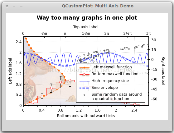
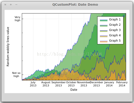
// set locale to english, so we get english month names:
  customPlot->setLocale(QLocale(QLocale::English, QLocale::UnitedKingdom));
  // seconds of current time, we'll use it as starting point in time for data:
  double now = QDateTime::currentDateTime().toTime_t();
  srand(8); // set the random seed, so we always get the same random data
  // create multiple graphs:
  for (int gi=0; gi<5; ++gi)
  {
    customPlot->addGraph();
    QPen pen;
    pen.setColor(QColor(0, 0, 255, 200));
    customPlot->graph()->setLineStyle(QCPGraph::lsLine);
    customPlot->graph()->setPen(pen);
    customPlot->graph()->setBrush(QBrush(QColor(255/4.0*gi,160,50,150)));
    // generate random walk data:
    QVector<double> time(250), value(250);
    for (int i=0; i<250; ++i)
    {
      time[i] = now + 24*3600*i;
      if (i == 0)
        value[i] = (i/50.0+1)*(rand()/(double)RAND_MAX-0.5);
      else
        value[i] = fabs(value[i-1])*(1+0.02/4.0*(4-gi)) + (i/50.0+1)*(rand()/(double)RAND_MAX-0.5);
    }
    customPlot->graph()->setData(time, value);
  }
  // configure bottom axis to show date and time instead of number:
  customPlot->xAxis->setTickLabelType(QCPAxis::ltDateTime);
  customPlot->xAxis->setDateTimeFormat("MMMM\nyyyy");
  // set a more compact font size for bottom and left axis tick labels:
  customPlot->xAxis->setTickLabelFont(QFont(QFont().family(), 8));
  customPlot->yAxis->setTickLabelFont(QFont(QFont().family(), 8));
  // set a fixed tick-step to one tick per month:
  customPlot->xAxis->setAutoTickStep(false);
  customPlot->xAxis->setTickStep(2628000); // one month in seconds
  customPlot->xAxis->setSubTickCount(3);
  // apply manual tick and tick label for left axis:
  customPlot->yAxis->setAutoTicks(false);
  customPlot->yAxis->setAutoTickLabels(false);
  customPlot->yAxis->setTickVector(QVector<double>() << 5 << 55);
  customPlot->yAxis->setTickVectorLabels(QVector<QString>() << "Not so\nhigh" << "Very\nhigh");
  // set axis labels:
  customPlot->xAxis->setLabel("Date");
  customPlot->yAxis->setLabel("Random wobbly lines value");
  // make top and right axes visible but without ticks and labels:
  customPlot->xAxis2->setVisible(true);
  customPlot->yAxis2->setVisible(true);
  customPlot->xAxis2->setTicks(false);
  customPlot->yAxis2->setTicks(false);
  customPlot->xAxis2->setTickLabels(false);
  customPlot->yAxis2->setTickLabels(false);
  // set axis ranges to show all data:
  customPlot->xAxis->setRange(now, now+24*3600*249);
  customPlot->yAxis->setRange(0, 60);
  // show legend:
  customPlot->legend->setVisible(true);
效果图:
三、曲线、柱形图、统计图...
到目前为止,我们为图像添加曲线都是使用
QCustomPlot::addGraph();
QCustomPlot::graph();QCPCurve:与QCPGraph 类似,差别在于它是用于展示参数化曲线,可以有循环。
QCPBars:柱形图,如果有多个QCPBars ,可以依次重叠。
QCPStatisticalBox、QCPColorMap、QCPFinancial
与QCPGraph 不同的是,这些画图类在添加到QCustomPlot 的时候需要使用new创建一个实例,而不能直接
<span style="color: rgb(53, 53, 53); font-family: monospace; line-height: 19.5px; background-color: rgb(240, 240, 240);">addPlottable</span>();简单例子如下:
QCPBars *myBars = new QCPBars(customPlot->xAxis, customPlot->yAxis);
customPlot->addPlottable(myBars);
// now we can modify properties of myBars:
myBars->setName("Bars Series 1");
QVector<double> keyData;
QVector<double> valueData;
keyData << 1 << 2 << 3;
valueData << 2 << 4 << 8;
myBars->setData(keyData, valueData);
customPlot->rescaleAxes();
customPlot->replot();


 500
500


 被折叠的 条评论
为什么被折叠?
被折叠的 条评论
为什么被折叠?
 到【灌水乐园】发言


