


运用场景描述
网站顶部有固定200px高度的行,左边显示图标右边显示导航菜单,如何把图标和菜单都居中显示
1、图标和菜单都浮动的效果
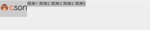
<div style="width: 500px;height: 100px;background: #eee;margin-bottom: 49px;">
    <div style="float: left;background: #ccc;">
     <img src="https://img-home.csdnimg.cn/images/20201124032511.png" style="height: 50px;">
    </div>
    <div style="float: left;background: #c3c3c3;">
        <span>菜单1</span>
        <span>菜单2</span>
        <span>菜单3</span>
        <span>菜单4</span>
        <span>菜单5</span>
    </div>
</div>
2、设置居中显示方法一
使用flex弹性布局,以及配合使用align-items:center;即可实现居中效果
- 详细样式如下

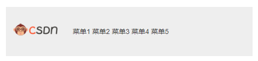

- 源码
<div style="width: 500px;height: 100px;background: #eee;margin-bottom: 49px;display: flex;align-items: center;">
    <div style="float: left;/* background: #ccc; */margin-left: 15px;">
     <img src="https://img-home.csdnimg.cn/images/20201124032511.png" style="height: 50px;">
    </div>
    <div style="float: left;/* background: #c3c3c3; */margin-left: 30px;">
        <span>菜单1</span>
        <span>菜单2</span>
        <span>菜单3</span>
        <span>菜单4</span>
        <span>菜单5</span>
    </div>
</div>


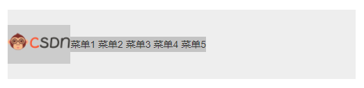
 2278
2278


 被折叠的 条评论
为什么被折叠?
被折叠的 条评论
为什么被折叠?
 到【灌水乐园】发言


