


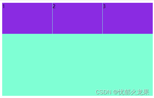
一、flex体验
<!DOCTYPE html>
<html lang="en">
<head>
    <meta charset="UTF-8">
    <meta http-equiv="X-UA-Compatible" content="IE=edge">
    <meta name="viewport" content="width=device-width, initial-scale=1.0">
    <title>Document</title>
</head>
<style>
    div{
        width: 100%;
        height: 300px;
        background-color: aquamarine;
        display: flex;
        justify-content: space-around;
    }
    div >span {
        width: 300px;
        height: 100px;
        background-color: blueviolet;
        flex: 1;
    }
    span:nth-child(2){
        margin-left: 1px;
        margin-right: 1px;
    }
</style>
<body>
    <div>
        <span>1</span>
        <span>2</span>
        <span>3</span>
    </div>
</body>
</html>
二、flex布局原理
2-1.布局原理
flex是flexible Box的缩写,意思为弹性布局,用来为盒状模型提供最大的灵活性,任何一个容器都可以指定为flex布局

 - 当我们为父盒子设为flex布局后,子元素的float,clear和vertical-align属性将失效
 - 伸缩布局=弹性布局=flex布局
2-2.布局原理
采用flex布局的元素,称为flex容器(flex container),简称“容器”。它的所有子元素自动成为容器成员,称为flex项目(flex item),简称“项目”
 - 体验中的div就是flex父容器
 - 体验中的span就是子容器flex项目
 - 子容器可以横向排列也可以纵向排列
总结
flex布局原理总结
就是通过给父盒子添加flex属性,来控制子盒子的位置和排列方式
三、flex布局父项常见属性
3-1.常见的父项属性
由6个属性是对父元素设置的
 - flex-direction:设置主轴的方向
 - justify-content:设置主轴上的子元素排列方式
 - flex-wrap:设置子元素是否换行
 - align-content:设置侧轴的子元素排列方式(多行)
 - align-items:设置侧轴上的子元素排列方式(单行)
 - flex-flow:复合属性,相当于同时设置了flex-direction和flex-wrap
3-2.flex-direction设置主轴方向(X轴)
3-2-1.主轴与侧轴
在flex布局中,是分为主轴和侧轴两个方向,同样的叫法有:行和列,x轴和y轴
- 默认主轴方向就是x轴方向,水平向右
- 默认侧轴方向就是y轴方向,水平向下
3-2-2.属性值
flex-direction属性决定主轴的方向(即项目的排列方向)
- 注意:主轴和侧轴是会变化的,就看flex-direction设置谁为主轴,剩下的就是侧轴,而我们的子元素是跟着主轴来排列的
| 属性值 | 说明 |
| row | 默认值从左到右 |
| row-reverse | 从右到左 |
| column | 从上到下 |
| column-reverse | 从下到上 |
3-3.justify-content设置主轴上的子元素排列方式
 1. justify-content: start;/* 设置主轴内容从左往右排序 */
 2. justify-content: flex-end;/* 设置主轴内容从右往左排序 */
 3. justify-content: center;/* /* 让子元素居中对齐 */
 4. justify-content: space-around;/* 平分剩余空间 */
 5. justify-content: space-between;/* 两边贴边,再平分剩余空间 */
3-4.flex-wrap设置子元素超出父盒子是否换行
 1. flex-wrap: wrap;/* 换行 */
 2. flex-wrap: nowrap;/* 不换行 */
3-4.align-items设置子元素在侧轴的排列方式(单行)
 1.align-items: center;/* 设置主轴单行内容居中 */
 2.align-items: flex-start;/* 设置主轴单行内容在上 */
 3.align-items: flex-end;/* 设置主轴单行内容在下 */
 4.align-items: stretch;/* 设置主轴单行内容拉伸 */
3-5.align-content设置子元素在侧轴的排列方式(多行)
1.align-content: center; /* 居中 */
2.align-content: flex-start;/* 上方 */
3.align-content: flex-end;/* 下方 */
4.align-content: space-around;/* 平分空间 */
5.align-content: space-between;/* 两边占用平分中间剩余空间 */
3-6.align-items和align-content的区别
 1. align-items适用于单行情况下,只有上对齐、下对齐、居中和拉伸
 2. align-content适应于换行(多行)的情况下(单行情况下无效)可以设置上对齐、下对齐、居中、拉伸以及平均分配剩余空间等属性值
 3.总结就是单行找align-items多行找align-content
3-7.flex-flow复合属性
display: flex;
flex-flow: column wrap;
四、flex布局子项常见属性
 - flex子项目占的分数
 - align-self控制子项自己在侧轴的排列方式
 - order属性定义子项的排列顺序(前后顺序)
4-1.flex属性
<!DOCTYPE html>
<html lang="en">
<head>
    <meta charset="UTF-8">
    <meta http-equiv="X-UA-Compatible" content="IE=edge">
    <meta name="viewport" content="width=s, initial-scale=1.0">
    <title>Document</title>
</head>
<style>
    section{
        width: 600px;
        height: 300px;
        margin: 0 auto;
        background-color: aquamarine;
        display: flex;
    }
    section > div:nth-child(1){
        width: 100px;
        height: 50px;
        background-color: antiquewhite;
    }
    section > div:nth-child(2){
        width: 100px;
        height: 50px;
        background-color: rgb(74, 68, 62);
        flex: 1;
    }
    section > div:nth-child(3){
        width: 100px;
        height: 50px;
        background-color: antiquewhite;
    }
</style>
<body>
    <section>
        <div>1</div>
        <div>2</div>
        <div>3</div>
    </section>
</body>
</html>

4-2.align-self属性
align-self属性允许单个项目右其他项目不一样的对齐方式,可覆盖align-items属性,默认设置为auto,表示继承父元素的align-items属性,如果没有父元素,则等同于stretch
section > div:nth-child(2){
        width: 100px;
        height: 50px;
        background-color: rgb(159, 31, 210);
        flex: 1;
        align-self: flex-end;
    }
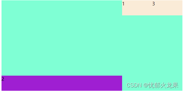
4-3.order属性
更改盒子排列顺序,值越小盒子越靠前
section > div:nth-child(2){
        width: 100px;
        height: 50px;
        background-color: rgb(159, 31, 210);
        flex: 1;
        align-self: flex-end;
        order: -1;
    }
英文单词及解释
direction  ==>  方向
row   ==>  一行
justify   ==>   使每行排齐
content   ==>  所容纳之物
space-around  ==>   周围的空间
space-between   ==>  间隔
wrap   ==>   换行
stretch   ==>   伸展
order   ==> 顺序


 693
693


 被折叠的 条评论
为什么被折叠?
被折叠的 条评论
为什么被折叠?
 到【灌水乐园】发言


