


前言
最近使用日历,在没有设置样式的情况下,如下图效果是这样的,?完全白花花一片完全找到到按钮在哪里啊,然后就是各种调试~此处略
一 AlertDialog 样式
我是知道AlertDialog 有如下样式
/**
 * Special theme constant for {@link #AlertDialog(Context, int)}: use
 * the traditional (pre-Holo) alert dialog theme.
 *
 * @deprecated Use {@link android.R.style#Theme_Material_Dialog_Alert}.
 */
@Deprecated
public static final int THEME_TRADITIONAL = 1;

/**
 * Special theme constant for {@link #AlertDialog(Context, int)}: use
 * the holographic alert theme with a dark background.
 *
 * @deprecated Use {@link android.R.style#Theme_Material_Dialog_Alert}.
 */
@Deprecated
public static final int THEME_HOLO_DARK = 2;

/**
 * Special theme constant for {@link #AlertDialog(Context, int)}: use
 * the holographic alert theme with a light background.
 *
 * @deprecated Use {@link android.R.style#Theme_Material_Light_Dialog_Alert}.
 */
@Deprecated
public static final int THEME_HOLO_LIGHT = 3;

/**
 * Special theme constant for {@link #AlertDialog(Context, int)}: use
 * the device's default alert theme with a dark background.
 *
 * @deprecated Use {@link android.R.style#Theme_DeviceDefault_Dialog_Alert}.
 */
@Deprecated
public static final int THEME_DEVICE_DEFAULT_DARK = 4;

/**
 * Special theme constant for {@link #AlertDialog(Context, int)}: use
 * the device's default alert theme with a light background.
 *
 * @deprecated Use {@link android.R.style#Theme_DeviceDefault_Light_Dialog_Alert}.
 */
@Deprecated
public static final int THEME_DEVICE_DEFAULT_LIGHT = 5;

/**
 * No layout hint.
 * @hide
 */
public static final int LAYOUT_HINT_NONE = 0;

/**
 * Hint layout to the side.
 * @hide
 */
public static final int LAYOUT_HINT_SIDE = 1;
而现在的DatePickerDialog不支持使用这些值了,来看下它的构造方法:
public DatePickerDialog(@NonNull Context context, @StyleRes int themeResId,
        @Nullable OnDateSetListener listener, int year, int monthOfYear, int dayOfMonth) {
    this(context, themeResId, listener, null, year, monthOfYear, dayOfMonth);
}
看它的第二个参考限定为StyleRes类型,只能使用style了。
二 DatePickerDialog样式(自定义style)
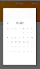
1 NoActionBar
<style name="dialog_date" parent="Theme.AppCompat.NoActionBar">
    <!--设置头部颜色-->
    <!--<item name="colorPrimary">@color/tip_text_color</item>-->
    <!--<item name="colorPrimaryDark">@color/tip_text_color</item>-->
    <!--<item name="colorAccent">@color/tip_text_color</item>-->
    <!--设置dialog不全屏 -->
    <item name="android:windowIsTranslucent">false</item>
    <item name="android:windowNoTitle">true</item>
    <!--除去title,如果在代码里面有其他设置会没效果的不过完全没效果-->
    <item name="android:windowContentOverlay">@null</item>
    <item name="android:backgroundDimEnabled">false</item>
    <!--<!–除去背景色–>-->
    <!--<item name="android:windowBackground">@null</item>-->
</style>
效果图
说明,此时也可以通过windowBackground属性改变其背景颜色。
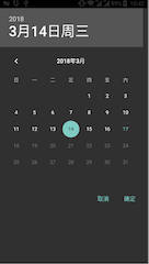
2 自定义样式
这种样式有浮动模式和非浮动模式,关键在于属性windowIsFloating。
(1)非浮动模式
<style name="dialog_date">
    <!--设置header部分显示的颜色-->
    <item name="colorPrimary">@color/tip_text_color</item>
    <item name="colorPrimaryDark">@color/tip_text_color</item>
    <item name="colorAccent">@color/tip_text_color</item>
    <!--这个说明提示框是否有边框-->
    <item name="android:windowFrame">@null</item>
    <!--这个说明提示框是否是浮动的 这个很重要-->
    <item name="android:windowIsFloating">false</item>
    <!--设置dialog不全屏 貌似没有效果-->
    <item name="android:windowFullscreen">false</item>
    <!--这个说明提示框是滞是透明的-->
    <item name="android:windowIsTranslucent">true</item>
    <item name="android:windowNoTitle">true</item>
    <!--除去title,如果在代码里面有其他设置会没效果的不过完全没效果-->
    <item name="android:windowContentOverlay">@null</item>
    <item name="android:backgroundDimEnabled">false</item>
    <!--<!–背景色  如果除去背景色 @null –>-->
    <!--<item name="android:windowBackground">@color/red_F1</item>-->
    <!--按钮字体的颜色-->
    <!--<item name="android:textColor">@color/dark_2B</item>-->
</style>
效果图:

通过windowBackground属性改变其背景颜色
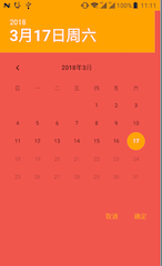
(2)浮动模式
把上面windowIsFloating属性设置为true。
效果图:
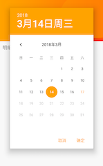
3 使用 Base.Theme.AppCompat.Light.Dialog.FixedSize
<style name="dialog_date" parent="Base.Theme.AppCompat.Light.Dialog.FixedSize">
    <!--设置header部分显示的颜色-->
    <item name="colorPrimary">@color/tip_text_color</item>
    <item name="colorPrimaryDark">@color/tip_text_color</item>
    <item name="colorAccent">@color/tip_text_color</item>
</style>
效果图:
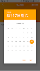
说明,很明确这种样式比起上面的多了个半透明背景,用户体验更好些,当然还有其他的很多样式~,就不再这里尝试了。


 2190
2190

 被折叠的 条评论
为什么被折叠?
被折叠的 条评论
为什么被折叠?
 到【灌水乐园】发言


