


布局变成横排。都先向左浮动,再根据调整外边距margin-top和margin-left调整位置
<!doctype html>
<html>
<head>
<meta charset="utf-8">
<title>浮动</title>
<style>
.box1{width: 270px;height: 170px;
border: 10px solid #000;
background: red;
padding: 5px;
float: 50px;
float: left;
margin-left: 300px;}
.box2{width: 270px;height: 170px;
border: 10px solid #000;
background: green;
padding: 5px;
float:left;
margin-left: -600px;}
.box3{width: 270px;height: 170px;
border: 10px solid #000;
background: yellow;
padding: 5px;
float:left;}
.all{margin:0 auto;width: 900px;}//整体居中
</style>
</head>
<body>
<div class="all">
<div class="box1">01</div>
<div class="box2">02</div>
<div class="box3">03</div>
</body>
</html>

<title>布局1</title>
<style>
.header{width: 748px;height: 88px;
border: 1px solid #000000;
padding: 5px;}//第一个框的属性,不用浮动
.left{width:148px;height: 390px;
border-left: 1px solid #000000;
border-right: 1px solid #000000;
padding: 5px;
float: left;}//左边第一个框的属性。向左浮动
.right{width: 589px;height: 390px;
border-right: 1px solid #000000;
padding: 5px;
float: left;}//右边框的属性,向左浮动
.footer{width: 748px;height: 88px;
border: 1px solid #000000;
padding: 5px;
clear: both;}//底部的属性。因为受到第三个框的浮动影响,所以要清除浮动
.all{margin:0 auto;width: 760px;}
</style>
</head>//整体内容居中
<body>
<div class="all">
<div class="header">01</div>
<div class="left">02</div>
<div class="right">03</div>
<div class="footer">04</div>
布局2
用border-top/right/left/bottom去掉重合的边

<title>布局</title>
<style>
.left{width: 160px;height: 600px;
float: left;}//整体左部分,不需要边框,向左浮动
.box1{width: 148px;height: 288px;
border: 1px solid #000;
padding: 5px;}
.box2{width: 148px;height: 288px;
border-left: 1px solid #000;
border-bottom: 1px solid #000;
border-right: 1px solid #000;
padding: 5px;}
.right{width: 600px;height: 600px;
float: left;}//整体右部分,不需要边框,向左浮动
.box3{width: 548px;height: 188px;
border: 1px solid #000;
border-left: 0;
padding: 5px;}
.box4{width: 548px;height: 188px;
border-right: 1px solid #000;
padding: 5px;}
.box5{width: 548px;height: 188px;
border: 1px solid #000;
border-left: 0;
padding: 5px;}
.all{margin:0 auto width: 760px;}
</style>
</head>
<body>
<div class="all">
<div class="left">
<div class="box1">01</div>
<div class="box2">02</div>
</div>
<div class="right">
<div class="box3">03</div>
<div class="box4">04</div>
<div class="box5">05</div>
</div>//先整体分左右两部分,在分
</div>
布局3

<style>
.box1{width: 88px;height: 588px;padding: 5px;border: 1px solid red;
float: left;}
.box2{width: 649px;height: 88px;padding: 5px;border: 1px solid red;
float: left;border-left: 0;}
.box3{width: 149px;height: 489px;padding: 5px;border: 1px solid red;
float: left;border-left: 0;border-top: 0; }
.box4{width: 489px;height: 189px;padding: 5px;border: 1px solid red;
float: left;border-top: 0;border-left: 0;}
.box5{width: 240px;height: 140px;padding: 5px;border: 0px solid red;
float: left;}
.box6{width: 238px;height: 289px;padding: 5px;border: 1px solid red;
float: right;border-top: 0;}//限于整体长度的影响,所以向右浮动
.box7{width: 240px;height: 138px;padding: 5px;border: 1px solid red;
float: left;border-left: 0;border-right: 0;}
.all{margin:0 auto ;width: 760px;}
</style>
</head>
<body>
<div class="all">
<div class="box1">01</div>
<div class="box2">02</div>
<div class="box3">03</div>
<div class="box4">04</div>
<div class="box5">05</div>
<div class="box6">06</div>
<div class="box7">07</div>
</div>
盒子

<!doctype html>
<html>
<head>
<meta charset="utf-8">
<title>无标题文档</title>
<style>
div{border: 10px solid red;background-color: green;width: 300px;height: 300px;
border-radius: 2000px;/*圆角大小*/
box-sizing: border-box;/*自己定义的宽高就是实际的宽高,包括了边框,不用最后再减掉边框了*/
font-size: 100px;line-height: 280px;text-align: center;font-family: "alex-brush";/*文字line-height等于实际高度(280)就会垂直居中*/
float: left;}/*相当于divd的第一个孩子,底下div的孩子的属性可以只写要改变的*/
div:nth-child(2){border-color: #0034FF;}/*divd的第二个孩子,只改变边框颜色即可*/
div:nth-child(3){border-color:#FFAE00;}/*divd的第三个孩子,只改变边框颜色即可*/
</style>
</head>
<body>
<div>01</div>
<div>02</div>
<div>03</div>
</body>
</html>

给出具体宽度
<!doctype html>
<html>
<head>
<style>
/*css语言的注释*/
html{border: 3px solid black;width: }
body{border: 3px solid green;width: 500px;}
div{border: 3px solid red;box-sizing: border-box;width: 600px;}
</style>
<!--html注释(手机meta)
content 内容“device设备 initia初始化 scale缩放比例 maximum最大数 user用户 scaleable允许缩放比例”
name 名字“ viewport视窗”
-->
<meta content="width=device-width, initial-scale=1.0;maximum-scale=1.0,user-scaleable=0"
name="viewport">
<meta charset="utf-8">
<title>无标题文档</title>
</head>
<body>
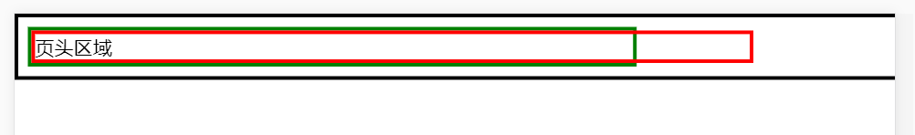
<div>页头区域</div>
</body>
</html>
相对百分比
html{border: 3px solid black;width: }
body{border: 3px solid green;width: 50%;}
div{border: 3px solid red;box-sizing: border-box;width: 50%;}
案例一
手机端

<!doctype html>
<html>
<head>
<!--html注释(手机meta)
content 内容“device设备 initia初始化 scale缩放比例 maximum最大数 user用户 scaleable允许缩放比例”
name 名字“ viewport视窗”
-->
<meta content="width=device-width, initial-scale=1.0;maximum-scale=1.0,user-scaleable=0"
name="viewport">
<meta charset="utf-8">
<title>无标题文档</title>
<style>
/*css语言的注释*/
body{margin: 0;}/*去掉body自带的外边距*/
.header{background-color: red;box-sizing: border-box;
font-size: 18px;color: white;letter-spacing: 8px;font-family: "微软雅黑";
line-height: 50px;text-align: center;/*注意:不能轻易设置盒子的高度*/
.text1{font-size: 16px;font-family: "微软雅黑";letter-spacing: 2px;/*字间距*/
text-indent: 32px;padding:20px 10px;/*首行缩进了两个字符(一般不设置);内边距缩进上下缩进20px 左右缩进10px;*/
text-align: justify;}/*两端对齐(相当于ps里,下面的避头尾)*/
.header2{background-color: #FF4700;box-sizing: border-box;
font-size: 16px;color: white;font-family: "微软雅黑";
line-height: 30px;
padding-right: 10px;}
.text2{padding: 30px 10px;line-height: 25px;}
</style>
</head>
<body>
<div class="header"><strong>页头内容区域</strong></div>
<div class="text1">假如我们想在这个地方显示一些文案信息,让文字信息成为盒子里面的段落文字,怎么排???</div>
<div class="header2">小标题内容区域</div>
<div class="text2"><b><!--加粗-->
<a href="www.baidu.com">新闻链接位置可以点击链接到百度网站</a><br><!--换行-->
<a href="www.baidu.com">新闻链接位置可以点击链接到百度网站</a><br>
<a href="www.baidu.com">新闻链接位置可以点击链接到百度网站</a></b>
</div>
</body>
</html>
网页端
.header{background-color: red;box-sizing: border-box;
font-size: 18px;color: white;letter-spacing: 8px;font-family: "微软雅黑";
line-height: 50px;text-align: center;/*注意:不能轻易设置盒子的高度*/
transition: 3s;}/*过度延迟(加在鼠标经过变化之前)*/
.header:hover{background-color: green;font-size: 30px;color: yellow;}/*鼠标经过的时候背景变绿色;文字换大;文字变黄色*/
.text2{padding: 30px 10px;line-height: 25px;}
a:hover{color: red;}
根据宽度自动生成列数
div{border: 2px solid red;box-sizing: border-box;float: left;
width: calc(100% / 2)}/*运算符两边必须加空格*/
width: -webkit-calc(100% / 3 - 10px);/*-webkit用于低版本不显示的时候- */


 1219
1219


 被折叠的 条评论
为什么被折叠?
被折叠的 条评论
为什么被折叠?
 到【灌水乐园】发言


