一、style
<ResourceDictionary xmlns="http://schemas.microsoft.com/winfx/2006/xaml/presentation"
xmlns:x="http://schemas.microsoft.com/winfx/2006/xaml">
<SolidColorBrush x:Key="ProgressBar.Progress" Color="#FF06B025"/>
<SolidColorBrush x:Key="ProgressBar.Background" Color="#FFE6E6E6"/>
<SolidColorBrush x:Key="ProgressBar.Border" Color="#FFBCBCBC"/>
<Style x:Key="ProgressBarStyle1" TargetType="{x:Type ProgressBar}">
<Setter Property="Foreground" Value="{StaticResource ProgressBar.Progress}"/>
<Setter Property="Background" Value="{StaticResource ProgressBar.Background}"/>
<Setter Property="BorderBrush" Value="{StaticResource ProgressBar.Border}"/>
<Setter Property="BorderThickness" Value="1"/>
<Setter Property="Template">
<Setter.Value>
<ControlTemplate TargetType="{x:Type ProgressBar}">
<Grid x:Name="TemplateRoot">
<VisualStateManager.VisualStateGroups>
<VisualStateGroup x:Name="CommonStates">
<VisualState x:Name="Determinate"/>
<VisualState x:Name="Indeterminate">
<Storyboard RepeatBehavior="Forever">
<DoubleAnimationUsingKeyFrames Storyboard.TargetName="Animation" Storyboard.TargetProperty="(UIElement.RenderTransform).(TransformGroup.Children)[0].(ScaleTransform.ScaleX)">
<EasingDoubleKeyFrame KeyTime="0" Value="0.25"/>
<EasingDoubleKeyFrame KeyTime="0:0:1" Value="0.25"/>
<EasingDoubleKeyFrame KeyTime="0:0:2" Value="0.25"/>
</DoubleAnimationUsingKeyFrames>
<PointAnimationUsingKeyFrames Storyboard.TargetName="Animation" Storyboard.TargetProperty="(UIElement.RenderTransformOrigin)">
<EasingPointKeyFrame KeyTime="0" Value="-0.5,0.5"/>
<EasingPointKeyFrame KeyTime="0:0:1" Value="0.5,0.5"/>
<EasingPointKeyFrame KeyTime="0:0:2" Value="1.5,0.5"/>
</PointAnimationUsingKeyFrames>
</Storyboard>
</VisualState>
</VisualStateGroup>
</VisualStateManager.VisualStateGroups>
<Border CornerRadius="10" Background="{TemplateBinding Background}" BorderBrush="{TemplateBinding BorderBrush}" BorderThickness="{TemplateBinding BorderThickness}"/>
<Rectangle x:Name="PART_Track"/>
<Grid x:Name="PART_Indicator" ClipToBounds="true" HorizontalAlignment="Left">
<Border x:Name="Indicator" CornerRadius="10" Background="{TemplateBinding Foreground}"/>
<Border x:Name="Animation" CornerRadius="10" Background="{TemplateBinding Foreground}" RenderTransformOrigin="0.5,0.5">
<Border.RenderTransform>
<TransformGroup>
<ScaleTransform/>
<SkewTransform/>
<RotateTransform/>
<TranslateTransform/>
</TransformGroup>
</Border.RenderTransform>
</Border>
<TextBlock Text="{Binding RelativeSource={RelativeSource TemplatedParent},Path=Value,StringFormat={}{0}%}" Foreground="White" HorizontalAlignment="Center"/>
</Grid>
</Grid>
<ControlTemplate.Triggers>
<Trigger Property="Orientation" Value="Vertical">
<Setter Property="LayoutTransform" TargetName="TemplateRoot">
<Setter.Value>
<RotateTransform Angle="-90"/>
</Setter.Value>
</Setter>
</Trigger>
<Trigger Property="IsIndeterminate" Value="true">
<Setter Property="Visibility" TargetName="Indicator" Value="Collapsed"/>
</Trigger>
</ControlTemplate.Triggers>
</ControlTemplate>
</Setter.Value>
</Setter>
</Style>
<Style x:Key="ProgressBarStyle2" TargetType="{x:Type ProgressBar}">
<Setter Property="Foreground" Value="{StaticResource ProgressBar.Progress}"/>
<Setter Property="Background" Value="{StaticResource ProgressBar.Background}"/>
<Setter Property="BorderBrush" Value="{StaticResource ProgressBar.Border}"/>
<Setter Property="BorderThickness" Value="1"/>
<Setter Property="Template">
<Setter.Value>
<ControlTemplate TargetType="{x:Type ProgressBar}">
<Grid x:Name="TemplateRoot">
<VisualStateManager.VisualStateGroups>
<VisualStateGroup x:Name="CommonStates">
<VisualState x:Name="Determinate"/>
<VisualState x:Name="Indeterminate">
<Storyboard RepeatBehavior="Forever">
<DoubleAnimationUsingKeyFrames Storyboard.TargetName="Animation" Storyboard.TargetProperty="(UIElement.RenderTransform).(TransformGroup.Children)[0].(ScaleTransform.ScaleX)">
<EasingDoubleKeyFrame KeyTime="0" Value="0.25"/>
<EasingDoubleKeyFrame KeyTime="0:0:1" Value="0.25"/>
<EasingDoubleKeyFrame KeyTime="0:0:2" Value="0.25"/>
</DoubleAnimationUsingKeyFrames>
<PointAnimationUsingKeyFrames Storyboard.TargetName="Animation" Storyboard.TargetProperty="(UIElement.RenderTransformOrigin)">
<EasingPointKeyFrame KeyTime="0" Value="-0.5,0.5"/>
<EasingPointKeyFrame KeyTime="0:0:1" Value="0.5,0.5"/>
<EasingPointKeyFrame KeyTime="0:0:2" Value="1.5,0.5"/>
</PointAnimationUsingKeyFrames>
</Storyboard>
</VisualState>
</VisualStateGroup>
</VisualStateManager.VisualStateGroups>
<Border CornerRadius="10" Background="{TemplateBinding Background}" BorderBrush="{TemplateBinding BorderBrush}" BorderThickness="{TemplateBinding BorderThickness}"/>
<Rectangle x:Name="PART_Track"/>
<Grid x:Name="PART_Indicator" ClipToBounds="true" HorizontalAlignment="Left">
<Border x:Name="Indicator" CornerRadius="10">
<Border.Background>
<LinearGradientBrush>
<GradientStop Color="{Binding RelativeSource={RelativeSource TemplatedParent},Path=Foreground}"/>
</LinearGradientBrush>
</Border.Background>
</Border>
<Border x:Name="Animation" CornerRadius="10" RenderTransformOrigin="0.5,0.5">
<Border.RenderTransform>
<TransformGroup>
<ScaleTransform/>
<SkewTransform/>
<RotateTransform/>
<TranslateTransform/>
</TransformGroup>
</Border.RenderTransform>
<Border.Background>
<LinearGradientBrush>
<GradientStop Color="Green" Offset="0"/>
<GradientStop Color="Aqua" Offset="0.3"/>
<GradientStop Color="Purple" Offset="0.5"/>
<GradientStop Color="Blue" Offset="0.7"/>
<GradientStop Color="Red" Offset="0.9"/>
</LinearGradientBrush>
</Border.Background>
</Border>
<TextBlock Text="{Binding RelativeSource={RelativeSource TemplatedParent},Path=Value,StringFormat={}{0}%}" Foreground="White" HorizontalAlignment="Center"/>
</Grid>
</Grid>
<ControlTemplate.Triggers>
<Trigger Property="Orientation" Value="Vertical">
<Setter Property="LayoutTransform" TargetName="TemplateRoot">
<Setter.Value>
<RotateTransform Angle="-90"/>
</Setter.Value>
</Setter>
</Trigger>
<Trigger Property="IsIndeterminate" Value="true">
<Setter Property="Visibility" TargetName="Indicator" Value="Collapsed"/>
</Trigger>
</ControlTemplate.Triggers>
</ControlTemplate>
</Setter.Value>
</Setter>
</Style>
<Style x:Key="ProgressBarStyle3" TargetType="{x:Type ProgressBar}">
<Setter Property="Foreground" Value="{StaticResource ProgressBar.Progress}"/>
<Setter Property="Background" >
<Setter.Value>
<LinearGradientBrush>
<GradientStop Color="Green" Offset="0"/>
<GradientStop Color="Aqua" Offset="0.3"/>
<GradientStop Color="Purple" Offset="0.5"/>
<GradientStop Color="Blue" Offset="0.7"/>
<GradientStop Color="Red" Offset="0.9"/>
</LinearGradientBrush>
</Setter.Value>
</Setter>
<Setter Property="BorderBrush" Value="{StaticResource ProgressBar.Border}"/>
<Setter Property="BorderThickness" Value="1"/>
<Setter Property="Template">
<Setter.Value>
<ControlTemplate TargetType="{x:Type ProgressBar}">
<Grid x:Name="TemplateRoot">
<VisualStateManager.VisualStateGroups>
<VisualStateGroup x:Name="CommonStates">
<VisualState x:Name="Determinate"/>
<VisualState x:Name="Indeterminate">
<Storyboard RepeatBehavior="Forever">
<DoubleAnimationUsingKeyFrames Storyboard.TargetName="Animation" Storyboard.TargetProperty="(UIElement.RenderTransform).(TransformGroup.Children)[0].(ScaleTransform.ScaleX)">
<EasingDoubleKeyFrame KeyTime="0" Value="0.25"/>
<EasingDoubleKeyFrame KeyTime="0:0:1" Value="0.25"/>
<EasingDoubleKeyFrame KeyTime="0:0:2" Value="0.25"/>
</DoubleAnimationUsingKeyFrames>
<PointAnimationUsingKeyFrames Storyboard.TargetName="Animation" Storyboard.TargetProperty="(UIElement.RenderTransformOrigin)">
<EasingPointKeyFrame KeyTime="0" Value="-0.5,0.5"/>
<EasingPointKeyFrame KeyTime="0:0:1" Value="0.5,0.5"/>
<EasingPointKeyFrame KeyTime="0:0:2" Value="1.5,0.5"/>
</PointAnimationUsingKeyFrames>
</Storyboard>
</VisualState>
</VisualStateGroup>
</VisualStateManager.VisualStateGroups>
<Border CornerRadius="10" Background="{TemplateBinding Background}" BorderBrush="{TemplateBinding BorderBrush}" BorderThickness="{TemplateBinding BorderThickness}"/>
<Rectangle x:Name="PART_Track"/>
<Grid x:Name="PART_Indicator" ClipToBounds="true" HorizontalAlignment="Left">
<Border Opacity="0.3" x:Name="Indicator" CornerRadius="10" Background="{TemplateBinding Foreground}">
</Border>
<Border Opacity="0.3" x:Name="Animation" CornerRadius="10" RenderTransformOrigin="0.5,0.5" Background="{TemplateBinding Foreground}">
<Border.RenderTransform>
<TransformGroup>
<ScaleTransform/>
<SkewTransform/>
<RotateTransform/>
<TranslateTransform/>
</TransformGroup>
</Border.RenderTransform>
</Border>
<TextBlock Text="{Binding RelativeSource={RelativeSource TemplatedParent},Path=Value,StringFormat={}{0}%}" Foreground="White" HorizontalAlignment="Center"/>
</Grid>
</Grid>
<ControlTemplate.Triggers>
<Trigger Property="Orientation" Value="Vertical">
<Setter Property="LayoutTransform" TargetName="TemplateRoot">
<Setter.Value>
<RotateTransform Angle="-90"/>
</Setter.Value>
</Setter>
</Trigger>
<Trigger Property="IsIndeterminate" Value="true">
<Setter Property="Visibility" TargetName="Indicator" Value="Collapsed"/>
</Trigger>
</ControlTemplate.Triggers>
</ControlTemplate>
</Setter.Value>
</Setter>
</Style>
</ResourceDictionary>
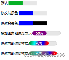
二、Demo
 <WrapPanel>
            <StackPanel Orientation="Horizontal" Margin="10">
                <TextBlock Text="默认:"/>
                <ProgressBar Width="100" Value="50"/>
            </StackPanel>
            <StackPanel Orientation="Horizontal" Margin="10">
                <TextBlock Text="修改前景色:"/>
                <ProgressBar Width="100" Value="50" Foreground="Blue"/>
            </StackPanel>
            <StackPanel Orientation="Horizontal" Margin="10">
                <TextBlock Text="修改背景色:"/>
                <ProgressBar Width="100" Value="50" Foreground="Blue" Background="Black"/>
            </StackPanel>
            <StackPanel Orientation="Horizontal" Margin="10">
                <TextBlock Text="增加圆角和进度显示:"/>
                <ProgressBar Style="{DynamicResource ProgressBarStyle1}" Width="100" Value="50" Foreground="Purple"  />
            </StackPanel>
            <StackPanel Orientation="Horizontal" Margin="10">
                <TextBlock Text="修改内部进度样式:"/>
                <ProgressBar Style="{DynamicResource ProgressBarStyle2}" Width="100" Value="70" Foreground="Aqua"  />
            </StackPanel>
            <StackPanel Orientation="Horizontal" Margin="10">
                <TextBlock Text="修改内部进度样式:"/>
                <ProgressBar Style="{DynamicResource ProgressBarStyle3}" Width="100" Value="70" Foreground="Gray"  />
            </StackPanel>
        </WrapPanel>
三、效果


 1996
1996


 被折叠的 条评论
为什么被折叠?
被折叠的 条评论
为什么被折叠?
 到【灌水乐园】发言


