


一、控件的TemplateParent属性。
在WPF中,每个控件都有一个TemplateParent属性,如果他的值不为Null,标明这个控件是由Template自动生成的,而该属性的值就是应用了该模板的控件。
如,在前面提到的TextBox实际上是由Microsoft_Windows_Themes:ListBoxChrome下面包含一个ScrollViewer构成,对于ListBoxChrome和ScrollViewer,它的TemplateParent就是这个TextBox控件。
二、DataTemplate与ControlTemplate作为资源使用
2.1 ControlTemplate应用到目标上需要借助Style实现,如果Style没有标记x:Key,默认会应用到所有目标控件上;如果标记了x:Key,目标控件要引用该Style需要引用该Key。
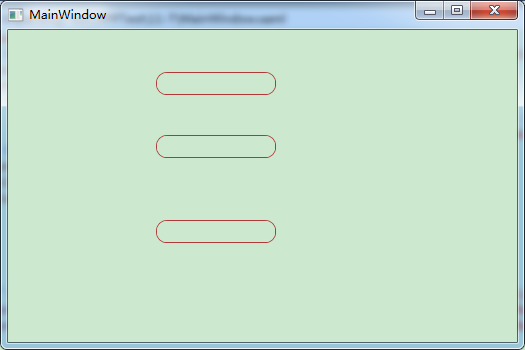
还是以之前将TextBox直角变弯的例子为例,如果我们将其x:Key删除,发现所有的TextBox都编程了弯角。
<Window x:Class="_11_7.MainWindow"
        xmlns="http://schemas.microsoft.com/winfx/2006/xaml/presentation"
        xmlns:x="http://schemas.microsoft.com/winfx/2006/xaml"
        Title="MainWindow" Height="350" Width="525">
    <Window.Resources>
        <Style BasedOn="{x:Null}" TargetType="{x:Type TextBox}">
            <Setter Property="Foreground" Value="{DynamicResource {x:Static SystemColors.ControlTextBrushKey}}"/>
            <Setter Property="Background" Value="{DynamicResource {x:Static SystemColors.WindowBrushKey}}"/>
            <Setter Property="BorderThickness" Value="1"/>
            <Setter Property="Padding" Value="1"/>
            <Setter Property="AllowDrop" Value="true"/>
            <Setter Property="FocusVisualStyle" Value="{x:Null}"/>
            <Setter Property="ScrollViewer.PanningMode" Value="VerticalFirst"/>
            <Setter Property="Stylus.IsFlicksEnabled" Value="False"/>
            <Setter Property="Template">
                <Setter.Value>
                    <ControlTemplate TargetType="{x:Type TextBox}">
                        <Border x:Name="Bd" BorderBrush="{TemplateBinding BorderBrush}" BorderThickness="{TemplateBinding BorderThickness}" Background="{TemplateBinding Background}"  SnapsToDevicePixels="true"
                        CornerRadius="10">
                            <ScrollViewer x:Name="PART_ContentHost" SnapsToDevicePixels="{TemplateBinding SnapsToDevicePixels}"/>
                        </Border>
                        <ControlTemplate.Triggers>
                            <Trigger Property="IsEnabled" Value="false">
                                <Setter Property="Background" TargetName="Bd" Value="{DynamicResource {x:Static SystemColors.ControlBrushKey}}"/>
                                <Setter Property="Foreground" Value="{DynamicResource {x:Static SystemColors.GrayTextBrushKey}}"/>
                            </Trigger>
                        </ControlTemplate.Triggers>
                    </ControlTemplate>
                </Setter.Value>
            </Setter>
        </Style>

    </Window.Resources>
    <Grid>
        <TextBox Height="23" HorizontalAlignment="Left" Margin="148,42,0,0" Name="textBox1" VerticalAlignment="Top" Width="120" BorderBrush="#FFB13939" />
        <TextBox BorderBrush="#FFB13939" Height="23" HorizontalAlignment="Left" Margin="148,105,0,0" Name="textBox2" VerticalAlignment="Top" Width="120" />
        <TextBox BorderBrush="#FFB13939" Height="23" HorizontalAlignment="Left" Margin="148,190,0,0" Name="textBox3" VerticalAlignment="Top" Width="120" />
    </Grid>
</Window>
运行效果如下(为了查看的效果更明显,我将TextBox的边界颜色改成了红色):
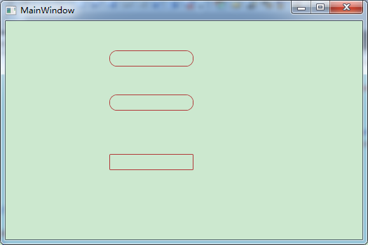
此时,若我们想要将其中一个TextBox的Style不采用这种Style,则需要设置该TextBox的Style为{x:Null}
<TextBox BorderBrush="#FFB13939" Height="23" HorizontalAlignment="Left" Margin="148,190,0,0" Name="textBox3" VerticalAlignment="Top" Width="120"
                 Style="{x:Null}"/>
运行效果如图:
2.2 把DataTemlate应用在某个数据类型,方法是设置DataTemlate的DataType属性,并且DataTemlate作为资源时不能带有x:Key标记。
 <Window x:Class="_11_7.MainWindow"
        xmlns="http://schemas.microsoft.com/winfx/2006/xaml/presentation"
        xmlns:x="http://schemas.microsoft.com/winfx/2006/xaml"
        xmlns:local="clr-namespace:_11_7"
        xmlns:c="clr-namespace:System.Collections;assembly=mscorlib"
        Title="MainWindow" Height="350" Width="525">
    <Window.Resources>
        <DataTemplate DataType="{x:Type local:Unit}">
            <Grid>
                <StackPanel Orientation="Horizontal">
                    <Grid>
                        <Rectangle Stroke="Yellow" Fill="Orange" Width="{Binding Price}"/>
                        <TextBlock Text="{Binding Year}"/>
                    </Grid>
                </StackPanel>
            </Grid>
        </DataTemplate>
        <c:ArrayList x:Key="ds">
            <local:Unit Year="2001" Price="100"/>
            <local:Unit Year="2002" Price="120"/>
            <local:Unit Year="2003" Price="140"/>
            <local:Unit Year="2004" Price="160"/>
            <local:Unit Year="2005" Price="180"/>
            <local:Unit Year="2006" Price="190"/>
        </c:ArrayList>
    </Window.Resources>
    <Grid>
        <StackPanel>
            <ListBox ItemsSource="{StaticResource ds}"/>
            <ComboBox ItemsSource="{StaticResource ds}" Margin="5"/>
        </StackPanel>
    </Grid>
</Window>
运行效果如下:
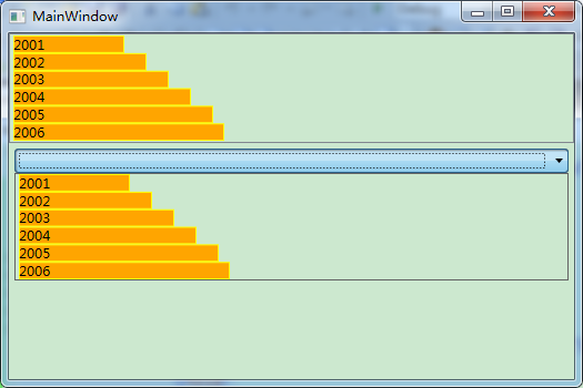
至此,对DataTemlate和ControlTemplate的区别也更见清晰,DataTemlate本质上是将数据进行封装,以特定的UI表现出来,而直接的应用就是将一个类中的数据进行封装,那么后续这个类所有的对象都会采用该种UI表现。


 扫一扫
扫一扫
 849
849

 被折叠的 条评论
为什么被折叠?
被折叠的 条评论
为什么被折叠?
 到【灌水乐园】发言


