


一、基本概念:标准+IE模型
盒模型:指在网页设计和和排版中用来描述元素在页面上占据空间的一种模型。
margin + border + padding + content
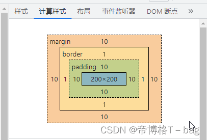
标准模型:将元素的宽度和高度仅计算为内容区域的尺寸(content-box,默认)
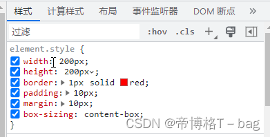
当CSS盒模型为 标准盒模型 (box-sizing: content-box) 时,
元素的宽度 = 内容区域的宽度(content)
200px = 200px
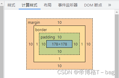
IE模型:将宽度和高度包括了内边距和边框的尺寸(border-box)
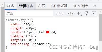
当CSS盒模型为 IE盒模型 (box-sizing: border-box) 时,
元素的宽度 = 内容区域的宽度 + 内边距 + 边框 (content + padding + border)
200px = 178 + 10 * 2 + 1 * 2
二、标准和IE的模型区别
计算宽度和高度的方式不同
三、CSS如何设置两种模型
- 通过css设置标准模型
box-sizing: content-box;
- 通过css设置IE盒模型
box-sizing: border-box;
四、JS如何设置获取盒模型对应宽和高
- 通过dom.style属性获取, 只能获取内联样式的宽和高
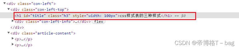
let dom = document.getElementById("title")
console.log('宽度',dom.style.width) // 只能获取内联样式的宽
console.log('高度',dom.style.height) // 无法外部样式表的高
宽度 100px
高度
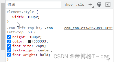
1-1. 扩展知识:css 三种样式表
// 内联样式:直接在html标签中使用style属性设置的样式
<p style="color: red;">这是内联样式的文本</p>

// 内部样式表: 内部样式表是在HTML文件的头部使用style标签定义的样式
<head>
<style>
p {
color: blue;
}
</style>
</head>

// 外部样式表:外部样式表是单独的CSS文件,与HTML文件分离
<head>
<link rel="stylesheet" type="text/css" href="styles.css">
</head>
- 通过dom.currentStyle.width/height, 获取浏览器渲染以后的宽和高,但是这个属性只有IE支持
- window.getComputedStyle(dom).width/height , 获取浏览器渲染以后的宽和高,兼容性好
let dom = document.getElementById("title")
console.log('宽度',window.getComputedStyle(dom).width)
console.log('高度',window.getComputedStyle(dom).height)
// 宽度 200px
// 高度 100px
- dom.getBoundingClientRect().width/height, 通过计算该元素top、left、bottom、right到浏览器的距离,可以算出元素的宽高
let dom = document.getElementById("title")
console.log('宽度',dom.getBoundingClientRect().width)
console.log('高度',dom.getBoundingClientRect().height)
// 宽度 100
// 高度 100
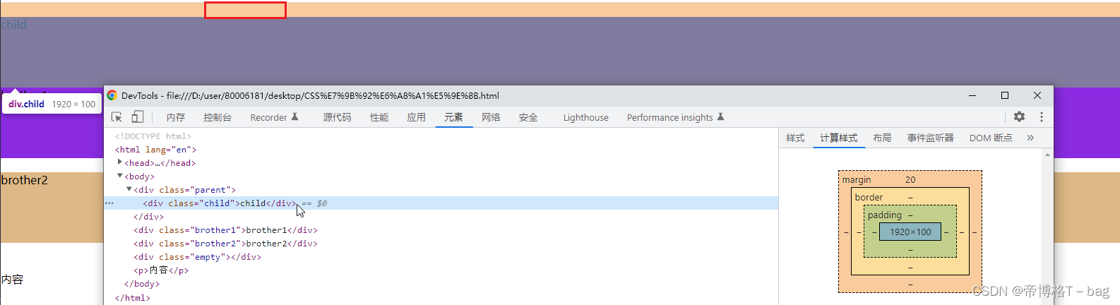
五、实例题(根据盒模型解释边距重叠)
边距重叠:相邻的两个或多个元素的外边距(margin)会合并(或折叠)成一个单一的外边距
- 父子元素的边距重叠,取两者之间的最大值
<style>
.parent {
	background-color: aqua;
}
.child {
  height: 100px;
  margin-top:20px ;
  background-color: brown;
}
</style>
<body>
  <div class="parent">
    <div class="child"></div>
  </div>
<body>
父元素:margin-top: 0 和 子元素margin-top: 20px,取margin-top:20px
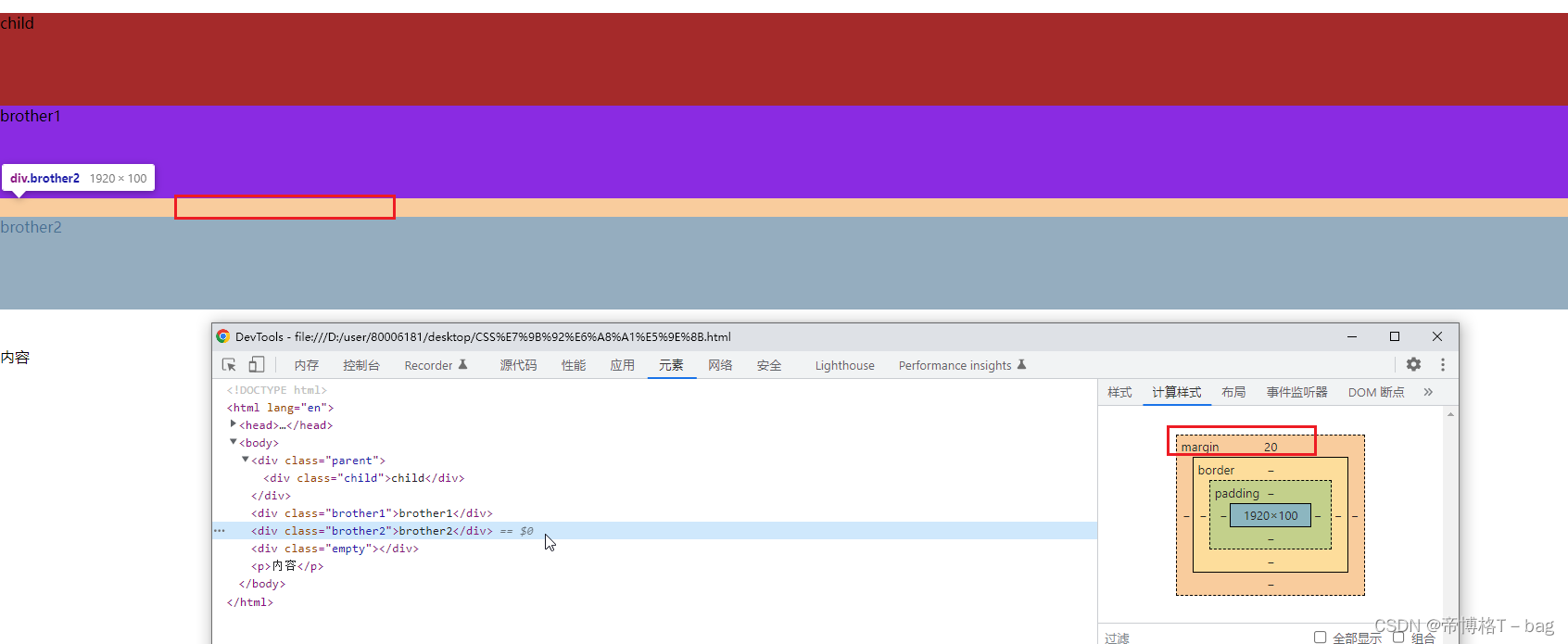
2. 兄弟元素的边距重叠,取两者之间的最大值
<style>
.brother1 {
  height: 100px;
  background-color: blueviolet;
  margin-bottom: 10px;
}
.brother2 {
  height: 100px;
  background-color: burlywood;
  margin-top: 20px;
}
</style>
<body>
<div class="brother1">brother1</div>
  <div class="brother2">brother2</div>
</body>
brother1 margin-bottom: 10px; brother margin-top:20px; 取 margin-top:20px
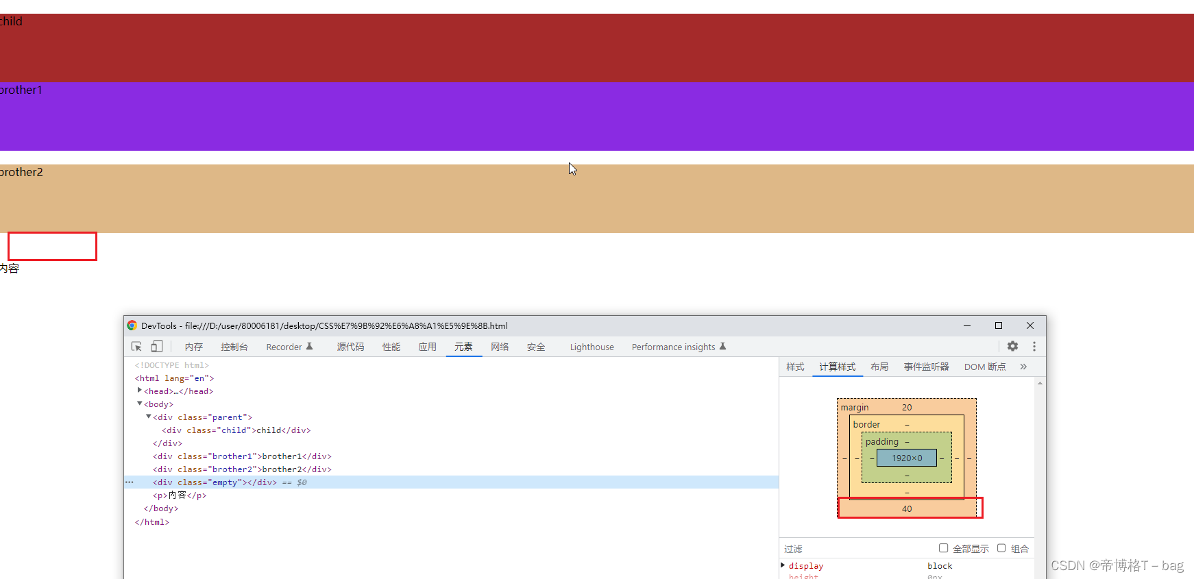
3. 空元素的边距重叠,取两者之间的最大值
<style>
.empty {
  margin-top: 20px;
  margin-bottom: 40px;
}
</style>
<body>
<div class="empty"></div>
</body>
.empty margin-top: 20px; margin-bottom: 40px; 取margin-bottom: 40px
六、BFC (边距重叠解决方案)
overflow:hidden;
解决边距重叠的问题,使用BFC
-
什么是BFC
块级格式化上下文,BFC 是一个独立的渲染区域,其中的元素按照一定规则进行布局,不受外部元素的影响 -
BFC的原理(渲染规则)
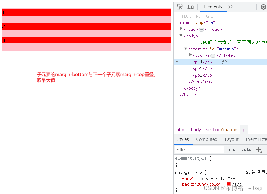
2-1. BFC的子元素垂直方向的边距会发生重叠
<!-- BFC的子元素的垂直方向边距重叠 -->
    <section id="margin">
        <style>
            #margin {
                background-color: pink;
                overflow: hidden;
            }
            #margin > p {
                margin: 5px auto 25px;
                background-color: red;
            }
        </style>
        <p>1</p>
        <p>2</p>
        <p>3</p>
    </section>
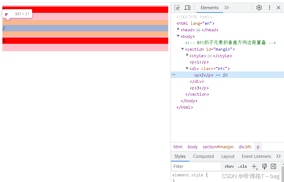
解决方案:如何消除边距重叠,需要给相邻的元素添加父元素,并创建BFC(overflow: hidden)
<section id="margin">
        <style>
            #margin {
                background-color: pink;
                overflow: hidden;
            }
            #margin > p {
                margin: 5px auto 25px;
                background-color: red;
            }
            /* 添加父元素,新增样式overflow: hidden; 创建BFC,防止边距重叠 */
            .bfc{
                overflow: hidden;
            }
        </style>
        <p>1</p>
        <div class="bfc"><p>2</p></div>
        <p>3</p>
    </section>
2-2. BFC的区域不会与float元素的box重叠,用于清除浮动布局
<!-- BFC的区域不会与float元素的box重叠,用于清除浮动布局 -->
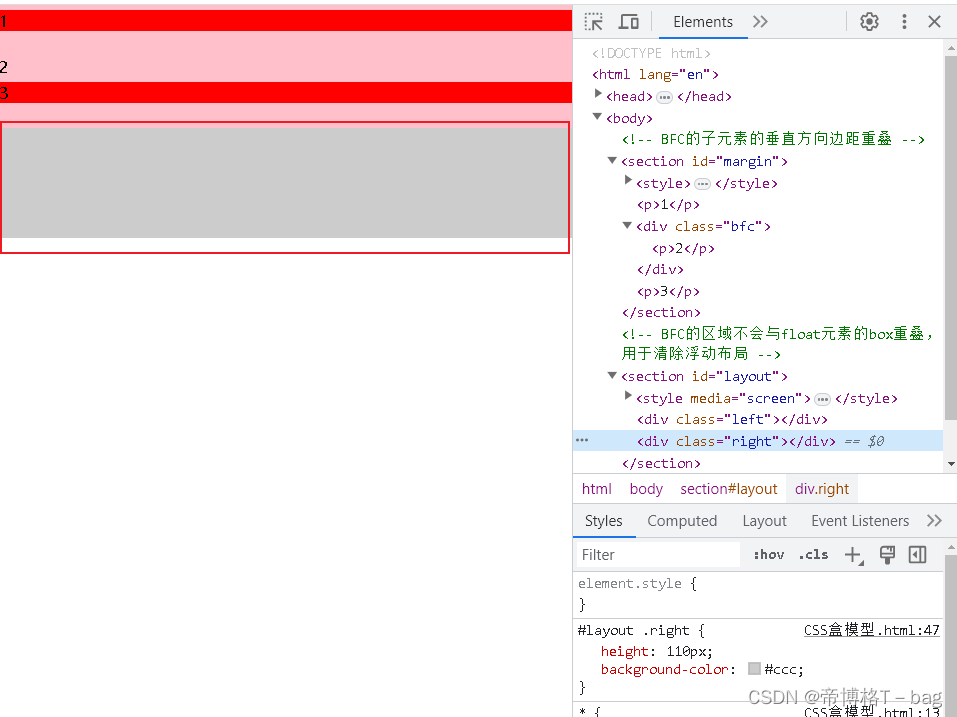
<section id="layout">
<style media="screen">
#layout {
background-color: red;
}
#layout .left {
float: left;
width: 100px;
height: 100px;
background-color: pink;
}
#layout .right {
height: 110px;
background-color: #ccc;
}
</style>
<div class="left"></div>
<div class="right"></div>
</section>
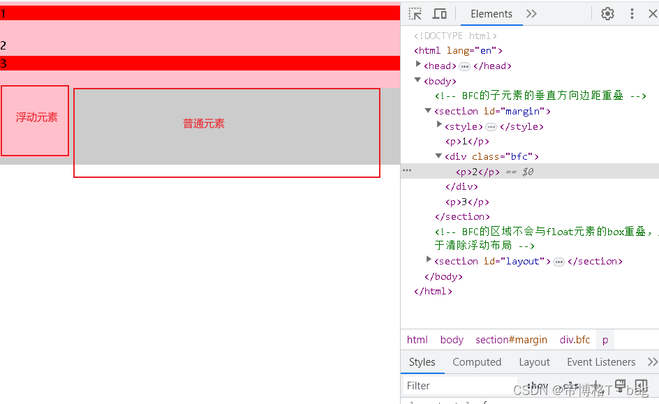
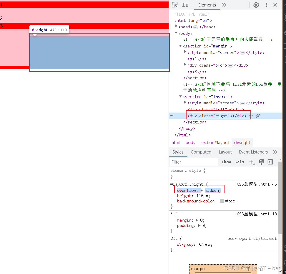
2-2-1:为什么左侧会和右侧发生重叠?
因为浏览器会先渲染文档流中的元素
然后浏览器再文档流的基础上再渲染脱离文档流的元素(浮动元素),所以发生了重叠
如何防止普通元素和浮动元素重叠(文档流元素和脱离文档流的元素重叠)?
把普通元素变成BFC
<!-- BFC的区域不会与float元素的box重叠,用于清除浮动布局 -->
    <section id="layout">
        <style media="screen">
            #layout {
                background-color: red;
            }
            #layout .left {
                float: left;
                width: 100px;
                height: 100px;
                background-color: pink;
            }
            #layout .right {
                overflow: hidden;
                height: 110px;
                background-color: #ccc;
            }
        </style>
        <div class="left"></div>
        <div class="right"></div>
    </section>
2-3. BFC再页面上是一个独立容器,外面的元素和里面元素不会互相影响
2-4. 当元素为BFC高度时,浮动元素也会参与高度计算
<!-- 浮动元素不参与高度计算,所有父元素高度为0,父元素为BFC时,浮动元素参与高度计算,所以父元素高度为40 -->
  <section id="float">
    <style media="screen">
      #float {
        background-color: red;
        overflow: hidden;
      }
      #float .float {
        float: left;
        font-size: 30px;
      }
    </style>
    <div class="float">浮动元素</div>
  </section>
- 如何创建BFC
3-1 overflow:visible、auto、hidden;
3-2 float:≠ none
3-3 position: ≠ static 或 ≠ relative
3-4 dipslay: inline-table、table-caption、table-cell、table


 2194
2194


 被折叠的 条评论
为什么被折叠?
被折叠的 条评论
为什么被折叠?
 到【灌水乐园】发言


