


通过调试微信小程序示例代码解析flex布局参数功能
官方示例小程序源代码下载地址:https://github.com/wechat-miniprogram/miniprogram-demo
通过调试微信小程序示例代码解析flex布局参数功能

打开源代码,在搜索栏搜flex,可以看到在微信示例小程序中有很多flex的使用!
学习flex首先先在开放社区中搜索flex,扫一眼官方文档说明、
要点是“通过display:inline | block | inline-block、 position、float来实现布局,缺乏灵活性且有些适配效果难以实现,比如难以实现在内容高度不确定下保持垂直居中。”
display:flex;
flex-direction:row(默认值) | row-reverse | column |column-reverse
flex-wrap:nowrap(默认值) | wrap | wrap-reverse
justify-content:flex-start(默认值) | flex-end | center |space-between |space-around | space-evenly
align-items:stretch(默认值) | center | flex-end | baseline | flex-start
align-content:stretch(默认值) | flex-start | center |flex-end | space-between | space-around | space-evenly
flex-direction属性
flex-direction 通过设置坐标轴,来设置项目排列方向。
视觉效果是在wxss中设置的,而它与wxml之间的通过class类来连接:在wxml的<view class=''>的语句中定义class的名称,如class=‘container’,然后在wxss中通过相应的命令设置container的视觉效果。设置flex的第一步是在父级容器(这里是最高父级容器container)的样式中设置display为flex.接着再设置其它的参数。
在wxml中的代码是<view class='container'>...</view>
如下面的在源代码的app.wxss文件中中设置了全局container的样式:
.container {

  display: flex;
  flex-direction: column;
  min-height: 100%;
  justify-content: space-between;
  font-size: 16px;
  font-family: -apple-system-font,Helvetica Neue,Helvetica,sans-serif;
}
回到之前看到的容器属性的第一个: flex-direction 通过设置坐标轴,来设置项目排列方向。
flex-direction:row(默认值) | row-reverse | column |column-reverse
column应该就是项目竖着排列的意思。
在搜索框中里再搜flex-direction,查看设置其它值的情况示例。
查看代码详情:
.item-content {

  width: 100%;
  display: flex;
  flex-direction: row;
  justify-content: space-around;
  height: 150px;
  align-items: center;
}
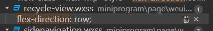
代码中在名称为item-content的类的样式中设置flex,然后flex-dirction设为水平。
在调试器中查看item-content所在的容器的情况:
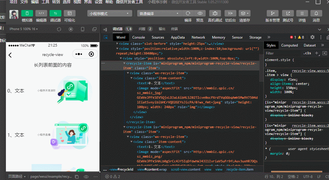
看鼠标所在的位置,以及在模拟器中对应的变蓝区域。文本和图片水平排列。
然后再将flex-direction改为column:

修改之后可以看到文本和图片变成垂直排列。
flex-direction还有另一种设置方法,例如在"view"页面上,<view class="flex-wrp" style="flex-direction:row;">与<view class="flex-wrp" style="flex-direction:column;">分别将排列方式设置为水平和垂直。
如图所示,上一部分中A B C水平排列,下半部分垂直排列。

放上对应wxml代码,看不懂可以跳过,以后有机会写文章再讲,现在要学习的地方是style="flex-direction:row&
 最低0.47元/天 解锁文章


 301
301


 被折叠的 条评论
为什么被折叠?
被折叠的 条评论
为什么被折叠?
 到【灌水乐园】发言


