


你好,我是沐爸,欢迎点赞、收藏、评论和关注。
阿里 DataV 大屏是一款功能强大的数据可视化应用搭建工具,由阿里云提供,旨在帮助用户通过图形化的界面轻松搭建专业水准的可视化应用。
下面我们一起看下 DataV 大屏 是如何做自适应的?
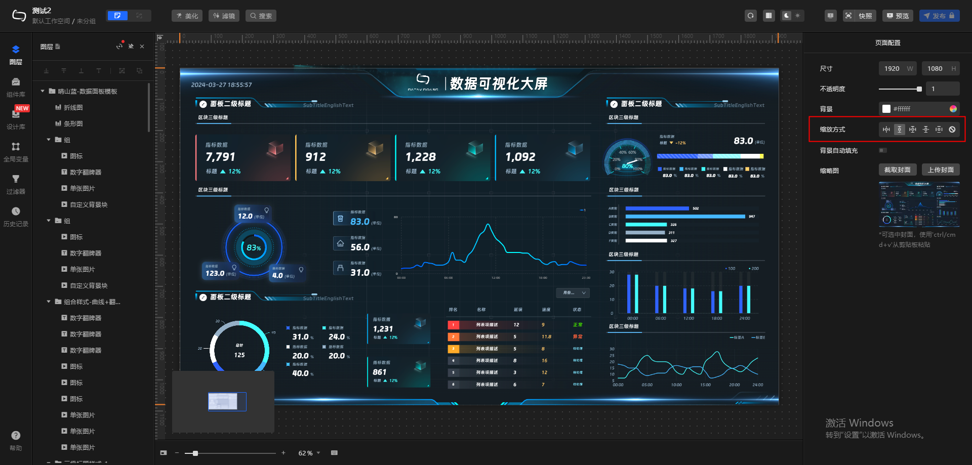
了解 阿里 DataV 大屏,可注册账号免费试用,时长为1个月。随便打开一个大屏模板,点击画布,编辑器右侧会显示页面配置,其中“缩放方式”即为自适应方案,一共有5种。
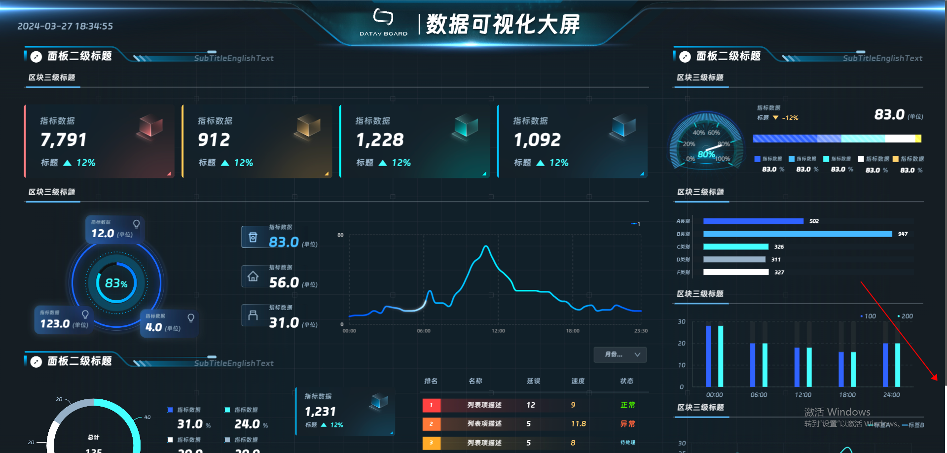
一、全屏铺满
特点:- 铺满屏幕,不保持纵横比。
- 页面元素可能被拉伸或压缩。

<template>
  <div id="root-el" :style="{ transform: 'scale(' + x + ',' + y + ')' }">
    这里放一张图片
  </div>
</template>

<script>
  export default {
    data() {
       return {
         x: 1,
         y: 1
       }
     },
    mounted() {
      this.x = window.innerWidth / 1920
      this.y = window.innerHeight / 1080
      window.onresize = () => {
        this.x = window.innerWidth / 1920
        this.y = window.innerHeight / 1080
      }
    }
  }
</script>
二、等比宽度铺满可滚动
特点:- 保持纵横比。
- 缩小时可能会留白。
- 屏幕内容被遮挡时显示滚动条,未被遮挡时无滚动条。
<style>
  html {
    width: 100% !important;
    height: 100% !important;
    overflow: hidden !important;
  }
  body {
    width: 100%;
    height: 100%;
    overflow: hidden;
  }
  body:hover ::-webkit-scrollbar-thumb{
    display: block;
  }
  ::-webkit-scrollbar-thumb {
      display: none;
      background: #525252;
      border-radius: 2px
  }
  ::-webkit-scrollbar-track {
      background: transparent;
  }
  ::-webkit-scrollbar {
      display: block;
      width: 4px;
      height: 4px
  }
  ::-webkit-scrollbar-corner {
      background-color: transparent
  }
  #app {
    width: 100%;
    height: 100%;
  }
</style>
<template>
  <div id="root">
    <div class="preview-page">
      <div id="runtime">
        <div class="datav-common-hoc">
          <div class="datav-com-wrapper">
            <div class="datav-absolute-page-wp" :style="{ height: innerHeight + 'px' }">
              <div id="index" ref="appRef" :style="{ transform: 'scale(' + x + ')' }">
                <div class="bg">
                  ......
                </div>
              </div>
            </div>
          </div>
        </div>
      </div>
    </div>
  </div>
</template>

<script>
export default {
  data() {
    return {
      x: 1,
      y: 1,
      innerHeight: 1080
    }
  },
  mounted() {
    this.x = window.innerWidth / 1920
    this.y = window.innerHeight / 1080
    this.innerHeight = 1080 * this.x
    window.onresize = () => {
      this.x = window.innerWidth / 1920
      this.y = window.innerHeight / 1080
      this.innerHeight = 1080 * this.x
    }
  }
}
</script>

<style lang="scss" scoped>
  #root {
    width: 100%;
    height: 100%;
    display: flex;
    flex-direction: column;
    .preview-page {
      width: 100%;
      height: 100%;
      overflow: auto;
      flex: 1 1;
      #runtime {
        width: 100%;
        height: 100%;
        .datav-common-hoc {
          height: 100%;
          width: 100%;
          position: relative;
          .datav-com-wrapper {
            height: 100%;
            width: 100%;
            position: relative;
            transform: translate(0, 0);
            box-sizing: border-box;
            transform-origin: left top;
            overflow: inherit;
            .datav-absolute-page-wp {
              width: 100%;
              height: 100%;
              position: relative;
              overflow: hidden;
              #index {
                width: 1920px;
                height: 1080px;
                background: rgb(255, 255, 255);
                transform-origin: left top;
                overflow: hidden;
                .bg {
                  width: 100%;
                  height: 100%;
                  padding: 16px 16px 0 16px;
                  background-image: url("../assets/pageBg.png");
                  background-size: cover;
                  background-position: center center;
                }
              }
            }
          }
        }
      }
    }
  }
</style>
三、等比高度铺满居中
特点:- 保持纵横比
- 页面居中显示,两侧可能留白。宽度不够时,两侧可能被隐藏。
<template>
  <div id="root">
    <div class="preview-page">
      <div id="runtime">
        <div class="datav-common-hoc">
          <div class="datav-com-wrapper">
            <!--datav-absolute-page-wp 不再动态设置高度-->
            <div class="datav-absolute-page-wp">
              <div id="index" ref="appRef" :style="{ transform: 'scale(' + x + ')', 'margin-left': ml + 'px' }">
                <div class="bg">
                  ......
                </div>
              </div>
            </div>
          </div>
        </div>
      </div>
    </div>
  </div>
</template>

<script>
  export default {
    data() {
      return {
        x: 1,
        y: 1,
        ml: 0 // 水平方向的左外边距
      }
    },
    mounted() {
      this.x = window.innerWidth / 1920
      this.y = window.innerHeight / 1080
      this.ml = (window.innerWidth - 1920 * this.y) / 2
      window.onresize = () => {
        this.x = window.innerWidth / 1920
        this.y = window.innerHeight / 1080
        this.ml = (window.innerWidth - 1920 * this.y) / 2
      }
    }
  }
</script>

<style lang="scss" scoped>
  /*保持不变*/
</style>
四、等比高度可滚动
特点:- 保持纵横比
- 窗口宽度大于内容宽度时,右侧留白。窗口宽度小于内容宽度时,显示滚动条。

<template>
  <div id="root">
    <div class="preview-page">
      <div id="runtime">
        <div class="datav-common-hoc">
          <div class="datav-com-wrapper">
            <div class="datav-absolute-page-wp" style="overflow-x: auto;">
              <div class="datav-absolute-page" :style="{width: scaleWidth + 'px', height: innerHeight + 'px'}">
                <div id="index" ref="appRef" :style="{ transform: 'scale(' + y + ')' }">
                  <div class="bg">
                    ......
                  </div>
                </div>
              </div>
            </div>
          </div>
        </div>
      </div>
    </div>
  </div>
</template>

<script>
  export default {
    data() {
      return {
        x: 1,
        y: 1,
        scaleWidth: 1920
      }
    },
    mounted() {
      this.x = window.innerWidth / 1920
      this.y = window.innerHeight / 1080
      this.innerHeight = window.innerHeight
      this.scaleWidth = 1920 * this.y
      window.onresize = () => {
        this.x = window.innerWidth / 1920
        this.y = window.innerHeight / 1080
        this.innerHeight = window.innerHeight
        this.scaleWidth = 1920 * this.y
      }
    }
  }
</script>

<style lang="scss" scoped>
  /*保持不变*/
</style>
五、居中
特点:- 保持纵横比
- 无论页面怎么缩放,总保持居中显示

<template>
  <div id="root">
    <div class="preview-page">
      <div id="runtime">
        <div class="datav-common-hoc">
          <div class="datav-com-wrapper">
            <div class="datav-absolute-page-wp">
              <div class="datav-absolute-page" :style="{transform: 'translateX(-50%) translateY(-50%) scale(' + dynamicScale + ')'}">
                <div id="index" ref="appRef">
                  <div class="bg">
                    ......
                  </div>
                </div>
              </div>
            </div>
          </div>
        </div>
      </div>
    </div>
  </div>
</template>

<script>
  export default {
    data() {
      return {
        x: 1,
        y: 1,
        dynamicScale: 1
      }
    },
    mounted() {
      if (window.innerWidth / window.innerHeight < 1920 / 1080) {
        this.dynamicScale = (window.innerWidth / 1920)
      } else {
        this.dynamicScale = (window.innerHeight / 1080)
      }
      window.onresize = () => {
        if (window.innerWidth / window.innerHeight < 1920 / 1080) {
          this.dynamicScale = (window.innerWidth / 1920)
        } else {
          this.dynamicScale = (window.innerHeight / 1080)
        }
      }
    }
  }
</script>

<style lang="scss" scoped>
  .datav-absolute-page {
    width: 1920px;
    height: 1080px;
    background: rgb(255, 255, 255);
    transform: translateX(-50%) translateY(-50%) scale(0.550521);
    left: 50%;
    top: 50%;
    position: absolute;
  }
  /*其他保持不变*/
</style>
六、堪称完美的适配
DataV 大屏的5种自适应方案,多多少少都有些缺陷,有没有更完美的适配方式呢?看看下图
上面这种自适应如何实现?我们明天接着唠。
好了,分享结束,谢谢点赞,下期再见。


 扫一扫
扫一扫


 2334
2334

 被折叠的 条评论
为什么被折叠?
被折叠的 条评论
为什么被折叠?
 到【灌水乐园】发言


