


library(ggplot2)
library(RColorBrewer)
#-------------------------------------------Method 1: ggpubr包的ggscatterhist()函数------------------------------
library(ggpubr)
N<-300
x1 <- rnorm(mean=1.5, N)
y1 <- rnorm(mean=1.6, N)
x2 <- rnorm(mean=2.5, N)
y2 <- rnorm(mean=2.2, N)
data1 <- data.frame(x=c(x1,x2),y=c(y1,y2))
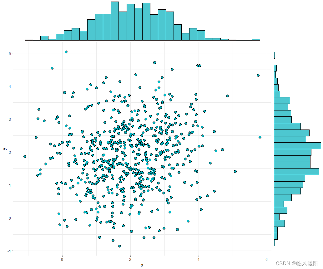
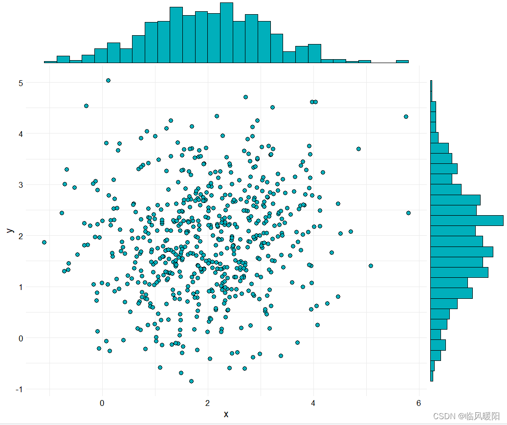
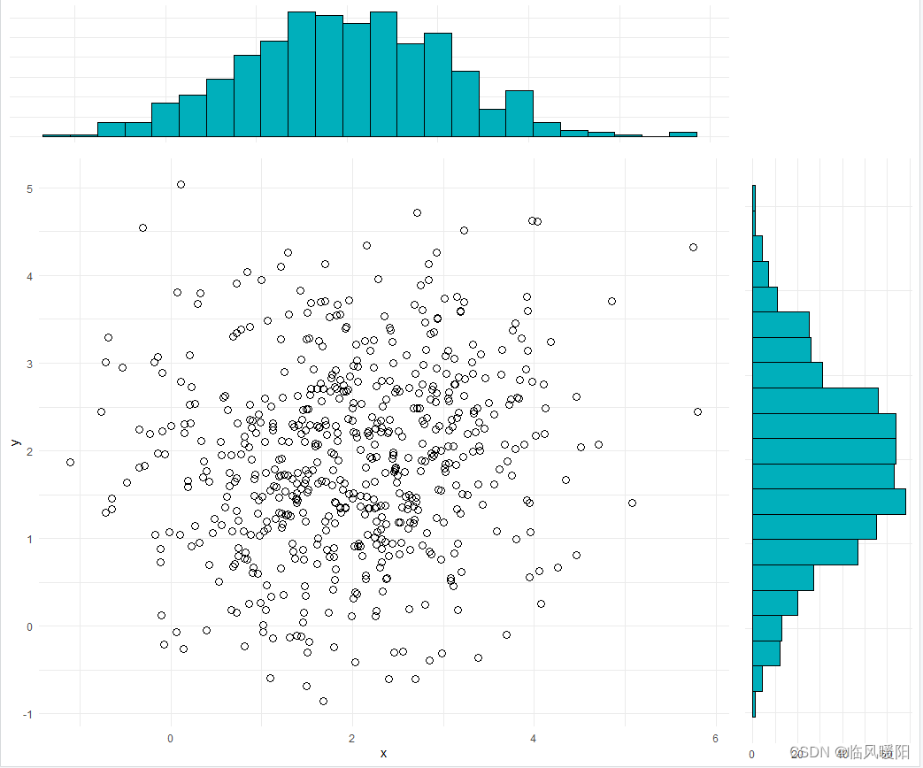
#(a) 二维散点与统计直方图
ggscatterhist(
data1, x ='x', y = 'y', shape=21,fill="#00AFBB",color = "black",size = 3, alpha = 1,
#palette = c("#00AFBB", "#E7B800", "#FC4E07"),
margin.params = list( fill="#00AFBB",color = "black", size = 0.2,alpha=1),
margin.plot = "histogram",
legend = c(0.8,0.8),
ggtheme = theme_minimal())
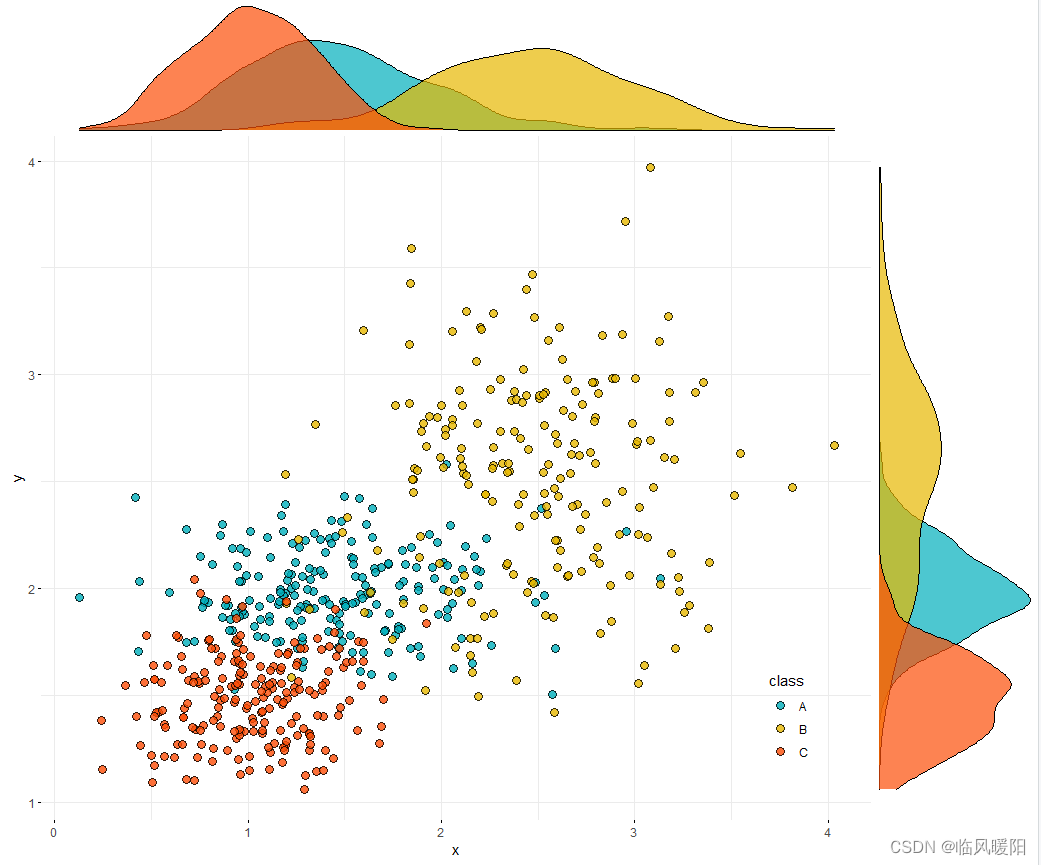
N<-200
x1 <- rnorm(mean=1.5, sd=0.5,N)
y1 <- rnorm(mean=2,sd=0.2, N)
x2 <- rnorm(mean=2.5,sd=0.5, N)
y2 <- rnorm(mean=2.5,sd=0.5, N)
x3 <- rnorm(mean=1, sd=0.3,N)
y3 <- rnorm(mean=1.5,sd=0.2, N)
data2 <- data.frame(x=c(x1,x2,x3),y=c(y1,y2,y3),class=rep(c("A","B","C"),each=200))
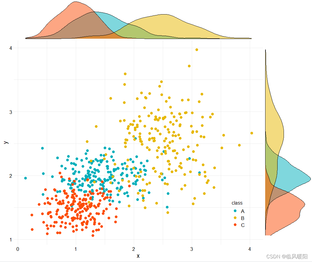
#(b) 二维散点与核密度估计图
ggscatterhist(
data2, x ='x', y = 'y', #iris
shape=21,color ="black",fill= "class", size =3, alpha = 0.8,
palette = c("#00AFBB", "#E7B800", "#FC4E07"),
margin.plot = "density",
margin.params = list(fill = "class", color = "black", size = 0.2),
legend = c(0.9,0.15),
ggtheme = theme_minimal())
#-----------------------------------Method 2: ggExtra包的ggMarginal()函数------------------------------------

library(ggExtra)

#(a) 二维散点与统计直方图
scatter <- ggplot(data=data1,aes(x=x,y=y)) +
  geom_point(shape=21,fill="#00AFBB",color="black",size=3)+
  theme_minimal()+
  theme(
    #text=element_text(size=15,face="plain",color="black"),
    axis.title=element_text(size=15,face="plain",color="black"),
    axis.text = element_text(size=13,face="plain",color="black"),
    legend.text= element_text(size=13,face="plain",color="black"),
    legend.title=element_text(size=12,face="plain",color="black"),
    legend.background=element_blank()
    #legend.position = c(0.12,0.88)
  )

ggMarginal(scatter,type="histogram",color="black",fill="#00AFBB")
#(b) 二维散点与核密度估计图
scatter <- ggplot(data=data2,aes(x=x,y=y,colour=class,fill=class)) +
  geom_point(aes(fill=class),shape=21,size=3)+#,colour="black")+
  scale_fill_manual(values= c("#00AFBB", "#E7B800", "#FC4E07"))+
  scale_colour_manual(values=c("#00AFBB", "#E7B800", "#FC4E07"))+
  theme_minimal()+
  theme(
    #text=element_text(size=15,face="plain",color="black"),
    axis.title=element_text(size=15,face="plain",color="black"),
    axis.text = element_text(size=13,face="plain",color="black"),
    legend.text= element_text(size=13,face="plain",color="black"),
    legend.title=element_text(size=12,face="plain",color="black"),
    legend.background=element_blank(),
    legend.position = c(0.9,0.15)
  )

ggMarginal(scatter,type="density",color="black",groupColour = FALSE,groupFill = TRUE)
#-----------------------------------method 3:grid.arrange()函数------------------------------
library(gridExtra)
#(a) 二维散点与统计直方图

# 绘制主图散点图,并将图例去除,这里point层和path层使用了不同的数据集
scatter <- ggplot() +
  geom_point(data=data1,aes(x=x,y=y),shape=21,color="black",size=3)+
   theme_minimal()
# 绘制上边的直方图,并将各种标注去除
hist_top <- ggplot()+
  geom_histogram(aes(data1$x),colour='black',fill='#00AFBB',binwidth = 0.3)+
  theme_minimal()+
  theme(panel.background=element_blank(),
        axis.title.x=element_blank(),
        axis.title.y=element_blank(),
        axis.text.x=element_blank(),
        axis.text.y=element_blank(),
        axis.ticks=element_blank())
# 同样绘制右边的直方图
hist_right <- ggplot()+
  geom_histogram(aes(data1$y),colour='black',fill='#00AFBB',binwidth = 0.3)+
  theme_minimal()+
  theme(panel.background=element_blank(),
        axis.title.x=element_blank(),
        axis.title.y=element_blank(),
        #axis.text.x=element_blank(),
        axis.text.y=element_blank(),
        axis.ticks=element_blank())+
  coord_flip()

empty <- ggplot() +
  theme(panel.background=element_blank(),
        axis.title.x=element_blank(),
        axis.title.y=element_blank(),
        axis.text.x=element_blank(),
        axis.text.y=element_blank(),
        axis.ticks=element_blank())
# 要由四个图形组合而成,可以用空白图作为右上角的图形也可以,但为了好玩加上了R的logo,这是一种在ggplot中增加jpeg位图的方法
# logo <-  read.jpeg("d:\\Rlogo.jpg")
# empty <- ggplot(data.frame(x=1:10,y=1:10),aes(x,y))+
#   annotation_raster(logo,-Inf, Inf, -Inf, Inf)+
#   opts(axis.title.x=theme_blank(),
#        axis.title.y=theme_blank(),
#        axis.text.x=theme_blank(),
#        axis.text.y=theme_blank(),
#        axis.ticks=theme_blank())
# 最终的组合
grid.arrange(hist_top, empty, scatter, hist_right, ncol=2, nrow=2, widths=c(4,1), heights=c(1,4))

#(b) 二维散点与核密度估计图

# 绘制主图散点图,并将图例去除,这里point层和path层使用了不同的数据集
scatter <- ggplot() +
  geom_point(data=data2,aes(x=x,y=y,fill=class),shape=21,color="black",size=3)+
  scale_fill_manual(values= c("#00AFBB", "#E7B800", "#FC4E07"))+
  theme_minimal()+
  theme(legend.position=c(0.9,0.2))
# 绘制上边的直方图,并将各种标注去除
hist_top <- ggplot()+
  geom_density(data=data2,aes(x,fill=class),colour='black',alpha=0.7)+
  scale_fill_manual(values= c("#00AFBB", "#E7B800", "#FC4E07"))+
  theme_void()+
  theme(legend.position="none")
# 同样绘制右边的直方图
hist_right <- ggplot()+
  geom_density(data=data2,aes(y,fill=class),colour='black',alpha=0.7)+
  scale_fill_manual(values= c("#00AFBB", "#E7B800", "#FC4E07"))+
  theme_void()+
  coord_flip()+
  theme(legend.position="none")

empty <- ggplot() +
  theme(panel.background=element_blank(),
        axis.title.x=element_blank(),
        axis.title.y=element_blank(),
        axis.text.x=element_blank(),
        axis.text.y=element_blank(),
        axis.ticks=element_blank())
# 要由四个图形组合而成,可以用空白图作为右上角的图形也可以,但为了好玩加上了R的logo,这是一种在ggplot中增加jpeg位图的方法
# logo <-  read.jpeg("d:\\Rlogo.jpg")
# empty <- ggplot(data.frame(x=1:10,y=1:10),aes(x,y))+
#   annotation_raster(logo,-Inf, Inf, -Inf, Inf)+
#   opts(axis.title.x=theme_blank(),
#        axis.title.y=theme_blank(),
#        axis.text.x=theme_blank(),
#        axis.text.y=theme_blank(),
#        axis.ticks=theme_blank())
# 最终的组合
grid.arrange(hist_top, empty, scatter, hist_right, ncol=2, nrow=2, widths=c(4,1), heights=c(1,4))

开发工具:RStudio与微信快捷截屏工具Alt+A


 4623
4623


 被折叠的 条评论
为什么被折叠?
被折叠的 条评论
为什么被折叠?
 到【灌水乐园】发言


