Vue中echarts半圆环图表

在这里插入图片描述

更新补充

才发现官方文档有更简便方式,有两个参数:startAngle开始的角度,endAngle结束的角度

官方案例

option = {
  tooltip: {
    trigger: 'item'
  },
  legend: {
    top: '5%',
    left: 'center'
  },
  series: [
    {
      name: 'Access From',
      type: 'pie',
      radius: ['40%', '70%'],
      center: ['50%', '70%'],
      // adjust the start and end angle
      startAngle: 90,
      endAngle: 270,
      data: [
        { value: 1048, name: 'Search Engine' },
        { value: 735, name: 'Direct' },
        { value: 580, name: 'Email' },
        { value: 484, name: 'Union Ads' },
        { value: 300, name: 'Video Ads' }
      ]
    }
  ]
};

父组件调用

<template>
  <Semicircle id="seedling-ratio" width="50%" height="40vh" :mapData="mapData"></Semicircle>
</template>
<script>
import Semicircle from './components/Semicircle.vue'
export default {
  components: { Card, Semicircle, Slider },
  data() {
  	return {
  	  mapData: {
        data: [
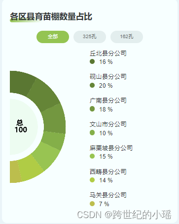
          { name: '丘北县分公司', value: 16 },
          { name: '砚山县分公司', value: 20 },
          { name: '广南县分公司', value: 18 },
          { name: '文山市分公司', value: 10 },
          { name: '麻栗坡县分公司', value: 15 },
          { name: '西畴县分公司', value: 14 },
          { name: '马关县分公司', value: 7 }
        ],
        total: 100
      },
    }
  }
}
</script>

Semicircle.vue图表组件

<template>
    <div class="cirle-pie">
        <div :id="id" :style="{ width, height }"></div>
        <ul class="legend-ul">
            <li class="legend-li" v-for="(item, index) in mapData.data" :key="index">
                <p class="li-name">{{ item.name }}</p>
                <div class="li-num">
                    <span class="point" :style="{ background: color[index] }"></span>
                    <span class="num">{{ item.value }} %</span>
                </div>
            </li>
        </ul>
    </div>
</template>

<script>
import * as echarts from 'echarts'

export default {
    name: 'Semicircle',
    props: ['id', 'width', 'height', 'mapData'],

    computed: {},
    data() {
        return {
            myMap: {},
            // 颜色设置
            color: ["#5B7630", "#668435", "#75963D", "#86AD46", "#9AC24E", "#B6CA3F", "#C4BC48", "#E0C646", "#F7CF46", "#FFDE87", "#FEEECA"],

        }
    },
    watch: {
        'mapData': {
            handler(newVal, old) {
                this.setOption()
            },
        }
    },
    created() { },
    mounted() {
        this.init()
    },
    methods: {
        init() {
            const _this = this
            this.myMap = echarts.init(document.getElementById(this.id),);

            window.addEventListener("resize", function () {
                _this.myMap.resize();
            });
            this.setOption()
        },
        setOption() {
            const _this = this
            let option = {
                color: [
                    "#F5F9ED",
                    "transparent",
                    ..._this.color,
                    "transparent",
                ],
                grid: {
                    top: "0px",
                    left: "0px",
                    right: "0px",
                    bottom: "0px"
                },
                series: [
                    {
                    	// 内圆
                        name: '总',
                        type: 'pie',
                        selectedMode: 'single',
                        radius: [0, '70%'],
                        center: ["0", "50%"],
                        label: {
                            position: 'inner',
                            fontSize: 14,
                            color: '#000000',
                            formatter: ` {b} \n {c}`,
                            position: 'center',
                            padding: [0, 0, 0, 40],
                            fontWeight: 'bold'
                        },
                        labelLine: {
                            show: false
                        },
                        data: [
                             // 要显示的内半圆部分
                            { value: _this.mapData.total, name: '总' },
                            // 隐藏掉的内半圆
                            {
                                value: 1,
                                name: "",
                                label: {
                                    show: false,
                                },
                                labelLine: {
                                    show: false,
                                },
                                itemStyle: {
                                    normal: {
                                        borderWidth: 0,
                                        shadowBlur: 0,
                                        borderColor: "transparent",
                                        shadowColor: "transparent",
                                    },
                                },
                            },
                        ]
                    },
                    // 外圆环
                    {
                        name: '占比',
                        type: "pie",
                        radius: ["85%", "140%"],
                        avoidLabelOverlap: false,
                        startAngle: 90, // 角度
                        center: ["0", "50%"],
                        labelLine: {
                            normal: {
                                length: 20,
                                length2: 88,
                            },
                        },
                        label: {
                            show: false
                        },
                        data: [
                            // 要显示的外半圆数据
                            ...this.mapData.data,
                            // 隐藏的外半圆数据
                            {
                                value: this.mapData.total, // total是要展示的半圆数据的总和,以达到显示和隐藏比例各占50%
                                name: "其他",
                                label: {
                                    show: false,
                                },
                                labelLine: {
                                    show: false,
                                },
                                itemStyle: {
                                    normal: {
                                        borderWidth: 0,
                                        shadowBlur: 0,
                                        borderColor: "transparent",
                                        shadowColor: "transparent",
                                    },
                                },
                            },
                        ],
                    },
                ],
            };

            this.myMap.setOption(option);

        }
    }
}
</script>

<style scoped lang='scss'>
.cirle-pie {
    display: flex;
}

.legend-ul {
    width: 50%;

    .legend-li {
        line-height: 34px;
        font-size: 24px;
        color: #333333;
        font-weight: 500;
    }

    .li-name {
        margin-bottom: 0;
    }

    .li-num {
        .point {
            display: inline-block;
            width: 20px;
            height: 20px;
            border-radius: 50%;
            margin-right: 16px;
        }
    }
}
</style>

  • 8
    点赞
  • 9
    收藏
    觉得还不错? 一键收藏
  • 0
    评论
要在 Vue3 Echarts 环形图表,可以按照以下步骤进行: 1. 安装 EchartsVue-Echarts: ``` npm install echarts vue-echarts@5.0.0-beta.5 ``` 2. 在需要使用的组件引入 EchartsVue-Echarts: ```javascript import * as echarts from 'echarts' import { use } from 'echarts/core' import { CanvasRenderer } from 'echarts/renderers' import { PieChart } from 'echarts/charts' import { LegendComponent, TooltipComponent } from 'echarts/components' import VueECharts from 'vue-echarts' use([CanvasRenderer, PieChart, LegendComponent, TooltipComponent]) export default { components: { VueECharts } } ``` 3. 在组件的模板使用 Vue-Echarts 组件,并传入需要渲染的数据和 Echarts 实例: ```vue <template> <div> <vue-echarts :options="options" :auto-resize="true" :renderer="'canvas'" :chart="chart"></vue-echarts> </div> </template> <script> export default { data() { return { chart: null, options: { title: { text: '环形示例' }, tooltip: { trigger: 'item', formatter: '{a} <br/>{b}: {c} ({d}%)' }, legend: { orient: 'vertical', left: 10, data: ['数据1', '数据2', '数据3', '数据4', '数据5'] }, series: [ { name: '访问来源', type: 'pie', radius: ['50%', '70%'], avoidLabelOverlap: false, label: { show: false, position: 'center' }, emphasis: { label: { show: true, fontSize: '30', fontWeight: 'bold' } }, labelLine: { show: false }, data: [ { value: 335, name: '数据1' }, { value: 310, name: '数据2' }, { value: 234, name: '数据3' }, { value: 135, name: '数据4' }, { value: 1548, name: '数据5' } ] } ] } } }, mounted() { this.chart = echarts.init(this.$refs.chart) } } </script> ``` 这样就可以在 Vue3 画出一个简单的 Echarts 环形图表了。注意,在组件 mounted 钩子函数,需要使用 Echarts.init 方法初始化 Echarts 实例。

“相关推荐”对你有帮助么?

  • 非常没帮助
  • 没帮助
  • 一般
  • 有帮助
  • 非常有帮助
提交
评论
添加红包

请填写红包祝福语或标题

红包个数最小为10个

红包金额最低5元

当前余额3.43前往充值 >
需支付:10.00
成就一亿技术人!
领取后你会自动成为博主和红包主的粉丝 规则
hope_wisdom
发出的红包
实付
使用余额支付
点击重新获取
扫码支付
钱包余额 0

抵扣说明:

1.余额是钱包充值的虚拟货币,按照1:1的比例进行支付金额的抵扣。
2.余额无法直接购买下载,可以购买VIP、付费专栏及课程。

余额充值