echarts vue里画一个简单的环状饼图

18 篇文章 1 订阅

        <!--观察记录-->
        <div class="teach-plan observe-record">
          <div class="title-common">
            <div class="title-common-left">
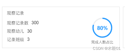
              观察记录
            </div>
          </div>
          <div class="teach-plan-cont">
            <div class="tpc-lef">
              <div class="tpc-lef-list">
                <div class="d1">观察记录数</div>
                <div class="d2">300</div>
              </div>
              <div class="tpc-lef-list">
                <div class="d1">观察幼儿</div>
                <div class="d2">30</div>
              </div>
              <div class="tpc-lef-list">
                <div class="d1">记录班级</div>
                <div class="d2">3</div>
              </div>
            </div>
            <div class="tpc-rig">
              <div class="pie-box">
                <div class="d1" id="completionRate" style="width: 66px; height: 66px;"></div>
                <div class="d2">完成人数占比</div>
              </div>
            </div>
          </div>
        </div>
        <!--观察记录-end-->

  data() {
    return {
      chartdom: null,
    };
  },

  mounted() {
    this.pieEcharts();
  },

methods里:

    pieEcharts() {
      const container = document.getElementById('completionRate'); // 获取容器元素
      this.chartdom = echarts.init(container); // 初始化echarts实例
      let correctRate = 80
      let errorRate = 20
      var option = {
        tooltip: {
          show: false,
          trigger: 'item',
          formatter: "{a} : {c} ({d}%)"
        },
        title: {
          text: correctRate + '%',  //图形标题,配置在中间对应效果图的80%
          left: "center",
          top: "35%",
          textStyle: {
            color: "#299bff",
            fontSize: 16,
            align: "center"
          }
        },
        series: [
          {
            type: 'pie',
            radius: ['86%', '98%'],  //设置内外环半径,两者差值越大,环越粗
            hoverAnimation: false,  //移入图形是否放大
            label: {     //对应效果图中的Angular显示与否以及设置样式
              // show: true,
              // position: 'center',
              normal: {
                show: true,
                position: 'center',
                padding: [0, 0, 20, 0],  //设置字angular的边距
                fontSize: 16,
              }
            },
            labelLine: {
              normal: {  //label线不显示
                show: false
              }
            },
            data: [
              {
                value: correctRate,  //对应显示的部分数据即80%
                itemStyle: {
                  normal: {
                    color: '#299bff',
                  }
                }
              },
              {
                value: errorRate,
                itemStyle: {
                  normal: {
                    color: '#edeef0'
                  }
                }
              }
            ]
          }
        ]
      };

      this.chartdom.setOption(option);
      //随着屏幕大小调节图表
      //myChart.resize();
      window.addEventListener('resize', () => {
        this.chartdom.resize();
      });
    },

  • 1
    点赞
  • 2
    收藏
    觉得还不错? 一键收藏
  • 0
    评论
你可以通过使用 Vue.jsECharts 来创建一个3D环形饼状。首先,确保你已经在你的项目中安装了 Vue.jsECharts。 接下来,你可以按照以下步骤创建一个3D环形饼状: 1. 在你的 Vue 组件中引入 ECharts: ```javascript import echarts from 'echarts' ``` 2. 创建一个 div 元素作为表的容器: ```html <div id="chartContainer" style="width: 600px; height: 400px;"></div> ``` 3. 在 Vue 组件的 mounted 钩子函数中初始化表: ```javascript mounted() { this.initChart() }, methods: { initChart() { // 使用 echarts.init 初始化表容器 const chartContainer = document.getElementById('chartContainer') const chart = echarts.init(chartContainer) // 配置饼状的数据 const data = [ { value: 335, name: '直接访问' }, { value: 310, name: '邮件营销' }, { value: 234, name: '联盟广告' }, { value: 135, name: '视频广告' }, { value: 1548, name: '搜索引擎' } ] // 配置饼状的选项 const option = { tooltip: { trigger: 'item', formatter: '{a} <br/>{b}: {c} ({d}%)' }, series: [ { name: '访问来源', type: 'pie', radius: ['40%', '70%'], avoidLabelOverlap: false, label: { show: false, position: 'center' }, emphasis: { label: { show: true, fontSize: '30', fontWeight: 'bold' } }, labelLine: { show: false }, data: data } ] } // 使用 setOption 方法将配置项应用到表中 chart.setOption(option) } } ``` 以上代码会在表容器中绘制一个3D环形饼状,你可以根据自己的需求修改数据和选项来自定义表的样式和行为。 希望这能帮到你!如果有任何问题,请随时询问。

“相关推荐”对你有帮助么?

  • 非常没帮助
  • 没帮助
  • 一般
  • 有帮助
  • 非常有帮助
提交
评论
添加红包

请填写红包祝福语或标题

红包个数最小为10个

红包金额最低5元

当前余额3.43前往充值 >
需支付:10.00
成就一亿技术人!
领取后你会自动成为博主和红包主的粉丝 规则
hope_wisdom
发出的红包
实付
使用余额支付
点击重新获取
扫码支付
钱包余额 0

抵扣说明:

1.余额是钱包充值的虚拟货币,按照1:1的比例进行支付金额的抵扣。
2.余额无法直接购买下载,可以购买VIP、付费专栏及课程。

余额充值