


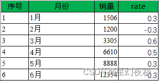
原表数据:
import pandas as pd
import matplotlib.pyplot as plt
df=pd.read_excel('G:/code/027/mrbook.xlsx')                 #导入Excel文件
x=[1,2,3,4,5,6]
y1=df['销量']
y2=df['rate']
fig = plt.figure()
plt.rcParams['font.sans-serif']=['SimHei']  #解决中文乱码
plt.rcParams['axes.unicode_minus'] = False  #用来正常显示负号
ax1 = fig.add_subplot(111)                  #添加子图
plt.title('销量情况对比')                    #图表标题
#图表x轴标题
plt.xticks(x,['1月','2月','3月','4月','5月','6月'])
ax1.bar(x,y1,label='left')
ax1.set_ylabel('销量(册)')            #y轴标签
ax2 = ax1.twinx()                       #共享x轴添加一条y轴坐标轴
ax2.plot(x,y2,color='black',linestyle='--',marker='o',linewidth=2,label=u"增长率")
ax2.set_ylabel(u"增长率")
for a,b in zip(x,y2):
    plt.text(a, b+0.02, '%.2f' % b, ha='center', va= 'bottom',fontsize=10,color='red')
plt.show()
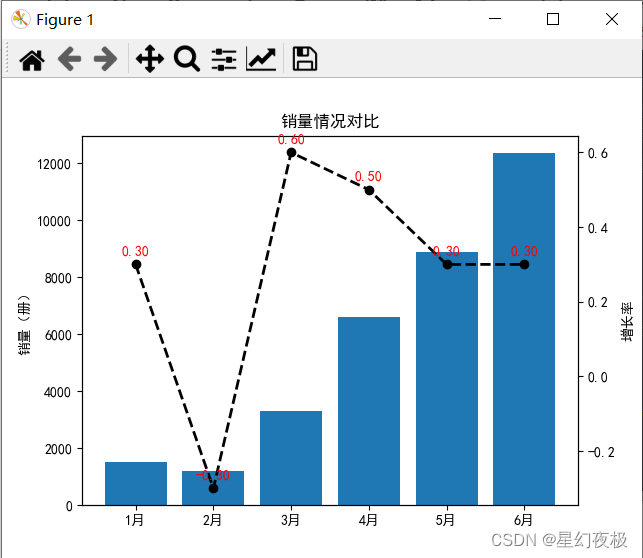
运行结果:


 1886
1886


 被折叠的 条评论
为什么被折叠?
被折叠的 条评论
为什么被折叠?
 到【灌水乐园】发言


