


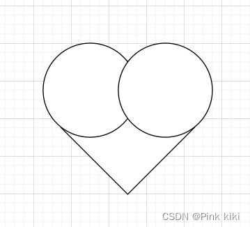
思路一:一个正方形盒子逆时针旋转45度,两个圆形定位在正方形顶角两侧
代码部分:
    <style>
        div {
            position: relative;
            margin: 100px auto;
            width: 100px;
            height: 100px;
            background-color: lightcoral;
        }
        div::before {
            position: absolute;
            top: -50px;
            left: 0px;
            content: '';
            width: 100px;
            height: 100px;
            background-color: lightcoral;
            border-radius: 50%;

        }
        div::after {
            position: absolute;
            top: 0px;
            left: 50px;
            content: '';
            display: block;
            width: 100px;
            height: 100px;
            background-color: lightcoral;
            border-radius: 50%;
        }
        div {
            transform: rotate(-45deg);
        }
    </style>
</head>
<body>
    <div></div>
</body>
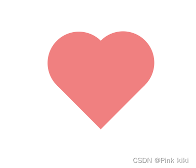
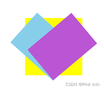
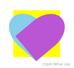
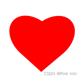
思路二: 一个正方形盒子和两个长和正方形一样,宽任意的长方形盒子左右旋转定位到两侧
代码部分:
<style>
        div {
            position: relative;
            width: 150px;
            height: 150px;
            margin: 100px auto;
        }
        div::before,div::after {
            content: '';
            position: absolute;
            width: 105px;
            height: 150px;
            background-color: red;
            border-radius: 50% 50% 0 0;
        }
        div::before {
            left: 0;
            transform: rotate(312deg);
        }
        div::after {
            right: 0;
            transform: rotate(50deg);

        }
    </style>
</head>
<body>
    <div></div>
</body>
进阶:跳动的爱心
<!DOCTYPE html>
<html>

<head>
    <style>
        div{
            position:relative;
            margin-left:100px;
            margin-top:100px;
            width:150px;
            height:150px;
            /* border:1px solid green; */

            animation-name: ttt;
            animation-duration: 1s;
            animation-iteration-count: infinite;
        }

        div::before,div::after{
            content:'';
            position:absolute;
            width:105px;
            height:150px;
            border-radius: 50% 50% 0 0;
            /* border:1px solid black; */
            background-color:red;
        }
        div::before{
            left:0;
            /* background-color:blue; */
            transform: rotate(312deg);
        }
        div::after{
            right:0;
            /* background-color:yellow; */
            transform: rotate(50deg);

        }

        @keyframes ttt{
            0%{
                transform: scale(1);
            }
            30%{
                transform:scale(1.1);
            }
            50%{
                transform:scale(1);
            }
            75%{
                transform:scale(1.1);
            }
            83%{
                transform:scale(1);
            }
            100%{
                transform:scale(1.1);
            }
        }
    </style>
</head>

<body>
    <div></div>
</body>

</html>


 950
950


 被折叠的 条评论
为什么被折叠?
被折叠的 条评论
为什么被折叠?
 到【灌水乐园】发言


