


css小练习
1.用css实现一个聊天框
<!DOCTYPE html>
<html lang="en">
<head>
<title>用css实现一个聊天框</title>
<style>
*{
margin: 0;
padding: 0;
}
html,body{
height: 100%;
overflow: hidden;
}
#test{
width: 400px;
height: 200px;
border: 1px solid plum;
border-radius: 50%;
text-align: center;
line-height: 200px;
position: relative;
}
#test::before,#test::after{
position: absolute;
display: block;
content: "";
border: 1px solid plum;
border-radius: 50%;
}
#test::before{
width: 50px;
height: 50px;
right: -20px;
bottom: -20px;
}
#test::after{
width: 30px;
height: 30px;
right: -60px;
bottom: -60px;
}
</style>
</head>
<body>
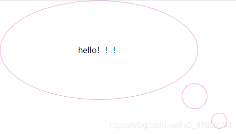
<div id="test">hello!!!</div>
</body>
</html>
实现结果如图所示
2.用css实现一个简易版风车
<!DOCTYPE html>
<html lang="en">
<head>
<title>简易版风车</title>
<style>
*{
margin: 0;
padding: 0;
}
/* 禁止系统默认滚动条 */
html,body{
height: 100%;
overflow: hidden;
}
#wrap{
width: 200px;
height: 200px;
/* border: 1px solid plum; */
position: absolute;
top: 0;
bottom: 0;
left: 0;
right: 0;
margin: auto;
transition: 2s all;
}
#wrap > div{
margin: 10px;
width: 80px;
height: 80px;
background-color: #bfa;
float: left;
box-sizing: border-box;
}
#wrap > div:nth-child(1),
#wrap > div:nth-child(4){
border-radius: 0 60%;
}
#wrap > div:nth-child(2),
#wrap > div:nth-child(3){
border-radius: 60% 0;
}
#wrap:hover{
transform: rotate(360deg);
}
</style>
</head>
<body>
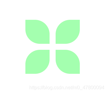
<div id="wrap">
<div></div>
<div></div>
<div></div>
<div></div>
</div>
</body>
</html>
实现结果如图所示


 131
131


 被折叠的 条评论
为什么被折叠?
被折叠的 条评论
为什么被折叠?
 到【灌水乐园】发言


