


CSS动画(CSS Animations)可以使网页元素呈现平滑的动态效果。通过使用@keyframes规则和CSS的animation属性,你可以定义复杂的动画效果。
目录
一、基本语法
1、@keyframes定义动画
@keyframes用于定义动画的关键帧,动画将在这些关键帧之间进行过渡。
@keyframes animation-name {
  from {
    /* 初始状态 */
    transform: rotate(0deg);
    opacity: 0;
  }
  to {
    /* 结束状态 */
    transform: rotate(360deg);
    opacity: 1;
  }
}
2、animation属性
动画是通过animation属性应用到元素上的。这个属性用于指定动画的名称、时长、延迟时间、重复次数等。
.element {
  animation: animation-name 2s ease-in-out infinite;
}
注: animation-name: 指定使用的@keyframes动画名称。
2s: 动画持续的时间(例如2秒)。
ease-in-out: 动画的过渡曲线,表示动画的开始和结束会慢一些,中间较快。
infinite: 动画的重复次数(infinite表示无限循环)。
二、完整示例
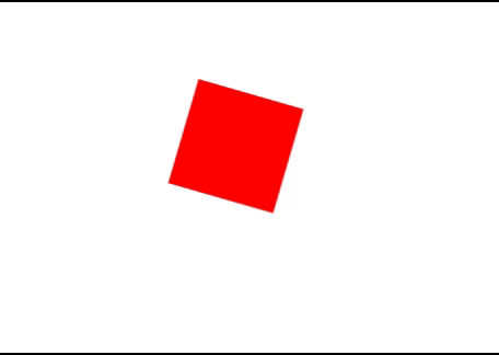
1、多重平移动画与旋转
1)HTML
<div class="rotate"></div>2)CSS
.rotate {
  width: 100px;
  height: 100px;
  background-color: red;
  animation: rotateAnimation 4s linear infinite;
}
@keyframes rotateAnimation {
  from {
    transform: rotate(0deg);
  }
  to {
    transform: rotate(360deg);
  }
}
3)效果
2、立体浮动效果
1)HTML
<div class="fade"></div> 2)CSS
.fade {
  width: 100px;
  height: 100px;
  background-color: green;
  animation: fadeInOut 3s ease-in-out infinite;
}
@keyframes fadeInOut {
  0% {
    opacity: 0;
  }
  50% {
    opacity: 1;
  }
  100% {
    opacity: 0;
  }
}
3)效果

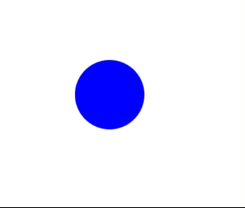
3、 分解展开效果
1)HTML
<div class="bounce"></div>2)CSS
.bounce {
  width: 100px;
  height: 100px;
  background-color: blue;
  border-radius: 50%;
  animation: bounceAnimation 2s ease-in-out infinite;
}
@keyframes bounceAnimation {
  0% {
    transform: translateY(0);
  }
  50% {
    transform: translateY(-50px);
  }
  100% {
    transform: translateY(0);
  }
}
3)效果
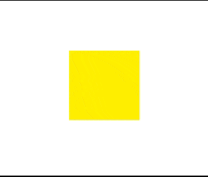
4、 文字渐变动画
1)HTML
<div class="colorChange"></div>2)CSS
.colorChange {
  width: 100px;
  height: 100px;
  animation: changeColor 5s linear infinite;
}
@keyframes changeColor {
  0% {
    background-color: red;
  }
  50% {
    background-color: yellow;
  }
  100% {
    background-color: blue;
  }
}
3)效果
5、平移动画
1)HTML
<div class="move"></div>2)CSS
.move {
  width: 100px;
  height: 100px;
  background-color: purple;
  animation: moveAnimation 3s ease-in-out infinite;
}
@keyframes moveAnimation {
  0% {
    transform: translateX(0);
  }
  50% {
    transform: translateX(200px);
  }
  100% {
    transform: translateX(0);
  }
}
3)效果


 扫一扫
扫一扫


 1万+
1万+

 被折叠的 条评论
为什么被折叠?
被折叠的 条评论
为什么被折叠?
 到【灌水乐园】发言


