


1 css
1.1 样式写法
- 在 xxx.css 写样式
@import './common/uni.css'; - 样式写在
<style></style>中 - 可有多个样式
class="box red"后面的样式会覆盖前面的样式 - 在当前页面写的样式会覆盖 App.vue 公共样式,和其在
class=""中的位置无关 - 在带有单个根元素的自定义组件上使用 class 属性时,这些 class 将被添加到该元素中。此元素上的现有 class 将不会被覆盖
- 如果你的组件有多个根元素,你需要定义哪些部分将接收这个类。可以使用 $attrs 组件属性执行此操作
- 内联: 在标签里写样式
- 内嵌: 在
<style>里写样式 - 外联: 在 xxx.css 文件里写样式
静态的样式统一写到 class 中。style 接收动态的样式,在运行时会进行解析,请尽量避免将静态的样式写进 style 中,以免影响渲染速度。
1.1.1 基本写法
前端 css class 嵌套/选择器总结(目的:识别 less 文件中嵌套的写法)
// 抽取公共部分
.classA,
.classB {
}

<div class="classA"></div>
<div class="classB"></div>
.classA.classB{
}

<div class="classA classB"></div>
.classA .classB{
}

<div class="classA">
	<div class="classB"></div>
	<div>
		<div class="classB"></div>
    </div>
</div>
/*所有<div>,<p>都生效*/
div,
p {
}

/*<div>内部的所有<p>都生效*/
div p {
}

/*<div>内部第一层<p>生效*/
div > p {
}
1.1.2 响应式写法
- class 与 style 是 HTML 元素的属性,用于设置元素的样式,可以用 v-bind 来设置样式属性
- :class 指令也可以与普通的 class 属性共存。
<template>
	<view>
		<!-- class -->
		<view class="static" :class="{ classA: aaa, classB: bbb }">111</view>
		<view class="static" :class="{ 'classA': aaa, 'classB': bbb }">222</view> <!-- 加''有效, 加""无效 -->

		<view class="static" :class="['classA', 'classB']">333</view> <!-- 去掉''无效 -->
		<view class="static" :class="[classValueA, classValueB]">444</view> <!-- 加''无效 -->

		<view class="static" :class="[aaa ? 'classA' : '', 'classB']">555</view> <!-- 三元表达式 -->
		<view class="static" :class="[aaa ? classValueA : '', classValueB]">666</view> <!-- 三元表达式 -->

		<view class="static" :class="[{ classA: aaa }, 'classB']">777</view>
		<view class="static" :class="[{ 'classA': aaa }, 'classB']">888</view>

		<view class="static" :class="[{ classA: aaa }, classValueB]">999</view>
		<view class="static" :class="[{ 'classA': aaa }, classValueB]">000</view>

		<view class="static" :class="classStr">111</view>
		<view class="static" :class="classObject">222</view> <!-- 小程序端不支持 -->

		<!-- style -->
		<view style="color: green">333</view> <!-- 加{} []无效 -->
		<view style="color: green; fontSize: 20px">444</view> <!-- 加{} []无效 -->

		<view :style="{ color: colorValue }">555</view>
		<view :style="{ 'color': colorValue }">555</view>
		<view :style="{ color: colorValue, fontSize: '20px' }">666</view>
		<view :style="{ color: colorValue, fontSize: fontSizeValue + 'px' }">777</view>

		<view :style="[{ color: colorValue, fontSize: fontSizeValue + 'px' }]">888</view>

		<view :style="styleStr">999</view>
		<view :style="styleObject">000</view>
	</view>
</template>
<script>
	export default {
		data() {
			return {
				aaa: true,
				bbb: false,
				classValueA: 'classA',
				classValueB: 'classB',
				colorValue: 'green',
				fontSizeValue: 20
			};
		},
		computed: {
			classStr() {
				return this.aaa ? 'classA' : '';
			},
			classObject() {
				return { classA: this.aaa };
			},
			styleStr() { // 以下几种都行
				return 'color: green; fontSize: 20px';
				// return "color: green; fontSize: 20px";
			},
			styleObject() { // 以下几种都行
				// return { color: this.colorValue, fontSize: '20px'};
				// return [{ color: this.colorValue, fontSize: '20px'}];
				// return { color: this.colorValue, fontSize: `${this.fontSizeValue}px`};
				return [{ color: this.colorValue, fontSize: `${this.fontSizeValue}px` }];
			}
		}
	};
</script>
<style>
	.static {
		color: #2c405a;
	}
	.classA {
		background-color: #efefef;
	}
	.classB {
		color: #dd524d;
	}
</style>
1.1.3 媒体查询
响应式布局:同一行代码,适配不同的屏幕
.xxx {
}

/* 当屏幕宽度小于等于 480px 时 */
@media screen and (max-width: 480px) {
  .xxx {
  }
}
1.1.4 选择器
- 通配选择器
- 用一个星号(*)表示。单独使用时,这个选择器可以与文档中的任何元素匹配,就像一个通配符
* { margin: 0; }
- 伪类选择器
:hover当用户悬浮到一个元素之上的时候匹配。:active在用户激活(例如点击)元素的时候匹配
- 伪元素选择器
::after匹配出现在原有元素的实际内容之后的一个可样式化元素。::before匹配出现在原有元素的实际内容之前的一个可样式化元素。::first-letter匹配元素的第一个字母。::first-line匹配包含此伪元素的元素的第一行。::grammar-error匹配文档中包含了浏览器标记的语法错误的那部分。::selection匹配文档中被选择的那部分。::spelling-error匹配文档中包含了浏览器标记的拼写错误的那部分。
1.1.5 单组件文件 css 功能
- 当
<style>标签带有scopedattribute 的时候,它的 CSS 只会影响当前组件的元素 - scoped 指定样式的局部作用域。
<style scoped lang="scss"></style>- 在 vue 中,App.vue 相当于根容器,不设置 scoped。所以一般在 App.vue 中引用公共样式。
- 而在其它.vue 页面中用 scoped,代表当前样式只作用于当前.vue 页面。不作用于其它.vue 页面。
- page 相当于 body 节点,使用 scoped 会导致失效,如
page { background-color: #999; }
在 uni-app 中不能使用 * 选择器。
1.2 常用属性
- 小按钮要是不好按,把它的长宽加一些,其中的图形不变
1.2.1 位置
CSS 基础:浅谈 position
CSS 定位详解 阮一峰
position位置static静态定位(默认值): 存在于正常文档布局流中,- 每个块级元素占据自己的区块(block),元素与元素之间不产生重叠
- static 定位所导致的元素位置,是浏览器自主决定的,所以这时 top、bottom、left、right 这四个属性无效。
relative相对定位: 存在于正常文档布局流中- 相对于默认位置(即 static 时的位置)进行偏移,即定位基点是元素的默认位置。
- 必须搭配 top、bottom、left、right 这四个属性一起使用,用来指定偏移的方向和距离。
absolute绝对定位: 不存在于正常文档布局流中,其相对 父元素进行绝对定位- 相对于上级元素(一般是父元素)进行偏移,即定位基点是父元素。
- absolute 定位也必须搭配 top、bottom、left、right 这四个属性一起使用
fixed固定定位: 不存在于正常文档布局流中,其相对浏览器本身进行固定定位- 相对于视口(viewport,浏览器窗口)进行偏移,即定位基点是浏览器窗口。
sticky粘性定位: 开始像 relative,直到滚动到某个阈值点,就固定了 fixed- 必须搭配 top、bottom、left、right 这四个属性一起使用
- 例如
th { position: sticky; top: 0; }当到达顶部的时候变固定
z-index: -1; 置于底层(数字代表层数,大的数字位于顶层)
1.2.2 盒子模型
display显示布局/盒子flex弹性布局/盒子:block块级布局/盒子: 会换行, width 和 height 属性可以发挥作用- 常见块级元素
div,h1~h6,p,form,ul,li,ol,dl,address,hr,menu,table,fieldset
- 常见块级元素
inline内联布局/盒子: 不会换行, width 和 height 属性不起作用- 常见行内元素
a,span,label,strong,em,br,img,input,select,textarea,cite
- 常见行内元素
box-sizing盒子大小content-box: width、height 不包含 padding、border,默认值border-box: width、height 包含 padding、border
padding内填充margin外填充
1.2.2.1 flex 弹性布局
Flex 布局
flex 布局 flex 取值以及 align-self、align-content、align-items 的区别
Flex 布局教程:语法篇
- Flex 是 Flexible Box 的缩写,意为"弹性布局",用来为盒状模型提供最大的灵活性。
- 设为 Flex 布局以后,子元素的 float、clear 和 vertical-align 属性将失效。
.xxx {
display: flex;
flex-direction: row; /* 主轴为水平方向 */
flex-direction: column; /* 主轴为垂直方向 */
flex-wrap: wrap; /* 换行,第一行在上方 */
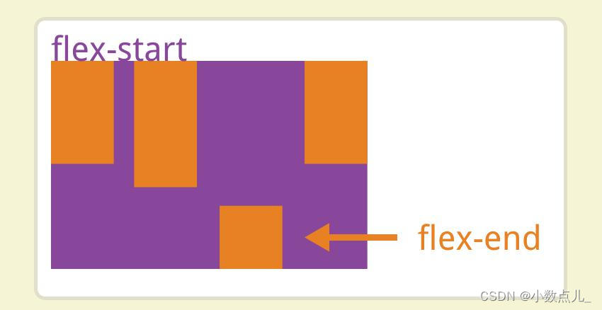
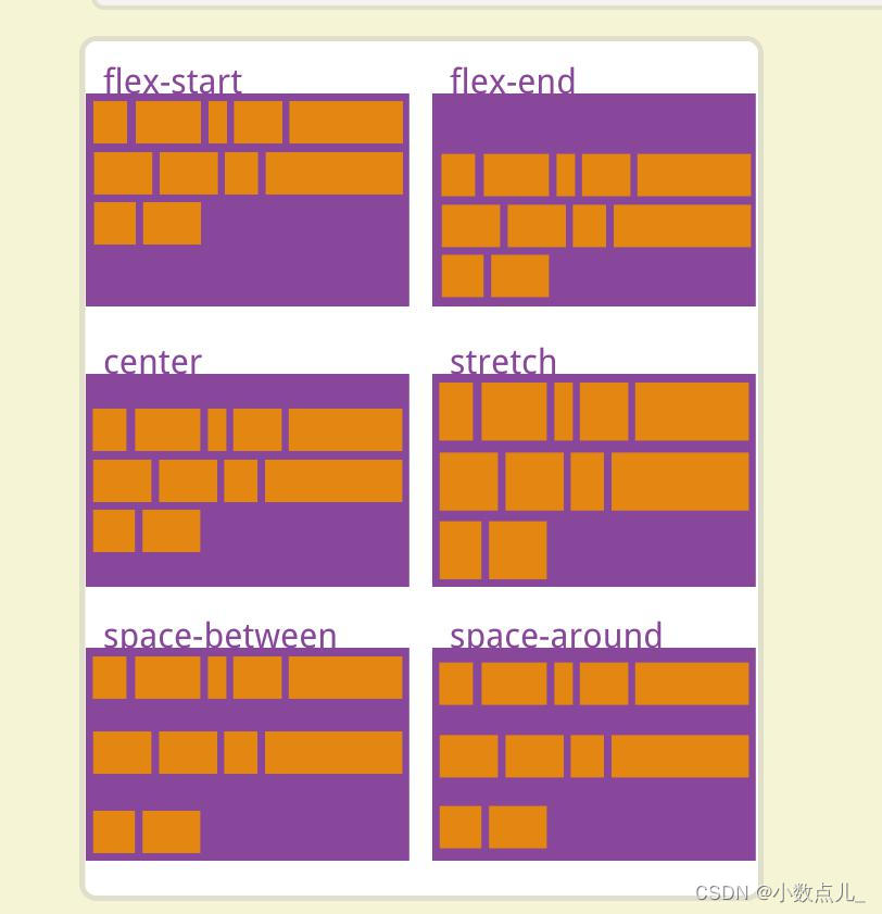
justify-content: flex-start; /* 主轴上靠头对齐(默认值) */
justify-content: flex-end; /* 主轴上靠尾对齐 */
justify-content: center; /* 主轴上居中 */
justify-content: space-between; /* 主轴上两端对齐 */
justify-content: space-around; /* 主轴上延轴线平均分布 */
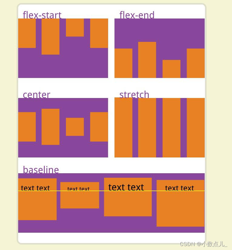
align-items: flex-start; /* 交叉轴上靠头对齐(默认值) */
align-items: flex-end; /* 交叉轴上靠尾对齐 */
align-items: center; /* 交叉轴上居中 */
align-items: baseline; /* 交叉轴上以第一行文字的基线对齐 */
align-items: stretch; /* 如果项目未设置高度或设为auto,将占满整个容器的高度。(默认值) */
justify-self: center;
justify-items: center;
justify-content: center;
align-self: center; /* 自身在父元素中居中 交叉轴上 */
align-items: center; /* 将所有直接子节点上的 align-self 值设置为一个组 */
align-content: center;
text-align: center; /* 文字居中 */
}
- 善用 align-self,减少盒子嵌套层数
- 若居中不了可能是:
- 父元素宽度高度没有设置,加个背景色看看
- box 相对其父元素居中,但 box 中内容未相对 box 居中
- 可能跟行列反了
1.2.3 文字
text-shadow文字阴影
.font {
  font-family: SourceHanSansCN-Regular;
  font-size: 20rpx;
  font-weight: normal;
  letter-spacing: 0em;
  color: #000;
  line-height: 25rpx;
}
1.2.4 边框背景
border-radius边框圆角半径,border-radius: 50%为圆
1.3 常用样式布局
----xxx----这种布局,先写文字,放中间,文字加背景色盖住一部分线- 在页面多行的区域中,只有其中一行要靠左,该行区域
flex-start,其子元素位置绝对 - 右上角数字角标、关闭按钮
- 盒----------盒-- 数字 --子–子
- 盒-------------------------子
1.3.1 三角形
纯 CSS 实现带小三角提示框
css 实现 正方形 三角形 梯形
1.3.2 点击按钮效果
<button>标签hover-class属性 指定按钮按下去的样式类- 可自己另写一个样式
- 也可重写默认样式
.button-hover{}
- hover
.xxx:hover{} - active
.xxx:active{}
1.3.3 去掉按钮自带边框
解决 button 和 input 标签自带边框的问题
css 中 button 样式带边框的问题
button::after {
  border: 0;
}
1.4 CSS 规范
Css 规范
Code Guide
前端代码规范
前端 CSS 规范整理
- 颜色 16 进制 使用小写字母
- 属性声明顺序
- Positioning 位置
- Box model 盒子
- Typography 文字
- Visual 边框背景
- 样式表文件命名,示例
- 主要的 master.css
- 模块 module.css
- 基本共用 base.css
- 布局、版面 layout.css
- 主题 themes.css
- 专栏 columns.css
- 文字 font.css
- 表单 forms.css
- 补丁 mend.css
- 打印 print.css
.xxx,
.declaration-order {
  /* Positioning 位置 */
  position: absolute;
  top: 0;
  right: 0;
  bottom: 0;
  left: 0;
  z-index: 100;

  /* Box model 盒子布局 */
  display: flex;
  flex: 1;
  flex-wrap: wrap;
  flex-direction: column;
  align-items: center;
  justify-content: center;
  box-sizing: border-box;
  width: 100px;
  height: 100px;
  padding: 20rpx;
  margin: 20rpx;

  /* Typography 文字 */
  /* font: normal 14px "Helvetica Neue", sans-serif; */
  font-family: SourceHanSansCN-Medium;
  font-size: 24px;
  font-weight: 300;
  letter-spacing: 0em;
  line-height: 1.5;
  text-align: center;
  text-decoration: underline;
  color: #333;

  /* Visual 边框背景阴影 */
  background-color: #f5f5f5;
  border: 1px solid #e5e5e5;
  border-radius: 3px;
  box-shadow: 0 5rpx 10rpx 5rpx rgba(0, 0, 0, 0.15);

  /* Misc */
  opacity: 1; /* 不透明度 */
}
1.4.2 BEM 命名规范
CSS — BEM 命名规范
BEM 命名规范入门及常用 CSS class 命名
样式命名有多难?浅谈 BEM 命名规范 ⚡
每一个块(block)名应该有一个命名空间(前缀)
block代表了更高级别的抽象或组件。block__element代表 .block 的后代,用于形成一个完整的 .block 的整体。block--modifier代表 .block 的不同状态或不同版本。- 使用两个连字符和下划线而不是一个,是为了让你自己的块可以用单个连字符来界定
.sub-block__element {}.sub-block--modifier {}
- 使用两个连字符和下划线而不是一个,是为了让你自己的块可以用单个连字符来界定
1.4.3 常用 class 名
-
状态类: primary, secondary, success, danger, warning, info, error, Link, light, dark, disabled, active, checked, loading
-
尺寸类: large, middle, small, bigger, smaller
-
组件类: card, list, picture, carousel, swiper, menu, navs, badge, hint, modal, dialog
-
位置类: first, last, current, prev, next, forward, back
-
文本类: title, desc, content, date, author, category,label,tag
-
人物类: avatar, name, age, post, intro
-
布局类:header, footer, container, main, content, aside, page, section
-
包裹类:wrap, inner
-
区块类:region, block, box
-
结构类:hd, bd, ft, top, bottom, left, right, middle, col, row, grid, span
-
列表类:list, item, field
-
主次类:primary, secondary, sub, minor
-
大小类:s, m, l, xl, large, small
-
状态类:active, current, checked, hover, fail, success, warn, error, on, off
-
导航类:nav, prev, next, breadcrumb, forward, back, indicator, paging, first, last
-
交互类:tips, alert, modal, pop, panel, tabs, accordion, slide, scroll, overlay,
-
星级类:rate, star
-
分割类:group, seperate, divider
-
等分类:full, half, third, quarter
-
表格类:table, tr, td, cell, row
-
图片类:img, thumbnail, original, album, gallery
-
语言类:cn, en
-
论坛类:forum, bbs, topic, post
-
方向类:up, down, left, right
-
其他语义类:btn, close, ok, cancel, switch; link, title, info, intro, more, icon; form, label, search, contact, phone, date, email, user; view, loading…
1.5 css 变量
uniapp 提供 css 变量
| CSS 变量 | 描述 | |
|---|---|---|
| –status-bar-height | 系统状态栏高度 | 小程序端: 25px |
| –window-top | 内容区域距离顶部的距离 | H5 端: NavigationBar 的高度 |
| –window-bottom | 内容区域距离底部的距离 | H5 端: TabBar 的高度 |
.xxx {
	height: var(--window-bottom);
}
1.6 固定值
uni-app 中以下组件的高度是固定的,不可修改:
| 组件 | 描述 | ||
|---|---|---|---|
| NavigationBar | 导航栏 | App 端: 44px | H5 端: 44px |
| TabBar | 底部选项卡 | App 端: HBuilderX 2.3.4 之前为 56px,2.3.4 起和 H5 调为一致,统一为 50px。但可以自主更改高度) | H5 端: 50px |


 363
363


 被折叠的 条评论
为什么被折叠?
被折叠的 条评论
为什么被折叠?
 到【灌水乐园】发言


