


Flutter——Dart学习
介绍
Flutter是一个开源的UI软件开发工具包,由Google创建,用于构建跨平台的美观、高性能的移动、Web和桌面应用程序。Flutter的核心设计理念是一切皆为widget(组件),这意味着Flutter中的每个元素都是一个widget,从简单的文本到复杂的布局结构。
在Flutter中,基本布局widget是构建界面的基石。例如,AppBar是一个在屏幕顶部显示内容和操作的容器,通常用于显示应用程序的名称和主要操作。Scaffold则实现了基本的Material Design视觉布局结构,提供了显示抽屉、小吃店和底部表单的API。而 Stack允许你将widget重叠在一起,这在创建重叠元素的布局时非常有用。
让我们深入了解一些Flutter的基本布局widget:
- AppBar: 作为应用程序的顶部栏,它通常包含应用程序的标题和一些重要的操作按钮。它的设计灵活,可以很容易地自定义,比如添加标签页、搜索栏等。
- Scaffold: 它提供了一个框架,用于实现基本的Material Design布局。Scaffold包括一个AppBar、一个body属性来展示主要内容,以及一个浮动的操作按钮。
- Stack: 这个widget允许你在多维空间内对子widget进行定位和堆叠。这对于需要重叠元素的布局非常有用,比如一个图片上覆盖一段文字。
- Column和Row: 这两个widget分别用于垂直和水平地排列其他widget。它们是构建布局的基础,可以通过多种方式来调整子widget的对齐和大小。
了解这些基本的布局widget对于任何Flutter开发者来说都是至关重要的。它们提供了构建直观和响应式界面所需的灵活性和控制。无论是简单的个人项目还是复杂的商业应用程序,掌握Flutter的布局系统都将帮助你创建出色的用户体验。
想要更深入地了解Flutter的布局系统,可以查看Flutter的官方文档,那里有更详细的信息和示例代码,帮助你开始Flutter之旅。
小试牛刀
-
先安装flutter
-
由于从github上拉的项目版本不一致,所以要更换dart sdk版本的需求,可以用
flutter version命令切换到相应的Flutter版本,但Flutter从1.22版本开始不再推荐使用flutter version命令切换版本。建议使用fvm(Flutter Version Management)来管理不同的Flutter版本。 -
FVM是一个Flutter版本管理工具,它允许您在不同的项目之间轻松切换Flutter版本。使用FVM,您可以为每个项目设置特定的Flutter版本,而不会影响其他项目或全局Flutter安装。
-
命令行输入
dart pub global activate fvm安装FVM

-
之后修改fvm默认缓存位置,配置系统变量
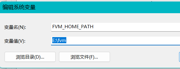
-
打开命令行输入
fvm config --cache-path E:\fvm修改位置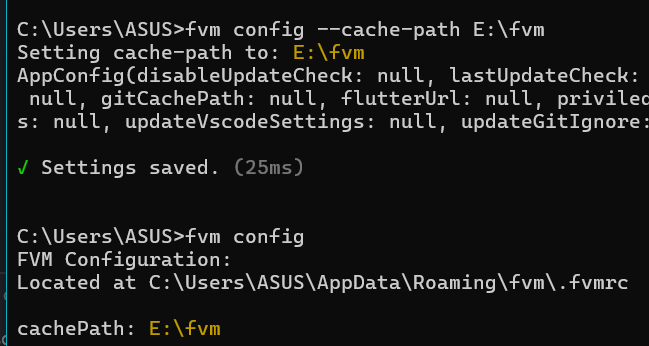
-
之后可通过相关命令操作
-
fvm install <版本号># 安装特定版本的Flutter -
fvm use <版本号># 在当前项目中使用特定版本 -
相关版本对应Flutter SDK 版本列表
-
输入
fvm list可查看已安装版本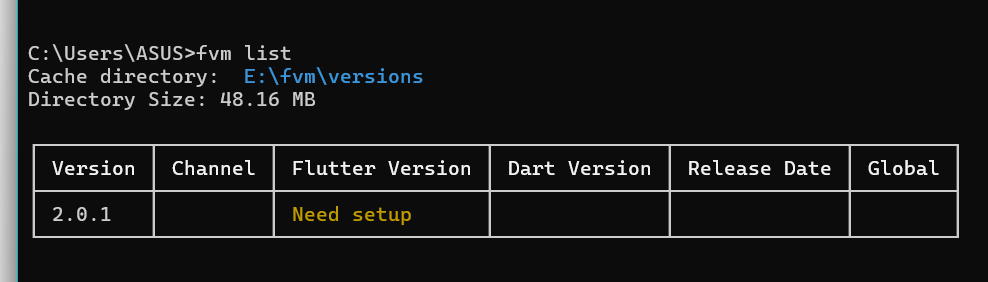
-
状态组件Widget
StatefulWidget
- 是一个有状态小部件,有状态组件的生命周期比无状态组件复杂得多,因为它们可以在其生命周期中的多个阶段改变状态。有状态组件的生命周期简单来说可以分为以下几个阶段:
- 创建(Create):在这个阶段,Flutter框架会调用组件的构造函数和createState方法来创建组件的状态。
- 初始化(Initialization):在这个阶段,Flutter框架会调用initState方法来初始化组件的状态。这个方法只会在组件的生命周期中被调用一次
- 构建(Build):在这个阶段,Flutter框架会调用build方法来构建组件的界面
- 更新(Update):当组件的状态改变时,Flutter框架会调用build方法来更新组件的界面
- 销毁(Dispose):当组件被移除时,Flutter框架会调用dispose方法来清理组件的资源
- (StatefulWidget)的生命周期包含了一些其他的方法,这些方法在特定的时机被调用,可以帮助我们更好地管理组件的状态和行为。
- deactivate:这个方法在State对象从树中被移除时调用,但在调用dispose之前。这个阶段通常会在组件从树中被移除,然后在稍后的帧中重新插入到树中时发生。这个方法通常用于清理那些在dispose方法中不适合清理的资源。
- didUpdateWidget:当组件的配置改变(即widget发生改变)时,Flutter框架会调用这个方法。例如,如果父组件重建并创建了一个新的widget,然后将这个新的widget传递给同一个子组件,那么子组件的didUpdateWidget方法就会被调用。这个方法通常用于开始一些针对新配置的操作。
- didChangeDependencies:当State对象的依赖关系改变时,Flutter框架会调用这个方法。例如,如果你的组件依赖于一个InheritedWidget,那么当这个InheritedWidget改变时,didChangeDependencies方法就会被调用。这个方法通常用于执行一些依赖于其他组件的操作。
- 可变性 :Stateful 小部件是动态的,它们可以在运行时根据用户操作或数据变化进行更新。它们具有内部状态,如果输入数据发生变化或小部件的状态发生变化,它们可以重新绘制。
- 示例 :
Checkbox、Radio Button、Slider、InkWell、Form和TextField都是 Stateful 小部件的示例。 - 创建方式 :要创建 Stateful 小部件,我们需要重写
createState()方法,该方法返回小部件的状态。
_MyStatefulWidgetState createState() => _MyStatefulWidgetState();
}
Build
这个方法在组件需要构建其界面时被调用。Flutter框架会在多种情况下调用这个方法,例如在组件首次插入到树中时,或者在组件的状态改变时。这个方法必须返回一个新的widget,这个widget将会被用于构建组件的界面
- 作用是构建视图,在Flutter中,组件的重构(即重新调用build方法)通常在以下情况发生:
- 组件的状态改变。例如,当你调用setState方法时,Flutter框架会安排组件在下一帧中重构。
- 组件的配置改变。例如,当父组件重建并创建了一个新的widget,然后将这个新的widget传递给同一个子组件时,子组件会被重构。
- 组件的依赖关系改变。例如,如果你的组件依赖于一个InheritedWidget,那么当这个InheritedWidget改变时,你的组件会被重构。
- Flutter框架通过比较新旧widget的差异来决定是否需要重构组件,这个过程被称为diffing。如果新旧widget相同,那么组件可能不会被重构。
StatelessWidget
- 是一个无状态小部件,无状态组件在其生命周期中只有一个阶段,即创建(Create)阶段。在这个阶段,Flutter框架会调用组件的构造函数和build方法来创建组件。一旦创建,无状态组件就不能再改变,也就是说它们是不可变的。
- 不可变性 :Stateless 小部件是静态的,它们在整个生命周期内不会改变。它们的外观和属性在创建后保持不变。
- 示例 :
Text、Icon、RaisedButton等都是 Stateless 小部件的示例。 - 创建方式 :要创建 Stateless 小部件,我们需要重写
build()方法。
class MyStatelessWidget extends StatelessWidget {
Widget build(BuildContext context) {
return Text("Hello, Stateless Widget");
}
}
Scaffold
-
Scaffold,就是脚手架的意思,它实现了 Material Design 的基本布局结构,Scaffold会自动填充可用的空间,以下是一些基础用法
const Scaffold({ Key? key, this.appBar,//标题栏 this.body,//用于显示当前界面主要内容的Widget this.floatingActionButton,//一个悬浮在body上的按钮,默认显示在右下角 this.floatingActionButtonLocation,// 用于设置floatingActionButton显示的位置 this.floatingActionButtonAnimator,// floatingActionButton移动到一个新的位置时的动画 this.drawer,// 左侧的抽屉菜单 this.endDrawer,// 右'侧的抽屉菜单 this.bottomNavigationBar,// 底部导航栏。 this.bottomSheet,// 显示在底部的工具栏 this.backgroundColor,// 内容的背景颜色 this.primary = true,// Scaffold是否显示在页面的顶部 this.drawerEdgeDragWidth,//侧滑栏拉出来的宽度 this.drawerEnableOpenDragGesture = true,//左侧侧滑栏是否可以滑动 this.endDrawerEnableOpenDragGesture = true,//右侧侧滑栏是否可以滑动 this.restorationId, })-
来看个例子:
import 'package:flutter/material.dart';

void main() {
  runApp(MyApp());
}

class MyApp extends StatelessWidget {
  @override
  Widget build(BuildContext context) {
    return MaterialApp(
      home: MyHomePage(),
    );
  }
}

class MyHomePage extends StatelessWidget {
  @override
  Widget build(BuildContext context) {
    return Scaffold(
      appBar: AppBar(
        title: Text('My App'),
      ),
      body: Center(
        child: Text('Hello, World!'),
      ),
      drawer: Drawer(
 	child: Center(
 	child: Text('抽屉'),
 	),
      floatingActionButton: FloatingActionButton(
        onPressed: () {
          // Add your action here
        },
        child: Icon(Icons.add),
      ),
    );
  }
}
-
AppBar
-
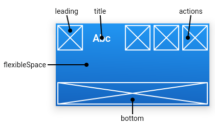
AppBar是一个非常重要的组件,它通常出现在应用程序界面的顶部,并提供了导航和屏幕标题的功能。AppBar可以高度自定义,支持添加多种元素,如标题、按钮和选项卡。
AppBar({ Key? key, this.leading,widget类型,即可任意设计样式,表示左侧leading区域,通常为icon,如返回icon this.title,//widget类型,即可任意设计样式,表示中间title区域,通常为标题栏 this.actions,// List<Widget>类型,即可任意设计样式,表示右侧actions区域,可放置多个widget,通常为icon,如搜索icon、菜单icon this.flexibleSpace, this.bottom,//PreferredSizeWidget类型,appbar底部区域,通常为Tab控件 this.shadowColor, this.shape,//ShapeBorder 类型,表示描边形状 this.backgroundColor,//Color类型,背景色 this.brightness, this.iconTheme,//IconThemeData类型,可影响包括leading、title、actions中icon的颜色、透明度,及leading中的icon大小。 }) -
布局如下
child使用
-
使用时,我有一个搜索按钮点击后显示搜索框和输入框搜索单词我原来的代码是
child: Row( children: [ Padding( padding: EdgeInsets.all(8), // 左侧图标的内边距 child: Icon(Icons.person, color: Colors.grey), // 左侧图标 ), Expanded( // 搜索框 child: TextField( // 运行后点击按钮后这边就报错了 controller: _controller, onSubmitted: (value) { _search(value); // 回车触发搜索 }, decoration: InputDecoration( hintText: '请输入要搜索的单词或词组', border: InputBorder.none, // 无边框 ), textInputAction: TextInputAction.search, // 设置回车为搜索 ), ), IconButton( icon: Icon(Icons.mic, color: Colors.white), // 语音图标 onPressed: () { // 语音识别逻辑 }, ), IconButton( icon: Icon(Icons.search, color: Colors.white), // 右侧搜索图标 onPressed: () { _search(_controller.text); // 搜索图标点击触发搜索 }, ), ], ), -
显示
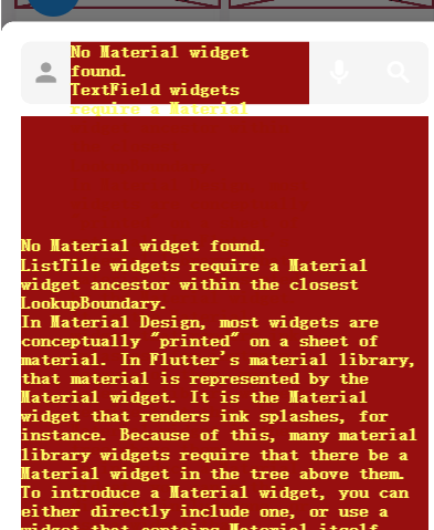
-
这个错误是因为
TextField需要一个Material组件作为它的祖先组件,可以使用提示将其包裹在Material中就可以了。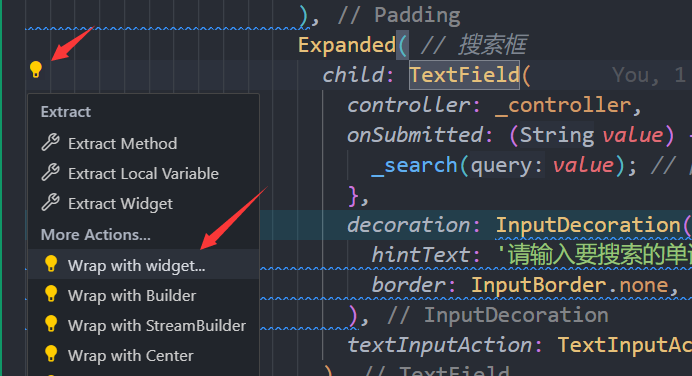
动画animation
- 在Flutter中,
Offset是一个表示二维空间中的点的类。它通常用于定义位置、距离或者向量。
Offset 的两个参数分别是 dx 和 dy:
dx:表示在水平方向(x轴)上的距离。正值表示向右,负值表示向左。dy:表示在垂直方向(y轴)上的距离。正值表示向下,负值表示向上。
例如,Offset(1, 0) 表示向右移动一个单位,Offset(0, 1) 表示向下移动一个单位。
// 定义一个从右侧滑出的动画,用于跳过按钮
    final _skipAnimation = Tween<Offset>(begin: Offset(0, 0), end: Offset(2, 0))
        .animate(CurvedAnimation(
          parent: animationController, // 使用传入的动画控制器
          curve: Interval(0.6, 0.8, curve: Curves.fastOutSlowIn), // 设置动画间隔和曲线
        ));
Tween<Offset> 是用来定义动画的起始和结束位置的。例如,Tween<Offset>(begin: const Offset(4, 0), end: const Offset(0, 0)) 表示动画从右侧4个单位的位置开始,到当前位置结束。
Interval是 Flutter 中的一个类,它用于定义动画的一部分时间范围。Interval的两个参数begin和end都是 0.0 到 1.0 之间的值,表示动画的开始和结束时间。例如,Interval(0.6, 0.8)表示动画在整个动画时间的60%到80%之间进行。
- 使用动画控制器时要使用with SingleTickerProviderStateMixin或者TickerProviderStateMixin,二者区别就是你使用动画一个controller还是多个controller
SingleTickerProviderStateMixin
- 作为动画构造器中的vsync参数,用于绑定动画的定时器到一个可视的widget,当widget不显示时,动画定时器将会暂停,当widget再次显示时,动画定时器重新恢复执行,这样就可以避免动画相关UI不在当前屏幕时消耗资源;
TickerProviderStateMixin
- 作为动画构造器中的vsync参数,防止当前页面也就是widget被回收
TickerProviderStateMixin是一个Mixin,提供了一个单独的Ticker,它只在当前树启用时Tick。这意味着,如果您希望在不同部分共享相同的AnimationController,最好采用TickerProviderStateMixin。
SingleTickerProviderStateMixin(自number:1、2、3、6、8和9)则是一个更特殊的Mixin类型。因此,如果你可以创建所有动画使用同一个AnimationController,推荐使用SingleTickerProviderStateMixin来创建和管理AnimationController,以确保它只在树处于活动状态时运行。
方法返回object类型
在Dart中,由于Dart的类型系统,使用 Object类型时无法直接进行索引访问,因为 Object类型并没有定义 []运算符。要解决这个问题,需要告诉Dart编译器你的对象的具体类型,以便正确地使用索引操作符。可以通过使用类型转换来做到这一点。
// 获取阅读进度
  Future<String> _getReadingProgress(int ebookId) async {
    final ReadingProgressService readingProgressService = Get.find<ReadingProgressService>();
    final progress = await readingProgressService.getProgress(ebookId);
    print('阅读进度:$progress');
    return progress['progress'].toString();
  }
- 显示
The operator '[]' isn't defined for the type 'Object'. (Documentation) Try defining the operator '[]'.
修改
// 获取阅读进度
Future<String> _getReadingProgress(int ebookId) async {
  final ReadingProgressService readingProgressService = Get.find<ReadingProgressService>();
  final progress = await readingProgressService.getProgress(ebookId) as Map<String, dynamic>; // 使用类型转换
  print('阅读进度:${progress['progress']}');
  return progress['progress'].toString();
}
InheritedModel:这是一个可以在Widget树中共享数据的Widget。它的主要功能是允许在Widget树中的任何位置访问祖先Widget的数据。在你的英语学习app中,如果有一些全局的设置或者数据需要在多个页面中共享,那么InheritedModel就非常适合。例如,你可以使用InheritedModel来存储用户的主题设置,然后在app的任何地方都可以访问这个设置。
Notifier:这是一个可以在数据改变时通知监听器的类。它通常用于实现观察者模式。在你的英语学习app中,如果有一些数据的改变需要通知到多个Widget,那么Notifier就非常适合。例如,你提到的点赞功能就可以使用Notifier来实现。当用户在一个页面点赞后,你可以通过Notifier来通知其他页面的Widget,让它们更新点赞的数量。
异步获取数据
在flutter中一些请求返回的结果需要使用future来异步接收,我的代码中在获取电子书阅读进度的时候,pdf和epub的进度需要当成参数传递给详细页面
return Scaffold(
      appBar: AppBar(
        title: Text('电子书系列'),
      ),
      body: ListView.builder(
        itemCount: seriesEbooks.length,
        itemBuilder: (context, index) {
          final ebookItem = seriesEbooks[index];
          if (ebookItem['fileType'] == 'pdf') {
            // 异步获取 PdfDocument
            return FutureBuilder<PdfDocument>(
              future: PdfDocument.openUri(Uri.parse(ebookItem['filePath']!)),
              // 将字符串转换为 Uri
              builder: (context, snapshot) {
                if (snapshot.connectionState == ConnectionState.waiting) {
                  return CircularProgressIndicator(); // 显示加载进度
                }
                if (snapshot.hasError) {
                  return ListTile(
                      title: Text('Error: ${snapshot.error}')); // 错误处理
                }
                final pdfDocument = snapshot.data;
                if (pdfDocument == null) {
                  return ListTile(title: Text('Failed to load PDF')); // 加载失败
                }
                return ListTile(
                  leading: SizedBox(
                    width: 50.0, // 设置一个固定的宽度
                    child: PdfPageView(
                      document: pdfDocument,
                      pageNumber: 1, // 显示第一页缩略图
                      maximumDpi: 300,
                    ),
                  ),
                  title: Text(ebookItem['title']), // 显示 PDF 标题
                  // 跳转到 PDF 详情页面
                  onTap: () {
                    Get.to(
                      PdfView(
                          pdfPath: ebookItem['filePath']!,
                          eBookId: ebookItem['id'],
                          currentPage:
                              _getReadingProgress(ebookItem['id']) as int),
                      transition: Transition.fade,
                      duration: Duration(seconds: 1),
                    );
                  },
                );
              },
            );
          } else if (ebookItem['fileType'] == 'epub') {
            return ListTile(
              // 使用空白图片并显示文本
              leading: SizedBox(
                width: 80.0, // 设置一个固定的宽度
                height: 120.0,
                child: BlankImageWithText(text: ebookItem['title']),
              ),
              title: Text(ebookItem['title'] ?? ''),
              onTap: () async {
                final initialCfi = await _getReadingProgress(ebookItem['id']);
                Get.to(
                  EpubViewer(
                      epubUrl: ebookItem['filePath']!,
                    ebookId: ebookItem['id'],
                    // 传入阅读进度
                    initialCfi: initialCfi),
                  transition: Transition.fade,
                  duration: Duration(seconds: 1),
                );
              },
            );
          }
          return null;
        },
      ),
    );
- 我在传递pdf进度的时候就会报错;
_getReadingProgress返回的Future<String>不能立即使用,因为当尝试强制转换它时它尚未完成。需要等待完成,然后才能使用其结果
title: FutureBuilder<String>(
    future: _getReadingProgress(ebookItem['id']),
    builder: (BuildContext context, AsyncSnapshot<String> snapshot) {
      if (snapshot.connectionState == ConnectionState.waiting) {
        return CircularProgressIndicator();
      } else if (snapshot.hasError) {
        return Text('Error: ${snapshot.error}');
      } else {
        return Text(ebookItem['title']); // 显示 PDF 标题
      }
    },
  ),
  onTap: () {
    Get.to(
      PdfView(
        pdfPath: ebookItem['filePath']!,
        eBookId: ebookItem['id'],
        currentPage: int.parse(snapshot.data! as String),
      ),
      transition: Transition.fade,
      duration: Duration(seconds: 1),
    );
  },
主题切换
- 原生的主题
factory ThemeData({
    Brightness brightness, // 应用主题亮度,可选(dark、light)
    VisualDensity visualDensity, // 视觉密度
    MaterialColor primarySwatch, // 主要样式,设置primaryColor后该背景色会被覆盖
    Color primaryColor, // 主要部分背景颜色(导航和tabBar等)
    Brightness primaryColorBrightness, // primaryColor的亮度
    Color primaryColorLight, // primaryColor的浅色版
    Color primaryColorDark, // primaryColor的深色版
    Color accentColor, // 前景色(文本,按钮等)
    Brightness accentColorBrightness, // accentColor的亮度
    Color canvasColor, // MaterialType.canvas 的默认颜色
    Color shadowColor, // 阴影颜色
    Color scaffoldBackgroundColor, // Scaffold的背景颜色。典型Material应用程序或应用程序内页面的背景颜色
    Color bottomAppBarColor, // BottomAppBar的默认颜色
    Color cardColor, // Card的颜色
    Color dividerColor, // Divider和PopupMenuDivider的颜色,也用于ListTile之间、DataTable的行之间等。
    Color focusColor, // 突出颜色
    Color hoverColor, //  hoverColor
    Color highlightColor, // 高亮颜色,选中在泼墨动画期间使用的突出显示颜色,或用于指示菜单中的项。
    Color splashColor, // 墨水飞溅的颜色。InkWell
    InteractiveInkFeatureFactory splashFactory, // 定义由InkWell和InkResponse反应产生的墨溅的外观。
    Color selectedRowColor, // 用于突出显示选定行的颜色。
    Color unselectedWidgetColor, // 用于处于非活动(但已启用)状态的小部件的颜色。例如,未选中的复选框。通常与accentColor形成对比。也看到disabledColor。
    Color disabledColor, // 禁用状态下部件的颜色,无论其当前状态如何。例如,一个禁用的复选框(可以选中或未选中)。
    Color buttonColor, // RaisedButton按钮中使用的Material 的默认填充颜色。
    ButtonThemeData buttonTheme, // 定义按钮部件的默认配置,
    ToggleButtonsThemeData toggleButtonsTheme, // 切换按钮的主题
    Color secondaryHeaderColor, // 选定行时PaginatedDataTable标题的颜色。
    Color textSelectionColor, // 文本框中文本选择的颜色,如TextField
    Color cursorColor, // 文本框中光标的颜色,如TextField
    Color textSelectionHandleColor, // 调整当前选定的文本部分的句柄的颜色。
    Color backgroundColor, // 与主色形成对比的颜色,例如用作进度条的剩余部分。
    Color dialogBackgroundColor, // Dialog元素的背景颜色
    Color indicatorColor, // 选项卡中选定的选项卡指示器的颜色。
    Color hintColor, // 用于提示文本或占位符文本的颜色,例如在TextField中。
    Color errorColor, // 用于输入验证错误的颜色,例如在TextField中
    Color toggleableActiveColor, // 用于突出显示Switch、Radio和Checkbox等可切换小部件的活动状态的颜色。
    String fontFamily, // 文本字体
    TextTheme textTheme, // 文本的颜色与卡片和画布的颜色形成对比。
    TextTheme primaryTextTheme, // 与primaryColor形成对比的文本主题
    TextTheme accentTextTheme, // 与accentColor形成对比的文本主题。
    InputDecorationTheme inputDecorationTheme, // 基于这个主题的 InputDecorator、TextField和TextFormField的默认InputDecoration值。
    TabBarTheme tabBarTheme, // 用于自定义选项卡栏指示器的大小、形状和颜色的主题。
    TooltipThemeData tooltipTheme, // tooltip主题
    CardTheme cardTheme, // Card的颜色和样式
    AppBarTheme appBarTheme, // appBar主题
    ColorScheme colorScheme, // 拥有13种颜色,可用于配置大多数组件的颜色。
    NavigationRailThemeData navigationRailTheme, // 导航边栏主题
    // ...
  })
- 自定义主题文件Theme.dart
import 'package:flutter/material.dart';
import 'package:flutter/services.dart';
import 'package:flutter_english_hub/theme/app_theme.dart';
import 'package:get/get.dart';


class CustomThemePage extends StatelessWidget {
  final List<MaterialColor> colors = [
    Colors.red,
    Colors.yellow,
    Colors.green,
    Colors.blue,
    Colors.indigo,
  ];

  @override
  Widget build(BuildContext context) {
    return Scaffold(
      appBar: AppBar(
        title: Text('Custom Theme'.tr),

      ),
      body: Column(
        children: [
          ElevatedButton(
            onPressed: () {
              Get.changeTheme(
                Get.isDarkMode ? lightTheme : darkTheme
              );
            },
            // 一键切换白天黑夜模式
            child: Text(
              Get.isDarkMode ? 'Day'.tr : 'Night'.tr,
              style: Get.textTheme.displaySmall,
            ),
          ),
          Expanded(
            child: GridView.builder(
              padding: EdgeInsets.all(10.0),
              gridDelegate: SliverGridDelegateWithFixedCrossAxisCount(
                crossAxisCount: 3,
                crossAxisSpacing: 10.0,
                mainAxisSpacing: 10.0,
              ),
              itemCount: colors.length,
              itemBuilder: (context, index) {
                return GestureDetector(
                  onTap: () {
                    Get.changeTheme(
                      ThemeData.light().copyWith(
                        primaryColor: colors[index], // 主要部分背景颜色(导航和tabBar等)
                        splashColor: colors[index][100], // 按钮点击时的水波纹颜色
                        appBarTheme: AppBarTheme(
                          systemOverlayStyle: SystemUiOverlayStyle.dark,
                          elevation: 0,
                          backgroundColor: colors[index], // AppBar的背景颜色
                          iconTheme: IconThemeData(color: colors[index][700]), // AppBar的图标颜色
                        ),
                        scaffoldBackgroundColor: colors[index][50], // Scaffold的背景颜色
                        backgroundColor: colors[index][50], // 背景颜色
                        iconTheme: IconThemeData(
                          color: colors[index][700], // 图标颜色
                        ),
                        bottomNavigationBarTheme: BottomNavigationBarThemeData(
                          selectedItemColor: colors[index], // 底部导航栏选中项的颜色
                          unselectedItemColor: colors[index][700], // 底部导航栏未选中项的颜色
                        ),
                        visualDensity: VisualDensity.adaptivePlatformDensity,
                      ),
                    );
                  },
                  child: Container(
                    color: colors[index],
                  ),
                );
              },
            ),
          ),
        ],
      ),
    );
  }
}
// 白天模式
ThemeData lightTheme = ThemeData.light().copyWith(
  shadowColor: Colors.black38,
  primaryColor: Colors.blue,
  colorScheme: ThemeData.light().colorScheme.copyWith(
    primary: Colors.blue,
    secondary: Colors.blueAccent, // 替代accentColor
    onPrimary: Colors.black,
  ),
  appBarTheme: AppBarTheme(
    systemOverlayStyle: SystemUiOverlayStyle.dark,
    elevation: 0,
    backgroundColor: Colors.white, // AppBar的背景颜色
    iconTheme: const IconThemeData(color: Colors.black),
  ),
  scaffoldBackgroundColor: Colors.white,
  backgroundColor: Colors.white,
  iconTheme: const IconThemeData(
    color: Colors.black,
  ),
  primaryIconTheme: const IconThemeData(
    color: Colors.black,
  ),
  bottomNavigationBarTheme: const BottomNavigationBarThemeData(
    selectedItemColor: Colors.blue,
    unselectedItemColor: Colors.grey,
    backgroundColor: Colors.white,
  ),
  tabBarTheme: TabBarTheme(
    labelColor: Colors.blue, // 选中的Tab的颜色
    unselectedLabelColor: Colors.black, // 未选中的Tab的颜色
  ),
  textTheme: ThemeData.light().textTheme.apply(
    bodyColor: Colors.black,
    displayColor: Colors.black,
  ),
  inputDecorationTheme: InputDecorationTheme(
    border: OutlineInputBorder(
      borderSide: BorderSide(color: Colors.blue),
    ),
    focusedBorder: OutlineInputBorder(
      borderSide: BorderSide(color: Colors.blue),
    ),
  ),
);

// 夜间模式
ThemeData darkTheme = ThemeData.dark().copyWith(
  shadowColor: Colors.grey[500],
  primaryColor: Colors.black,
  appBarTheme: AppBarTheme(
    systemOverlayStyle: SystemUiOverlayStyle.light,
    elevation: 0,
    backgroundColor: Colors.black, // AppBar的背景颜色
    iconTheme: const IconThemeData(color: Colors.white),
  ),
  scaffoldBackgroundColor: Colors.black,
  backgroundColor: Colors.black,
  iconTheme: const IconThemeData(
    color: Colors.white,
  ),
  primaryIconTheme: const IconThemeData(
    color: Colors.white,
  ),
  bottomNavigationBarTheme: const BottomNavigationBarThemeData(
    selectedItemColor: Colors.tealAccent,
    unselectedItemColor: Colors.grey,
    backgroundColor: Colors.black,
  ),
  tabBarTheme: TabBarTheme(
    labelColor: Colors.tealAccent, // 选中的Tab的颜色
    unselectedLabelColor: Colors.grey, // 未选中的Tab的颜色
  ),
  textTheme: ThemeData.dark().textTheme.apply(
    bodyColor: Colors.white,
    displayColor: Colors.white,
  ),
  colorScheme: ThemeData.dark().colorScheme.copyWith(
    primary: Colors.teal,
    secondary: Colors.tealAccent, // 替代accentColor
    onPrimary: Colors.white,
  ),
  inputDecorationTheme: InputDecorationTheme(
    border: OutlineInputBorder(
      borderSide: BorderSide(color: Colors.tealAccent),
    ),
    focusedBorder: OutlineInputBorder(
      borderSide: BorderSide(color: Colors.tealAccent),
    ),
  ),
);
使用getx库,不用设计上下文context来获取当前主题颜色
Get.theme.primaryColor: 主题的主要颜色。
Get.theme.accentColor: 主题的强调颜色。
Get.theme.canvasColor: 用于 Material 的默认颜色。
Get.theme.backgroundColor: 用于 Material 的背景颜色。
Get.theme.scaffoldBackgroundColor: 用于 Scaffold 的背景颜色。
Get.theme.cardColor: 用于 Card 的颜色。
Get.theme.buttonColor: 用于 MaterialButton 的颜色。
Get.theme.errorColor: 用于表示错误的颜色。

// 还可以访问主题中的 TextTheme,IconTheme,ButtonTheme 等,来获取文本,图标,按钮等的颜色和样式。例如:

Get.theme.textTheme.bodyText1.color: 主题中 bodyText1 样式的文本颜色。
Get.theme.iconTheme.color: 主题中图标的颜色。
Get.theme.buttonTheme.colorScheme.primary: 主题中按钮的主要颜色。
一些问题
Rx观测对象
-
创建项目后,我在写登录逻辑时,通过接口返回的数据来给予用户反馈,需要用到一个User模型,使用getx库中的Rx来观测,在User对象发生变化时更新UI,使用
Obx()进行监听。在定义User构造函数时记得加上required或者给定一个默认值。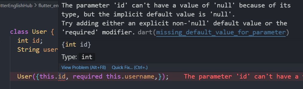
表单GlobalKey
Another exception was thrown: A GlobalKey was used multiple times inside one widget's child list.- 该错误重新运行就好了,r/R不会重置其状态,在 Flutter 中,
GlobalKey的状态是持久的,即使你的 widget 被重建,GlobalKey的状态也不会改变。但是,当你重新运行应用时,所有的GlobalKey都会被重置。
LayoutBuilder
LayoutBuilder 是 Flutter 中的一个 widget,它会根据父 widget 传递给它的约束条件来构建 widget。这些约束条件包括最大和最小宽度和高度。LayoutBuilder 的主要作用是根据其自身的约束条件来决定其子 widget 的大小。
LayoutBuilder 的工作原理如下:
LayoutBuilder接收到父 widget 传递的约束条件,这些约束条件描述了 widget 可以有的最大和最小宽度和高度。LayoutBuilder会将这些约束条件传递给其builder函数。builder函数接收两个参数:一个BuildContext和一个BoxConstraints对象,其中BoxConstraints对象就包含了这些约束条件。builder函数根据这些约束条件来构建 widget。例如,你可以根据约束条件的不同来返回不同的 widget,或者计算 widget 的大小。
以下是一个 LayoutBuilder 的示例:
LayoutBuilder(
  builder: (BuildContext context, BoxConstraints constraints) {
    if (constraints.maxWidth > 600) {
      return WideLayoutWidget();
    } else {
      return NarrowLayoutWidget();
    }
  },
)
在这个示例中,builder 函数根据最大宽度的约束条件来返回不同的 widget。如果最大宽度大于 600,那么就返回 WideLayoutWidget,否则就返回 NarrowLayoutWidget。这样,你就可以根据屏幕的大小来选择最合适的布局。
- 我的项目中的单词书的进度展示时,当时使用了这个widget想动态改变进度条的宽度,又引入了animation动画,使其从0增长到进度,然后我将其二者混在一起使用时,起初动画是没问题的,就是起点不大对,后面直接就动画暂停了背景也为灰色,但是点击事件却可以触发,在点击页面左上角返回按钮的时候动画在那一瞬间恢复正常了,但是却返回到上一个页面了,也不知道为什么,但是我仔细想了一下不需要这个layout来约束宽度,将其代码注释后动画就恢复正常了
- 可能有什么冲突了吧,所以还是要搞清楚widget的作用,由于也是刚开始学flutter
Column
- 报错:
════════ Exception caught by rendering library ═════════════════════════════════
A RenderFlex overflowed by 597 pixels on the bottom.
The relevant error-causing widget was:
════════════════════════════════════════════════════════════════════════════════
- 这个错误是由于 Flutter 的
ColumnWidget 在垂直方向上溢出了。ColumnWidget 会尽可能地占据其父 Widget 在垂直方向上的所有空间,但是如果其子 Widget 的总高度超过了其父 Widget 的高度,就会发生溢出。
我的代码:postcard页面底部的区域溢出;
body: TabBarView(
        controller: _tabController,
        children: favorList.map((favor) => Favor(favorId: favor['id'])).toList(),
      ),

class Favor extends StatelessWidget {
  final int favorId;

  const Favor({Key? key, required this.favorId}) : super(key: key);

  @override
  Widget build(BuildContext context) {
    return buildContentForId(favorId);  // 直接返回内容
  }

  Widget buildContentForId(int id) {
    switch (id) {
      case 1:
        return const FavorDailySentence();
      case 3:
        return Column(
          children: List.generate(6, (index) => const PostCard()),
        );
      default:
        return Container();  // 为其他情况提供默认空容器
    }
  }
}
@override
  Widget build(BuildContext context) {
    return Container(
      margin: EdgeInsets.only(bottom: 20, left: 8, right: 8),
      padding: EdgeInsets.only(bottom: 24),
      decoration: BoxDecoration(
        border: Border(
          bottom: BorderSide(color: Color(0xffD0D0D0)),
        ),
      ),
      child: Column(
        children: [
          Row(xxx)]))}
- 解决办法
- 可以将
ColumnWidget 替换为ListViewWidget。ListViewWidget 是一个滚动视图,它可以处理子 Widget 的总高度超过其自身高度的情况。 - 或者使用
SingleChildScrollView
switch (id) {
      case 3:
        return ListView.builder(
          itemCount: 6,
          itemBuilder: (context, index) => const PostCard(),
        );
ault:
return Container(); // 为其他情况提供默认空容器
}
}
}
@override
Widget build(BuildContext context) {
return Container(
margin: EdgeInsets.only(bottom: 20, left: 8, right: 8),
padding: EdgeInsets.only(bottom: 24),
decoration: BoxDecoration(
border: Border(
bottom: BorderSide(color: Color(0xffD0D0D0)),
),
),
child: Column(
children: [
Row(xxx)]))}
- 解决办法
- 可以将 `Column` Widget 替换为 `ListView` Widget。`ListView` Widget 是一个滚动视图,它可以处理子 Widget 的总高度超过其自身高度的情况。
- 或者使用 `SingleChildScrollView`
switch (id) {
case 3:
return ListView.builder(
itemCount: 6,
itemBuilder: (context, index) => const PostCard(),
);


 扫一扫
扫一扫


 497
497

 被折叠的 条评论
为什么被折叠?
被折叠的 条评论
为什么被折叠?
 到【灌水乐园】发言


