


 这篇博客介绍了微信小程序中TabBar的使用,包括原生配置、使用LinUI组件以及自定义TabBar的详细步骤。内容涵盖了app.json配置、组件安装、事件处理和图标变化问题的解决方法。
微信小程序合集
一. Tabbar 底部导航要点
1.微信小程序中自带的tabbar(推荐)
在app.json文件中设置tabBar属性,包括tabBar的背景色、文字颜色、选中态的颜色、图标等。代码如下:
"tabBar": {
"custom": true,
"color": "#000000",
"selectedColor": "#000000",
"backgroundColor": "#000000",
"list": [{
"pagePath": "pages/index/index",
"text":"首页",
"iconPath": "yourIconSrc",
"selectedIconPath": "yourIconSrc",
"renderer": "webview"
},
...
]}
}"custom": true是在微信小程序中定义页面导航栏时使用的一个属性,用于指示是否使用自定义导航栏。当设置为true时,将不显示系统默认的导航栏,而是使用开发者自定义的导航栏。
2.使用组件的Tabbar,以LinUI为例
LinUI组件准备
LinUI下载,下载连接:TaleLin/lin-ui: 🌈 简洁、易用、灵活的微信小程序组件库 (github.com)[源码安装用,不多赘述]
使用nmp安装
初始化你的项目为一个npm项目:
打开你的微信小程序,在根目录下打开终端,输入
npm init -y若项目根目录已包含 package.json 文件,则可跳过
安装 LinUI
npm i lin-ui配置微信开发者工具 要正确安装 Lin UI,需将微信开发者工具的如下三个选项全部勾选上
使用 npm 模块
增强编译
ES6 转 ES5
设置路径:微信开发者工具右上角 -> 详情 -> 本地设置
构建 NPM 模块 微信开发者工具配置完成以后,还需进行一次 NPM 模块的构建
按钮位置:微信开发者工具顶部 -> 工具 -> 构建 npm
若你本地没有 Node.js 环境,无法使用 NPM 安装]( https://doc.mini.talelin.com/start/# 方式二:下载代码)
构建成功后,在你的根目录下会出现一个名为”miniprogram_npm“的组件文件
组件的使用
引入组件
在页面中引入(注意:底部导航栏使用需要引入tab-bar)
在app.json中添加:
 {
   "usingComponents":{
     "l-tabbar":"/miniprogram_npm/lin-ui/tab-bar/index"
   }
}同时在app.json中添加tabBar,其中的custom要设置为true(这步自定义导航栏都要做):
 "tabBar": {
 •    "custom": true,
 •    "list": [{
 •        "pagePath": "pages/index/index"
 •      }, {
 •        "pagePath": "pages/mine/mine"
 •      },
 •      {
 •        "pagePath": "pages/wait/wait"
 •      }
 •    ]
   },
使用组件
在项目根目录下添加一个custom-tab-bar文件夹(这是固定要求,不能改)
选中文件夹右键点击新建component
3.在index.wxml中添加代码:
<l-tab-bar list="{{list}}" bind:lintap = "lintap"></l-tab-bar>4.在index.js编写list数据
 // 页面 js 文件
 Page({
     data:{
         list:[
             {
                 pagePath:"/pages/index/index",
                 text:"首页",
                 iconPath:"/icons/tab-bar/index.png",
                 selectedIconPath:"/icons/tab-bar/index-selected.png"
             }
             ...
         ]
     }
 })
组件参数
导航栏属性
属性 | 说明 | 类型 | 可选值 | 必填 | 默认值 | 版本号 |
list | TabBar 绑定的页面路径 | Array<Object> | - | 是 | - | - |
bg-color | TabBar 背景色 | String | CSS 支持的颜色 | 否 | white | - |
bg-img | TabBar 背景图 | String | 图片网络路径 | 否 | - | - |
text-selected-color | TabBar 文字选中时的颜色 | String | CSS 支持的颜色 | 否 | 主题色 | - |
text-color | TabBar 文字未选中时的颜色 | String | CSS 支持的颜色 | 否 | #666666 | - |
页面列表属性
list接收一个数组,数组中的每项都是一个对象,对象可配置属性如下表
属性 | 说明 | 类型 | 可选值 | 必填 | 默认值 | 版本号 |
pagePath | 标签对应页面路径 | String | - | 是 | - | 0.8.12 |
text | 标签文字 | String | - | 是 | - | 0.8.12 |
iconPath | 未选中状态图标路径 | String | - | 是 | - | 0.8.12 |
selectedIconPath | 选中状态图标路径 | String | - | 是 | - | 0.8.12 |
redDot | 是否显示红点 | Boolean/Number | true/false/数字 | 否 | false | 0.8.12 |
导航栏事件
事件名称 | 说明 | 返回值 | 备注 |
bind:linchange | 标签切换时触发 | 当前标签信息 | |
mut-bind:linchange | 点击标签时触发 | 点击标签信息 |
有个问题(注意)
不知道是什么原因,每次选中导航栏目标时,图标不会进行变化,希望有大神指导指导
3.自定义组件(推荐)
自定义准备
app.json配置:
在app.json配置好对应属性,其中custom必须是true,并且要设置list中你要跳转的tab全部路径(其他不用设置,在自定义中设置即可):
"tabBar": {
• "custom": true,
• "list": [{
• "pagePath": "pages/index/index"
• },{
• "pagePath": "pages/message/message"
• },{
• "pagePath": "pages/mine/mine"
• }custom-tab-bar配置
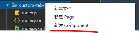
在项目根目录下添加一个custom-tab-bar文件夹(这是固定要求,不能改)
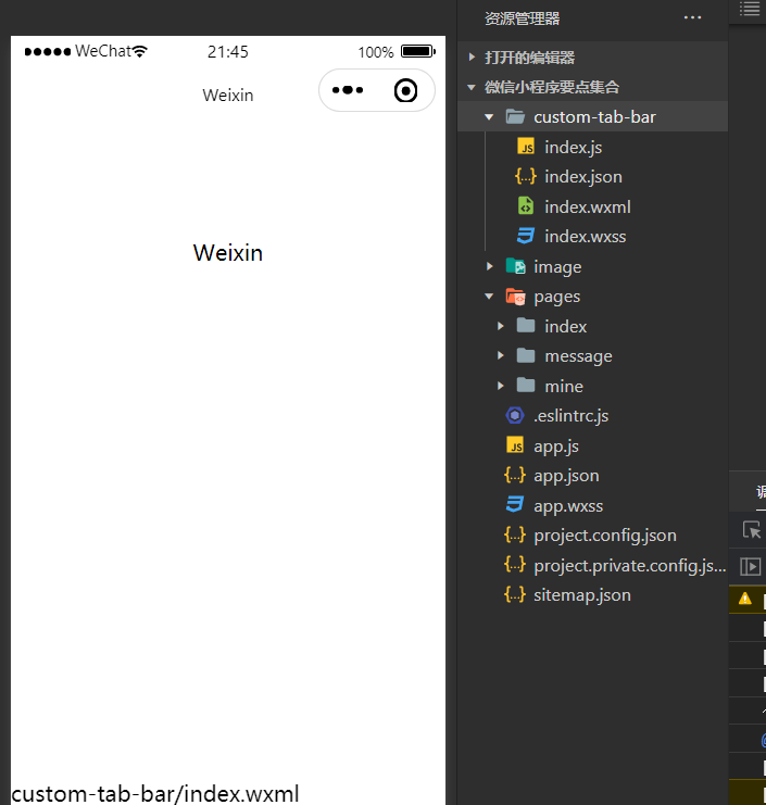
选中文件夹右键点击新建component(如图所示成功后最下面会有个custom-tab-bar/index.wxml)
在index.wxml中编写
 <view class="tab-bar">
 <view class="tab-bar-border"></view>
 <view wx:for="{{selectList}}" wx:key="index" class="tab-bar-item" data-path="{{item.pagePath}}" data-selected="{{item.selected}}" bindtap="switchTab">
 <image class="cover-image" src="{{selected === item.selected ? item.selectedIconPath : item.iconPath}}"></image>
 <view class="cover-view" style="color: {{selected === item.selected ? selectedColor : color}}">{{item.text}}
 </view>
 </view>
 </view>
这段代码是一个小程序的底部选项卡,包含了多个选项卡。
其中,tab-bar 表示整个选项卡的容器,tab-bar-border 是选项卡底部的分割线。通过 wx:for 循环展示 selectList 中的每一个选项卡,选项卡的内容包括 icon 图标、文字和对应的页面路径。
cover-image 是选项卡的图标,根据 selected 属性判断当前选项卡是否被选中,选中则显示 selectedIconPath,否则显示 iconPath。
cover-view 是选项卡的文字描述,根据 selected 属性判断选中状态,选中则显示 selectedColor,否则显示 color。
bindtap="switchTab" 表示点击该选项卡时会触发 switchTab 函数。
3.在index.wxss中编写
.tab-bar {
position: fixed;
bottom: 0;
left: 0;
right: 0;
height: 48px;
background: white;
display: flex;
padding-bottom: env(safe-area-inset-bottom);
}
.tab-bar-border {
background-color: rgba(0, 0, 0, 0.33);
position: absolute;
left: 0;
top: 0;
width: 100%;
height: 1px;
transform: scaleY(0.5);
}
.tab-bar-item {
flex: 1;
text-align: center;
display: flex;
justify-content: center;
align-items: center;
flex-direction: column;
}
.tab-bar-item .cover-image {
width: 44rpx;
height: 44rpx;
}
.tab-bar-item .cover-view {
margin-top: 8rpx;
font-size: 24rpx;
}4.index.js编写(重点)
 Component({
   /**

    * 组件的属性列表
      */
        properties: {

   },

   /**

    * 组件的初始数据
      */
        data: {
          selectedColor: "#3161ff",
          allList: [
      [{
          "pagePath": "/pages/index/index",
          "text": "首页",
          "iconPath": "",   //填入未选中时的图片路径
          "selectedIconPath": "g",  //填入被选择时的图片路径
          "selected": "index"
        },
        {
          "pagePath": "/pages/message/message",
          "text": "消息",
          "iconPath": "",
          "selectedIconPath": "",
          "selected": "message"
        },
        {
          "pagePath": "/pages/mine/mine",
          "text": "我的",
          "iconPath": "",
          "selectedIconPath": "",
          "selected": "mine"
        }
      ]
          ],
          selectList: []
        },
        /**
    * 生命周期方法
      */
        attached() {
          this.setData({
      selectList: this.data.allList[0]
          })
        },
        /**
    * 组件的方法列表
      */
        methods: {
          switchTab(e) {
      // console.log(e.currentTarget.dataset);
      let path = e.currentTarget.dataset.path;
      let selected = e.currentTarget.dataset.selected
      // console.log(e.currentTarget.dataset.selected);
      wx.switchTab({
        url: path,
      })
          }
        }
      })
这段代码定义了一个名为switchTab的方法,用于响应用户在标签栏中切换标签的操作。在点击标签时,会获取该标签对应的页面路径和当前标签是否被选中,然后使用wx.switchTab方法跳转到对应的页面。wx.switchTab方法可以用于切换到标签栏中的页面,并关闭其他所有非标签栏页面。
实现图标正确变化的步骤
在所有导航栏选中项对应页面的js中添加:
onShow() {
• if(typeof this.getTabBar === 'function' &&
• this.getTabBar()) {
• this.getTabBar().setData({
• selected: "the 'selected' from your item of list " //你custom-tab-bar.js中的list每一项对应的 selected元素值
• })
• }
这段代码是在小程序页面的 onShow 生命周期函数中调用的,它的作用是在页面展示时,如果当前页面有自定义的 TabBar 组件,则将 TabBar 中 selected 属性设置为 "index",以实现选中首页的效果。
具体来说,它首先判断当前页面是否存在 getTabBar() 函数,如果存在则说明当前页面有自定义 TabBar 组件,它调用 getTabBar() 函数获取 TabBar 组件实例,然后通过 setData() 方法将 selected 属性设置为 "index",表示选中首页。这样就可以在页面展示时自动选中首页,提高用户体验。
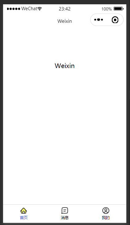
效果图:


 扫一扫
扫一扫


 1643
1643

 被折叠的 条评论
为什么被折叠?
被折叠的 条评论
为什么被折叠?
 到【灌水乐园】发言


